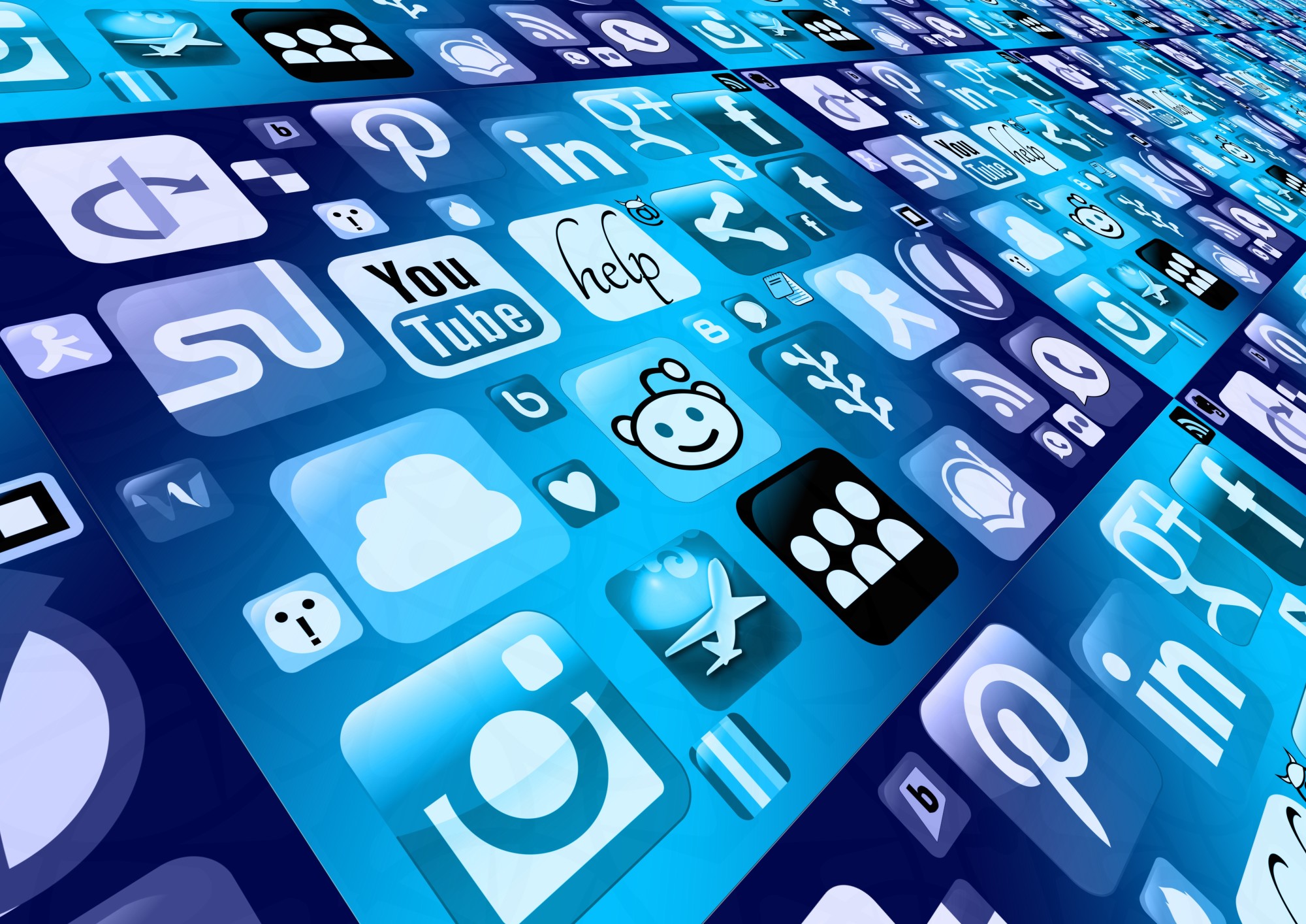
It’s not unusual to refer to a well-known and highly recognizable logo as iconic. For example, Apple, McDonald’s, and IBM all have rather iconic logos.
This can lead some to believe that logos and icons are interchangeable. That’s not the case though.
There is a difference between an icon and a logo. We’ll bring to light the distinction.
The Logo
A logo represents a business or organization. We mentioned above the logos for Apple, IBM, and McDonald’s. When you see these logos you immediately think of these companies.
Sometimes a logo is very straightforward; such as Apple’s. There’s no guesswork behind what the logo stands for.
Other times, a logo may be more abstract. Take the Nike “swoosh.”
This simple but unique shape conveys movement and speed. There is zero mention of the company’s name, yet everyone knows the “swoosh” stands for Nike. It’s a graphic summary of their brand.
This sort of simplicity, versatility, and timelessness makes for an extremely successful logo.
A logo can be any shape, color, or dimension – though designers are aware of the psychology of color and shape when creating logos. A logo, rather than an icon, is what would be presented on a large banner, custom medals or drinking glasses, or a tattoo.
It’s a form of advertising, while an icon is not. But there are other differences as well.
The Icon
Icons have, for centuries, been utilized to visually represent concepts or actions. They serve to bridge the gap between abstract and practical.
This continues to be their job today.
In the simplest of terms, an icon is a graphical representation that summarizes an operation and relays it to the user. This is one of the ways it differs from a logo. It represents an action.
For example, the Facebook “like” icon allows a person to quickly denote their approval of a post without having to respond with words.
The Technical Element
Logo and icon design are also different from one another in that icon design is influenced by technical dimensions.
Since icons are most commonly used in apps and are a major element in UI/UX interface, they must also abide by the restrictions of the systems that will display them. While there aren’t shape requirements, if it’s used for an organization, it should fit into a square. Think of the iTunes icon.
On other occasions, an icon is used in responsive web design to help visitors navigate sites. You’re probably familiar with the three lines at the top of a website’s navigation bar. This is called a hamburger icon – since it looks vaguely like a hamburger. But it also looks like a list and it serves as a menu.
Now You Know the Difference Between Icon and Logo
It’s true that some logos use an icon to distinguish them from others. For the most part, however, the difference between icon and logo is what each represents, as well as the technical aspects.
At the end of the day, you want each to be simple, effective, and recognizable.
And for more great articles about logos and marketing, keep checking back with us!


