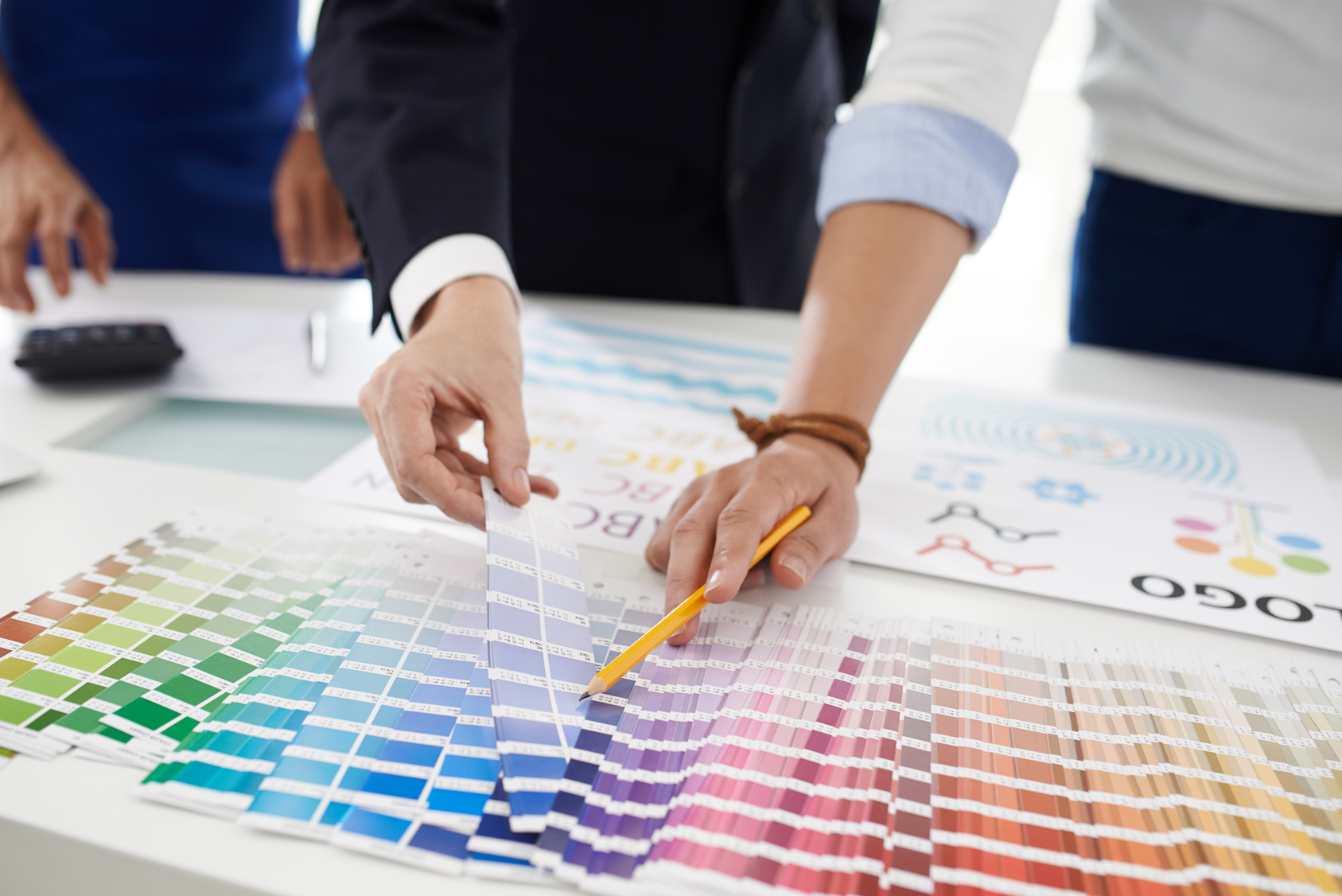
If you feel like your current logo isn’t doing anything to bring you customers and engage with your target market, it’s time to evaluate how to use psychology in your logo design.
Let’s look at how shape and color affect your target market’s mood and likeliness to do business with you.
Use the Psychology of Color in Your Ad Logo Design
No matter what you sell, from a direct response tv to highly-pigmented eyeshadows, you need a strong ad logo design to help you sell more of it.
That starts with a basic understanding of the ways in which different colors can create certain moods or evoke different emotions.
It’s also a huge part of what makes someone say “yes” or “no” to your product or brand. In fact, over 84% of people say that color is one of the most important factors that influence buying decisions.
This statistic only makes choosing the right color even more crucial. You need to choose the color that evokes the mood most closely related to your brand’s message.
Let’s quickly look at some of the most popular colors in ad logo design, and the psychology behind them.
Red
Red indicates strength, urgency, and even aggression.
This means it’s perfect for things like gyms, startups, and medical brands. Of course, it also has a strong association with sales and discounts, meaning it’s a great color to use if you want to draw attention to the money saved by working with you.
Blue
Blue is associated with book-smart intelligence and expertise. This means it’s great for law and accounting firms, as well as other business professional services.
It also helps to calm and relax people, so it’s a great choice for a spa, massage center, or even beauty shop.
Yellow
Yellow evokes happiness and positivity, meaning it’s a great fit for retail shops of pretty much any kind. It works especially well in more creative fields and stores.
Green
You probably have already guessed what green makes people think of — money. This means it’s a great option for a logo design for a financial firm.
However, it also works to restore balance. This means a yoga studio, a bookstore, or even a non-profit could use this color well.
The Psychology of Shapes
Colors aren’t the only thing that matters when it comes to logo design. Shapes also have emotional connotations.
Let’s check out what a few of them are really telling your market now.
Round Shapes
Circles and ovals evoke a sense of trust, protection, and community. They’re great for businesses that handle sensitive information.
They also signal that you plan to be around for years to come — that you’re stable and established.
Shapes With Lines
Shapes like rectangles, squares, and triangles tell people that you pay attention to detail. This will appeal to Type A clients, and those that value professionalism over anything else.
They also appeal to a more intellectual and scientific mind, making them wonderful shapes to include in financial firms, schools, and Internet companies.
Use Human Psychology to Your Advantage
Now that you know how to send helpful subliminal messages through shapes and color, it’s time to start creating your logo.
Use our free online logo maker tool to help you to make the most visually-appealing and unique design possible. Be sure to check out our blog for more great advice on ad logo design!


Leave a comment