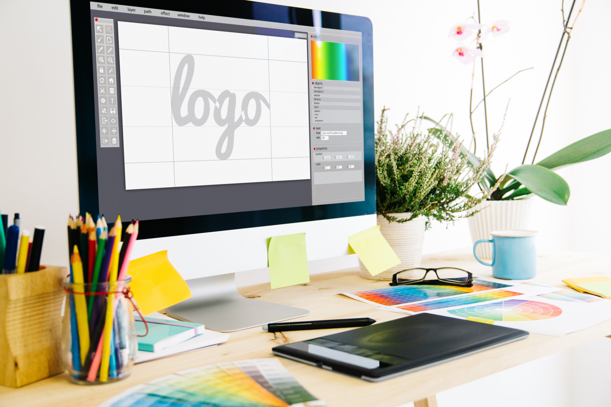
Branding says everything about your business. Some of the largest companies in the world have spent millions of dollars branding and rebranding their logos to connect with their customers and showcase their beliefs.
Some brand logos are iconic, some rememberable, and others not so much. So what makes a logo stand out? What are the logo colors, fonts, and design that produce an attractive and enticing logo?
In this article, we will explore how colors play with our emotions and how thorough designers have to be when creating a logo.
The Psychology of Color
You’ve heard of the practice of psychology – the study of the mind and behavior – but did you know there’s such a thing as the psychology of color?
The psychology of color refers to the way people feel or what they think when they see a specific color. Color is fascinating, in that it provokes emotions, thoughts, feelings when it’s seen, though we rarely pay attention to it. Color can alter our thinking.
When designers are creating a logo, like those at Leaflet Distribution Dublin, understanding the spectrum of color is significant and essential. Each color speaks to us differently, and how they use that color within the logo is instrumental in communicating the brand’s philosophy.
Questions, Questions, Questions
Designing a logo can be a fun and exciting time. It means you’re finally launching your business and you’re ready to show the world who you are. But there are a few questions to ask yourself about your business.
Here are some to consider:
- Who is your target market? Male or female?
- Is your brand whimsical or down-to-earth?
- Is the brand trendy or classy?
- What’s the age of your ideal customer?
- Is your ideal customer wealthy or more middle-class?
These questions might seem silly at first. But once you start digging deeper into your brand, you’ll learn how to create a logo that truly speaks to your company correctly. And, also, you’ll probably even solidify your brand even further!
Logo Colors: What They Convey
As mentioned before, colors make us feel certain emotions, even though we may not realize it at the time. Walk into a room that’s painted blue, and you’ll get the sense of a calming atmosphere. Enter a bright, cheery yellow room, and you’ll sense the complete opposite.
Even though there are variations of every color, in general, the color itself speaks something to us. Here is an essential color emotion guide on how each color makes us feel and think.
Colors are divided into two categories – warm and cool. Let’s take a look at the warm colors.
Warm Colors
Warm colors are all very similar in that they produce many of the same emotions, but all in their unique way.
Red
Red is associated with fire, passion, gumption, and an overall go-get-’em attitude. Males, in particular, are drawn to this color. If you want to grab anyone’s attention, red is the color to use as it creates a sense of urgency. Red is known to increase heart rate, getting people pumped up for whatever comes their way.
Orange
Although orange is not as in-your-face as red, it still deserves a nod. Orange promotes friendliness, playfulness, and possess overall energy. This color is especially approachable if you’re working with children.
Yellow
Despite what some say, yellow isn’t for the mellow! Yellow is like a bright smiley face, meant to bring joy, happiness, warmth, and cheerfulness to any logo. Yellow is unique, in that it needs to be balanced with other colors because too much or too little leaves you distracted or overwhelmed.
Cool Colors
Now that we’ve had a chance to get to know the warm colors let’s take a closer look at their opposites – cool colors.
Blue
Blue is one of the most popular logo colors, with about 33% of brands using some form of blue. This color presents tranquility, peace, and maturity. If you want people to trust you (and your brand) adding blue is a perfect choice.
Green
Green is naturally associated with the outdoors, and that’s exactly what it conveys. This color is all about newness, whether it be a change in health or even wealth. Seeing the color green brings us peace and a desire to promote growth in our lives.
Purple
Purple is the color of luxury. Red and blue create this striking color used for those who wish to communicate boldness, power, and passion. Purple showcases a grand and distinguished brand with just a hint of mystery.
Brown
Surprised to learn that brown is a cool color? Brown is a more serious color, appealing mostly to a male audience for it’s earthy, tough-guy persona. Even though brown is not as popular as the other colors, using it can be tricky or brilliant.
Black and White
These two colors are in a category by themselves. Black is modern, trendy, sleek, and sophisticated, but could also be seen as harsh. White expresses youthfulness, purity, and innocence.
While they do well on their own as a logo color, they’re even more powerful when combined with the colors above.
Combining these two to get gray or even silver indicates a similar feel to blue – maturity with a touch of seriousness. The hue matters as well, because a darker gray gives off a bolder feel, while a lighter silver adds approachability.
Color for Your Brand
A logo without color is like a business without a personality. Logo colors speak to your clients and customers and represent who you are as a brand. Choosing the right ones will propel you forward for a bright future.
Ready to get started on your logo today? For free? Check out our online logo maker and be on your way to promoting your brand today!


