5 Gambling Logo Mistakes You’re Making
Posted on January 15, 2018 by Logo Design Tips and Tricks

It’s time to design a new gambling logo. You might have some ideas in mind, but you may not be sure how to bring them all together.
Every day, we see about 5,000 logos. You want yours to be remembered for the right reasons, not because you made some critical mistakes along the way.
How do you make yours stand out from the thousands of logos and be remembered for the right reasons?
You start by knowing what mistakes you need to avoid when designing your logo. Read on for the top 5 mistakes you need to avoid to make your gambling logo stand out from the crowd.
What a Logo Is, and What It Isn’t
How important is a logo for your business? A logo is often the first impression you get of a business. It’s what people see first on a brochure, website or business card.
It then takes someone 10 seconds to form a first impression of your business by looking at your logo.
How can you create a unique gambling logo? Let’s start by going over what a logo is and isn’t.
A logo is:
- A visual representation of your brand
- Carefully researched and thought out
A logo is not:
- Just a couple of cool images put together
- To be taken lightly
- Your brand
What’s the difference between a logo and a brand? A brand is what your company stands for. It’s the values, name, customer service, company culture and everything that your business embodies.
Your logo is all of that wrapped up in a neat image that creates an emotional connection between your customers and your brand.
Mistake #1: No Planning or Research into the Logo
Plenty of gambling businesses create logos by slapping a few images together with the company name and think it looks cool, so they go to print it.
What they don’t realize is that just because it looks cool, the message of what the company is about isn’t there.
While a logo may look good to you, it may not connect with your customers, your employees, or anyone else. That’s why it’s necessary to plan your logo out before considering colors and fonts.
You’ll need to consider your target market, competition, and the first thing you want people to know about your business.
Also, ask yourself the following questions:
- What makes your company stand out from your competition?
- What are your company’s strengths?
- How do your customers think about your company? Is there anything you’d like to change?
- How do you talk about your business to someone for the first time?
By answering these questions, you’ll have the attributes of your company and the core of what you want your logo to say about your company.
Mistake #2: Your Logo Is an Instructional Drawing
If you’re creating a gambling logo, does it have to have someone standing at a slot machine for people to know what your company does?
Absolutely not.
You want your logo to be simple and memorable. You don’t have to be completely obvious when designing it.
For example, a logo for a boot company doesn’t have to have a boot in it, and a logo for a gambling business doesn’t have to have a stack of chips, or a slot machine or obvious imagery.
The logo isn’t there to tell people what you do. That’s why you have your website. It’s there to tell them about who your company is.
If your company targets men, then you should use colors like brown or blue in your logo to make that psychological connection.
Take a look at this blog post about understanding the tote at Betting Gods. First of all, their name is awesome. If you’re a bettor, odds are you’ve prayed the betting gods before.
Secondly, take a look at the logo. It’s colorful, creative and plays in its name. You know what the company does, and it’s a company that has a sense of humor.
Mistake #3: Logo Isn’t Scaled for Different Uses
Another common mistake you see is that the logo is designed with only one use in mind, usually for a website.
Always consider the different uses of your logo. Will it be used on t-shirts, brochures, letterhead, and your website?
These are vastly different uses and you want to be sure that your logo looks good in every instance.
Not taking this into consideration can result in having a logo that’s pixelated and looks poor.
That’s not the first impression you want to make.
Be sure to test your logo out in different environments before you settle on a final design.
Mistake #4: Your Gambling Logo Looks like Other Logos
There’s a difference between inspiration and copying someone’s logo outright.
You can find inspiration in different logos and adopt a typeface or a color, as long as it’s not trademarked.
However, if you copy someone’s logo outright, you’ll only confuse people. That also won’t reflect well on your company. You’ll look lazy or you’re trying to piggyback on someone else’s success.
Mistake #5: Your Logo Is Busy
Yes, there is a lot you want to convey in a logo. That does not give you license to pack as much information into your logo as possible.
Remember to keep it simple.
A major mistake people make when designing a logo is that they use too many fonts, and colors. They also try to do too much with it by having too many images.
Your best bet is to stick to one or two typefaces and a single image. You can decide to just have your name as the logo and use a single typeface like Betting Gods.
Make Your Gambling Logo Stand Out
Are you ready to design your gambling logo? After you’ve done your research and you have a few sketches to work with, you can start designing your logo.
OnlineLogoMaker.com is here to make your design process easy, even if you don’t have a design degree. There are countless templates, images, and fonts for you to design a high-quality logo without much hassle.
You can save your image and download it using a free or premium account.
Start designing your logo today.
The Top Mistakes To Avoid For Your Restaurant Logo Design
Posted on July 13, 2017 by Logo Design Tips and Tricks
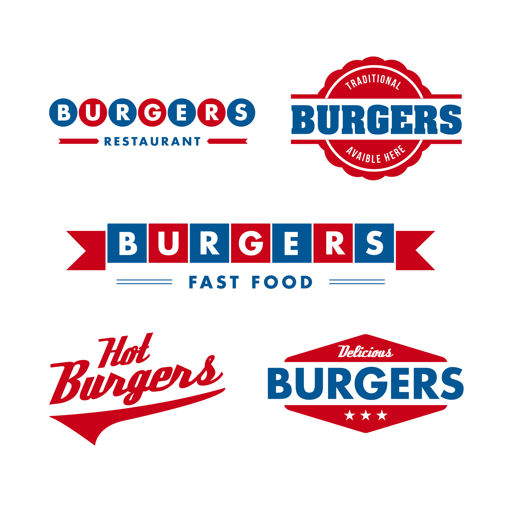
Great restaurant logo design can really help your business stand out from competitors on the high street.
A good logo will convey to customers exactly what your restaurant is about – if it’s fancy, family-friendly, or fast and tasty.
A bad logo can make the place look tacky and put off customers. Here are the top mistakes to avoid when looking for a new restaurant logo design.
Keep it as Simple as Possible
Think of some restaurant logos – McDonald’s, KFC, Wendy’s. What do they have in common?
That’s right – they’re all very simple. There’s a limited color palette in use and there isn’t very much going on in any of these three.
But we bet you were able to remember them all. And you’re not alone.
A survey from Siegel + Gale found that simple logos were the most memorable. 16% of the 3,000 people asked said Nike was the most memorable, followed by 15.6% saying Apple.
It doesn’t matter if your restaurant is serving fast food or gourmet meals – keeping your logo simple will aid your customers’ memories and help to build brand recognition.
This can be an incredibly powerful marketing tool if you go on to open other restaurants under the same brand.
Choose a Legible Font
Make sure people can actually read the name on your logo. That means choosing a clear font which is easy to read, and setting it at an appropriate size.
There are hundreds of fonts out there, but whatever you choose it should reflect your business. You don’t want a very ‘cartoony’, informal font for a high-end restaurant, or vice versa. It sends the wrong message.
Do some testing before you commit to having your design made up. Ask your friends and family to see if they can read the text, and what they think the font represents. If their answer doesn’t match what you’re looking for, consider making a change.
Don’t Copy Anyone Else
The whole point of having a logo is to differentiate and identify yourself in a busy market. If you copy someone else (inside or outside your industry), it will confuse customers and definitely generate ill-will from the business you’ve copied.
In the worst-case scenario, you could even find yourself on the wrong side of a lawsuit. The owner of the ‘Krusty Krab’ restaurant was pursued by Viacom for use of its trademark last year (the name comes from the popular kids’ show Spongebob Squarepants).
Be original. Stand out.
Cheaper isn’t Always Better…
We know local businesses have limited budgets. But hiring a super cheap designer is not always a great idea.
We’ll admit, there are outliers – some designers might do special rates for smaller companies, for example.
However, chances are that paying someone to create a logo for next to nothing is simply money down the drain.
…but Free Just Might Be
If you’re willing to stick to the key points we’ve set out here, and have a limited budget, you might want to have a go at making your own logo.
We recommend you get feedback on it and refine it sensibly. But if you want to save money and feel like your creative juices are flowing, we say go for it!
3 Damaging Mistakes in Business Logo Building
Posted on June 16, 2017 by Logo Design Tips and Tricks
Whether you’re just starting your business or are in the process of a rebranding, logo building is one of the most crucial things to consider.
But even if you’re the creative type and think you have a great design, you need to make sure it’s not sending the wrong message to clients.
Are you making one of these three logo design mistakes?
1. Relying On Cliches
We get it — when you’re in the process of logo building, you want to create a design that’s recognizable. It is important that your clients and potential markets are easily able to make the association between your logo and what you’re selling.
But that doesn’t mean you should be doing what everyone else is.
For example, if you’re a company like Best Access Doors, your first instinct might be to base your logo around the design of closed door.
While a door is a good thing to include, how can you take it to the next level and avoid a cliche? Make sure your design shows an action, like the door opening!
2. Blindly Following Trends
Especially if you’re catering to a millennial market, it can be tempting to throw yourself at the latest trends, like using hipster mustaches and millennial Pink in your designs.
But doing everything the trends tell you to is a mistake for a variety of reasons.
For one, these trends just might not mesh well with the overall message of your brand. They also have a tendency to look dated fast. This means that a few months after you create your initial logo design, you’ll have to recreate it.
This can eat up both your time and money.
3. Doing Too Much
Bright colors, crazy fonts, a logo image that shows about five of the products you sell.
While it’s important that you try to take advantage of all the real estate your logo design gives you to connect with your target market, you don’t want to go overboard.
Doing this doesn’t just make your text difficult to read and your image hard to make out. It also makes you look incredibly unprofessional — even desperate.
You don’t need to pull out every bell and whistle you have in order to make a great impression on your client. Instead, you need to focus on creating a design that’s clear, concise, and in step with your overall branding process.
There’s nothing wrong with minimalism — and it sends the message that you can rely on the strength of your products and services to make the sale.
Avoid Making These Mistakes When Logo Building!
The logo building process may look simple, but as you can tell from this post, there are countless tiny details that can make a huge difference.
One final way to tell if your logo is making an impact or missing the mark?
See it for yourself! Use our free online logo maker tool to create several different mock-ups of your favorite design. Then, thoroughly critique them (several extra sets of eyes can come in handy here.)
Still feel like something just isn’t quite right with your design?
Read the advice on our blog for design inspiration, branding tips, and more.
Create a Logo and Avoid These Mistakes
Posted on June 08, 2017 by Logo Design Tips and Tricks

Want to have a stunning logo for your brand? Contrary to what you may have heard, there’s no need to spend a fortune on this service.
Actually, you can create a logo with just a few clicks. There are plenty of online tools that make it easy to design beautiful business logos. All you need is some creativity.
Logo design services can exceed $2,500. Most freelancers charge at least $800. If you hire a web design agency, expect to pay more.
Additionally, no one can guarantee that you’ll be happy with the final result. Some designers have huge potential, but limited experience. Others may not be familiar with your type of business and the message you’re trying to convey.
Web design agencies may refuse to make the changes required, or charge extra for these adjustments.
The best thing you can do is create a logo yourself. Online logo makers feature professional templates for any niche.
Eager to learn more? Let’s get into it!
Why Create a Logo Yourself?
The art of creating logos requires creativity and technical skills. After all, you want a logo that’s relevant, memorable, and scalable.
It should also convey the brand’s personality and gain immediate recognition. A good logo should give your clients a feeling of familiarity and trust. It needs to look professional and stand the test of time.
What if you lack the skills needed to create a logo?
You can always hire a web design agency, but the costs are high. This is where free logo makers come in handy. These tools enable users to create logos without the need for design skills.
All you need to do is choose a template, drag and drop items, and pick the right colors. It’s that simple!
With free logo software, you’ll save money and get things done in less time.
It’s no need to give phone calls or send dozens of emails to a design agency. Your new logo could be ready in minutes.
These online tools are perfect for business owners, bloggers, and online marketers. When used right, they can help increase brand awareness and visibility.
Before getting started, check out these common logo mistakes and how to avoid them:
No Research
Just because you have a certain logo in mind, it doesn’t mean it will work. The colors might not be right. Or the image might not reflect your brand.
The world’s most popular logos share a couple of similarities, so use them for inspiration. Take a quick look at Coca-Cola, Toyota, Dell, Samsung, and other well-known brands. What do they have in common?
- About 90 percent of these logos lack a by-line tag.
- 74 percent of them only use one color.
- Just 31 percent include the company’s initials in their design.
Most of these logos use the colors red and blue. According to experts, blue conveys trust. Red expresses strength and passion. Additionally, they use no more than three fonts. Using too many fonts can make a logo hard to remember.
Take the time to do some research before creating your logo. This way, you’ll avoid common mistakes and produce something that’s truly memorable.
Low Resolution
If you need a magnifying glass to read your logo, you’re doing it all wrong.
With a few exceptions, resolution-dependent raster graphics are a recipe for failure.
A good logo should include quality images, with no pixelation issues. Not to mention that it’s easier to edit vector graphics than raster graphics. Fortunately, most logo makers use simple images that are easy to read and understand.
When using vector graphics, it’s easier to edit and scale the logo at any size. The image will look better on mobile devices.
Relying on Color
Using too many colors for logo design may distract attention from the core message. That’s why the most popular logos use three colors or less.
Every color elicits a different emotional response.
Restaurants often use the color red in their logos because it stimulates appetite. Car manufacturers rely on this color to showcase their signature products.
Red also highlights images and text. In marketing, it drives customers to make buying decisions. For this reason, it’s widely used for Click Here and Buy Now buttons.
Yellow draws attention and evokes cheerful feelings. This color is also associated with food.
Health companies use the color green because it symbolizes hope and fertility.
Dark blue is a sign of professionalism and expertise. It’s a favorite choice for most corporations. Since it suppresses appetite, you should not use it for promoting foods and cookware.
Black is associated with prestige, authority, and elegance. This makes it a perfect choice for business and fashion logos.
White is typically used for promoting dairy foods, low-fat foods, and health products.
Toy manufacturers add the color orange to their logos because it’s playful and energetic.
Now that you know these things, pick one or two colors that best fit your brand. Create a logo that can be easily associated with your business.
Before adding color, design it in black and white. People should be able to recognize your logo even in grayscale.
Following Trends
Trends come and go, but your logo remains the same for years.
Don’t rely on the latest fads if you want to create a logo that lasts. Following trends is like printing the term of expiration on your work.
The best logos are timeless. They’re just as popular now as they were decades ago.
For example, extreme minimalism was the latest craze back in 2014. Now, it lost some of its appeal.
In 2017, designers used broken letters and cropping to make logos. The question is: are these trends going to last?
Think about big names like Sony, UPS, and IKEA. Their logos haven’t changed at all over the years. Yet, they still look fresh.
Another example is the BBC logo, which has remained the same since 1997.
Focus on your brand’s core values instead of slavishly following trends. Create a logo that clients will remember for years.
Poor Font Choice
World-famous brands use Times New Romans, Arial, and Helvetica for their logos. Just think about Microsoft and Honda.
Complex fonts are hard to remember and may overshadow your message. Choose one that’s legible, clear, and easy to the eye.
When you create a logo, consider your audience’s age and demographics. Use fonts that match the purpose and message of your brand.
Decide whether you want a traditional font, a bold font, or an elegant font. Select one that resonates with your business and targeted customers.
Copying Current Logos
Drawing inspiration from the most iconic brand logos can increase your success. But it’s an excuse to copy them.
First of all, you run the risk of violating copyright and trademark laws. Secondly, it can hurt your credibility.
You must create a logo that’s unique and original. It should not look too much like your competitors.
Select fonts, shapes, and colors that set your brand apart. This will help your clients easily identify your business and its values.
A logo that lacks originality will confuse your customers.
Get creative and play with colors. Experiment with different icons and create your own fonts.
Using an Overly-Complex Design
You probably have lots of different ideas for a new logo, which is great. However, you don’t have to use all of them!
An overly-complicated logo will be difficult to remember and lose its meaning. Additionally, it may increase printing costs.
Embossing looks good on the page, but it’s difficult to reproduce on different materials. Complex graphic elements can turn a work of art into a visual nightmare.
One of the best ways to make your logo memorable is to keep things simple.
For instance, big brands like GAP, Apple, and Nike have a simple logo that anyone can recognize. The font style is clean, and the background is solid.
Choose a simple picture and upload it to the logo maker. Remember that more is less.
Typographic Issues
Surprisingly, even the best designers make typography mistakes. For example, Curlz and Vijaya fonts have no place in a professional logo.
Predictable typefaces, excessive spacing, and super-heavy fonts are not the best choice. Also, it’s not unusual to see misspelled words in a logo.
These silly mistakes can hurt your business and make you look like an amateur. To avoid them, run the text spellchecker before finalizing your logo.
Using Acronyms to Create a Logo
Unless you have a popular brand, refrain from using acronyms. Customers might not be able to remember them and understand their meaning.
Also, there might be other brands that use the same acronymic as you do.
Eventually, you can shorten your business name. Just make sure it’s recognizable and easy to memorize.
Another strategy you can use is incorporating the company’s name with an acronym logo. This will make it stand out from the competition and strengthen your brand.
As you see, it’s not that hard to create a logo. Avoid the most common mistakes and keep things simple.
For a quick boost of inspiration, check out these expert logo design tips!