How to Create A Church Logo That Converts!
Posted on September 22, 2017 by Logo Design Tips and Tricks

Looking to attract new visitors to your church? That sign out front isn’t your only option.
Creating an inspiring church logo is a great way to build a community around your house of worship.
By affixing a unique design to collateral such as your bulletins, newsletters, outreach materials and more, you help put a face to a name, so to speak.
Doing so makes you recognizable, spurs interest, and draws guests in.
Today, we’re discussing how to create a logo that’s powerful and gets your message across.
Ready to learn more? Let’s go!
Encourage Staff Input
Creating a church logo shouldn’t be a solitary process.
Rather, meet with your executive committees, as well as your full and part-time staff, to listen to their input and ideas.
Key questions to ask include:
- In what areas is our current logo weak?
- What is the message we want to send with our new logo?
- What religious symbols best convey that message?
- Is there a specific demographic we especially need to reach with this new logo?
In addition to your current team members, it’s also helpful to survey a few churchgoers (from within your own congregation and outside of it) to glean their opinions on your current and future logo.
Take a Look Around
The church around the corner might not be the best place to research your next logo design.
Or, could it be?
You might be surprised at what you can learn by simply researching the logos that other churches designed for themselves.
Excellent design knows no bounds. It exists in grand megachurches that attract thousands in attendance to Las Vegas wedding chapels like Little Church of the West. There are churches around the world whose message and marketing can act as examples of great design.
Even if you aren’t intending to imitate them, these designs can still provide you with inspiration on color scheme, symbolism, font, and more. Then, you can pull your favorite elements from each to create a new church logo that’s all your own.
Explore Your Stream of Consciousness
By definition, stream of consciousness thinking occurs when we simply let our thoughts go where they will, without directing them in any specific way.
While this might sound like an exercise best left for a psychology class, it can prove helpful when designing your church logo.
Begin by thinking of your church and its mission. Then, see where your mind takes you.
As you think of specific words, write them down.
Then, try using a visual thesaurus to expand on these ideas. This tool allows you to enter one word, then gives you a map of other, related words.
You may just stumble upon the perfect term that can translate into the perfect idea for a logo!
Draw, Refine, Repeat
Once you have the initial concept in place for your logo, the real fun starts.
Begin by loosely sketching how you envision your design will look.
Don’t focus too much on being precise. Just get the general idea on paper (or onto your logo design software).
Then, meet with mentors and other advisors who can objectively evaluate your design and offer suggestions to strengthen it.
Go back to the drawing board and work on these ideas, refining your logo until it passes your own test of effectiveness, as well as those of others.
Ready to Design Your Own Church Logo? Start Here!
Now that you know a little bit about how to navigate the logo design process, are you ready to create one for your church?
If so, we’d love to help.
Our free logo maker makes it easier than ever to turn your ideas into a powerful reality.
Register today to get started and share your mission with the world!
3 Tips to Create An Iced Jewelry Logo Design
Posted on September 22, 2017 by Logo Design Tips and Tricks
Your iced jewelry stands out from the rest of the market, but does your jewelry logo design reflect that?
A unique logo has the power to earn the trust of your current customers, and the intrigue of future buyers. But do you know what elements of logo design are sure to secure your place in the market?
In this post, we’ll examine jewelry logo design and how to create something that resonates with your customer base.
Fundamentals of Jewelry Logo Design
A well-designed logo is a powerful tool. It can help create a persona around your business that people can learn to trust.
When they look at your logo, they’re reminded of the quality craftsmanship and the personal customer service. But how do you create a logo that conveys that same message to new customers?
Check out the tips below to help you design a memorable and classy jewelry logo design for your business:
Types of Logos
Before you dive into the creative process, it’s helpful to first consider the different types of logos.
One type isn’t necessarily better than the other, and the design of your logo doesn’t have to be confined to one type.
Rather, consider combining the different elements to make yours more impactful. The three main types of logos include:
Font Based Logos
These logos feature text predominantly. With this type of logo, selecting the right font is critical to its success.
A typical jewelry logo design will use fonts which are ornate and elegant. However, modern, more blocky fonts can also be used with great impact and may set your business apart from the rest.
Illustrative Logos
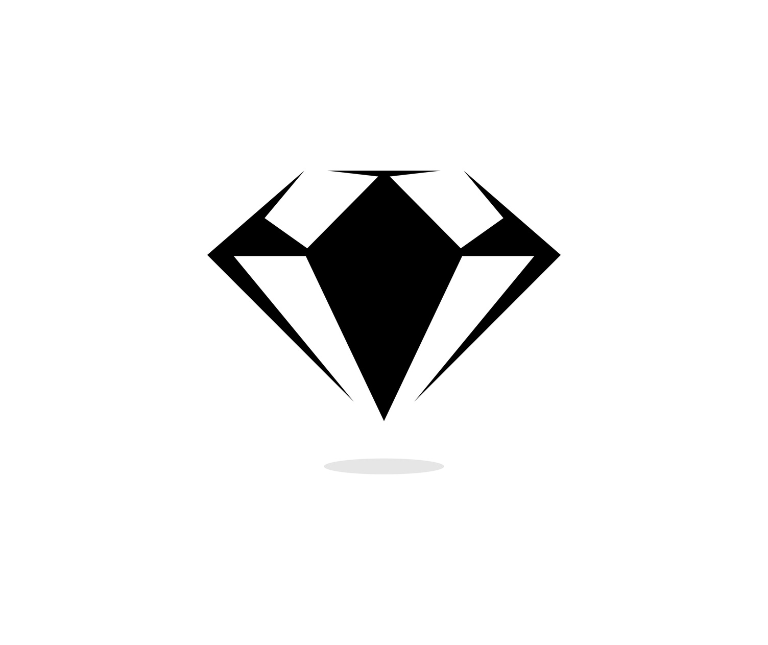
Illustrative logos focus on conveying meaning through the use of illustrations. For example, a jewelry logo of this type might include an illustration of a diamond.
However, your graphic designer should be wary of using illustrations that don’t convey the same class as your products.
Abstract Graphic Logos
Abstract logos are similar to illustrative logos. But the abstract elements leave more to the imagination and have the potential to convey more meaning.
Great care should be taken when designing a logo of this type. Abstract symbols are effective, but they can also lead to confusion if not crafted correctly.
Keep It Simple
As with any good logo, less is often more. Don’t clutter the logo by incorporating all of the elements listed above. Your logo should be clean and elegant, much like your jewelry. And if you’re interested, click for more examples of what a simple jewelry logo looks like.
Pick Your Color Scheme
Selecting the right color scheme is also critical to the success of your logo. Color has the power to convey different meanings.
For example, red signifies a bold energy, while black exhibits credibility and power. With the right combination, your logo can tell more of your story without risking a cluttered logo.
Making Your Logo
Designing an effective logo is a challenge. But the value of a well-designed logo cannot be understated.
To get started on your new logo design, check out this online logo maker.
5 Elegant Logo Design Tips for an Internet Provider
Posted on September 19, 2017 by Logo Design Tips and Tricks
Internet providers are usually thought of as utilitarian companies because of the service they offer. But that doesn’t mean they can’t benefit from an elegant logo design.
A company’s logo is the first thing people notice about it, and it could even be the deciding factor when someone is choosing where to do business. Because of this, company’s take their logos very seriously and it’s important as a designer to understand what makes a logo successful.
Below, we’ve outlined five tips that can help you create an elegant logo design for an Internet provider.
1. Elegant Logo Design Comes from Understanding the Brand
The best logos are those that use visual elements to tell the customer a story about the brand. They hint at the company’s attitude and culture, in addition to communicating the services provided.
To be able to design a logo that does all that, you need to know the company from the inside out. Talk to stakeholders and employees to get a sense of what the company is like. If you understand what about the brand a logo should represent, you’ll be well on your way to the perfect design.
2. Keep It Simple but Interesting
Truly elegant logo design incorporates a balance of elements. This goes beyond just contrasting visual and text elements. You also want to create a logo that does enough to grab a customer’s attention without doing too much that will confuse them.
A customer should want to look at the company’s logo — it should catch the eye with a surprising element. But no one should have to work hard to understand a logo or spend time trying to figure it out. A balance of simple elements working together in a new way keeps a logo interesting without making it complicated.
3. Use Color to Create Emotional Connection
There are certain colors that are very closely associated with emotional reactions and responses. This is important to keep in mind when designing a logo for an Internet provider.
People rely on high-speed Internet to get them through their daily routines. When designing a logo for an Internet provider, you would want your work to inspire confidence that the company will be able to give its customers what they want.
Color is a design element that can help with that. Strong, bold colors would be a better choice than softer pastels, for example.
To understand more about high-speed Internet and why it’s so important for these companies to have the confidence of their customers, click here.
4. Look for Inspiration Everywhere
Inspiration for logo design can come from even the most unexpected places.
A great slogan could come from a customer’s online review. An interesting visual element could be inspired by a building you pass every day on your way to work.
Being open to unconventional sources of inspiration could take your creativity to a new level and help you design a logo unlike anything anyone else has done for the industry. That’s a great way for the company you’re working with to set itself apart from its competition.
5. Trust the Process
Creating elegant logo design takes time, and a truly successful logo cannot be thrown together in a rush. The design process is just that.
Start by brainstorming different ideas and don’t be afraid to pursue several of them. Trial and error can work to your benefit.
What you don’t want is to be so committed to one idea that you try to force it to work even after it becomes obvious that it’s not the best design. Try to keep personal feelings and attachments separate from the work, and you’ll end up serving your client in the best way possible.
Ready to Start Designing?
Online design tools can guide you through the creative process from start to finish. They can help you visualize your ideas and give you a sense of what’s working and what needs to be rethought or tweaked.
For more information, check out our Frequently Asked Questions so you can start designing today.
Creative Education Logo Design Tips and Inspiration
Posted on September 18, 2017 by Logo Design Tips and Tricks

The global education market is massive, exceeding $4.4 trillion in 2012.
It’s set to continue to trend upwards, partially spurred by the growth of mobile learning.
However, as more and more education brands pop up, it becomes increasingly difficult to stand out from the crowd. But a stunning education logo design is the surest way to make the right first impression.
Read on to find out how you can put together an education logo that attracts attention to your brand!
Elements of Education Logo Design
Overall, there are three primary elements of every logo.
Graphics
Most of the time, the graphics, whether an icon or pattern, is what people will notice first.
Your best bet is to find a way to creatively incorporate the end goal of your client in your educational logo design. For example, Moji University’s logo features an academic cap fused with the letter “O” in the name. It doesn’t look forced or out of place, and it blends seamlessly with the font.
Color
Since each color evokes specific moods, they can have a powerful effect on how people view your brand.
When it comes to education logos, certain colors are better suited than others. Blue is a great pick because it’s associated with creativity, productivity, and professionalism.
You can also use two or three different colors to evoke several moods at once. However, make sure the colors compliment each other. Canvas Network accomplishes this well.
Font
The font is just as important to a logo as the graphics. But it has to fit the theme of your design.
The type of font you should choose depends on the type of services you provide. For example, Washington Leadership Academy’s logo font looks very serious and sophisticated. In comparison, A Kid’s World Preschool uses a very playful font for their logo.
Try many different fonts before finalizing your logo to see how they mesh with your graphic.
Making Your Design Adaptable
From Nike to Chanel, great logos have one characteristic in common: adaptability. Logos must adapt to fit anything from small website banners to large billboards. Visitors will hesitate to click for more on your site if your logo looks blurry when shrunk.
The easiest way to improve the adaptability of your logo is to simplify its design. Once you have the full version of your logo, try removing any unnecessary letters or details. Feel free to use initials if you have to.
Another excellent way to make your logo more adaptable is to rearrange its elements. For example, you can move the icon from the top of a logo to the left or right side of the font.
What to Avoid
There are certain mistakes you should avoid when designing a logo.
First, it’s a good idea to look at logos within your industry to see what works. However, avoid copying someone else’s logo. The last thing you want is a generic education logo.
Next, make sure you’re designing a logo for your target audience, not yourself. Just because a logo looks good to you doesn’t always mean potential customers will flock to it.
Finally, remember to keep it simple. Try not to use more than two fonts or three colors in one logo. This not only helps with adaptability but also makes your logo easier to remember.
Final Thoughts
Overall, your education logo design should be simple and adaptable. It should also appeal to your target audience and evoke the right moods.
If you have a few ideas you want to play with, head over to our free online logo maker and start building your own logo!