5 Smart Logo Design Tips for Camping Supplies Companies
Posted on October 08, 2017 by Logo Design Tips and Tricks
In designing a logo for a camping supply company, it is important to use SMART logo design tips to make the process easier.
What does the acronym “SMART” stand for?
Simple, Memorable, Appropriate, Resizable, and Timeless.
These rules are the perfect guidelines for how to create a quality logo for a camping or outdoor supply company. Keeping things “SMART” provides a way to double check a logo once it is finished.
Read on to learn tips based on this easy logo lingo.
1. Keep it Simple
Simplicity is key in developing a logo and increasing brand recognition.
Simpler logos are easier for consumers to recognize. It’s difficult to convey any clear message through a complicated logo.
Think of some of the most familiar logos that we are see daily: Apple, Starbucks, and McDonald’s. One of the key components of these logos is that they are all straightforward and clean.
Adopt a “less is more” mentality in designing a logo.
2. Make it Resizable
There is no telling where your logo will end up. Promotional materials could range from small pens and t-shirts to stickers and large posters.
This means that it’s important to design a logo in vector format. This ensures that it can be resized to fit anything perfectly, without loss of picture quality.
3. Ensure it’s Memorable
Human attention spans today are comparable to that of goldfish.
Most of that information we process will never be remembered. When it comes to smart logo design, simplicity helps with a person’s memory. Other factors could include color, icons, or font.
Think about the design, and consider the different shapes and colors that will be used.
Frame it for the audience of outdoor-friendly people. Don’t overestimate the attention span or memory of individuals.
4. Consider if it’s Appropriate
Your target demographic should be on the forefront of your mind during the design process.
A simple swap of logos from different brands can convey an entirely new message to the consumers.
You don’t want the logo to be too fancy for the audience that loves the sun and the dirt of the outdoors. You want the brand’s message to come through.
Think about what they like, and try to encapsulate their interests into the style of your logo.
5. Keep it Timeless
The last thing you want is to create a smart logo design that doesn’t stand the test of time.
Memorable logos change little as decades pass. Don’t design something that is “trendy.” Instead, make something that is going to stay relevant and on-brand for many years to come.
Keep it unique to your brand, and never worry too much about what others are designing.
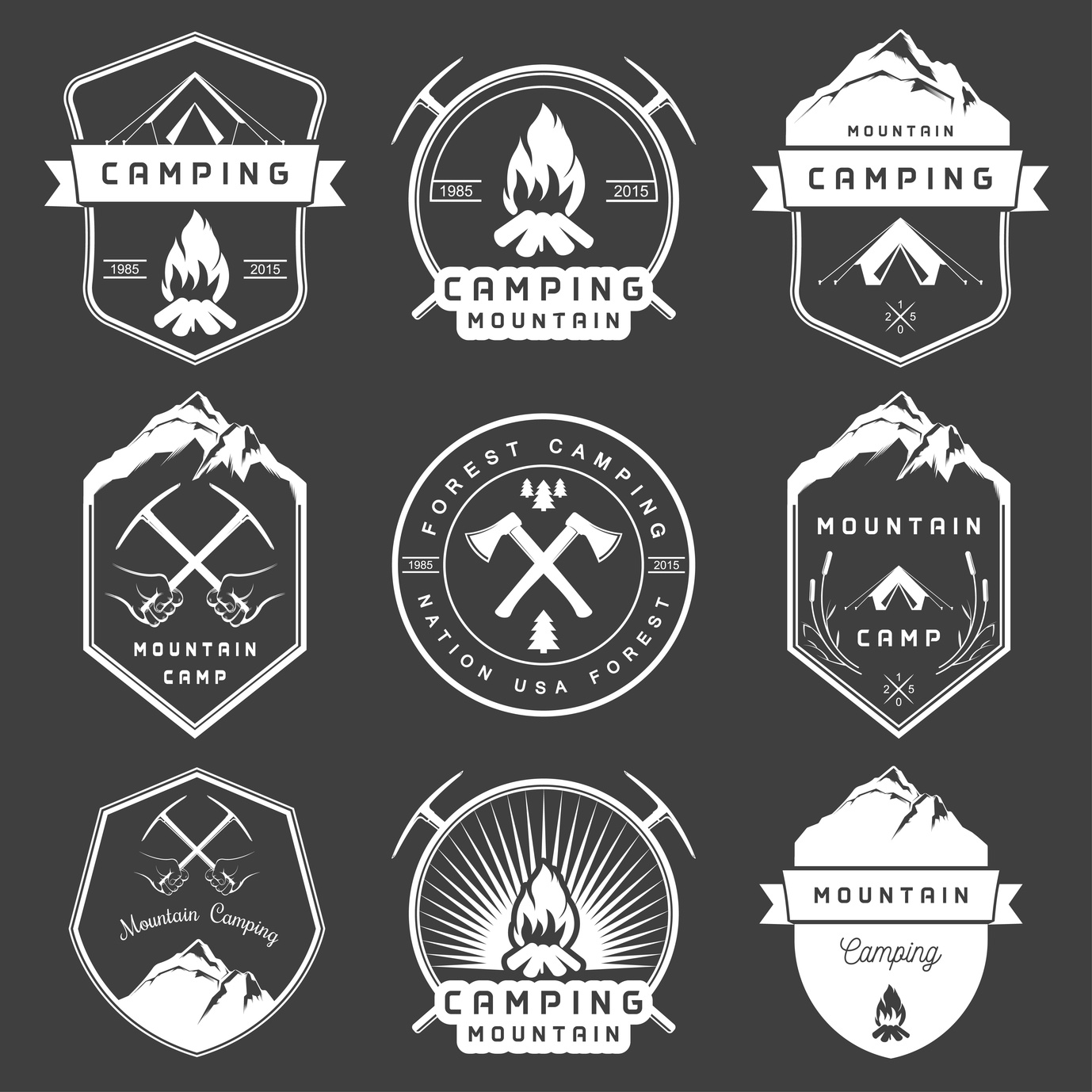
Smart Logo Design for Camping Supply Companies
One example of a camping supply company with an excellent logo is everstryke pro.
It is simple, timeless, appropriate, resizable, and memorable. It also promotes the brand of everstryke firestarter well.
All and all, the is no one system of designing a logo, and that is the beauty of creativity.
The best thing to do in the design process is to consider all the points you would like to accomplish with the design through this basic SMART outline.
Ready To Get Started?
If you need help creating your camping logo, feel free to check out our free logo maker. Or, you can choose from one of our hundreds of templates.
What’s your favorite method to creating the best logos? Let us know in the comments below.
What Makes a Highly Successful Casino Logo?
Posted on October 08, 2017 by Logo Design Tips and Tricks
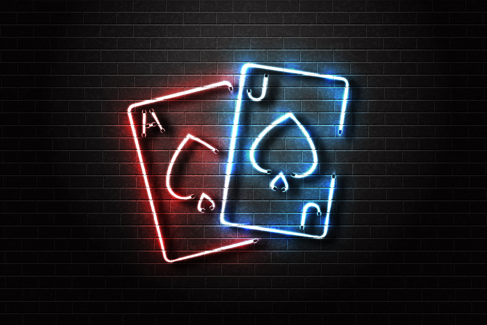
Few aspects of your business are as important as your marketing logo. It’s how your casino is represented to the world. And since you’re facing some pretty remarkable competition, you’ll need to make sure you’re getting the most out of your logo.
Whether you’re starting a brand new casino business or just looking for a redesign, you don’t have to be an artist to create a great-looking logo.
Here are some of the most important elements to help you create a successful casino logo.
Elegance And Simplicity
Some logos are just too busy for their own good. Be it too many colors or too many images, your customer can get distracted quite easily if you’re not careful.
That’s why it’s important to make efficiency and simplicity your biggest target goals. After all, some of the most effective logos in history are simple. Apple’s famous logo doesn’t even feature any text!
Sensory overload is a very real phenomenon. So when you’re beginning to design your casino logo, ask yourself, “Could this be simplified?”
It Sets Your Business Apart
There’s no shortage of competition within the casino industry. Accordingly, you’re going to need to set yourself apart from the competition.
And while this may sound difficult if not hopeless, there are a few easy things you can do to diversify.
First, look at your competition’s logo. Take some time to digest their logo, including geometric shapes, colors, text, and images. While there will undoubtedly be a bit of overlap, try your best not to replicate their design.
You can also incorporate local elements into your design to give your casino logo a more region-specific design. MPL Casino does a great job of this. Notice the small leaf on their design, as well as the Canada-specific color scheme.
A Great Casino Logo Incorporates Color Psychology
Psychology has actually been a huge part of casino design for decades now, and you can use it within your logo. People have unique reactions to certain colors and associate them with certain feelings or memories.
For an example, think about reds, oranges, and yellows. You likely think of fall when the three colors are combined.
You’ll want to incorporate this same general principle into your logo design. What kind of mood are you trying to set with your logo? Simple and subdued (cool colors) or exciting and energetic (warm colors)?
Research color psychology and determine how you can use color to set the right mood with your logo.
Your Brand Should Steal The Show
It’d be great if every business was as successful as Apple, you’ll want to ensure that your brand is front and center. While it doesn’t need to be the largest graphic on the logo, it should be sizable enough that it can be read at a distance.
And each of the previous elements should be incorporated into your text. Remember, simplicity and elegance are key and you can use colors to set a mood.
Your Logo Design Matters
You can’t afford to have a poorly designed casino logo, so take efforts into your own hands. Use our software to create an exciting and effective new logo that your audience is sure to love.
You can have a brand new logo in just 5 minutes! Sign up today and see just how much of a difference your gorgeous new logo can make.
What Etsy Can Teach You About Wedding Logo Design
Posted on October 05, 2017 by Logo Design Tips and Tricks
Every spring, fresh editions of magazines flood the shelves. They feature gorgeous new ideas for wedding inspiration for brides-to-be.
As you pour through those glossy pages you will find articles on everything. It can range from the proper way to set a table, to ideas for wedding logo design.
Having a well-themed wedding is the central focus for these magazines and the goal of every new bride.
But what does it take to create one of the stunning images you see gracing dancefloors and envelopes? How can you create a professional looking logo for your own wedding? Continue reading to find out.
Using a Wedding Logo Design
From the moment your guests walk into your wedding venue you will need to give them information about things like where to go and what the seating arrangements are.
Creating a custom sign to place outside the venue is a great way to give your guests information they need about the event.
Some venues host multiple weddings on the same day and giving your guests this extra hint will make sure everyone finds everything they need. By including your logo you are ensuring that they know they are going to the right place.
Wedding Attire
You might be surprised to find that there are multiple opportunities for you to feature your wedding logo design in your outfit.
In fact, some innovative brides have even begun to create personalized jewelry featuring their logo.
Other brides have chosen to embroider their veils and handkerchiefs. If that is still a little too obvious for you then embroidering your wedding logo design in blue on the inside of your dress is a beautiful option. For many women this makes their dress feel truly unique.
Dining
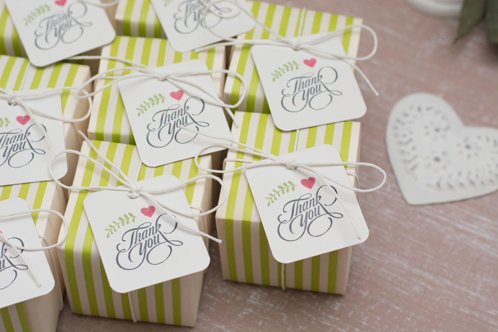
The most obvious place to use your image is on the paper products you use for the day of the event. From cocktail napkins to menus, there will be plenty of opportunities for you to feature your beautiful design.
Accent plates could also be purchased that feature your chosen design. You can use it to trademark your party favors, adorn your wedding cake with it, or simply use it to embroider the tablecloths.
Some women have even used it on glass jars from sandsationalsparkle.com. Sand ceremonies are popular and work for any wedding. This personal touch really takes it to the next level.
The Importance of Consistency
After you have chosen to design a logo for your wedding, you will want to head over to Etsy to get some inspiration. Once you have scanned many of the options there, you will have a better idea of what you want yours to look like.
You will see design ideas for different fonts and sizes that can shape the most basic outline of what you want to make. The angle of every item in your logo is very important. By changing it you will change the way the eye moves over it and this has a significant impact on perception.
If you are ready to begin creating today, try this online logo maker. It has some really great and easy-to-use features that will allow you to create a custom design that will leave all your guests dazzled.
4 Essential Tips for Designing a Brilliant Information Technology Logo
Posted on October 03, 2017 by Logo Design Tips and Tricks

Impressive logos are an integration of visual art elements, color theory, and psychology concepts that represent a company in a quickly identifiable way. An information technology logo is the instantly recognizable face of a business, as some of the most successful IT companies have proven.
Exceptional logo design is more important now than ever before. We see and even interact with logos in entirely new ways thanks to the digital age. An effective, classic design that sets an IT company apart in an expanding industry is a must-have.
What does it take to design a brilliant, unforgettable information technology logo?
Read on to learn 4 essential tips for great information technology logo design.
Stay Simple
When it comes to an effective information technology logo, simplicity is the secret. Information technology is complicated and this is why potential customers are seeking your services. They’re not looking for a code to crack.
Keeping your logo clean and direct is key. Some of the most well-known IT companies have the simplest logos.
Good design conveys the business or company’s mission in a powerful, straightforward way. Don’t dilute your message with a busy or complex logo.
Often, you don’t even need the logo to include a brand’s name or description. Some of the most well-known logos have no name or words but can be quickly identified.
The Color and the Shape
Colors should be limited but appropriate. Keep in mind you’ll be dealing with a lot of other businesses, so your color choice and design need to convey professionalism. A great example is a logo for NENS, a company that provides IT services to many industries.
Logo shape has a significant effect on the overall feel of a logo, also. Round shapes tend to evoke a sense of love or community, while straight lines and straight-edged shapes suggest strength and stability. The best logos find a way to use both elements for connection and confidence.
Getting the Message Across
Great logo designs tell who you are and what you do. The information technology industry has many facets. It’s a good idea to incorporate some part of your particular business into your logo if possible.
An obvious representation isn’t the rule, however. More subtle designs masterfully show customers what company they represent and then creatively suggest the company’s purpose.
Your Information Technology Logo Should Be Unique
IT logos should leave an impression. In a computer-driven world, there are many companies offering IT services. Don’t get lost in a sea of logos.
While it’s a great idea to draw inspiration from popular logos, don’t be tempted to model your design too closely to theirs. This can make your design seem unoriginal, which suggests that your company may be the same.
Similar logos are also easily confused with other companies. You want your logo to make people think of your business, not anyone else’s.
Consider these things when deciding on a one-of-a-kind logo:
- What does your company value and represent?
- What kinds of services do you offer?
- Who are your target customers?
- Can you describe your company in 1-3 words?
- What makes your company different or special?
Asking yourself these questions is a good starting point when thinking up a unique but fitting logo.
Build Your Brand on a Strong Logo
Your logo is a crucial piece of your brand’s identity. It has to be a high-quality design that is memorable. When customers see the logo, they see you.
Let us help you design an incredible logo for your brand. It’s fast and easy. Visit our website to get started today.