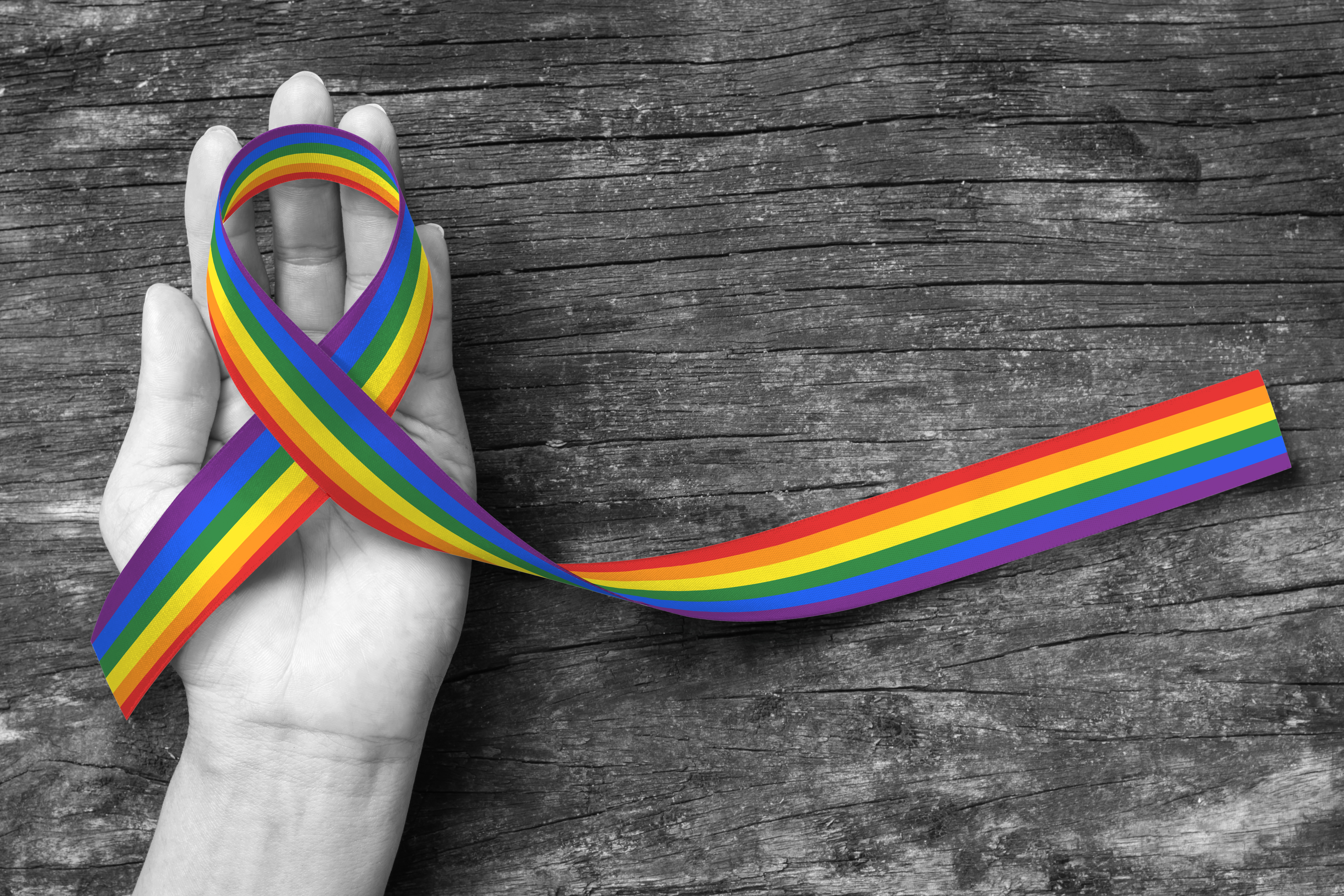
5 LGBT Logo Design Tips to Appeal to Queer Consumers
Posted on November 24, 2017 by Logo Design Tips and Tricks
Did you know the first documented gay rights organization was formed in 1924?
Fast forward nearly a hundred years: An openly transgender candidate was elected to the Virginia House of Delegates in November 2017.
This makes her the first openly transgender candidate to ever be elected into a state legislature in American history.
LGBT rights have come a long way. It’s important to be aware of LGBT issues in order to reach this audience.
Let’s take a look at five LGBT logo design tips to appeal to your queer customers.
1. Understand Your Demographic
It can be helpful to familiarize yourself with common obstacles and achievements surrounding the LGBT community. This knowledge can help you in designing an effective LGBT logo.
Before you try to communicate to the LGBT community through your logo, attempt to connect with them on a human level. Step into their shoes. Make an effort to see things through their eyes.
Then, prepare to create the best LGBT logo around.
2. Be Diverse and Inclusive
Be mindful of symbols or representations that have a history of being divisive or exclusive.
For instance, even though the swastika was originally the symbol of good luck and good health, you wouldn’t want to use it in your LGBT logo. Unfortunately, this peace symbol has become a high-trigger image for most people around the globe.
Be sure you know the history of any logo design you use for your brand.
3. Do Thorough Market Research
Research LGBT perspectives on different topics and causes. Also, find out who is buying your products.
This is especially important if you have a product that is highly specialized, such as the Whizzinator prosthetic. It’s important to do your research to determine who’s buying, who’s interested, and who’s still on the fence.
Then you’ll want to market more strongly to the group that is shown to be buying the most.
When you do your research, less falls through the cracks.
4. Familiarize Yourself With LGBT Symbols
There’s no denying that symbols have power. They can invoke strong emotion and even direct action.
Throughout history, there have been symbols that engender warm, secure feelings such as the peace sign or a cross for some. Others, such as the Confederate flag, can bring up anger, fear, and resentment.
It’s important to become familiar with which symbols communicate certain messages. Rainbows, triangles and the Greek lambda have come to be powerful symbols for the LGBT community.
5. Avoid Stereotypes and Misconceptions
You can best avoid stereotypes by arming yourself with knowledge about the LGBT community as outlined above. Keep away from anything that directly sets them apart from the rest of society.
It can be a fine line. Aim for a balance between acknowledging and honoring the struggles and accomplishments of the LGBT community and also treating them as you would any other consumer.
Create Your Own LGBT Logo Designs
You want an amazing logo design for your brand. You want your design to reach as many people as possible.
That’s where we come in. Our online logo maker helps you create the look you want to gain the business you need.
Are there any other design tips you would add to our list? Comment below!
How to Design a Massage Logo That Shows Off Your Brand
Posted on November 24, 2017 by Logo Design Tips and Tricks

Did you know half of Americans who received massages between 2015 and 2016 did so for health issues? And nearly 90% believe that massage is beneficial in decreasing pain.
While, in the same survey, about 30% received a massage for relaxation purposes alone.
This means your massage logo should communicate how your services can meet these needs and more.
Let’s take a look at how you can design a logo that shows off your brand.
1. Know Your Core Values, Purpose and Mission
Your values, purpose, and mission are the foundation for your brand. What is important to you as a business owner? How would you like your company portrayed to your target demographic?
Values
Your values are the bases of your entire practice. These could be things like integrity, authenticity, honesty, hard work and rapid response time with phone messages.
Stimulating Questions
Ask yourself the following questions:
- What standards do I hold myself and my employees to?
- What do I value when it comes to customer service?
- What values am I looking for in the employees I hire?
These are just a few of the questions that you’ll want to answer before you create your logo. They will pave the way for an accurate representation of your brand to potential customers.
Purpose
Your purpose is your reason for doing what you do. This could be something such as, “I choose to go into massage because I find fulfillment in alleviating stress, tension, and unease from my clients. I wish to be of service to those who suffer from tension, chronic pain and circulation problems.”
Stimulating Questions
Why did you go into massage in the first place? What is your personal purpose in life? How does that coincide with your professional purpose?
These questions will get the ball rolling as you consider what your professional purpose in the industry is.
Mission
Your mission is what you seek to accomplish based on your values and purpose. Your mission may be something similar to, “My mission is to provide safety and comfort to my clients, ensure they leave my parlor better than they were when they arrived and to deliver quality services for every customer.”
Stimulating Questions
How do you want your customers to remember their experience with you and your staff? What do you hope to accomplish through your contribution to the profession?
Clearly define your massage parlor’s values, purpose, and mission. This will be the foundation upon which you create your massage logo.
2. Handle The Process With Care
Remember, your massage logo will be seen all over town and on the Internet. From your website and business cards to advertisements and social media, your logo will encompass your entire business.
For this reason, it’s important that the image you portray through your logo is the one you desire. During the logo creation process, ask yourself these questions:
- Does this massage logo communicate my company’s values and practices?
- Does this logo convey my business’ purpose and mission?
- Does it let my customers know what to expect from my services?
- Does it communicate who I am as a business owner?
Take your time when designing your logo and handle the process with care and attention to detail.
3. Make it Memorable
Your massage logo should leave an impression. It needs to make your customers think of you every time they see it. The more they think of you, the more likely they are to call to book an appointment.
Get creative. But not too creative. You want to communicate a simple, direct message that’s easy for your customer to remember and process.
4. Communicate Your Message Clearly
We both know there are plenty of reasons why every person should book a massage. But the average person may not be aware of them.
That’s why you need a massage logo that communicates the relaxation and tension release that your massage offers. As well as any other stress-relieving services your business provides for its customers.
5. Ensure Your Text is Centered Properly
Whether you use a logo maker or another option, be sure your text is where it’s supposed to be.
If your logo is leaning right, your text should be aligned to the right. It can be tempting to get a little too creative with mismatching the logo and the text. But try to keep it simple.
6. Get Colorful
Even though your massage parlor may not be a high-stakes business, you still want to attract as many clients as possible through your massage logo.
The Psychology of Colors
Familiarize yourself with the psychology of colors. Each color can have a profound impact on the viewer. And everyone can elicit a certain response from your potential customers.
Know what psychological aspect is associated with the various colors. And use each wisely to communicate your intended message for your business.
7. Consider Your Font Size and Spacing
Massage logos let your potential customers know where to find you on the web. Your business name should be clearly written and easily legible at a distance.
This is also reason to have your company name be short and simple. A good rule of thumb is 2 words as the maximum in the name of your massage parlor.
A simple name such as WINKS helps potential customers to retain the name in their memory when they see it.
If your business name is already 3 to 4 words, consider using a shortened version of your logo. This will help viewers remember your brand.
Spacing Between Letters
You may be tempted to get creative and use bulky block letters or wide variations. Resist this temptation.
It’s important for there to be enough space between the letters for legibility purposes.
Designing a Massage Logo that Shows Off Your Brand
You want potential customers to book a massage now. And to accomplish this, you’ll want to create a killer logo.
These are our reasons why designing a massage logo can show off your brand. What would you add to our list? Comment below!
5 Qualities of Effective Real Estate Logos
Posted on November 24, 2017 by Logo Design Tips and Tricks

Real estate logos are extremely important marketing and advertising tools. But how do you design a logo that you know will effectively expand your reach and increase your profits?
Here are some qualities of the best real estate logos that you should consider:
Communicates Your Brand
In order for your logo to be effective, it has to successfully communicate everything you and your real estate business stand for.
What are your goals? If you want to become a national realtor, consider designing a universal logo. If you want to focus on your local community, try designing an understated logo that people will trust easily.
A logo is a great way to unify and focus your brand strategy. But you have to take every step to make sure it accurately represents your real estate business.
Not Easy to Replicate
All successful logos have a unique way of standing out. To make a logo that stands alone and cannot be easily copied, consider designing your own font or graphic.
The more unique your logo design is, the easier it will be for your target demographic to associate the design with your company. This builds long-term recognition.
Memorable
Along those lines, you have to make sure that your logo stays in the minds of your potential customers. Brand recognition is crucial to fostering a consumer base over time.
The best real estate logos are memorable for the right reasons. They make the audience feel like they can expect quality services and reliable expertise.
Appeals to Your Audience
Your logo also has to have an intangible attractive quality. Think about what kind of company you want to be. Are you trying to appeal to young families buying their first home?
Or maybe you are looking to help retirees downsize to smaller houses in quieter neighborhoods. Either way, your logo is the best way to attract customers toward patronizing your business.
The logo for this Cash Home Buyer works perfectly because it is made with their audience in mind. Try to figure out the way your audience thinks. As a home buyer in Texas, this company knows exactly what appeals to their target demographic.
Does Not Offend
While you should be open to taking chances with your logo design, you should make sure that it doesn’t offend any potential customers.
Take great care when you are designing images for your logo. Ask others in your industry or conduct focus groups to gauge reactions to your logo before you release it to the public.
This way, you’ll be able to avoid any potential public relations gaffes.
Designing Real Estate Logos is Simple
It doesn’t have to be difficult to create a logo for your real estate business. As long as you keep these tips in mind, you’ll be able to devise a successful marketing strategy around your logo in no time at all.
To develop your own logo, visit our tutorial page. It’s simple to use, fast, and best of all, free.
Why Marketers Need a Professional Brand Logo Design
Posted on November 24, 2017 by Logo Design Tips and Tricks

In 2000, the UK-based oil company BP unveiled a logo redesign that cost them 136 million pounds.
Although that number may seem incredibly high for just a logo, the truth is that brand logo design is one of the most important things for your company.
The best logo may not be the one that you like most at first glance, or the most obvious choice for your company. Using a professional design helps you get the perfect logo that will boost your brand’s success, not just one that looks nice.
Just what makes professional brand logo design so worthwhile? Read on to learn more about why you need to get one professionally designed today.
1. Affects Your Reputation
It might seem like logo and reputation should be two separate things. However, any professional logo designer knows that logos are closely connected to a brand’s reputation.
If you’re just starting out, the right logo can give customers the right idea about your business. For example, logos in shades of blue tend to be seen as belonging to reliable businesses. Bold colors, like orange, can make your brand seem exciting instead.
Reliable is a word you might want customers to associate with a financial institution. However, if you’re starting a dating website for college students, you might want to evoke excitement instead.
Once your business is going strong, a logo redesign can be a great way to manage reputation issues. If you experience a PR disaster (though we hope you never will!) a logo update can help with revamping your image.
2. Helps Make the Sale
A recognizable logo is a great way to re-grab the attention of customers who left your site without making a purchase.
Sometimes, people will visit your site and browse around, but leave too soon. However, these customers can be gained again using a technique called retargeting. A good logo helps.
Retargeting is when an online ad is shown to that customer who was on your site before. A Javascript code on your site allows your site’s viewers to be “tracked” on the web, so an ad can be shown to them after they leave.
If you have a great, instantly recognizable logo, they will immediately know where that ad is from and be that much more likely to click on it.
3. Shows How You’re Different
In any industry, there will be competition. A logo is a good way to show how you’re set apart from that competition at first glance.
Professionals know how to make a logo that stands out from the rest. If everyone in your industry is using abstract logo design, maybe some lettering is a good idea for yours. Or if everyone has nature-themed imagery in their logo, you can be different with a geometric style.
Of course, it’s important that your logo makes sense for your business. But that doesn’t mean it needs to use the same elements as every other logo in your industry.
Ready for a New Brand Logo Design?
With the right logo, you’ll see the results in the growth of your business right away. Sometimes it just takes a little professional help.
If you have logo ideas that you want to try out before you contact a professional, an online logo maker is a great way to test your designs. Try our free online logo maker today and put these brand logo design ideas into practice!


