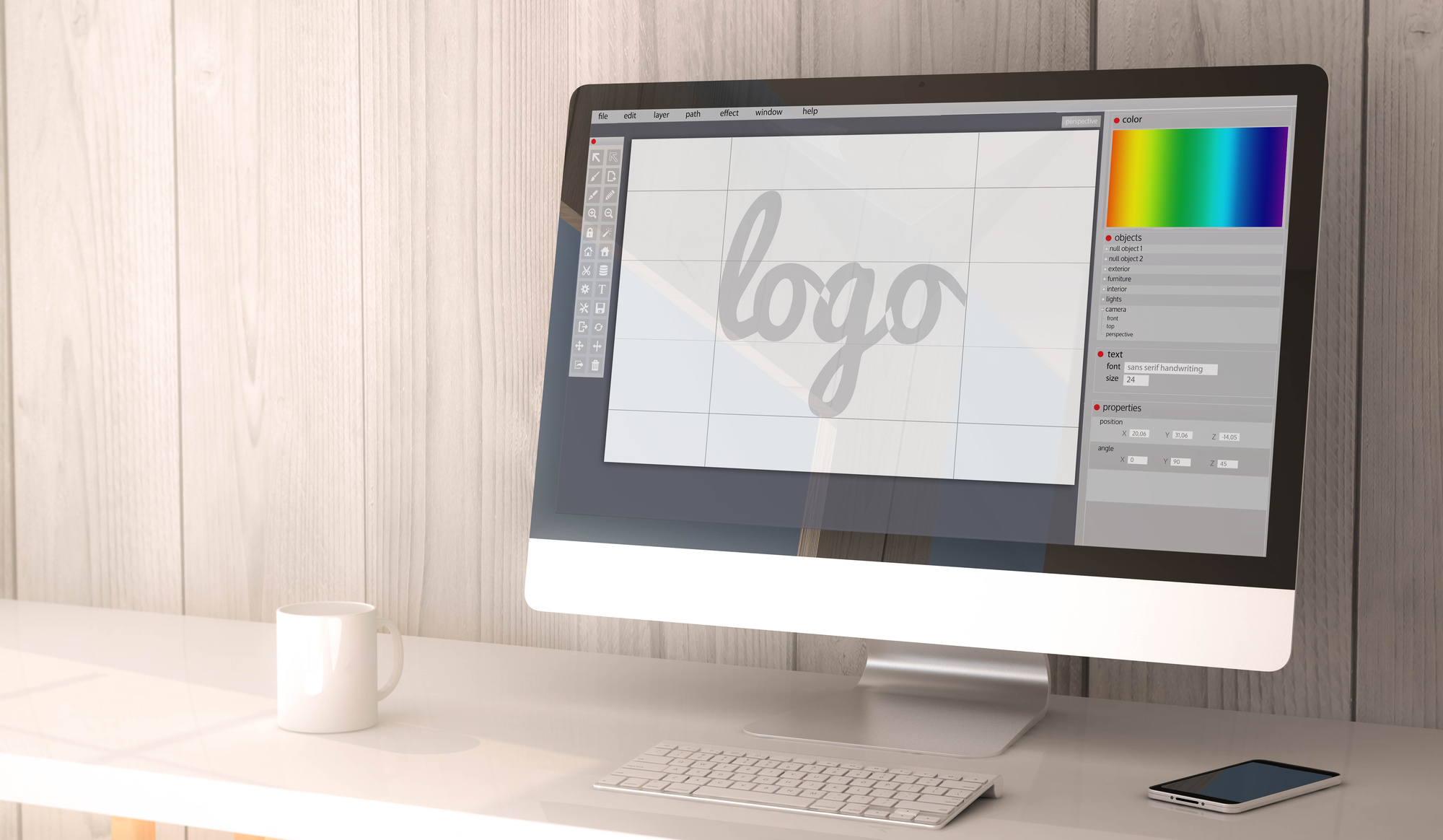
How To Create The Perfect Toy Company Logo
Posted on December 13, 2017 by Logo Design Tips and Tricks

Children are all about visuals. When something pops out at them that they like, it doesn’t matter what it is. They want it!
If you’re marketing to kids, it’s not enough for the toy to look cool. All the branding has to be eye-catching.
Does your toy company have a boring logo? It won’t matter how great your product is if your logo isn’t great, too.
Every toy company needs a great logo to grab children’s attention and bring in sales. Read on to learn how to create the perfect toy company logo.
Think About Your Target Audience
Sure, you know that your target consumers are children. But, to have a really great toy company logo, you should know even more about your target audience.
This will affect other decisions you’ll make for your logo as you work on the design.
What’s the exact age group and gender you’re aiming to sell to? What will appeal to a 4-year-old might not have the same effect on a 7-year-old.
After you know the “who,” you’ll have to figure out the “how.”
How Will Your Logo Be Used?
The way your logo will be used should directly influence your design.
Will you be using your toy company logo on tiny letterhead? Maybe blown up and used on a trade show booth?
If you’re using it across a lot of platforms you have to design accordingly. The logo will have to look just as attractive at all sizes.
A certain font you want to use might only be legible at a large size. Something that looked great on a small logo could look blurry when expanded.
Using a free logo maker can be beneficial if you plan to use your logo for different things. The logo you made doesn’t look perfect blown up to a bigger size? Design another, similar logo that works for the larger size.
When designing a logo on your own, you have more freedom to play around.
Use Other Logos Only for Inspiration
When dreaming up the design for your toy company logo, look to other logos for inspiration.
Look at logos of competing brands. Take note of what you like. Ask yourself what worked for that logo.
Notice the things you would change. You can even get inspiration from logos you don’t like at all. What made that logo so unsuccessful to you?
Consider all of this new information when you’re designing. But, make sure it stops there. The last thing you want to do is make your logo too similar to someone else’s.
Logos are a huge part of brand recognition. When people look at your logo, they should only be thinking about your company.
People will be wondering what that logo reminds them of. The worst case scenario is they confuse your company with another.
The design should be unique and so should the color scheme.
Choose the Right Colors
Choosing the right colors for your logo is one of the most important aspects of design.
Color is a big part of brand recognition. Research shows that consumers make a judgment on a product with 90 seconds of viewing it. Over 60% of that judgment is impacted by the color of the product.
The right color in your logo can make or break how people judge your brand. That’s why you should take some time considering the best color scheme to use.
Go back to thinking about your target audience.
Maybe your primary consumers are 8 to 11-year-old girls. Your first thought might be to make your logo princess pink. Perhaps that’s the right choice for your brand.
But, consider if your product is something boys would enjoy as well. A pink logo will be immediately alienating to them.
Perhaps a more neutral shade would be a better choice.
Click for more inspiration for a toy company logo. It’s a great example of color usage and simple, streamlined design.
Keep it Simple and Streamlined
Think about some of the best logos you’ve seen from the biggest brands in the world: Apple, FedEx, Facebook. One thing they all have in common is that their designs are simple and sleek.
If your logo has too much going on, it will immediately look amateurish. Less is more.
But, that’s great news for you!
You don’t have to be an artist to design a logo. There’s no need to add a bunch of bells and whistles. A simple picture or the name of your company in a nice font will make the biggest impact.
Active vs. Passive Logos
How can a logo be active or passive? They’re two-dimensional, after all.
What makes a logo active or passive is the story that it tells.
Think again about the Apple logo. When it was first designed, it was just an apple. Later on, they revised the logo to have a bite taken out of it.
That’s active. Someone is eating the apple.
The Twitter logo is another example. The original logo design was the bird sitting idle. The revised logo shows the bird in flight.
The Twitter bird is flying off to send your tweet out to the world.
When thinking about your logo, ask yourself, “what’s the story I want to tell about my brand?” How can you make that story more active?
You’re Ready to Design Your Toy Company Logo
With these tips, you’ll be well on your way to designing a great logo for your toy company. Take some time to sketch and brainstorm. The more effort you put into dreaming up a great design the happier you’ll be with the final product.
Are you not sure you’ll be able to figure out how to design a logo on your own? It’s easier than you think.
Before you get started, check out this logo maker tutorial. By the time you’re finished reading you’ll know exactly what you’re doing.
5 Smart Logo Design Tips for a Clinic
Posted on December 11, 2017 by Logo Design Tips and Tricks

Does your clinic have a powerful smart logo design to maximize brand promotion?
A logo can help your clinic stand out in the crowd and appeal to a wider, more diverse audience.
It can aid consumers to remember your clinic, and attach the picture to a physical place and name. Logos can also establish your brand’s values and make you more likable to potential clients.
It serves as the first impression of the clinic and as a reflection of the clinic as a whole.
Therefore, in designing a smart logo, there are many factors to consider in order to best promote your individual brand.
Read on to learn five key tips in forming a smart logo design for your clinic.
1. Keep it Clean
In 2017, there has been a growing trend towards a clean and simple logo design. This is expected to continue well into 2018.
A minimal, simple approach is needed to advertise with a logo in this day and age.
For example, even the 20-year-old logo of MasterCard was revamped in 2017 to be more modern, and minimalist.
2. Make it Versatile
A versatile logo is a good logo because it can be used in a multitude of channels towards many different audiences.
In addition, the last thing you want is a logo that looks good on one medium and not so great on another.
This tip also applies in terms of color. There’s just the right balance between too much color and not enough, and it’s important to consider how the logo will be used when deciding on the color scheme.
3. Design it Uniquely
This tip is almost too obvious, but try not to copy any well-known brand logos, especially if the company is also in your industry.
Living by this will avoid customer confusion, and benefit your clinic in the long run.
In addition, consumers know when a logo looks copied, and this does not usually leave the best impression.
4. Don’t Underestimate Color
While there is a balance between too much or too little color, it’s important not to underestimate color altogether.
There’s beauty in the simplicity of white, black, and empty space. But subtle, targeted color can also work wonders.
5. Don’t be Cliche
This tip goes hand and hand with the importance of being different. It can be tempting to simply follow the trends in your industry blindly while tossing aside originality.
Avoid being cliche, and give your clients a standout design that they will expect from you.
This is especially true when you provide them high-quality services such as safer STD testing. (You can read more on std testing here.)
The Best in Smart Logo Design
In the world of logo design, it can be difficult to find the right person or company for the job.
If you love the idea of designing your own logo on a user-friendly platform, look no further than online logo maker.
Our designer is perfectly customizable, and can easily be understood, even by technophobes.
Check it out today, and start making a killer smart logo design for your clinic.
How to Create an Amazing Chimney Services Logo
Posted on December 06, 2017 by Logo Design Tips and Tricks
People become extremely attached to their favorite logos.
This is why so many Uber customers voiced their displeasure when the transportation giant changed its logo. The old logo was a representation of the relationship the customers had with the brand.
You want people to develop the same level of attachment to your chimney services logo. But it’s hard to stand out in an industry where many logos look similar.
Let’s look at how you can make an amazing logo for your chimney services company!
Choose the Color Scheme
The colors you pick for you logo tell people what they can expect from your business. They affect how your target audience perceives your brand personality.
For example, Harley Davidson wouldn’t be as popular with rugged bikers if its logo was raspberry pink and Honolulu blue. But the color combo works very well for a brand like Baskin Robbins.
Thankfully, there are many colors you can use for a chimney services logo.
Blue can help you build an amazing logo. For one, it’s it the world’s favorite color. But people also associate it with reliability and professionalism.
Orange is another excellent choice for this industry. It signals sociability and affordability. Plus, it’s an energetic color that evokes feelings of happiness.
Use the color wheel to find complementary colors for your brand. However, try to avoid including more than three colors in your logo design. While Google, eBay, and NBC can pull it off, using four or more colors tends to give off more of an easy-going, fun vibe.
Select the Graphics
When beginning your design, look for inspiration from other chimney services logos. Take a few elements of successful designs, but avoid copying them outright.
In this industry, many logos feature a chimney, for obvious reasons. But simply placing a picture of a chimney next to a bland text won’t cut it. You need to put your own unique spin on the concept.
For starters, look at this example, which cleverly uses a ladder in place of the letter i. This is an excellent strategy as long as the readability of the logo doesn’t suffer.
If you’re still unsure how to approach your design, Click for More logo inspiration. Chimney Liner Pro does a great job of incorporating the ascender on the letter h into their graphic. It’s a very simple yet elegant design that delivers a clear message to the viewer.
You can choose to mix your graphic with the text, like the examples mentioned above. However, you can also place the graphic to the left or right of the text, or even above or below.
Pick a Font
Most chimney services companies use similar symbols in their logos. So what will really differentiate you from others is the written portion of your logo. You want the name of your business to stand out.
Choose a font that compliments your graphics. But no matter how good a font seems to you, make sure it’s readable.
ADAM.CG Pro is a very professional-looking font that pairs well with most graphics. It’s also easy to read from a distance.
Another great all-around font you can consider is Florencesans. It’s versatile and clean, and it suits the industry.
You can always include more than one font in the same logo. Just make sure that the two fonts aren’t similar, as this can be distracting. Try pairing serifs with sans serifs.
Finally, consider other aspects of your font as well. Switch between lowercase and uppercase to find something that looks eye-catching. Also, feel free to play around with the scaling of your font by condensing it or stretching it out.
Make it Versatile
One of the keys to an amazing logo is adaptability. For example, no matter how much you resize or change the color of the Apple logo, most people can recognize it.
An adaptable logo is simple, not chaotic. The more you have going on in your logo, the harder it will be to adapt it to different formats. You want your logo to look good whether it’s on a billboard, truck, Facebook profile, or t-shirt.
Never make a logo that’s too detailed. When you shrink your design down to use it on a business card, for example, a small bird in the distance can end up looking like a speck.
Also, don’t rely on colors to create a memorable logo either. In some cases, you might need to use a monochrome version of your design. So make sure it looks good in black and white before adding color to it.
Try Using Negative Space
If you look hard enough, you can see an arrow in the negative space between the letters E and X in the FedEx logo. You’ll also find a subtle peacock beak among the feathers in the NBC logo.
These two brands both use negative space to make their logos more distinctive. When done properly, negative space can take your amazing logo design to the next level.
To use negative space, start by placing your graphic on a white background. Think about how you can cut parts of it out to create a second shape that’s relevant to chimney services. You can also overlap new shapes or place white text over your graphic.
If you have a basic wordmark or lettermark logo, you can find shapes in the negative space of your letters. For instance, you can use the triangle found in the negative space of the letter V to add graphics.
Start Building Your Own Amazing Logo
Avoid trends as much as possible, because they come and go. Also, don’t copy the logos of other chimney services companies in your area. Your goal should be a unique, amazing logo that will be the face of your business for a decade or more.
Design the graphic before deciding the font. This way, you can scroll through the entire list of fonts and see which ones fit best with your graphic.
Are you ready to start designing? Use our free online logo maker tool to create an eye-catching logo for your chimney services business!
5 Features of a Streamlined POS Logo
Posted on December 06, 2017 by Logo Design Tips and Tricks

Since the point of sale industry is quickly turning into a nearly $100 billion field, you’ll need to offer the best branding to get your name out there.
As with any industry, this begins with finding a great logo.
If you run a point of sale business and don’t yet have a killer POS logo, you’ll need to follow the tips that will help you find that logo.
With this in mind, let’s explore the five features that guarantee a high-quality, streamlined POS logo.
What Makes A Streamlined POS Logo?
Make Your Logo Stand Out
It’s important that you do everything in your power to stand apart from your competition. Since this industry is cracking the $100 billion range, your competition will only continue growing.
Your logo needs to not only be eye-catching in terms of color and design, it should also possess plenty of personality. Doing this will make you a premier company in your field.
For instance, the Harbor Touch POS system logo is subtle, yet recognizable, which is why this company thrives.
Use A Professional Quality Logo Maker
There are a lot of services you can turn to when you need a great POS logo design. However, if you’re in need of a streamlined logo with little hassle, you can’t go wrong using a logo maker.
Having the help of an online logo maker lets you choose the right colors, dimensions, and design on your own, so you can get up and running ASAP.
Be sure that you find a reputable logo maker that gives professional-grade imaging with each file you create.
Hire A Company To Handle Your Logo Design
When you have a bit of a budget and want attention to detail, leave the logo creation process to a professional.
Hiring a professional logo design shop allows you to find the POS logo that will let your company market successfully.
However, don’t think the most expensive logo is the best. Companies like Nike and Twitter have built billion dollar empires with logos that cost them next to nothing.
Choose quality over price when finding your logo design company.
Think About What You’re Trying To Impart
The message is everything when it comes to selling your brand.
Since your POS system will serve as the foundation for a company that chooses to use it, make sure you’re conveying themes of security and trust.
There are endless ways to convey this with your logo, which is why a little creativity goes a long way. But knowing what you want to convey on the front end is half the battle.
Think About Dimensions And Symmetry
Finally, you need to make sure that you’re following some artistic principles that will bode well for your logo.
You need it to be symmetrical, yet not too plain. You’ll also want to emphasize the rights parts of the logo in order for it to stand out.
Get plenty of logo mockups before deciding on the final version.
Interested in learning more about branding and marketing? Check out more of our posts!


