8 Awesome Tips For Creating A Memorable Medical Logo Design
Posted on December 15, 2017 by Logo Design Tips and Tricks

Launching a medical business isn’t much different than launching any other kind of business. The players look a little different, perhaps, and the terminology isn’t quite the same. But at its core, business is business no matter the practice or industry.
Which means that, even if you are providing life-saving services, you still have to think about branding and logo design.
Because health care in America exists in a competition-based market, you have to look at medical logo design as an investment. Something that sets you apart from other medical professionals offering the same services.
How can you make sure your logo design is the best t can be? Let’s take a look at 8 key tips to creating the best logo design
Why Is Medical Logo Design Necessary?
Branding is vital to building a successful medical practice.
The human brain processes images thousands of times faster than it processes words. Your logo is the first thing potential patients will see when they come in contact with your business, and it will either draw them in or turn them away.
And while marketing may seem trivial when you are in an industry that works in saving literal lives, it is still vital if you want to have any patients to save.
So how can you create that perfect logo? Let’s take a look.
Do Your Research
The first thing you need to look at is your potential competition.
Take a look at local practices similar to your own. Check out their logos. What are they doing that draws you in? What turns you off?
This initial research will not only give you a look at what is successful (or not) in terms of a logo, but it will also give you the chance to develop something unique for your own practice.
The last thing you want to do is create something that is too close to what another practice is doing.
So take the time to make sure that your medical logo design isn’t too close or derivative of a competing practice. You want to be unique, to stand out in the sea of competing practices.
Keep It Simple
It’s easy to be tempted to make your logo ornate, adding in a ton of elements so that it stands out from the crowd.
And while you should be working to keep your medical logo design unique, you should also keep it simple.
A logo isn’t meant to tell a story. Logos are supposed to be a snapshot that immediately calls your business to mind.
You also want your logo to be easy to remember.
Consider this. Think of a red bullseye. Do you have a sudden urge to run to Target and buy $200 of things you don’t need? Of course, you do, because the red bullseye is unmistakable.
It’s a simple logo, easy to remember, and sticks in the head of the consumer. You want your logo to achieve the same. For it to do that, it has to be simple enough to be instantly recognizable.
Consider the Iconography
The medical business has tons of icons associated with it. The bowl of Hygeia and the Rod of Asclepius are the two most well-known examples. And while graphic design changes fast, symbols like these stay constant.
But looking further, hearts, hands, even the tools for the medical profession can be incorporated into an effective logo.
Using these well-known symbols and adding a new twist to them immediately identifies your business as “medical” before your audience has a chance to learn more. It captures the attention of potential patients and communicates who you are without any words being said.
This is more powerful than you might think.
The more quickly your logo gets your message across, the more effective it will be at drawing in clientele.
Color Psychology
Color may seem like purely an issue of aesthetics, but don’t fall into that trap.
Color is closely related to our psychology, and it affects how we perceive things around us. Choose your colors carefully based on the types of emotions you want to elicit.
Let’s take a look at the rainbow and talk about the messages each color sends.
Red – Bold, Aggressive, Heat. May stimulate appetite, but can also symbolize danger or anger
Orange – Fun, Optimism, Happy Energy
Yellow – Happy and energetic, but may also call to mind warning signs.
Green – Growth, Life, Vitality
Blue – Peace, Serenity, Trust
Purple – Creativity, Royalty, Imagination
Know Your Audience
Just like with any part of a marketing scheme, your medical logo design is going to depend on who your target clientele is.
If you work in pediatrics, for instance, you can get away with a logo that is more fun and less buttoned-up. Cardiology, however, works with mature individuals who will expect a mature, clean logo.
This is another opportunity to look at the logos of your competition to see what is working and what is not in your market.
Consider a Wordmark
Wordmarks are a logo design that incorporates the name of a company into the logo. Think Disney, CNN, or Budweiser.
All these companies use their name as their logo, and it works well for them.
This only works, however, is your name is distinct.
If you are using your name or the names of you and your partners, you may want to rethink the wordmark. But if you’ve created a unique name for your practice, it may be a good option.
Crowdsource
Gather a group of people you trust, and run your ideas by them. Call it a friends and family focus group. Choose people that match your target demographic, and who aren’t going to say it’s wonderful just because they love you.
Let them take a look at your logo designs and offer their comments and criticism. See what they react well to, and what was a flop.
Use that information to tweak and improve your medical logo design.
Utilize All Your Resources
Just because this is your practice doesn’t mean you are expected to draw up a logo from scratch. Utilize online tools and experts to make sure your logo is the best it can be.
If you’re feeling nervous about this, or if it feels like cheating, consider this.
With all the advances in management and medical technology, you wouldn’t try to sort patient files by hand or do billing yourself, would you? Of course not. You would hire someone who specializes in that sort of thing, or invest in a program to make the job more efficient.
The same goes for medical logo design. Utilize websites that can help you design and amazing logo for your amazing practice.
Wrapping Up
When it comes to creating an amazing logo, simplicity is key.
Know your audience and your competition to ensure you stay ahead of the curve, and stay true to your brand and message. Keep those things in mind, and you’ll have an amazing medical logo design in no time.
5 Awesome Retro Logo Design Tips
Posted on December 14, 2017 by Logo Design Tips and Tricks

Everything old is new again, and that’s especially true in the world of logo design. Retro designs are back in, adding a nostalgic je ne sais quois to even the most mundane brands.
Here, take a look at our five top tips for exploring, planning, and creating a retro logo design that works for your brand.
1. Pick a Decade and Industry
First, do your research.
If you’re loving a certain a modern retro logo design, find out which decade it belongs to and try to identify if the design was typical of a certain industry or area.
The reason for this being that you want a logo that is exactly like what you like already without being a carbon copy. After all, the whole point of branding is to stand out, even if you’re reaching into the past for inspiration.
Alternately, look at the classic design on a decade by decade basis to find a place in the past that that suits your particular aesthetic. You can even create something new by fusing the aesthetics of different time periods.
Before you look at logos themselves start with the absolute basics, like this explainer of design trends in the 20th century from Complex.
2. Focus on Typography
Now that you’ve explored design by the decade, decide on the typography you want to use. (If you’re not planning on incorporating typography into your logo, feel free to move to the next section!)
Font and typography is an incredibly important part of your overall retro logo design, so much so that certain logo design are all typography. Look no further than the logo of the Atari classic PONG.
You don’t have to restrict yourself to fonts made in the decade you’re drawing logo inspiration from. After all, fonts like Futura are still used today, despite originating in the 1920s.
This exercise is more about finding the typography that complements your overall design and feels like it fits the aesthetic.
In other words, Comics Sans on an industrial logo probably won’t work.
3. Explore a Reduced Color Palette
One important aspect of retro logo design to remember is that people in the past didn’t have access to as wide a range of colors as they do today.
Whether technological limitation, expense concern, or simply aesthetic difference, much of historical design relies on a stripped down color palette. Keep a keen eye on that as you comb through potential designs.
We’d even go so far as to say that a limited color range is part of what makes retro designs both appealing and lends them their suggestive power.
It’s usually smart to stick to a handful of colors at most and take cues from the most successful logos of the era you’re aiming for.
Then again, you might just settle on a fusion of newer color gradients or design touches to help your retro logo stand out. But it’s best to start with a simple beginning and iterate from there.
4. Consider Badges and Borders
One common theme of retro logo design is an interest in badge-style iconography and the inclusion of thick, defined borders.
Badges have a cool cachet that evokes motorcycle clubs and the space program. In an “everything old is new again” sort of way, the merging of retro badges and modern sensibilities are well-aligned with the badge-like style of social media icons. Ditto for the mobile web experience in general.
(Incidentally, if you need a web host to make sure your logo design loads at lightning fast speeds, click here.)
In fact, you might just find yourself developing a brand logo and a badge for your brand that follows a decade-appropriate design aesthetic just to increase synergy across your platforms while maintaining the retro cool.
Thick border lines, while less glamorous, are a staple of retro designs. Thick sticks and helps your new logo pop amid the competition.
5. Keep It Simple
Coming up with a vintage logo is a lot of fun, but in imitating older designs it can be tempting to overdo it.
Yes, you need a professional brand logo design and it needs to stand out, but don’t let that be an excuse for overdesigning your look. Here a few common pitfalls to avoid on your journey to the iconic:
Too Much Texture and Noise
When you’re aping the look of a previous era, that’s often going to include some kind of texture. After all, in a pre-digital age, wear and tear, misprinting, fuzzy ink, and other touches were everyday occurrences.
Now, those added details of texture and noise become design touches.
Unfortunately, they also can affect readability or lean too far into the past. The beautiful thing about retro design in the present day is that you can choose not to include these elements, keeping the design grounded in the present while echoing the past.
That’s not to say don’t use texture and noise. Just evaluate all your options.
Illustration Compromising Clarity
Large hand-drawn illustrations find their way into retro logo design all the time. That makes sense because they’re also a hallmark of many retro logos.
It’s a great element to commission, but make sure you don’t get so enamored of giant elephant illustration that the user misses the brand name. (Well, unless your brand is Elephant).
Too Many Graphical Bells and Whistles
Again, clarity is key here. One temptation when creating a retro logo design is to put too many period touches and graphics in your logo. It’s exciting and fun to work with these vintage design, but always mind the clutter.
This is especially true with early 20th century designs, which are more cluttered by nature thanks to the printing and style of the time (take these union labels, for instance).
Get Started on Your Retro Logo Design Today
Even if you decide to hire a professional to create your final logo design, it helps to play around with some different looks to give that professional guidance. That’ll save you time and money, too.
Try your hand at a few logo designs of your own with our online logo maker app. It’s free to use, though there’s a premium version as well, offering a few more bells and whistles. Check it out.
Red Means Go: Add the Perfect Accent to Your Painting Services Logo
Posted on December 14, 2017 by Logo Design Tips and Tricks
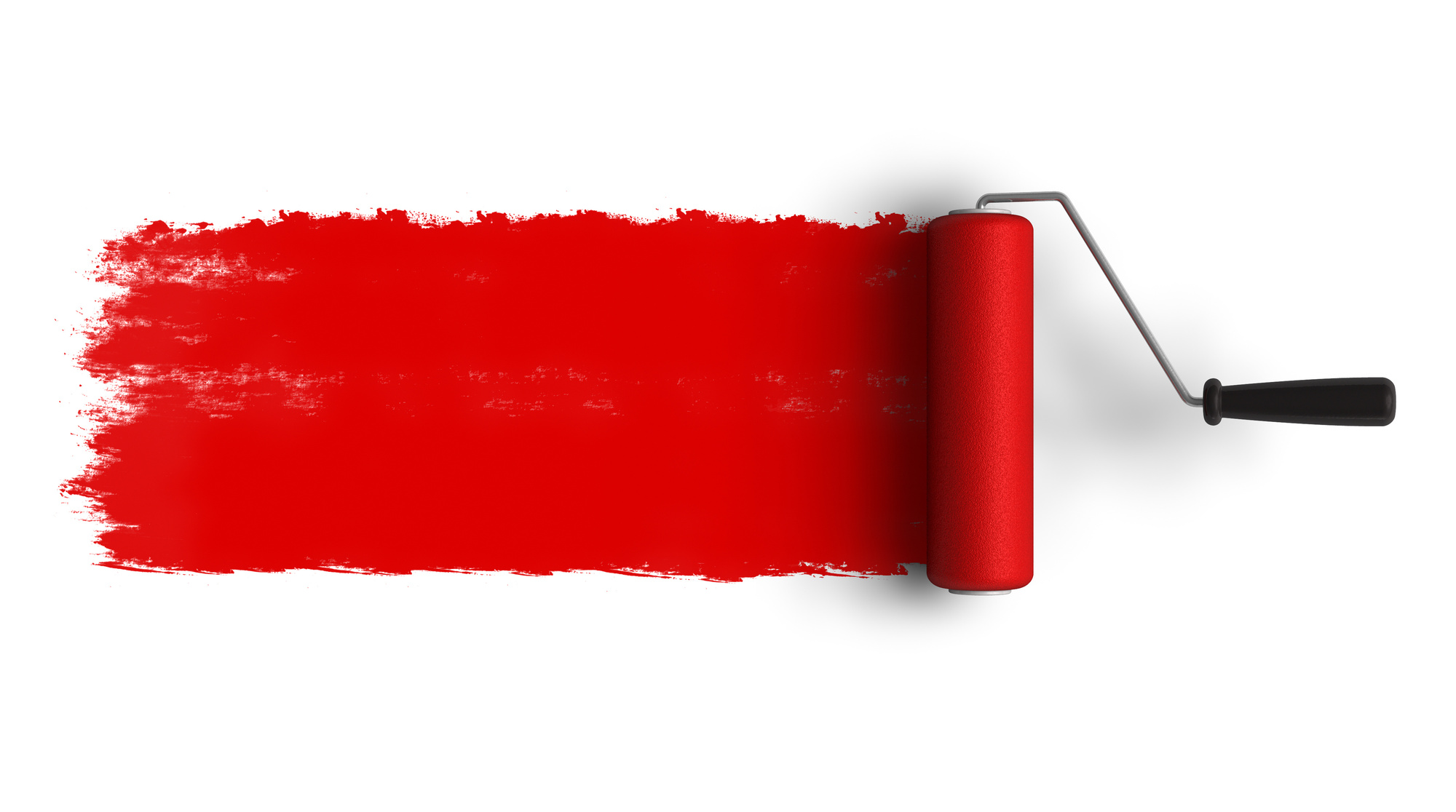
The Fire Colors: Red, Orange, and Yellow!
When designing a logo for your painting company you want something that’s vibrant, fresh, and colorful.
Many people might think that a red logo is something to stay away from. But consider all the big corporations who use the color in a powerful way. It makes a strong statement.
Let’s discuss how you can develop a business logo that incorporates red, maybe some yellow and a hint of orange. We’ll let you decide where you take it next.
Why Does Your Painting Business Need a Logo?
A logo is your brand identity.
The purpose of a logo is to act as an accurate representation of your company. That doesn’t mean it needs to be a literal representation. Don’t think a painting company logo is limited to paint brushes or cans of paint.
That’s not to say it doesn’t work. You can view here an example where including a paintbrush works well.
A logo gives life to your brand. It translates what your company has to offer into an illustrated story. The design behind a logo must also take the target audience into consideration.
An effective logo design accomplishes 3 goals:
- Customers choose your brand over all others
- Customers connect on a personal level with your brand
- Customers remember your company long after using your service
Take a guess. Which elements of a logo are best at accomplishing these goals? what would you choose?
You might be surprised to learn that the colors used in a logo complete all 3 of those goals. That’s why your choice of color is not something to take lightly.
It’s an emotional thing.
Understanding the Emotions of Color
Swiss psychologist Carl Jung (1875-1961) pioneered the concept of color psychology. Jung, credited with the introduction of art therapy said: “colors are the mother tongue of the subconscious.”
Study after study, researchers draw the same ultimate conclusions. Color isn’t a simple design element used to add some flair. Colors affect emotion.
The marketing and web design company, WebPageFX, conducted a study about the effects of color and customer perceptions. Here’s what they found:
- It takes less than 90 seconds for a person to make a subconscious judgment about a logo. Most people agree their assessment is based on color alone.
- When asked why they buy a particular product, 85% of consumers claim color is their underlying reason for buying.
- 80% of people share the opinion that color increases brand recognition.
Color choices convey very different images depending on the way they are used. Keep reading to find out if the Fire Colors are exactly what you need to spice up your logo.
Red Logo
One of the primary colors, this crimson king is a very strong color.
Often associated with the command “stop,” this color signals caution. It is also known to stimulate strong emotions such as passion, power, and excitement.
A common color choice for flags, red symbolizes pride and strength.
The strength of emotion elicited from red makes it great for stealing the eye’s attention. Take a moment to find something with multiple colors. Notice how your eye is immediately drawn to the red?
A red logo has the potential to be a real attention grabber.
Fanning down the embers a little, red can also evoke a sense of warmth.
When brainstorming your logo write down qualities that come to mind. Now check out this summary of what a red logo can represent to see if you find inspiration.
- Act as a signal — command to stop and pay attention
- Strong emotion — passion, excitement, pride, aggression
- Excitement — vitality, adventure, danger
- Power — strength, energy, courage
- Temperature — warm, hot, burning
With that powerful of a repertoire, red is one color to be careful with when designing a logo. To cool the emotions, your painting service logo may want to think about associating red with an image from nature. A rose, an apple, or a striking sunset tempers the drama, while still allowing red to pack its punch.
Another way to keep red in your design is to offset it with other colors.
Yellow Logo
Another of the three primary colors (the third is blue).
Upon seeing yellow the image that first comes to most people’s minds is the sun. In fact, yellow is the brightest color tone the human eye is capable of seeing.
The color yellow triggers the logical (left) side of the brain. For that reason, it is frequently associated with learning, thoughts, and creativity. It helps awaken the mind and bring new ideas to life.
Remember the Rubber Ducky?
He (or she) is traditionally yellow. Many children’s toys and clothes are yellow. When viewed within a logo design it can represent youthfulness, fun, and imagination.
Yellow is the true optimist of the rainbow, evoking happiness, confidence, and promise for the future.
The aspects to consider for a yellow logo include:
- Youthful — fun, active, energetic
- Creative — imaginative, thinking outside the box, unique
- Optimistic — bright, confident, happy
When using yellow be cautious of the colors you pair it with for your logo. Use contrasting, darker colors (hey, what about red?). Lighter colors will wash it out making it difficult to notice.
Orange Logo
Orange is one of the secondary colors on the color wheel. It is created by combining various shades of red and yellow.
While not as urgent as a red logo, an orange logo is just as energetic. It is another color that can stand out. But it does so in a more natural, approachable way.
Orange tends to awaken the fun a playful side of our personalities because of its bright glow. This brightness translates to other warm feelings. It can be upbeat and friendly or produce feelings of comfort and well-being.
Of course, we can’t forget the color’s namesake in this discussion. The citrus color reminds us of its naturalness. It suggests a fresh take on ideas.
Orange is also a natural when it comes to being outgoing. It defines friendliness and encourages socializing. (Have you ever seen an orange juice commercial with only one person in it?) This creates a sense of being approachable.
Use orange to illustrate these traits in your company:
- Youthfulness — fun, active, energetic
- Creativity — imagination, uniqueness, innovative
- Freshness — natural, glowing, warm
- Open — friendly, welcoming, familiar
An interesting side note is that the color orange is used less frequently in logo designs. This presents a fantastic opportunity to create something unique.
Command Attention with Your Logo
Red logo, yellow logo, orange logo, gee. Or perhaps a combination of three.
It may read like a Dr. Seues book, but there’s nothing wrong with that. Everyone remembers who Dr. Seuss is and his memorable phrases.
No matter what colors you decide to go with, make sure your logo stands out. Make it memorable and customers will think of you first when they have a painting project to complete.
Are you ready to get creative? Are you inspired to design a logo for your painting company?
We hope our breakdown of the fire colors shows you how easy it is to understand the emotions behind color. The next step is just as simple. Creating your own logo.
You have the ideas, and the tools are right here. Start designing a free logo today.
5 Tips for Building a Better Home Builder Logo
Posted on December 14, 2017 by Logo Design Tips and Tricks

Looking to design the perfect home builder logo for your construction-based company?
Having a great logo can help present your company in a trustworthy, positive, and appealing light. These are all good things for your business.
If you want to design a logo that looks great and appeals to your customers, you’ve come to the right place. Designing a logo can seem daunting, but we’ve made it easy.
Here, we give you five tips for creating a great home builder logo. Use these recommendations to put together a logo you and your company can be proud of.
1. Pick the Right Font
One of the first steps in designing your logo should be picking the right font. This will be one of the main items that will help your logo make a great first impression.
Using an ugly or basic font will immediately turn viewers off. No matter how great the rest of your logo design is, if your font is off, your whole design will be compromised.
There are many fonts that should simply be retired from use. Comic Sans, Papyrus, and Wingdings are among the list of fonts that simply do not need to appear anywhere in the modern world.
Designers who use these fonts are not the designers you want to work with.
Picking the right font is an essential step in creating a home builder logo that really works. Use something modern yet relatable, and do not be afraid to try something different.
You may even start a new font trend if you really get it right!
2. Use Sharp Elements
When creating a home builder logo, you do not want to use curvy lines and flowery script. Using sharp elements rather than more feminine ones will convey the vibe of your company much better.
Plus, using sharp and strong elements in your design process will help potential customers to trust you more.
If you and your company seem capable and professional, people are much more likely to keep you in mind for their needs.
Using sharp, strong, and bold elements in your logo design will go a long way in communicating your company’s core values to your potential customers.
Remember that your logo will be a visual representation of your company on all kinds of materials and for years to come, so you want to make sure to design something you feel proud to show off.
3. Keep It Simple
Keeping it simple may seem contrary to your goals. However, it is actually very important to keep your logo as simple as possible.
You do not want to complicate or clutter your logo design with too many elements.
Trying to add in accessories like home building tools, a motto, your company name, and cutesy details will only serve to drag down the overall appeal of your logo.
If you must, repeat this mantra to yourself while designing your logo: keep it simple.
This will help you to eliminate elements that are not necessary, or even refrain from adding them all together.
4. Visual Appeal Is Key
Keep in mind that above all, your logo should be visually appealing. It is the first thing many people will see when hearing about your company for the very first time.
A bad logo can make them never take a second glance. Don’t let this happen to you.
Including a lot of information in the logo may seem helpful, but really this just confuses the eye and crowds the brain of your logo viewer.
Take a step back after a draft of your logo is designed.
What’s the first thing you think of when you glance at the logo? What images or ideas does it call to mind, and how does it make you feel when you look at it?
These simple reactions can provide important insight into how well your home builder logo will be received. It must be visually appealing in addition to being a great representation of your brand.
5. Use the Right Colors
They may seem like a minor detail, but choosing the right colors for your home builder logo is key. Nothing can make or break a logo quite like the color choices can.
For example, check out the logo of Now Living. The orange and black colors convey the traditional construction colors while the modern fonts bring the company into the modern age.
While orange and black are the traditional colors associated with the construction world, you do not have to limit yourself to only these choices. Branch out and do something different.
Stay with colors that are somehow relevant to what your company does, but do not feel confined to only using the usual colors that most other companies do.
Your logo should be unique and recognizable, but must also be a good representation of your company’s values and mission.
Need Help Designing A Home Builder Logo?
If you need help designing the perfect home builder logo for your construction company, you have come to the right place.
Our logo-making platform will help you to design a logo in less than 10 minutes, even if you’re not a designer. The interface is not complicated and there are tons of options to choose from, making sure you’ll get your logo just right.
Plus, if you need a break, you can always save your design and come back later. You will also be able to download your logo an unlimited amount of times.
There are countless logo assets and design templates to choose from, so just scroll through the library of available elements if you need some logo design inspiration.
Check out our online logo-maker tutorial to get a feel for how it works.


