7 Tips For Creating An Awesome Online Business Logo Design
Posted on December 30, 2017 by Logo Design Tips and Tricks
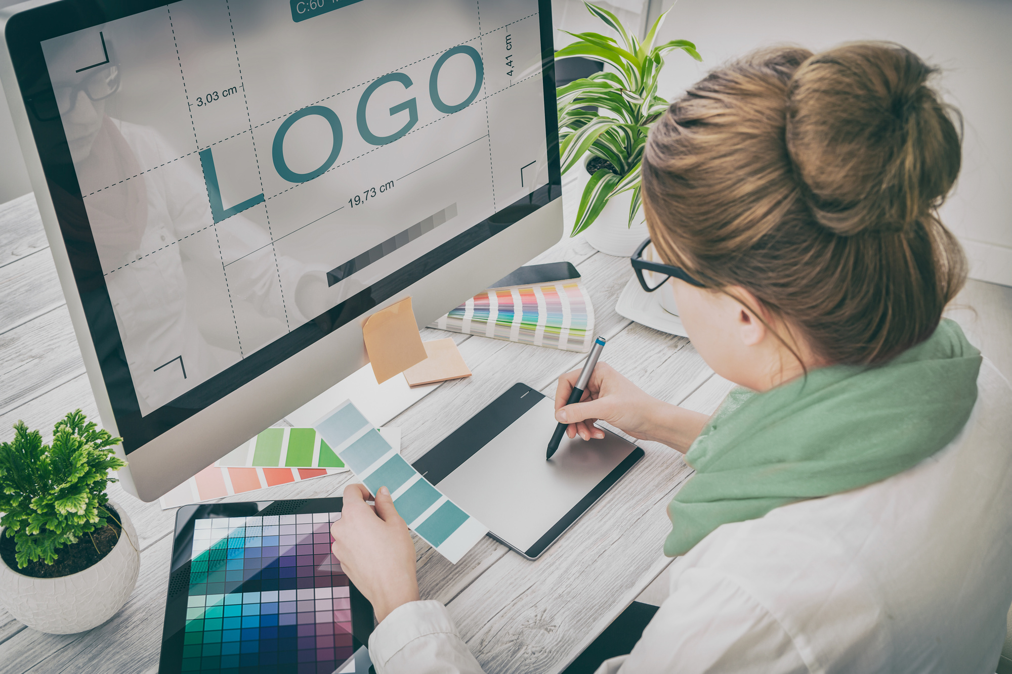
Online brand positioning has a direct effect on a business’s exposure, and thus, a direct effect on revenue. Creating a brand people remember all starts with a good logo.
However, coming up with and designing a memorable one isn’t easy. There’s an art behind it.
Furthermore, it’s essential to create something that properly represents your business and that you’re proud of. You don’t want to put something out there quickly only to realize six months down the road that it’s not effective.
Given the number of advertisements we see every day, it’s more important than ever to establish something unique. This seems like an impossible task, but there are techniques that will help you out.
Before you begin the design process, consider the following 7 tips for creating a quality online business logo design.
1. Stand Out From the Crowd
Just about every major business has a logo. Although it’s increasingly difficult to be original with so much company branding out there, you should always attempt to stand out in your industry.
It’s important to take a look at what your competition is doing with their logos. Which logos do you think work? Which ones don’t?
Looking at the competition gives you an idea of what kind of creative level you should strive for. Keep in mind this doesn’t mean you should imitate. In fact, you want to do what nobody else is doing.
Remember, in order for a logo to be successful, it needs to be appropriate for its industry. Think about what you do and what imagery it triggers. Then, find a unique take on that imagery.
2. Understand Your Audience
You’re branding to a specific audience, so you must know exactly who that audience is. This goes further than just simple demographics. What does your audience care about and why do they need your product?
Create a customer profile by asking yourself some questions and taking notes. What are your target audience’s interests? What are their spending habits and what other products and services are they interested in?
These things may seem trivial, but if you know your audience, you’ll create an online business logo design more likely to catch their attention.
Think of it this way. A bakery wouldn’t create a logo that’s more fitting for a nightclub. Doing so would confuse people, so know your audience intimately before you start designing.
3. Consider Your Colors
Color choice is a crucial decision and has a huge effect on a consumer’s perception. Every color creates a feeling in our minds, so you need to consider a few things when choosing yours.
Extremely bright colors are good for catching the eye, but if overused can overwhelm a potential customer. More muted and subtle tones achieve a certain level of sophistication. They can also go unnoticed.
Think about the philosophy behind your product or service. What do you represent? Then, think about the following colors and how humans perceive them.
- Orange – happiness, enthusiasm, creativity
- Red – energy, power, love
- Green – growth, fertility, money
- Blue – stability, wisdom, truth
- White – purity, cleanliness, safety
These are just the basics. Look for more exhaustive information on color before getting started.
4. Simplicity
The last thing you want from your online business logo design is for someone to have to try to dissect it. You also shouldn’t try to get too much information across at once.
Keep in mind that your logo will need to display well across a number of devices such as laptops, tablets, and smartphones. A web company like RdyToGO web design incorporates responsive design for this reason.
You also want to try to design something that will look good against different backgrounds. Keeping it simple is the best approach.
Simplicity goes a long way when trying to achieve something memorable. In an instant, your logo should tell someone who you are and give them an idea of what you do.
5. Think About Your Typography
We may not realize it, but the typography of a logo does a lot to our perception of a brand. Your business name is central to your logo, so you need to pick a font style that’s both interesting and represents who you are.
There are seemingly countless font styles out there. It’s easy to portray yourself as classy and sophisticated with a cursive typeface. Or, be bold and to the point with block letters.
The most important thing to consider here is that your brand name needs to be unique and also easy to read. Online consumers are impatient. If a font style is hard to read or turns them off, they’ll go to a competitor.
6. Negative Space
Sometimes it’s what’s not there that makes a logo great. Negative space is the area in a logo that’s not being used. In addition to creating a very clean look, negative space creates a sense of motion and immediacy.
It also helps call attention to the actual brand name or imagery. A few great examples are the NBC and FedEx logos. By using white space, they actually achieve a more impactful response.
Negative space is also great for creating a very minimal look, which is popular right now. This goes back to remaining modern and relevant with your branding.
Years ago, online logos resembled billboards or storefront signs. Today, however, your online business logo design needs to be fresh and up-to-date with modern trends.
7. A Good Balance
It’s been found that the shape of a logo impacts the way consumers react to it. Circular shapes evoke feelings of softness and comfort while angular shapes induce harsh or hard feelings.
Aside from shapes, it’s important your logo has a good balance. If too much emphasis is put on one side of your logo, it could be off-putting to a consumer.
Instead, try to achieve a consistent balance across the entire design. It’s fine to have a prominent element to one side as long as it’s balanced out by something else.
Start Creating Your Online Business Logo Design
Taking the tips above into consideration will drastically improve your end result. Remember, a logo isn’t just an image, it’s your business identity. It’s important you create something that speaks to consumers about who you really are.
For more information on creating quality logos, check out our tutorial today.
How to Design a Beautiful Jewelry Logo
Posted on December 30, 2017 by Logo Design Tips and Tricks
The U.S. jewelry industry is worth around $70 billion dollars and growing. With so many jewelry stores setting up shop to have a share of this market, it’s important to create a jewelry logo that stands out.
If you’ve been commissioned to design a logo for a jewelry company, you might be a little bit stumped. What are you supposed to do that hasn’t already been done? It might seem like every good idea has already been scooped up.
Don’t worry. We’ve put together a guide to help you create a beautiful logo that’s sure to stand out from the crowd. Read on to find out all of our best tips.
1. Play With Colors
When people say they want their jewelry business to be seen as elegant and classy, some designers hear, “use black and white.” It doesn’t matter if the company sells mens bracelets or diamond rings, you’ll probably see black and white somewhere.
You can definitely use those colors in your design, but don’t be afraid to play with your color scheme. You don’t need to limit yourself to what you think a jewelry logo ‘should’ look like.
See if you can add a splash of color somewhere in your design. Just make sure it still works in grayscale!
2. Create a Unique Jewelry Logo
It would be easy to just write the name of the company in fancy script, edit in an image of a diamond, and call it a day. But would you really have created a memorable logo?
It can be tempting to hop on the latest design trend. However, they’re trends for a reason. You need the logo that you create to last, not fade.
The best logos stand out because they’re different. Breaking the mold makes the logo more recognizable to potential customers. The best branding experts know this.
3. Choose a Great Font — Or Make Your Own
We all know the joke — creating a logo really just means finding a good font. It was even parodied on an episode of Parks and Recreation.
The joke’s not completely wrong. A good typeface is an important part of creating a logo. However, if all you’re doing is scrolling through a list of fonts, you’re not doing your job as a graphic designer.
If you’ve got the skills, try to create your own font. You’ll know that the jewelry logo you’ve made is truly unique, and it will be much harder for other designers to rip you off. It’s one thing to buy the same font — it’s another to have to recreate it from scratch.
4. Less Is More
When in doubt, keep it simple.
You shouldn’t overcomplicate your logo. If there’s too much going on, you risk confusing the consumer. Besides, a minimalist design actually might be the perfect image for the company. You can’t go wrong with a clean image that gets its message across.
Start Creating Today
Ready to start designing the perfect jewelry logo?
Use our online logo maker to create the perfect logo for any jewelry business. We have tools for both beginners and experts to make sure everyone walks away satisfied.
How to Create an Amazing Logo for a Boot Company
Posted on December 30, 2017 by Logo Design Tips and Tricks

Doesn’t your amazing business deserve an amazing logo?
A logo is usually the first point of contact people will have with your business. Eye tracking studies at the University of Missouri have shown how important that first impression is. They discovered that people visiting a website for the first time spend just over 6 seconds looking at a logo.
What does someone do in those 6 seconds? They decide whether or not they want to look further at your website or your business.
How do you create a logo that rocks?
Read on for the best tips to create a logo for your boot business.
Questions to Answer Before Designing a Logo
A logo isn’t something that you just slap together and hope it looks good. A logo requires planning and careful consideration before your start designing one. These are important questions to answer before designing one.
- Who are you targeting?
- Do you want people to know that you are a serious, friendly, or conservative company?
- Are there colors that you’d like to use in the logo?
- What makes your boot company different from the competition?
- Have you looked at your competitors’ logos? What do you think of them?
- Do you want your business name in the logo?
- If so, how much do you want it to stand out?
- Do you have a tagline that you want in the logo as well?
These questions will help you discover what kind of logo would be best for your business. It’s here where you’ll decide if you want something playful or something modern and sleek.
Know the Type of Logo You Want
For your boot business, you might want a logo that is just your company’s initials or you might want an image to accompany your logo. There are seven types of logos that range from simple letters to iconic images.
Logo Symbols
A logo symbol is just a picture or image. To understand what a logo symbol is, think of Twitter’s bird or Apple’s apple logo.
A boot company can use a stylized boot that is memorable and recognizable.
Lettermark & Watermark Logos
Use stylized text that places the focus on the company’s name or initials. A couple of examples are IBM and Google.
These are good options if your company name is short or you use initials in your company name. If you want to emphasize your name in the logo, this is the way to go.
Abstract Logo
An abstract mark, when done well, can distill your message into a single image. For example, Sony’s Play Station logo is an abstract design of the P and S of Play Station.
An abstract logo can be challenging to make work because you have to have a clear understanding of color and design.
Mascot Logo
Another way to create an amazing logo is to use a mascot. Let’s say you sell snakeskin boots.
You can create a snake as your mascot and incorporate that into your logo.
Combination Logo
This is an option that just about any business can use. It’s a combination of an image and text. It’s widely used, and you’ll see tons of examples of combination logos. It’s also a way to use
Emblem Logo
An emblem is simply You’ll see this used a lot by schools and governments. You have to be careful with emblems because there’s so much detail, the details can bleed together when printed.
Font Types
This is where knowing your target market will come in handy. People tend to have preconceived notions about a font type and what it conveys.
For example, a boot company that caters to women will want to have a thin font, serif, or script. These types of fonts tend to be more feminine and modern. That will attract their target market.
if you’re targeting an older demographic, you can consider a retro look for your logo. You’ll want to use a font that was popular in that era.
Create an Amazing Logo with Color
It’s no secret that people respond to color.
This is where you go back to the question of what your company message is.
Did you know that red can be used for impulse shoppers? Red is a passionate color that can raise your heart rate. It’s used to create urgency, too.
Yellow can be a great option for a boot company, as it’s been shown to grab the attention of window shoppers. It also represents good cheer and warmth.
Brown is a color that represents masculinity. If your boot company primarily targets men, then this color should be used.
Create Several Drafts and Test Them
This is just as important as the questions before you start to design.
Come up with several looks of your logo. Enlarge them, shrink them, and print them out.
You can try different colors or different fonts and print them out. Send them to a few trusted people, advisors or current customers. If there’s one design that you’re attached to, you might be surprised to learn that your customers don’t like it or they like another look much better.
You’ll also want to test them in according to how they’ll be used. Try putting them on brochures, business cards, and t-shirts.
An Amazing Logo That Rivals the Big Companies
Every year, organizations spend millions of dollars on their logo. In some rebranding efforts, companies have spent over $100 million on their logo only for it to fail.
You don’t have to spend millions on your logo. In fact, you can create yours in less than 10 minutes for free.
Consider the information in this article and then apply what you learned with Online Logo Maker.
You’ll have all the images, fonts, and templates to work from to create an amazing logo for your boot company.
What are you waiting for?
Get started today!
10 Dazzling Dental Logos That Will Inspire You
Posted on December 28, 2017 by Logo Design Tips and Tricks
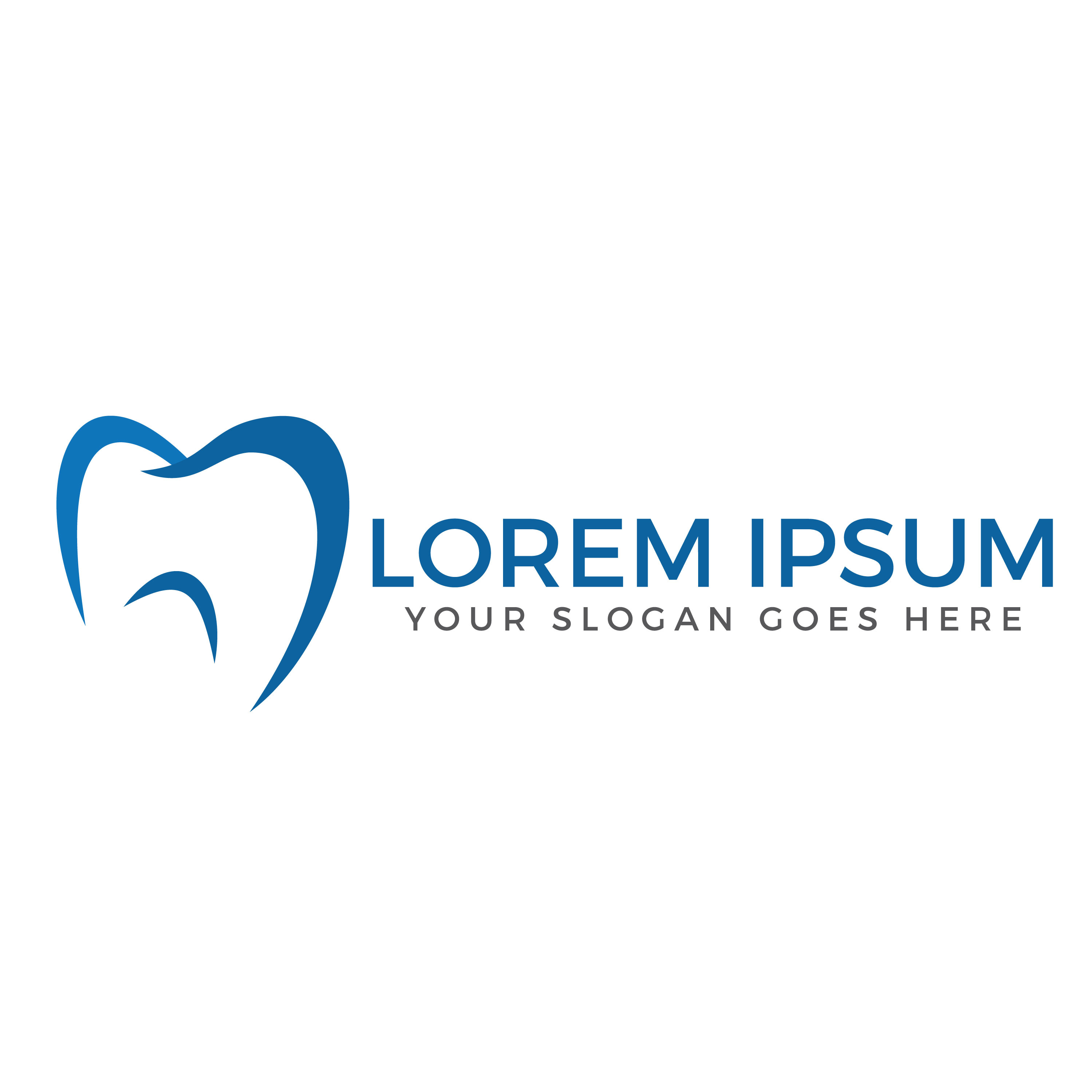
No one likes to be forgettable. Being replaceable never feels good. Feeling generic and run-of-the-mill is unpleasant at the best of times, but it’s the kiss of death for a dental practice. Dental logos help ensure that never happens by illustrating what makes your practice unique and special.
Dental logos are one of the most important components of a dental brand identity. A good logo spells out who you are and why customers should pick you, conveying your individuality with clear, clever visuals.
Dental logos are more than simply your practice’s masthead, however. They’re also how your customers remember you in the sea of competition. It’s no coincidence that most of the world’s biggest brands also have some of the most memorable logos. Think of Apple, McDonald’s, Nike, or Coca-Cola.
To deliver some visual inspiration to help you create your own sparkling dental logos, here are 10 inspiring dental designs.
10 Inspiring Dental Logos
Dental logos can be so much more than just incisors or toothbrushes. They can also come in a wide variety of colors, expanding on the classic (and also cliche) blue, white, and red of classic dental graphic design.
Davidson Dental
Stwebre1a’s classy design for Davidson Dental does not redesign the logotype, nor does it intend to.
Instead, the Davidson Dental design effortlessly broadcasts a sense of elegance and charm. The designer simply begins with the letter ‘D’, placing the cursive script in a circle and topping it with a crown. It exudes a sense of authority and trust, without having to say a word.
Vermont South Dental
Minimalist design trends have been in vogue for some years now. Minimalist designs deliver the brand identity as quickly and efficiently as possible, which is integral to today’s quickly-scrolling marketplace.
Minimalist designs are also easy to reproduce and look great on a wide variety of promotional products. As business owners looking to thrive in the 21st Century, we should be investigating every marketing opportunity at our disposal.
Flash Orthodontics
Oh! Studio’s design for Flash Orthodontics shows us that there’s more to dental design than stark black-and-white graphics and Helvetica font.
Graphic design needs to capture the unique essence of a company, which helps them to stand out, and Flash Orthodontic’s logo achieves this beautifully.
Orthodontics is a newer industry than traditional dentistry. Orthodontic practices are able to employ more futuristic designs to convey their cutting-edge approach. A striking mandarin orange ‘S’ and some futurist font make Oh! Studio’s design looks appropriate for a high-tech company, while still being approachable enough to make you feel safe.
Forest Park Dental
Forest Park Dental‘s logo is another example of memorable, colorful graphic design to convey a brand identity. Instead of the clinical white of so many dental logos, Forest Park Dental incorporate navy blue and emerald green into their logo to give a naturalist effect.
The mountain in the background is also a molar. Patients will still know this is a dental practice, even with no text involved.
Dental Perfection
Less is sometimes more when it comes to creating memorable dental logos. Dental Perfection’s logo incorporates a classic cursive script font into the outline of a tooth. It’s graphic and text, all in one, making it perfect for viral branding or online promotion.
Preston Park Dental
Graphic design communicates on more than one level at a time. Dental logos convey text, graphics, and color, simultaneously, in a way that is impossible for written text.
This logo from Flight Deck Creative plays up the visual ambiguity, with a curved forest green smile icon that also resembles a falling leaf. The green design radiates a natural calm, while the smile puts the viewer at ease. It seems approachable, as well as healthful. All good things for a dentist’s brand identity.
UltraThin Veneers
The color purple evokes an inherent sense of royalty and opulence. It’s also an easy for a dental practice to stand out in the sea of blue-and-white dental logos.
UltraThin Veneers’ logo layers hues of purple to give a flower-like effect that is both soothing and exhilarating. It also differentiates the practice as a veneer company, which is a newer industry and more likely to explore modernist design.
Dental House
While it’s tempting to employ an “everything and the kitchen sink” approach to design a dental logo, often times less is more. Annamaria Tiszka’s logo for Dental House is as stripped down as they come, using only the first letter of each word.
It’s an exquisite upscale design for a boutique dental practice. It could do double duty for a book publisher or an upscale hotel, which says something about its impeccable quality.
Ortho Annex
This cute, colorful design for Ortho Annex earned the designer a runner-up spot in a logo design competition.
This cute cartoon-like illustration owes more to today’s digital art style that you see so often on social media. It’s easy to imagine kids wearing this design on a shirt or playing with a plush toy of the molar mascot, which might make it easier to entice kids to go to the dentist.
Apple Dentistry
This simple line-drawing is effective for the way that it subconsciously conjures the saying “An apple a day keeps the doctor away,” and apple’s association with health.
The design is noteworthy in that it portrays an apple while not immediately calling iPhones and MacBooks to mind. No mean feat, considering the ubiquity of Apple in the design universe.
Remember, there are no boilerplate graphic designs. A great logo tells the story of each particular brand and what sets them apart from their industry.
There’s so much more to dental graphic design than molars and blue-and-white lettering. Let your imagination run wild and create something you truly love. Your patients are likely to love it as well.
Ready To Showcase Your Dental Practice To The World?
Branding is incredibly important with so much competition at the click of a button. Create an account with us today, and be creating your own logos in minutes!


