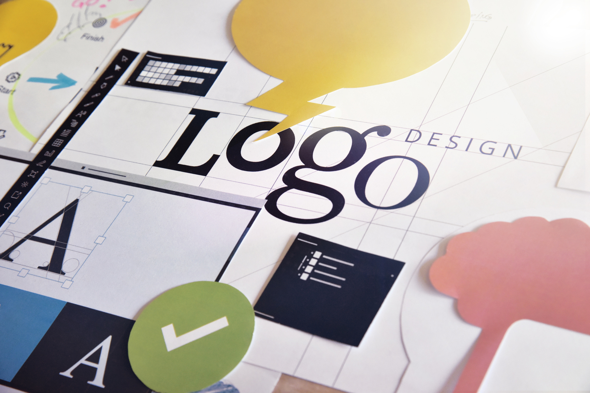
5 Design Tips and Tricks for Creating Your First Basic Logo
Posted on February 20, 2018 by Logo Design Tips and Tricks
A logo is essentially a company’s face –the first impression the company makes on a customer.
So, if you want to get into logo design, creating a basic logo that effectively sells your client is critical. Choose the wrong logo design and your client will appear unprofessional in the eyes of potential buyers.
At the same time, the right logo will create recognition instantly within the target audience’s minds.
Here’s a list of five design tricks and tips that will help you to create a killer basic logo from Day One.
1. Be Balanced
When you’re designing a logo, achieving balance is paramount. After all, the human mind naturally perceives balanced designs as appealing and pleasing.
So, what exactly is balance in logo design? It means keeping your size, graphics, and color on both sides of your logo equal in terms of weight.
Don’t place too much emphasis on either side. Keep things consistent across the board.
2. Be Colorful
Although color theory can be complicated, here are some basic rules worth keeping in mind.
First, utilize colors that are close to one another on a color wheel. For instance, if you’re going for a warm logo design, choose yellow, red and orange hues.
Also, stay away from hues that are too bright and thus would be hard on potential customers’ eyes.
Make sure that your logo looks good no matter what color scheme you use. It should stand out and be classy looking whether it features two colors, is in grayscale or is in black and white.
3. Be Choosy About Your Font
Picking the best font size and type is trickier than many new designers realize.
However, a good rule of thumb is to avoid fonts that are overly used today, including Comic Sans. Otherwise, your logo might appear amateurish.
Also, be sure that your font can still be read easily when you scale it down. This is especially important with a script font.
And another thing: Don’t use more than a couple fonts. Using a single font is best.
4. Keep the Company in Mind
Understanding your client is key to creating a logo that best suits the company. This means you need to perform some preliminary research on the client as well as its audience.
If you don’t, you may end up producing a logo that doesn’t align with the client’s vision. And do you really want to keep going back to the drawing board?
Didn’t think so.
If you create a satisfactory logo, your client may even decide to use your design on its own custom buttons to promote the organization. That means even more exposure for you.
5. Don’t Get Complicated
This is one of the most important rules of logo design.
It’s something Nike mastered with its swoosh–a simple yet globally recognizable logo.
Why not follow in Nike’s footsteps and keep your logo simple, too? Your client’s bottom line will thank you.
How We Can Help with Basic Logo Design
We offer a complete yet simple logo maker that can help you to become a whizz at basic logo design in no time.
Contact us to find out more about how you can create logos that will make companies stand out in today’s competitive business world.
How to Create the Perfect Logo for Your Postcard Business
Posted on February 20, 2018 by Logo Design Tips and Tricks
Designing a logo is deceptively difficult. You need more than just a cool name or object to grab attention. In fact, you don’t exactly want to be too flashy with your logo, it can have the opposite effect.
As a postcard business, your logo needs to be memorable and pleasant on the eyes. The perfect logo encompasses many key design aspects while complimenting the brand. As such, 72% of marketers agree, branded content is more effective than advertising in a magazine.
We’ll show you how to take your postcard business to the next level with a strong logo design.
Target Your Target Audience
Your logo needs to represent all the characteristics of your target demographic.
Are they young? Blue collar? Conservative? Sports fans?
These traits must somehow be present in your postcard business logo.
Take the logo for Disney, for instance. While there are plenty of adults who enjoy their movies, children are their target demographic. The logo reflects fun, magic, and creativity. These traits cannot be reflected in a basic comic sans or script font.
For your logo to be successful, it needs to capture your branding as well as the attention of your most valued customers. Subtlety goes a long way when you’re talking about a logo that you want to be remembered for, hopefully, the life of the company.
A Perfect Logo, Big or Small
A great design translates well on nearly any canvass, big or small. It needs to be recognizable on the postcards of your postcard business, as well as the billboards on the side of the highway. This demonstrates the versatility and clarity of a logo’s design.
The perfect logo can convey two ideas or messages at the same time without losing any of it when shrunk down to a postcard. How does one achieve that level of fidelity? Well, you might be surprised to hear that the simpler the design, the easier it becomes.
While logos with a lot of detail, shadowing, or special effects may look great on a website or poster, it’s unlikely that same logo can be used on a postcard or business card. You’ll see a lot of small businesses make this mistake. They will hand you a business card with their logo in a muddy mess because:
- They shrank a JPEG
- Their logo was not made to be so small
Try to aim for a logo that works great in a monochromatic scheme as well as a 16-bit web graphic.
Be a Leader, Not a Follower
Playing things safe is a tempting path to take when designing a logo for your postcard business. Keep things conservative, simple, and corporate makes sense. The problem is that you’ll just blend in with all the other competitors if you don’t take any risks.
Set the bar above expectations by avoiding trends and creating your own unique look. Personality shines through and sticks with the customer for a much longer time.
Master Color Theory
Choosing the incorrect color scheme could turn a strong logo into an unappealing and forgettable one. It’s not just about being bright and bold, it’s about finding a balance. A muted color scheme could provide a level of trust and sophistication, or it could blend in with the background and be missed.
Each color on the color wheel pairs with certain moods and emotions, it’s important to take these into consideration when branding.
There is a lot of psychology behind colors and logo design. Read some basic color theory to help you understand how to apply it to your postcard business.
Smart Negative and White Space
Negative space is often overlooked when designing logos for a postcard business.
Space needs to be accounted for if you want a smart and cohesive image. Poor use of white space leads to off-centered logos and lack of eye-catching properties. Good use of negative space tricks the brain into seeing more detail than what is there, thereby drawing the customer’s eyes in longer.
Logos should always be designed with the expectation that they will be placed on a white background at some point. Whether that be a banner, postcard, polo shirt, or a coaster. Strong logos excel at blending with white spaces.
Take Your Time
Craft your logo carefully, make sure it matches your branding. Look for ways to curate your brand and incorporate elements in the logo that reflect that. If you rush and create a logo just for the sake of something new, you might lose your identity.
This goes hand-in-hand with creating trends, not following them. If your competitor just went through a rebranding phase and created a new logo, wait before you decide to match it. If you’ve been with the same logo for over a decade, then that’s different.
Just be conscious of carrying over elements of your brand to your next logo design. Refresh is always better than a rebrand, unless you’re trying to leave behind a tarnished image.
Test and Adjust on Feedback
No matter how amazing your logo design may look to you and your designer, you must find out how it will be received. Of course, you could just throw it out there and get reactions if you prefer to live dangerously. For any postcard business that isn’t swimming in cash, there must be a test run or focus group studies.
Without any survey data, you would either be in the dark as to the impact of your logo design or witness a decrease in sales before going back the drawing board. Not a smart use of the budget, to say the least.
Protect Your Logo
Before you upload that logo to Send Photo Postcards Online, you must remember to go through the proper channels to protect your work. Register it as a trademark to prevent thieves from appropriating your brand.
Considering how small you are as a business starting out, it will be difficult, if not impossible to defend yourself from a larger entity stealing your idea if you don’t copywrite it.
If you live in America, you should look into how to copywrite or trademark your logo. If you delay on protecting your logo, you may become a victim of what are known as “copywrite trolls” which lay in wait to steal other’s work and then in-turn sue your business for infringement.
Avoid Cheesy Cliches
If your postcard business has “world” or “globe” in the name, don’t design a logo with a world or globe as the focal point. This is just taking the easy way out of designing something fresh. You want people to remember your logo and immediately associate it with your brand.
Yes, we know there are some major brands that aren’t following this rule of thumb (we’re looking at you, Burger King and Target). They can afford to have boring, uninspired logos.
Consider a Text-Only Logo
Using an object or image represent your brand can be tough to design from scratch. It can cost a lot to brainstorm and refine a visual-based logo that fits your business perfectly on a postcard. Going text-only may remedy this problem, you’ll just need to focus on creating an amazing font.
Notice that we said “create” an amazing font? That’s because most standard fonts are inadequate and can’t stand on their own as a logo. Instead, use a font you like as a base, then try to design and modify it until its personality matches your branding.
Shape Versus Text
For startups, we need a bit of perspective here. If you’re an unknown brand, take this opportunity to use wordplay by shaping your logo around your text. If your logo just reads like an address label, it will be forgotten. If, however, your logo looks like something you would put on your car bumper, then it will stand out tremendously.
You don’t have to go fancy or ornate as a postcard business, you can play around and have fun with your brand. Just do it within reason and use the above design principles while you’re at it.
Start Designing Your Postcard Business Now!
We hope this guide has helped you get an idea of how you want to design a logo for your business. There’s no real winning formula for logo design because it is a form of artistic expression. You cannot predict how people will react until it’s out there.
With that said, don’t let your good ideas go to waste, we have a great multi-featured logo maker that you can try right now. Even if you have no experience using graphic design tools or photo editors, our online logo maker is for everyone.
An easy-to-follow tutorial shows you all the basic functions, then you can intuitively get your logo ideas down. Whether you plan on doing all the designing yourself or hiring someone to finish the job, our powerful logo maker is a great place to start.
The 6 Best Logo Design Tips for Postcard Businesses
Posted on February 15, 2018 by Logo Design Tips and Tricks
The travel industry is one of the fastest-growing markets in the world.
People all over the planet are looking for deals on flights, booking hotels, and planning vacation to-do lists. Many of these travelers are using social media and other internet platforms to check in with loved ones back home or share their story.
But, this is not to say postcards are dead!
Sending a postcard is one of the sweetest ways to say hello to someone you care about from afar. As a postcard business owner, you know this better than anyone.
You may be having trouble reaching your audience, though.
This could mean you need a new digital marketing strategy or a branding overhaul. Or, it could be as simple as upgrading your postcard business’s logo.
The following are a handful of logo design tips and tricks you can use to create a symbol for your brand that is sure to stand out.
1. Start Sans-Color
The foundation of any logo design is to start in black and white.
It doesn’t matter if you already have an awesome gradient or a funky color combination in mind. Using black and white as your base allows all the other design elements to come together as best as possible.
When you put color aside for a second, you can better see the relationship between everything else. This pays off as you work with different lines and curves, or two separate design ideas entirely.
Such comparisons will guide you to the most effective structure for your logo.
From there, working in various shades and tones will be the final touch that brings the logo to life.
2. Think of the Psychology Behind the Logo
A logo is one symbol that can say many things at once.
This is best achieved when logo makers understand the psychology of the design process. The psychology of logos can be broken into two things: shapes and colors.
Shapes
Straight-edged shapes like squares, rectangles, and triangles create a sense of balance.
These elements tell users your company is trustworthy. They are a bit masculine and have an air of power about them, too.
But, this ranges between vertical and horizontal lines. Vertical lines suggest something aggressive while horizontal lines are more about community and togetherness.
This is similar to the way curves and circles make consumers feel. Circles are feminine shapes, used to create a feeling of friendship, stability, and even love.
Colors
Colors carry their own set of emotions, too.
Since postcards are all about togetherness, joy, and sharing fun experiences, you will likely want to stick with the most positive tones in the color wheel.
These are reds, yellows, and oranges. Such shades are all about excitement, passion, play, opportunity, and happiness.
Maybe your postcard business is made of recycled materials or by hand in a local store. Use green in the logo design to reflect sustainability or blue for a sense of trust.
Whatever the emotions you want to evoke, don’t be afraid to play with these rules. You can end up with a multi-colored logo or a design structure that incorporates various shapes.
These concepts are just the foundation.
But, the more you understand them, the better you can use them to your benefit.
3. Play with Fonts
The lines and curves of a logo design create the foundation and the color brings the basics to life. Then, the font adds the missing touch.
Your logo may be the name of your company presented in a unique way. Or, it could be a custom-made symbol that can be displayed with or without the name.
Either way, you need the right font for the job.
Think of a font’s construct in the same way you would breakdown shape psychology. Bold, straight-lined fonts are masculine and serious while those that flow or even look hand-written are feminine and fun.
But, just narrowing your font of choice down between the manly and the girly still leaves you with many to choose from!
You may need to switch back to black and white colors to find the right font. This is an easy edit to do while creating your logo design, and it can make all the difference.
4. Add a Tagline
There is the aesthetics of a font, and then there’s what you are actually trying to say.
Consider adding a tagline to your logo design.
This is something fun and simple to drive your efforts home. Your tagline can be the values you hold your company to or the motto your employees operate on.
It’s a simple touch with lasting benefits. Taglines help users understand who you really are.
This comes in handy if your postcards are focused on one area of the world, or if they are more for feel-good purposes like these postcards are. Taglines can be something that is said in the area or a universal expression of communication and togetherness.
5. Use a Hidden Message
Instead of saying something directly with a tagline, try using a hidden message.
These can turn a beautiful logo design into something iconic.
Hidden messages like those within the FedEx logo or the Amazon symbol are known pretty much all around the world. Even the famous “Golden Arches” are universally recognized as the McDonald’s logo.
Your hidden message shouldn’t be something that needs to be decoded.
It should be subtle enough to fit right into the logo design, yet clear to decipher and understand.
6. Be Timeless
The last thing every great logo has in common is the ability to stand the test of time. All the best logos are rarely ever edited or redone.
There may be small adjustments made as your company grows or the industry changes. Still, the common theme will be easy for anyone to notice.
Such a design accomplishment goes beyond the logo. It makes it easier to build brand recognition and brand loyalty.
Put These Logo Design Tips to the Test
Now that you understand the basics of logo design, it’s time to see what you can do.
You don’t need to spend hours brainstorming or a part of your budget on a graphic designer. You can make your own logo with the help of the right software!
Click here to get started.
Elegant Business Card Design Tips
Posted on February 15, 2018 by Logo Design Tips and Tricks

Networking is the bread and butter of connecting with potential new clients; it’s one of the quickest and most effective ways to build up your contacts. Having a quality business card and giving it out to your new contacts can be the perfect finishing touch, but most people don’t know where to start on creating their own business card.
Elegant business card design tips are few and far between online, so we decided to create this article to give you all the information you need in one place to get started on your own business card design.
This article will take you through all of the steps from:
- Keeping your business card minimal
- How to leverage social
- Building your brand into your business card
- And much more
Tie back your hair, and hold onto your hat, let’s get started!
Why Are These Elegant Business Card Design Tips Important?
First impressions last, and in-person meetings can be a really powerful way to get new clients or new contacts for your industry. Research also shows that closing rates for in-person meetings are 40%, with that in mind having a great business card design can really help to improve your odds of closing.
Our Top 7 Elegant Business Card Design Tips
To help you get the best elegant business card design tips, we’ve broken down our seven favorite ways to get the most out of your business card designs.
1. Keeping It Minimal
Stripped back business cards are the big trend for 2018. Don’t tempt yourself to bombard your card with a mountain of information but the problem with that, as with anything, is information overload.
You want to be thinking about your brand message and what you want to say. Remember because you’ll have given the person the business card in person, they will already know what you’re about and what you do, you don’t need to repeat that here.
Think of your business card as a call-to-action; you want the person you’re giving the card, to take action.
What action do you want them to take?
It may depend on what kind of person you’re giving the card to which leads us to our second elegant business card design tips.
2. Have Different Designs for Different People
There are some incredible designs of business cards out their online which can give you some real ideas on what to design your card like. It’s important to remember though that you may need a different message depending on the person you are giving the business card too.
Our second elegant business card design tips focus on designing different cards for different reasons. You may want to build a design for customers that showcases your brand’s identity and gets them to your website.
A design for a supplier or marketing firm may be more business-like in design, and you can focus on what value you can provide them.
Think about what value your business card can present for the person you’ll give it out too.
3. Using Social Media Effectively
Everybody these days is on every social media platform, right?
Do you want the person receiving your business card to hit you up on all social platforms or just one?
What would be the most relevant platform for the type of person you’ll be giving this business card to. Try to remember that one size doesn’t necessarily fit all.
You may want to showcase your brand identity to customers through a visual social platform like Pinterest or Instagram, whereas a someone you’d like to work with may be better of connecting through Linked-in a more professional network where they can easily see your past achievements and work background.
4. Reinforcing Your Brand
When you’re handing out your business card, you want it to tie in with your brand, so that people can get a snapshot of what your business is about. If this theme then carries onto your website and social platforms, it begins to build a familiarity.
Here are some awesome examples of logo designs for a financial institute for some inspiration of amazing branding. You can even go as far to make your logo or brand image the full size of the business card, with your details on the flip side.
5. Decide on What Concept to Follow
Turning your brand values into a business card is an incredible way to build familiarity with the person you’re giving your business card too. Deciding on what concept to follow is a good idea when considering which elegant business card design tips to follow.
By thinking about the customer you’re trying to impress, you can build a story around what you want them to follow.
6. Decide on Your Specs
Remember you can’t get started without knowing where to start logistically. It’s a good idea to get an idea of what specification to follow so you know what’s important to you and your budget.
The size of your business card can vary, and the most common business cards are 84mm by 55mm. You can go bigger, but if you do, the person you give the card to is less likely to keep it and won’t fit into a wallet as easily, the go-to place for most business cards.
You can go smaller to make your card stand out, but remember a non-traditional size is going to cost you more money. Tank Prints have a site that lets you design the cards the way you want them and are a great example of how to design your specification differently.
It’s also good to think about the orientation, will your design be landscape or portrait. Portrait designs have been up and coming in the last few years and can make your card design stand out, but it can be harder to read in a cardholder.
7. Think About the Material
Most business cards are paper, but you do have other options. This is one of our favorite elegant business card design tips as it can really make you stand out from the crowd.
You can choose your card to be plastic, wood, metal, and slate. If you go with paper, you’ll need to think about thickness, coating, color and weight. All of these can affect the price.
Time to Use Our Seven Best Elegant Business Card Design Tips
Now you’ve got the info; it’s time to take charge! Stand out from the crowd and make a big impact on your audience. For more tips on how to get the most out of your business card designs, head over to our blog.


