Logo Development Ideas for Outdoor Accessories
Posted on February 28, 2018 by Logo Design Tips and Tricks

You’re finally living out your dream and starting your own outdoor accessories business!
But before you can really start to sell some products, you need to build up your brand. And one of the most important parts of a company’s image is a logo.
So how do you go about designing your logo? Here are some logo development tips to help get you started.
Understand How Your Logo Will Be Used
One mistake many designers make is thinking of their logo purely in a digital form.
You’ll mainly use your logo on your website or as a social media profile picture, right?
Well, not exactly. You’ll likely also want to put that logo on the outdoor accessories you sell. For example, the brand logo has a prominent place on the latest Adventure Kings release inflatable stand up paddle board!
You might also make polo shirts and office supplies to be used by your employees, plus business cards to help spread the word.
Reproducing logos with high fidelity isn’t easy. Sometimes they’ll be printed, sometimes they’ll be stitched with thread. And they’ll be at both big and small sizes.
A complicated logo with a lot of detail might look good on a computer, but that detail could get lost or ruined in other applications.
When creating a logo, always keep in mind the many ways it will be used.
Pick Some Key Symbols
An important part of developing a logo is choosing the graphical symbols that you’ll incorporate into the design.
Symbols help make your logo iconic. As you build your brand, your symbols will allow customers to identify your product without even seeing a name.
Symbols can come in many forms. Some are a stylized letter, like McDonald’s golden arches. Others are abstract, like the Nike swoosh.
In the case of an outdoor accessory company, you can draw inspiration from nature and realism. The great outdoors has no shortage of possible imagery.
What do you think represents your products? The sun or trees? Flowers, a canoe, or maybe an animal?
Find a symbol that represents your brand and products well, and start drawing up some cool designs.
Choose the Right Colors
The colors you pick for your logo can have a huge impact on its public perception.
Colors have deep ties to emotion. Different colors evoke thoughts and feelings centered around certain unique characteristics. Because of this, picking the right colors can add an extra, unconscious layer of reputation for your brand.
For an outdoors company, green is an obvious go-to color for its ties to nature and health. Other options include yellow for its warmth and energy, as well as blue for its strength and dependability.
Represent a Great Business
A logo is merely a graphical representation of your business.
While logo development is a key aspect of building your brand, even more important is the business it represents.
Creating high-quality products and providing great customer service gives whatever logo you create even more credibility.
Get Started on Logo Development
Now that you know the keys to logo success, it’s time to start designing.
Online Logo Maker offers a free digital design tool to help you make an awesome logo for your brand.
How to Create a Killer Logo For Your Outdoor Adventure Travel Company
Posted on February 26, 2018 by Logo Design Tips and Tricks

One thing you probably know as an entrepreneur is that having a great logo is extremely important.
Seeing your logo is often people’s first impression of your business.
But, having someone design a logo for you can get really expensive. Luckily, there are other options.
You can do it yourself!
That might sound scary – you own an outdoor adventure travel company, you’re not a graphic designer. However, there are some basic rules of logo design that anyone can learn and use themselves.
For outdoor adventurists, you need to create a logo that is bold and exciting. Here’s how to create a killer logo for your outdoor adventure travel company.
Identify Your Audience
Sure, your consumers and clients love adventure and the outdoors. What else?
Are they millennials running to the US passport renewal office to get their documents rushed? They may make it just in time for their spontaneous Mexican surf vacation!
Are they middle-aged men who like white water rafting in Montana?
Maybe they’re couples visiting Costa Rica to go zip-lining through the jungle on their honeymoon.
Designing with those specifics in mind will change how your logo looks. For example, you might not use the same color scheme for one group as you would for another.
Put Thought into the Color Scheme
Color choice is an important part of any logo design.
You want a bold and exciting logo to match your company. That means skip boring black and white!
Research shows that marketing materials using color are read 42% more often than those in black and white.
Why is that? Many experts believe that there’s a psychology to colors and how they affect people.
You can pick certain colors based on how you want your intended consumer to feel.
Orange conveys high energy. It also gives the feeling of warmth. Consider using that color if your company operates in a hot climate.
Does your company cater to people who enjoy water adventures? Using blue in your logo is an obvious choice.
Yellow is often used by retail stores to grab the attention of window shoppers. If your logo will be used on a storefront, that might be a good color to go with.
The right use of color gives your logo a more active, energetic feel. An outdoor adventure travel company needs an active logo!
Active is Always Better Than Passive
As an adventurer yourself, no one should know this better than you!
You know how to be active in life. But, how do you make a static, two-dimensional design move on the screen?
Designs that don’t move can still give the feeling of movement. Any icons or graphics should be in motion.
Originally, the Twitter logo depicted a perched bird. That’s a passive illustration.
Later on, Twitter redesigned their logo to be a bird in flight. That’s much more engaging to look at.
But, what about logos that only use words?
Using spirals, flicks, and forward movement in font choice looks more active. The Coca-Cola logo is a great example of an active font.
Not so fast! Don’t try using the Coke font as your own. It’s crucial that your logo is different from everyone else’s.
Your Logo Should Be One-of-a-Kind
The whole point of having a logo is to create brand recognition. To earn that recognition, your branding can’t look like another business’s.
It’s fine to take a little inspiration from other logos you like. In fact, you can compile a list of a few logos that have the look you’re going for.
Study what it is that you like about these logos. Think about what you would do differently. But, be honest with yourself that you’re not just copying their design.
Steer clear of iconic color schemes. You might love the color pairing of purple and orange. Just make sure you’re not using the same exact shades as the FedEx logo.
One misconception in logo design is the more elements you add, the more unique it becomes. Don’t fall into that trap!
Don’t Overdo Your Design
Adding too much to your design is a common pitfall when designing a logo. You might think that more complicated additions will make it look more professional.
In fact, it’s quite the opposite!
Think of some of the most famous logos. Most, if not all, are very simplistic.
There shouldn’t be too many colors or too many pictures. If you’re worried that you’ve done too much with your design, you have!
Fix your mistake by removing an element and then reassessing. You might find that eliminating a flashy border or graphic makes all the difference.
Another problem with overdoing your design is it makes it less timeless. Simple designs rarely go out of style.
Design trends that you might try to incorporate could look dated in a few years. Keeping your design more simple will make it more versatile.
Versatility is Key
You’ll probably be using your outdoor adventure travel logo across different marketing materials. That’s something you have to take into consideration during the design process.
For example, a logo with smaller details might look great on a trade show booth. But, what about when it’s shrunken down on a business card?
All those little details could be unrecognizable.
When you’re designing your logo, think about all the ways you will use it. Make the logo versatile enough that it will look good at any size.
You can also consider designing multiple free logos. That way you have a logo for every marketing need you have.
Outdoor Adventure Travel Logo: The Takeaway
There are lots of other travel companies out there. One way to stand out is to have a logo that pops. With these tips, you’ll be well on your way to designing just that.
Still not confident that you can design a logo on your own? Check out this tutorial for more tips! Plus, with a free logo maker, there’s no pressure to get it perfect on the first try.
How to Create An Awesome Logo For Your Pilot Training School
Posted on February 26, 2018 by Logo Design Tips and Tricks

Do you own a reputable pilot training school? If you are looking to establish trust and build credibility within your community, you need a logo for your business.
Having a well-designed logo can bring in business that keeps coming back. People will see your symbol, recognize it, and begin to associate professionalism and trustworthiness with it.
Let’s take a look at the features your logo needs to have to position your brand as credible.
Credibility Matters
Having a credible business is one thing, but getting your logo to reflect this may be a little bit more difficult. You need to design a logo that shows your company to be professional and an expert in the field of pilot training schools.
Not only does it need to show professionalism, but it should also portray that your company is competent, knowledgeable, and trustworthy. With these business traits, you will have a bigger influence and persuasion on your potential and current clients.
Show Them You Are a Pilot Training School
The second thing all logos should incorporate is being clear about what your business does. When people see your logo, even if they don’t see your name, they should be able to tell what your business does.
Featuring a pilot, plane, or jet would be a good way to incorporate your business into your logo. You can create a logo that is a little more abstract, as long as the community will be able to tell what you do.
Establishing Trust
Establishing trust for your pilot training school is an important factor for your business. The more people that can trust you, the more business you’ll get. How do you make a logo that displays trustworthiness?
It’s all about nonverbal communication. Your logo design should show your desired business traits. Having a great logo designer is a good way to ensure your logo includes these unspoken elements.
For instance, a laundromat that’s been around a long time may have a logo that is vintage inspired to show the audience of its longevity. A design firm may include elements that scream creative and inspired.
For your pilot training school logo, having elements that say you are credible, trustworthy, and professional are great traits to start with. You want people to desire to learn more about flight training.
Colors
Lastly, the use of colors in your logo must also convey professionalism, credibility, and trustworthiness.
Colors stand for different traits in design. While a red symbolizes love, passion, energy, and power, a blue symbolizes cooling, calming, security, boldness, and authority.
Brown represents helpfulness, richness, and politeness, while black represents power, boldness, and classic. White is a symbol of purity and devotion, and yellow a symbol of warmth and happiness.
Purple shows luxury, wealth, and royalty. Green symbolizes healing, tranquility, health, and freedom.
There are many different colors and color combinations you can select to convey the personality and traits of your business. If you want to show power and authority, you could select blue and black. Warmth and devotion? White and yellow.
The choices are endless, as long as you are choosing what best represents you, you’re in the clear!
Creating a Logo
Now that you know the basics of how to create a logo that establishes your business traits, shows customers that you are credible and reliable, and displays professionalism, it’s time to go create your own!
There are a lot of tools out there for developing your logo on your own, without a designer. If you’re interested in getting started, check us out now!
How to Create Logo Guidelines for Brand Identity
Posted on February 22, 2018 by Logo Design Tips and Tricks
Did you know that there are over 30 million small businesses listed on Facebook alone? That means, if you want to compete in this crowded market, it’s important to make your business stand out.
One important way to do this is with your branding. Have a clear, recognizable brand identity that follows specific logo guidelines will help customers remember your business.
Want to make your brand identity strong? Check out this tips to communicate your brand effectively.
Why Are Guidelines Important?
First, let’s take a moment to consider why it’s so important to have guidelines for your logos and brand identity.
The purpose of a logo is to create an icon that is immediately recognizable to folks in your target market. Whether you put your logo on social media, a billboard, a mug, or a set of pinback buttons, customers should be able to associate it with your company.
Simply put, it’s impossible to achieve this goal if you don’t have consistency. If your logo looks slightly different from one medium or publication to another, it will be harder for customers to make the association.
Determine Your Colors
One of the reasons that Coca Cola’s brand is so recognizable is the unmistakable red and white colors. And it’s not just the fact that Coke always uses red and white, but that Coke always uses the same shade of red in all of its branding.
When you choose your colors, it’s important to stick with them. Determine what the RGB and CMYK color codes are, and make sure to always use the exact hue.
Also, whatever colors you use in your logo, make sure to incorporate these across these brands. For instance, if you have a particular shade of green in your logo, you should use that green on your website, or on promotional items like pens.
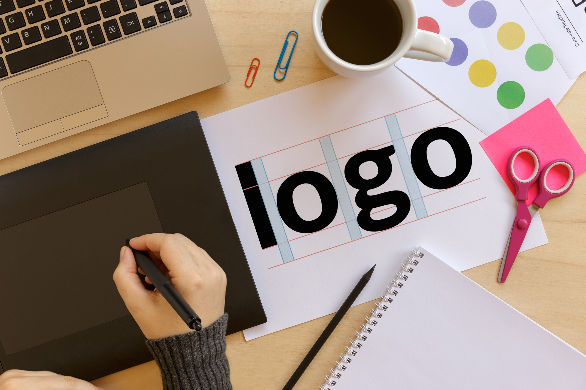
Choose Your Typography
If you decide to use lettering in your logos, it’s important to choose your font carefully. Will you use a serif or sans-serif font? Will it be bold, thin, or italic?
Also, whatever font you choose for your logo, carry this font across other branded materials. The same or similar font should be used for advertisements, publications, etc.
Specify How to Use Variations
Sometimes, companies have multiple variations of a single logo. Maybe there is one version with the icon and the company name, and another version with just the icon. Or, maybe there is a version in one color, and another in a different color.
Having these variations is acceptable, provided that you are consistent with how you use them. For instance, you may indicate that the icon-only logo is okay for internal communications, but the full logo must be used for external ones.
Put Logo Guidelines to Work Today
With these factors in mind, you’ll be able to design a logo that you can use on multiple platforms to reinforce your brand.
Ready to get started putting these tips for logo guidelines to work for your own business? Use our free logo maker today to design the perfect logo for your family.


