15 Tips for Designing a Quality Logo
Posted on May 18, 2018 by Logo Design Tips and Tricks

You might think that coming up with a logo that will help cement your brand’s voice is easy. Like most people, you probably think that all you need is to select a fancy color, draw a circle or square, type in your brand’s name, and call it a day.
You’re wrong!
Designing a quality logo that speaks of your company’s culture and values is not easy. It’s a process with many pitfalls, and one mistake could cost you huge amounts of money and your loyal clients.
But worry not; we have a guide that can help you come up with a unique, memorable logo for your brand.
Here is the guide.
1. Know What Your Brand Stands For
Before you think of the colors, fonts, and text you’ll use to create a logo, think about what your business stands for.
Ask the flowing questions:
- Why did you start the business?
- What solutions do you offer?
- What makes your business unique?
The answers to these essential questions will help you know what your business stands for. This will make it easy for you to figure out which colors, fonts, and texts will help you come up with a relevant logo.
2. Know Your Target Audience
You should also take some time to learn a few things about your target audience. Make sure you know their gender, age, where they live, their hobbies, income, and why they like your brand.
Knowing these things will help you identify the techniques you’ll use to create a logo that your audience will actually like.
3. Simplicity Results in a Quality Logo
Think that coming up with a complicated logo will help you stand out?
Well, think again. The logo you come up with should be simple. How do you tell if a logo is simple or not?
Well, a simple logo should have a clear brand’s message. If it takes a college degree to understand the message in your logo, it’s too complicated. Change it!
A simple logo should also be easy to remember.
Do people remember the details in your logo? If they can’t, there’s a problem with its design, and you should do something about it.
A simple logo should be easy to use in all media. Can you use your logo in any media including promotional gifts, signs, web, and embroidery?
If you can’t, go back to the drawing board and make it simple.
You can find some examples of bad logo designs here and learn a few things from them.
4. Ensure Your Logo Is Flexible
One of the biggest mistakes people make when coming up with a logo is creating a rigid logo.
Don’t make this mistake! You should note that your business is moving forward, and you might introduce new products or services in future.
Your logo should, therefore, be flexible. It should represent your company’s future needs, not just the current ones. It should also appeal to different audiences, not just your target audiences.
An effective logo has to be dynamic!
5. Avoid Trends
Yes, following trends can help your company win, but not in the world of logos.
There are numerous articles that say that logo designers should incorporate modern trends in logos. The reasons these articles give are quite compelling, and you may be tempted to incorporate a current trend or two in your logo design.
But don’t be misled!
Incorporating trends in your logo design will not make you stand out. It’ll only make you look like everyone else. You want to stand out, right?
Be timeless and avoid trends. Avoiding trends does not mean you should not check out the hottest, latest logo trends, no.
Take some time and study the trends. This will help ensure you don’t use these trends in your logo design by mistake.
6. Make Use of Online Tools
Need some inspiration when creating your logo?
There thousands of online articles that you can read and find the inspiration you need.
Want to create a logo but don’t have the skill or experience?
Well, worry not. LogoMaker can help you create a unique and memorable logo. It’s quite effective and easy to use.
7. Avoid Stereotyping Logo Designs
This is another common mistake that even the most experienced, well-trained logo designers make.
Using a common logo design may give you a beautiful logo but it won’t help you come up with a recognizable logo. It’ll only make you look like everyone else.
Don’t fall into this trap!
For instance, if you’re planning to come up with a flower delivery company, don’t include color red or a flower in your logo. That’s a stereotyping logo design.
Be different.
Create a logo that will make people think about your brand even when it does not contain your company’s name.
8. Utilize Double Entendre
Double entendre is a fancy technique that helps logo designers make a logo that has two pictures wrapped into one.
If used correctly double entendre comes off as a clever and memorable design option.
You should note that people love mind games. Using double entendre will, therefore, you help capture people attention.
This technique will also make people appreciate your logo even if it’s simple.
9. Make Sure Your Logo Tells a Story
Your logo should tell a story.
It could tell a story about your culture, your products, or what you stand for; just ensure the story is interesting and unique to your company. If possible, your logo should have two stories: the obvious one and the hidden one.
You might be thinking, “Why should a logo tell a story?”
And that’s a valid question. Stories activate people’s minds and make them more attentive. They also improve our retention for information.
Therefore, if your logo tells a story, this will help capture people’s attention, making it easy for you to tell them about the solutions you offer.
Also, if you show your audience that there’s something more to your logo, they’ll view you as an expert.
Simply put, ensuring that your logo tells a story will help introduce your brand to the world in a unique and memorable way.
10. Pay Attention to the Color in Your Logo
The colors in your logo should have a meaning and should tell us more about your company and the solution you offer.
Take some time to find out which colors match your brands’ needs.
If you don’t know, colors have meanings. For instance, if you use bright colors in your logo, this will portray your business as future ready.
Make sure the colors you use in your logo represent what your brand really stands for.
If you use colors correctly, you’ll be able to create a great first impression. People will also want to be associated with your brand.
11. If You Don’t Know How to Use Clip Art, Avoid It
Clipart can help make a logo more clear and recognizable.
But let’s face; not so many people know how to use clip art. This explains why most clip art logos are painful to look at.
If you don’t have the skills to use clip art, don’t use it. If you use it, your logo will look cheap and careless, not to mention that it’ll be difficult to use it in different settings.
12. Ensure Your Logo Speaks of Professionalism
Don’t compromise your brand’s work ethic by coming up with an unprofessional logo.
Your brand image can have more influence on your success than you may think. Ensure it speaks of professionalism.
How can you do this?
Well, just follow the following rules:
- Make sure you create a logo that looks attractive.
- Ensure your logo is sending the right message.
- Think about the reputation of your brand when coming up with your logo.
If you follow these three rules, you’ll be able to come up with a logo that shows your company is made up of professionals.
13. Choose Your Typeface Carefully
There are many typefaces that you can use in your logo. You should, however, note that some typefaces are more efficient than others.
Serif and sans-serif are the most common typefaces used by logo designers.
If you’re not an experienced designer, you should stick to these typefaces. However, if you are an experienced designer, you can incorporate decorative and script typefaces in your logo. They’ll help make your logo more unique.
The problem with most decorative and script typefaces is that they can be hard to read when put on smaller screens.
14. Be creative
Creating a nice logo is not all about using the right font, avoiding trends, and embracing professionalism. It’s about creating a logo out-of-the-box.
Think creatively. Being creative will help you create a logo that communicates with your target audience at a personal level.
It will help you create something that has never been seen before, making it easy for you to stand out.
15. Don’t Expect Instant Success
Top brands like Apple, Nike and Coca-Cola have iconic logos. These companies started small before they became the brands they are today.
Even if you have designed your logo using the most beautiful fonts, and text, your logo won’t become an instant success.
Be patient and don’t rush to make changes just because your logo hasn’t attracted the attention you expected.
Wrap-up
As we mentioned earlier, designing a quality logo is not easy. It may be confusing, difficult, or seem impossible.
However, if you follow tips discussed above, you can be sure that the process will easy enjoyable and successful.
You can visit our blog for more informative articles on this and other interesting topics.
8 Social Media Solutions for Your Logo
Posted on May 16, 2018 by Logo Design Tips and Tricks
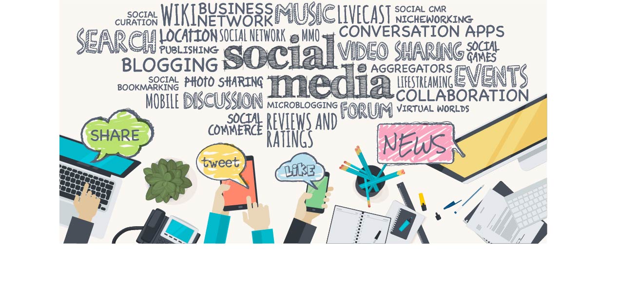
Your logo should be social media-friendly. Here are social media solutions for your logo that you can use.
Your logo is the face of your company. If it’s catchy enough, it will create a positive impression and stick in your customers’ heads.
You, too, can share your logo on social media with the world. It’s not too much to ask.
Here are 8 social media solutions for your logo:
1. Have a Symbol-Only Version of Your Logo
So you’ve come up with a beautiful, dynamic logo. Now, it’s time to simplify your logo into a symbol.
Having a trademarked symbol makes it easier to share on social media.
You can use the symbol as a social media profile picture. Meanwhile, you can use your bigger, non-symbolized logo as a cover photo.
Your symbol can resemble your photo or look entirely different. However, it’s best to leave “hints” of your logo in the symbol so people can recognize both.
When creating images of your logo, keep the following in mind:
2. Use PNG Logo Files
You want your logo to show up clearly at every size. Using PNG logo files is important.
PNG files are easier to resize. These images do not get all pixellated and distorted when resized.
JPEG images are no good for logos. They tend to get pixellated when resized.
You want to keep the social media platform in mind when uploading your logo onto it. No matter what, always do the following:
3. Stay Consistent: The Most Important of Social Media Solutions
Consistency is important. You should be using the same logo for all social media channels you use.
Be sure to keep your logo the same, color scheme and all, across all social media platforms.
You should also use the same fonts and sizes for your logo on every social media platform.
Be sure to position your logo the same way in all of your images. This will help you claim the image as belonging to your company. The social media user will make the connection quickly.
You want customers to draw a clear connection between your brand and the logo. Using different logos for different social media outlets will only confuse your customers.
Speaking of consistency, do the following as soon as possible:
4. Test Across Devices and Social Media Platforms
You should be testing out your logo on every social media platform you use. You want to know how it looks so you can confirm your logo’s appearance on every medium.
You’ll also want to test out your logo on your mobile phone as well as a regular computer. You want to make sure your logo is flattering everywhere it’s posted.
Send your logo to your friends and ask their opinion on it. A little bit of honesty can go a long way.
If you didn’t use a PNG file, your logo might look slightly different on different social media platforms. It might also look different on the web or mobile versions.
5. Get Creative With Fonts
Creative fonts help your logo stand out. These fonts can be so unique, they’re connected with your brand alone.
The fonts you choose convey messages about your brand. Your font should never be too hard to read so people can pick up on these messages.
Choose no more than three fonts and use them in your social media profiles. This helps your customers recognize your brand easier.
For more recognition, use the typeface most commonly associated with your brand. Your logo is counting on it.
Your fonts aren’t the only thing you should pay attention to:
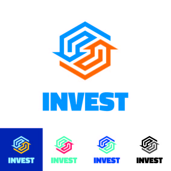
6. Use Your Brand Colors
Your logo design should contain your brand colors. These brand colors make a statement on your company’s behalf. They convey the personality of your company.
You should choose two to four colors and work with them consistently. This will help your brand stand out. Study the psychology of color and learn about how colors evoke certain emotions or thoughts.
Your social media profile should also integrate these colors. This helps social media users make the connection between your brand and the content they’re looking at.
People will judge your company by the colors it uses. According to one color marketing study, around 90% of the snap judgments people make about your products and brand will be based on the colors you use.
You should be using these colors in ways that make them stand out on your profile and your logo. Incorporate these colors into the images you share on social media. That will also help social media users make the connection between your brand and the content.
7. Take Advantage of Catchy Images
Edit your logo onto images that your audience will remember. Pictures of people wearing your logo, your products, or scenic surroundings are especially popular.
Using visuals is one of the social media solutions that are necessary for social media success. You want as many people to like and share your content as possible. Using catchy images makes this more possible.
Social media posts with visuals get 94% more shares than social media posts without it. It’s important to incorporate your logo into images whenever possible.
You can use different images for different social media platforms. However, make sure all the images fit your brand. Incorporate your logo or your brand colors for increased brand recognition.
Be sure to pay attention to the colors of the images you use. Vibrant colors pop out and attract more people. Black gives your brand a more sophisticated feel.
8. Make Your Logo Available On Every Social Media Platform
This is the most straightforward of the social media solutions here. You want your social media presence to be as big as possible. Your logo should be highly visible on all of them.
When people search for your company, they should be able to see your logo immediately. Your logo is one of the first impressions they’ll make of your brand.
Set your logo as your main profile picture on all social media platforms. This will help social media users recognize your brand and the official account you’re using.
Your company should establish official accounts on Twitter, Instagram, Facebook, Pinterest, YouTube, and more. All of these accounts should be updated regularly with fresh content. Your logo should be placed wherever possible.
Add personality to your social media posts. Don’t make your posts sound too corporate or impersonal. You can do this while sneaking your logo into the post with an image.
Use Your Logo Wisely
Your logo can take you far in the world of social media. These social media solutions will help you share your logo and your brand with the world.
With social media, your brand and business can expand beyond your wildest dreams. And it all starts with your logo.
5 Questions You Need to Ask Yourself When Designing Your Company Logo
Posted on May 14, 2018 by Logo Design Tips and Tricks
In 2013 there were almost 28 million small businesses in the United States alone. With so much competition, how can your company stand out from the crowd?
One of the best ways is through a strong company logo that conveys a specific message about your brand. But it can be hard to know where to start when it comes to designing your logo.
That’s why we’ve compiled the 5 questions to ask when designing a logo for your company!
Check them out below.
1. What Type of Logo Do I Want?
Let’s start with the basics. Your first step in designing your logo is to think about what kind you want. Keep in mind that there are a lot of different types of logos.
Here are some of the most popular categories:
-
Letterform. These are logos made up one single letter. McDonald’s, Honda, and Uber all use a letterform logo.
-
Wordmarks. These are words or abbreviations that make up a logo. Basically, a wordmark is when a company name is spelled out. Some examples are CNN, Google, and HP.
-
Characterization. This category includes a mascot that represents your brand. Geico and Progressive both do this in their marketing.
-
Pictoral. Pictoral logos utilize imagery, either literal or representative. A few examples are Apple, Starbucks, and Twitter.
-
Abstract. These include images or graphics that don’t represent anything recognizable. Think Sprint or the Nike swoosh.
So how do you pick? Well, there’s no one rule to follow. Remember, this is an art! But there are some general tips you could consider.
If you have a short and memorable name, a wordmark is a great logo type. These are typically the easiest to understand for consumers, especially if your brand is new.
An abstract logo can be very powerful, especially if it mirrors your brand’s personality, but they usually take longer for your customers to understand. Your consumers might need to see it multiple times before grasping the idea or recalling it.m However, when they do, it can be very powerful.
2. What Do I Want to Communicate through My Logo?
No matter what, you want your logo to provide an immediate sense of who you are as a company. It should convey your brand’s personality and give a little insight into the type of business you are.
For example, think about this. Is your company fun, energetic, and youthful? Or do you want to portray an image of seriousness, depth, and years of experience?
Your logo leaves an impression on your audience the second they see it. You want your logo’s communication to align with the attributes of your company, products, and services.
You also may want to send these messages:
- Your company and products unique
- You are a professional and trustworthy organization
- You are successful
- You’re different than your competitors in a key way
3. What Colors Should I Use?
Color choice is a crucial part of logo design. This is because different colors can send various messages. There is even a whole area of marketing dedicated to understanding the psychology behind color.
Think about some logo examples for a moment.
McDonald’s, KFC, Wendy’s, and Dairy Queen all have predominantly red logos. Pizza Hut, Arby’s, and Burger King have a lot of red in their logos as well. How come? Red is known to be stimulating, exciting, and associated with activity.
So when you’re driving down the road, looking for a fast food restaurant, the hope is that red will catch your eye and be stimulating to you so you will decide to eat there.
Yellow, on the other hand, is known to be happy, energetic, and even fresh. Subway uses this in their marketing with their image of freshness in a crowded fast-food marketplace. Blue is associated with calmness and reliability.
Do research to see what you think your target market will relate to. Remember, there are differences in color preference between ages, genders, and generations.
4. What Fonts Should I Use?
Fonts are another important part of the equation. Just like colors, fonts can convey certain emotions and give distinct impressions.
A toy store is going to want to use a whimsical, fun font that displays youth and is inviting to children. A surgical center for adults, on the other hand, will probably want to convey reliability and expertise with a strong, straightforward font.
Think about your brand’s personality. If you haven’t done so already, take some time to think of the top 5 adjectives you want to describe your company. Then look online for fonts that match up.
You can also use more than one font in your logo, but keep it limited to two. You don’t want to go overboard and make your logo look unorganized or cluttered.
5. What Mistakes Should I Avoid?
When it comes to logo design, there are some common mistakes that you want to avoid at all costs.
First of all, make sure you differentiate yourself from your competitors, especially if you only have one or two. It’s best to go in a different direction as far as type, color, or font.
The last thing you want is for your target market to confuse you and a competitor. Instead, try to stand out.
Also, think about the different places you will use your logo. You’ve probably thought about your logo on paper or in the top corner of your website. But where else will you potentially use it?
Consider how it will look on various types of marketing materials, such as:
- A billboard or other large-scale ad
- Your different packaging materials
- Screenprinted on a t-shirt or hoodie
- As an app icon
- In a square or circle format for your social media pages
Final Thoughts on Questions to Ask When Designing a Logo
Now that you’ve thought through these questions to ask when designing a logo, what’s next?
It’s time to get started! Begin thinking through your ideas and brainstorming potential options.
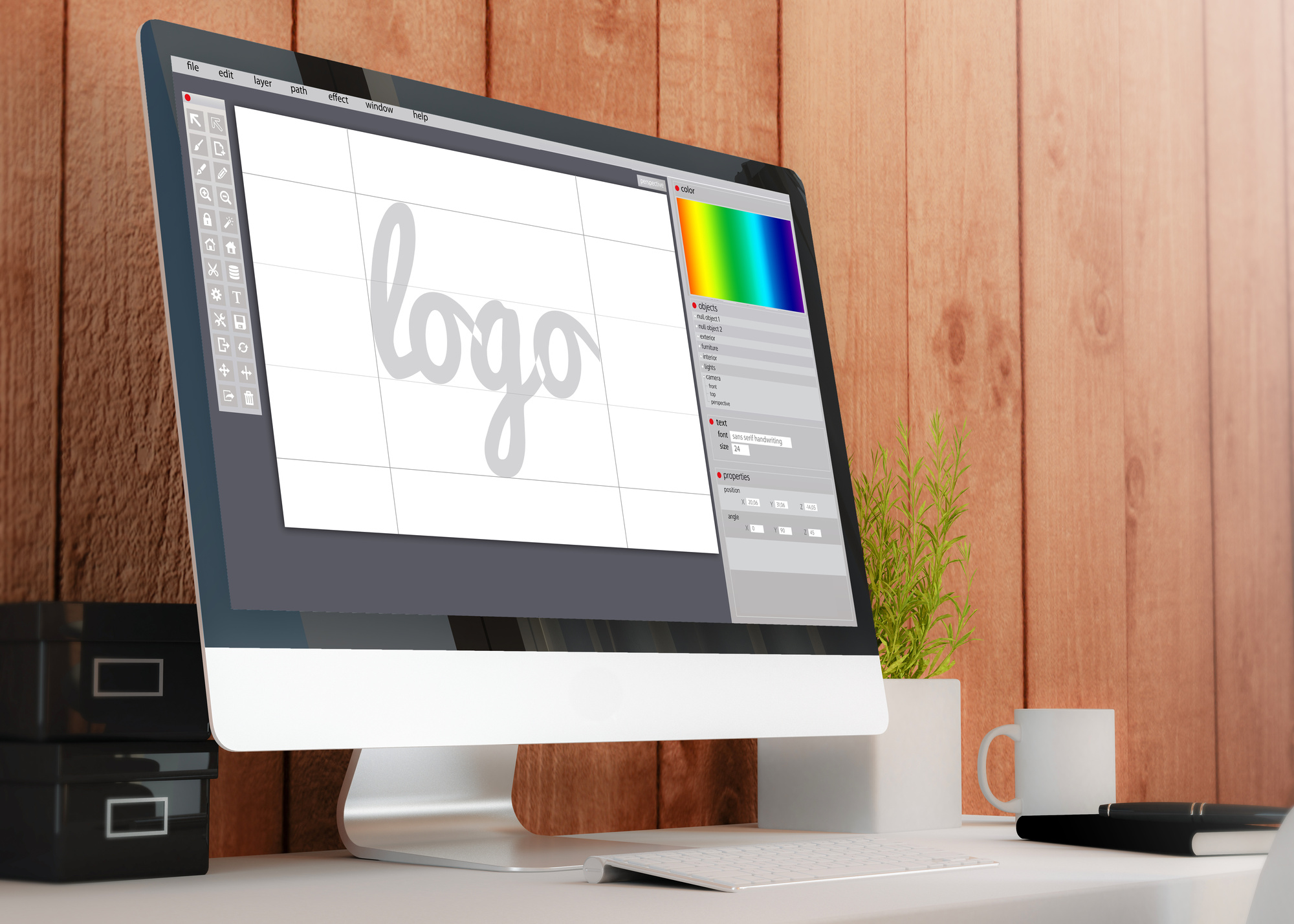
And if you need a free, reliable software to create your logo, check out our logo maker. We’ve helped millions of brands make beautiful logos over the years.
7 Examples of Bad Logo Design We Can All Learn From
Posted on May 10, 2018 by Logo Design Tips and Tricks
With your brand competing against thousands of other companies in your industry, your logo means more than you know. Your colors, images, graphics, fonts, and more determine the overall success of your business.
But sometimes, you encounter a bad logo (or, worse, your logo leaves much to be desired). Even some of the world’s leading brands are guilty of bad logo design.
Avoid this bad branding by steering clear of these damaging mistakes with your company logo.
1. Starbucks, 1971
Starting off with one of the worst logos in recent history, Starbucks has come a long way since their inception.
Long before they were the biggest coffeehouse chain in America, they were a simple coffee bean retailer. That didn’t stop them from scaring the heck out of customers with their ugly brown mermaid selling coffee, tea, and spices. There was also a brown belt behind the logo, so it looked like they had the championship belt in the Bad Company Logos division.
Thankfully, when they implemented espresso drinks on their menu they rebranded, saying goodbye to the brown and the portly mermaid for a simpler one. Make sure your colors evoke better emotions than brown. Plus, don’t have characters or graphics that scare the wits out of your audience.
2. Pepsi
Now you might be thinking, “These guys are world-famous! How could they possibly have a bad logo?” To which we say, “You haven’t looked at it long enough.”
In fact, you can use the logo as a way to curb your appetite for a sugary soda. On par with what will happen to you if you consume their drinks, Pepsi’s red, white, and blue logo gives the slight appearance of a fat person.
You read that right: Put a head and arms in the red, legs in the blue, and a belly button in the white, and you have a cute fat guy with his stomach protruding from his shirt. While they aren’t keeping any secrets from the public, perhaps it’s best to keep your logo from any negative connotations.
3. The 2012 London Olympics
By far one of the worst logos ever created is not by a company, but by an event.
Back in 2012, London was honored with hosting the Olympics. They took this honor and consequently flushed it down the toilet with their horrendous logo. With zero of London’s famous landmarks, as well as backlash for looking like a distorted Swastika (or something even less savory), the logo was a complete flop.
Instead of using abhorrent typography and ambiguous shapes, make your logo as clear as day. As we can see, room for interpretation is not always the best for your brand.
4. Microsoft Bing
We’ve never met a Microsoft logo we did like. Bing, the search engine nobody uses and never will, is no exception to logo failure.
In 2009, it received the award for “worst-designed logo of the year,” and with great reason. The typography is an absolute eyesore, the colors are unattractive, and the overall unprofessional appeal would be why nobody uses Bing.
Typography and color are major factors in brand logo success. Do research to find what your industry and competition use, as well as audience testing, to figure out what emotions work best for your brand.
But, for everyone’s sake, be the opposite of Bing.
5. Flightning
Odds are, you’ve never heard of this company. And a quick search online turns up zero results for a company with this brand name. Maybe that’s because their logo was straight up awful.
Stating the obvious, this is a deliberate mockery of both Facebook and Twitter. Whoever developed this logo gives a whole new meaning to lazy; the “f” has the same typography as Facebook, the outline of the square too. The color seems to be a blend of the two social media monsters, and the only real difference is the “f” is at an unfortunate angle.
Perhaps the “f” is pointing down, as in “this ugly logo should be burned to the ground.”
Don’t make a cheap imitation logo. Be original and unique.
6. British Telecom
There must have been a mistake or lack of communication with this terrible logo. Ugly doesn’t even cut it with British Telecom, or “BT.”
Apparently, the company has altered their logo a whopping four times in the past 30 years. This is not good for any brand.
The abbreviation isn’t the problem, per se. What is a problem is the color…or, colors. BT is in a sans serif typeface, splashed with a potent combination of red, pink, blue, and green.
Ever heard of a successful company with that kind of color wheel? Yeah, we haven’t either.
This goes against what’s known as “inherent logic,” which is immediately understanding or “getting” what the design is trying to accomplish. With BT, it’s anyone’s guess what they’re attempting to convey.
To curtail bad branding, have a logo that people can comprehend and do NOT mix colors that have no business being mixed.
7. Bodega
Woof. Startups have a tough time as it is with getting adequate funding and quality design, but dang, Bodega was way off with their bad logo design.
It’s rather unfortunate: The Spanish meaning of “bodega” is a small Hispanic grocery store, or essentially what Bodega the company is trying to get rid of. Using a cat as part of their logo throws this gentrification mission in the face of immigrant-owned establishments.
This is, quite frankly, irresponsible and culturally insensitive.
We hope this goes without saying, but never ostracize or mock any race, gender, nationality, or disability in your logo. Excluding people with your bad logo is a one-way ticket to declining business.
Don’t Fall Victim to Bad Logo Design
As you can see in these seven examples, having a bad logo is quite common. The only way companies can salvage their brand reputation is by continuously improving their logo design.
Make sure you aren’t advertising an ugly logo by keeping updated with current trends, doing market research, and basically having some common sense.
If you have a bad logo design and need help establishing your brand as an authority, check out our sleek and simple Online Logo Maker tool.


