How to Incorporate Negative Space Into Your Logo
Posted on July 22, 2018 by Logo Design Tips and Tricks
The popularity of reality-bending films give us some clues about people’s interests. Films such as The Matrix, Inception, and Doctor Strange present questions about what is known and what lies beneath.
We become engrossed in talking about concepts of what we see as well as what we don’t see.
When you face the challenge of catching in a potential customer’s mind you want to find a way to front-load and backdoor your message at the same time. You want something that catches the eye immediately.
However, adding in something that takes a minute to reveal itself provides added reinforcement.
For the front-loading, we’ve been coming up with shapes and objects to accomplish that for a while. We know logos have some profound impact on consumers.
For that backdoor into consciousness and lingering appeal, we need to go further into visual psychology with negative space logo concepts. How do you use them in your design? Read on for everything you will need to get started.
Negative Space Logo Design
Negative space design broaches into realms of mysticism. The principles of light and the functioning of the visual cortex play their part in how images are produced.
The interpretation and the fascination we have with them comes down to that gap left for transcendent ideas.
We get a charge out of that ah-ha moment when we notice something that was always there, but not readily apparent. Despite ourselves, we like to both learn and grasp hidden concepts.
So, you may be asking “What is negative space?” Let’s start with that and get you grounded so you can explore the limits of perception.
Go Negative
In a certain sense, negative space is the area between other images. Think of a photographic portrait. The foreground contains the person and the background is usually neutral to not steal focus.
Negative space is that gap between the two components of the image. When no background exist and it is flat, that whole area becomes negative space.
There’s some interesting psychology around what we do and do not see in an image. When negative space is present it can lead us to see something in the nothing between.
Consider the original work of Frank Miller’s Sin City. Instead of drawing in black ink on white paper, he inverted the image by drawing with white ink on black paper. It gives the work a remarkable finished emotional depth.
Which leaves us with the concern of how to create a negative space logo. Start by thinking outside and inside of your boxes.
Be Clever
Utilizing negative space when creating a logo requires you to think about both the seen and the unseen. Modern graphic design programs make this somewhat easier than the mind-bending feats of the past.
Consider how the layers in such a program can be placed on top of or underneath each other.
Get clever in placing an image within the shape of a letter o the gap of that letter. Shapes like R, P, and A offer a lot of room to tweak and create a secondary image.
Letters make for good places to manipulate negative space for two reasons. First is that using lettering in logos has a solid track record of efficacy. Second, humans recognize the basic shapes of letters and scan and identify them quickly.
This is part of the basis for how fonts work in the first place. A font takes the basic shapes of letters and changes them. They do so to invoke emotional responses or enhance readability at different sizes.
Different typography allows us to shape a message to be friendly, evoke a sense of unease, or build confidence.
Think Cookie Cutters
When trying to spot logo negative space opportunities, it is best to think about cookie cutters. The shape of the plastic or metal outline creates a negative image.
The space in between, the cookie, can be thought of as the positive space.
As you cut through the dough and pile up your positive shapes, you may notice that the area left sometimes resembles other shapes. This kind of overlapping provides another way to use negative space.
Another classic example is the yin-yang symbol. What exists on one side is seemingly taken out of the other.
A logo can benefit from similar mirroring and enhance its impact. The logo enhances a component by removing it from the positive space and representing it in the negative.
Lurk From the Shadows
Another trick in the box of how to use negative space is shadow enhancing. Much like Frank Miller did with Sin City, reversing the expectations and paint with the white to make the black disappear.
Shadows provide the most black and white way to see negative space. When you see a shadow in the world, you can get an idea of the shape casting the shadow because the shadow resembles, in part, the object.
Shadow puppets work by blocking light and creating an image. You may not have known you spent your childhood figuring out negative space, but there it is.
Creating a negative space logo with shadow effects creates a 3D illusion. It works the same way that drawing a 3D cube on paper does. We imagine what cast the shadow and we ‘see’ that object next to it.
The interplay of shadow and foreground also has a specific psychology to it. We tend to think of things in strict positive/negative of black/white as being serious or professional. It works much like the emotional attachment we have to colors.
Shadow doesn’t have to be only black and white. Two mixed colors can work just as well. The idea of shadow is to represent the quality of blocked or cast light.
Make It Yours
It can take a little bit of time to catch on to the interplay of elements in a negative space logo design. That same difficulty in creating the logo is part of what makes it effective in lingering with consumers.
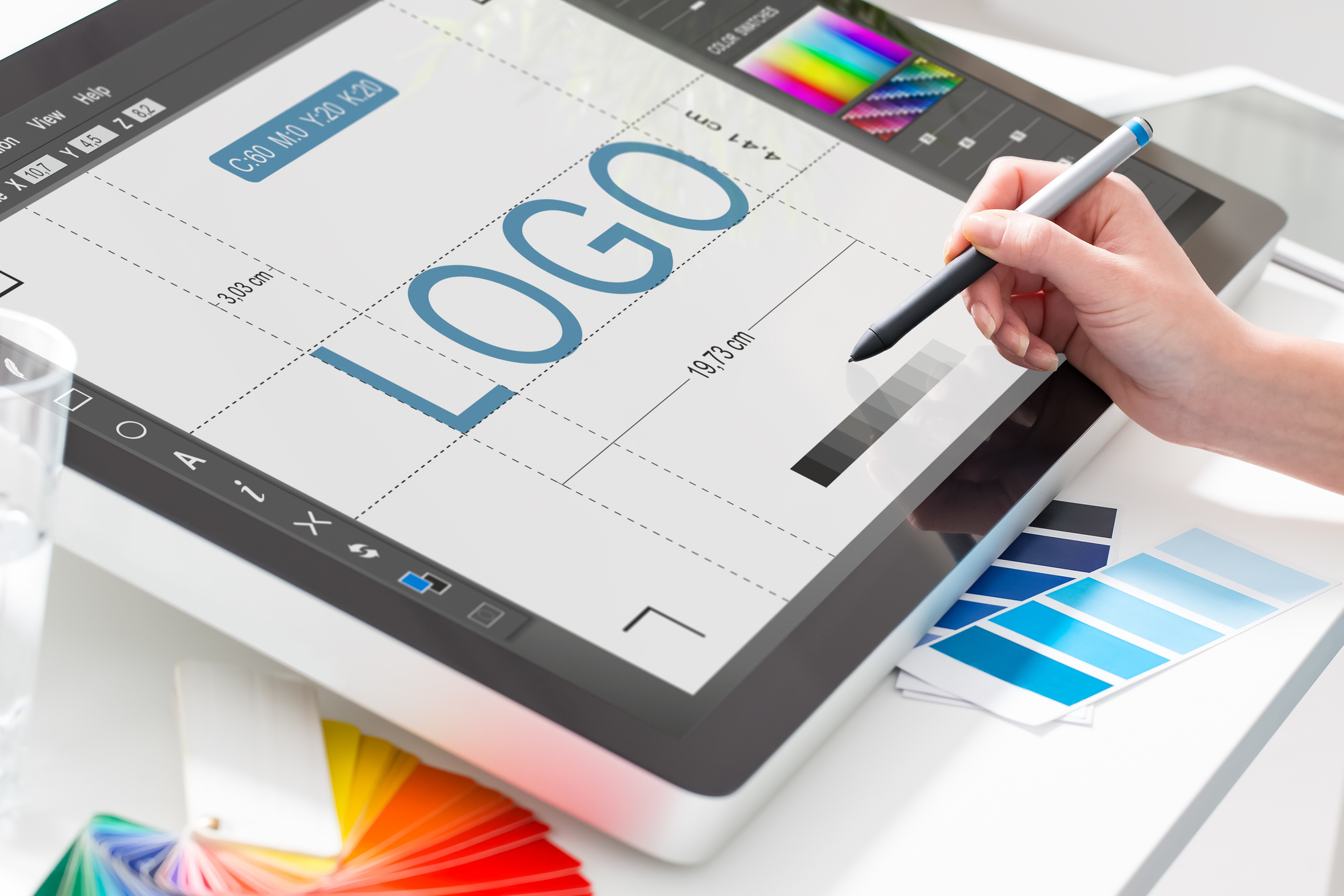
Looking to get started in designing a logo now? Check out our tutorial to learn more about logo design step by step.
The Not-Photoshop Way to Design a Logo
Posted on July 18, 2018 by Logo Design Tips and Tricks

Logos are expensive.
Graphic designers make good money using the tools of the trade to make a logo for your brand. And they should.
After all, they are signing over the intellectual property that will hopefully propel your business into branding success.
Your logo is the face of your brand, but some people can’t afford to hire an expensive graphic artist.
For those people, the idea of learning Photoshop and paying for a costly subscription may not be the best solution.
Luckily, there are alternatives that are not Photoshop, and that’s what we will discuss here.
1. Choose an Online Logo Maker
There are a number of online logo tools to choose from, we recommend ours.
Using OnlineLogoMaker, you have access to how to’s and tutorials that will help you craft your logo in no time at all.
All you need to do is register for an account with your name and email and get to work on the logo that will drive you to brand recognition in no time.
We even offer support, so you don’t have to go it alone should you get stuck on a project. That’s why we are the best program to make a logo.
Steps to Using OnlineLogoMaker
Here’s how to use OnlineLogoMaker to increase your brand presence:
- Navigate to http://www.onlinelogomaker.com
- Register for a free account or log in
- Select Create a New Logo
- Start drawing
Getting a professional logo has never been easier.
2. Hire From Fiverr
A great option for those seeking an inexpensive logo without the Photoshop skills is to hire a freelancer on Fiverr.
Sometimes this results in outsourcing work to other countries, but with many options to choose from you can find a designer that understands your vision.
The great thing about Fiverr is good designers get a lot of work, and therefore have a lot of reviews. You can see, in advance, if you’re partnering with someone who is likely to deliver.
With prices starting around $5 for a logo design, it’s going to be your most hassle-free bet.
How to Hire a Freelancer
Use Fiverr to find the right person for the job!
- Go to Fiverr.com
- Type ‘logo design’ in the search box
- Select a designer in your price range with lots of positive reviews
- You’ll be prompted to create an account before purchase — Bonus: it’s free to create
Don’t miss out on professional design services when a new logo is at your fingertips.
3. Look For Free Alternatives
Through the advent of web applications, there are a number of Photoshop simulators and alternatives to buying the program itself.
These differ from online logo makers, which tend to be more simplistic because Photoshop simulators offer a number of robust features for savvy users.
These can be used to make everything from logos to marketing materials, ads and more. But be careful, because they do tend to have a learning curve.
How to Find the Right Not Photoshop Simulator
If you’re looking for something with all the capabilities of Photoshop, follow these steps:
- Navigate to Google
- Search “Photoshop Simulator”
- Select from products available
- Choose a simulator that you like
- Start a design
Photoshop simulators have many tools, like retouch and smudge tools. And they use layers to create unique vector images for those seeking a new logo.
4. Find a Logo Mobile App
Depending on what phone you use, your mobile app store likely has logo design tools available for your consumption.
Just navigate to your app store and type in “logo design” to see what’s available.
These range in price from free to a couple of bucks. Some will have in-app purchases, like templates, that might offer a design you fancy.
Generally, this is a cheap and easy option for getting a logo made to be visible online. But to ensure your logo has the print quality you desire, you are likely better off using one of the other tools mentioned above.
What to Look for in a Mobile Logo App
These may seem like a dime a dozen, focus your search around:
- The option to create high-resolution images suitable for print
- Lots of free or inexpensive template options
- Full range of colors and design choices
They have an app for that! Using a logo app makes logo design attainable for small businesses and freelancers.
5. Focus on Minimalism
Minimalism is all the rage. That’s a good thing for those seeking how to make a logo design without Photoshop.
It’s okay to follow the rule of “K-I-S-S”:
See what we did there? We think you’re smart for wanting a simplistic logo design. And graphic designers might agree, considering minimalist logos are on the rise.
Minimalist Design Pillars
The minimalist principles of logo design include:
- Simplicity
- Selective typography
- Strategic use of whitespace
- Attention is given to the design proportion
- Make it memorable and timeless
- Keep it clean
With these pillars in mind, you can draw up a logo design in no time.
6. Take Google Drawings for a Spin
If you’ve had to work collaboratively at all recently in your career, odds are you’ve used Google apps.
A new tool launched by Google called Drawings helps users like you define your brand.
Using Drawings you can do some of the same things as Photoshop but in a more simple format.
As a logo tool, Drawings allows you to select and arrange fonts and shapes to create simple designs. You can add and change colors, select photos, or free draw.
How to Use Google Drawings
Here are some quick tips for effective use of Google Drawings:
- Log into your Google Account
- Select the Google Apps Logo and click on Drawings
- Familiarize yourself with the icons in the toolbar
- Use the toolbar to begin your design
For those already familiar with Google Apps, a big bonus to using Drawings is the resemblance to other Google tools you’ve already learned.
If Not Photoshop, What?
Gone are the days where business owners have to ask, “If not Photoshop, then what can I use?”
There are a lot of good, free and inexpensive options for small business owners looking to get a great design.
These include mobile apps, web apps, Google apps and more! For other great tips on how to brand your business, visit us here.
5 Benefits of Putting Your Logo on a Vehicle Wrap
Posted on July 17, 2018 by Logo Design Tips and Tricks
With the average small business spending nearly 10% of their annual revenue on advertising, you could be looking at a significant investment with unknown returns.
If you’re worried about how much you’re spending on advertising, a vehicle wrap might be able to fill in some gaps where spending would be. When you choose to wrap your vehicle in vinyl lettering, you get serious benefits in your advertising arsenal.
Here are 5 reasons to consider vehicle wrap for your car or truck.
1. Billboard Wherever You Go
When you pay for a billboard, you’re suddenly going to turn your boardroom into a war room. You’ll be looking at maps as if you were a general at war. You’ll be looking for the places where your brand name will have the biggest impact without stepping into market saturation or the wrong demographic.
One of the biggest benefits of a vehicle wrap is that you aren’t tethered to one spot. Rather than having to put all of your chips on a single location, a vehicle wrap allows you to be as nomadic as your audience is. No one stays in one location for too long anymore and neither should your brand.
Your vehicle wrap is a moving billboard that can be parked anywhere you please to get the effect you want. If you’re having a regional promotion, you can park your logo wrapped vehicle in a spot where you’ll get all the eyes you need.
Enlist friends, colleagues, and other businesses to loan you a spot on their lawn to promote yourself. Your billboard can be dropped off and picked back up whenever it needs to be. If you can get a little time during rush hour in a high traffic area, you could end up seeing a surprise spike in business.
2. Brand Awareness
People need to see or hear a brand’s name three times before they remember you. If you’re driving around with your brand name wrapped on your vehicle, you’ll have a much easier time letting people know about you than if you were in one spot. Your logo emblazoned vehicle could drive by people three times in a day, thinking you had more market saturation than you really have.
Vehicle wrap helps to remind people of your brand when they might not be paying attention. Their minds could be wandering during their drive home from work and they would need to pick up your products or call you for an appointment. Driving past your vehicle, they’ll be quickly reminded and they’ll make a call to seal the sale.
Brand awareness is a complicated dance you do with your customer base. Telling them about your brand over and over can be exhausting to the point that they might not want to do business with you. But as that’s unlikely on the average small business’s budget, you can rest assured that if you make the effort to put your name out there, it’ll resonate.
3. Let People Know What To Expect
When people see your wrapped vehicle in the parking lot as they pull up to a trade show or event, the hair on the back of their neck might stand up. They might be driving to the mall having an unpleasant day and then when they see your logo in the distance, their eyes might light up.
Knowing that the quality that your products provide is on site with them might turn their day around.
When people get to know about your brand and what you have to offer, they’ll be over the moon to see that they have a chance to talk about your products. If you sell at trade shows, events, or community fairs, you could hype up your audience by having your wrapped vehicle nearby. Rather than hide it somewhere in the parking lot, find a nice open spot to place your car in so that people can see your vehicle from off in the distance.
With your quality on site, your customers and clients know they’re in for a treat. If they’ve got friends with them, they’ll alert those friends about what they’re going to be experiencing with your products.
4. Attention is Important
When you have brightly colored vehicle wrap marking your car, your company’s vehicles stand out from the other cars that are passing on the street. Drivers who might otherwise ignore a plain white van will be wowed by the attention that you attract to your wrapped car.
If you take the time to get your wrap designed by a talented local designer, you could end up hitting the road with a piece of art.
Depending on the types of vehicle you own, you might attract a whole new audience. While people might associate your brand with something that’s not for them, if they see your brand wrapped on a vehicle they admire, it could be interesting.
They might decide to strike up a conversation with your salespeople when they would otherwise have ignored your brand altogether. Let’s hope you’re ready for all the gearheads that your vehicle might attract if you pick the right one.
5. The Perfect Balance
Vehicle wrapping might be one of the best ways to advertise because you get the perfect balance of ad styles. You get to be somehow both in your customers’ faces while not being all that aggressive. You won’t be making a hard sales pitch but you’ll be taking up space in the front of their mind.
One of the reasons that no one ever brings up issues with vehicle wrapping as visual pollution or noise in the landscape is that it’s pretty innocuous. Check out what Image360 could do for your brand with their vehicle wraps.
Vehicle Wrap is Cheap and Easy
When you chose to use vehicle wrap as an advertising strategy, you get to show off your brand and your style. Your vehicle choice means a lot to how you can drive home your brand’s image. A cool car wrapped in a cool logo doubles down on the coolness factor of your company.
If you’re working on creating a new logo that could enhance your business, check out our guide for creating one that works.
Need a Cool Logo? Get Tips and Inspiration Here
Posted on July 16, 2018 by Logo Design Tips and Tricks
The top characteristics of a successful brand include consistency, passion, and leadership. But you know one more thing that they did right? Their logos.
Their logos are unique. Why are their simple but elegant designs so memorable?
Chances are, you’ve already memorized the logos of the top companies today, such as Apple, Android, HP, and McDonald’s. These brands went through different changes and considered different things to come up with their logo.
What’s their secret? What makes a good logo exactly?
It’s not only one factor – it’s a lot of things that all have to come together. Dive in for some tips on creating your own cool logo.
Know What You Want to Convey
Before deciding on colors and graphics, you have to know what you want the logo to convey first. The logo is the face of your brand, and so it should represent your brand’s message, values, and personality.
It should have meaning, and it should be clear the moment your consumers lay their eyes on it. Ask yourself, what feelings do you want the logo to invoke in the audience?
When your company’s purpose is clear to you, you’ll make better choices when it comes to the design, colors, and other elements.
Research Your Audience
You know your company, now you have to know your audience. Your logo must be able to communicate your brand to them, so now your job is to think how your logo can do that.
If your target market is the upper class, you’ll want the logo to exude luxury. If it’s millennials, you might want your logo to have some quirky elements.
Consider the following factors when you’re deciding on your target audience:
- Age group
- Gender
- Location
- Socioeconomic segmentation
- Education
- Lifestyles
Once you’ve determined your audience, you’ll have a better action plan on making your logo.
The Right Colors Make All the Difference
One of the most important factors in making a logo is choosing the right colors. Each color has its own meaning, and each one carries its own ideas.
Learn more about meanings of colors, so you’ll get an idea of the reactions you’ll get from the audience. Don’t be afraid to play with the color palette! You can even turn the logo into gray scale just to see if it works better.
Examples of companies that make the right use of colors are McDonald’s, and Kellogg’s, and Coca-Cola. Notice how they all use red in their logos. Red is an extremely popular choice when it comes to food and beverage companies, as this color sparks the feeling of hunger.
However, note how Adidas and Apple’s logos are similarly effective as well despite the lack of popping colors.
Make Use of Negative Space
Want to be creative without adding too much graphics? Try playing around with negative space.
Negative space is the space around or between the subjects. The space around the Adidas logo, for example, is negative space, as well as space in-between the slanted stripes.
Many companies use this space to add a flair to their cool logos. Take the FedEx logo, for instance. The negative space between E and x looks like an arrow, doesn’t it?
It’s subtle yet clever. It leaves a lasting impression on its customers, which makes it an effective logo.
Another example is the Spartan Golf Club logo. The subject shows a golfer and the trajectory of its swing, but the clever use of negative space creates a second image of a Spartan helmet.
Know the Latest Digital Design Trends
Study the current market and be aware of the latest logo trends. This 2018, you’ll see a lot of minimalist cool logo designs. Simple shapes and fonts are everywhere, which is most welcome since they’re easy on the eyes.
However, it’s also a good idea to stay away from the current trends. You want your logo to still be relevant in the years to come. Sure, you can update it down the road, but that will require a lot of money and risks.
Furthermore, you want your logo to be unique. When the logos of every other startup businesses this 2018 look the same, how will your customers be able to differentiate you at a glance?
Custom Lettering is Your Friend
Sometimes, a logo doesn’t need more than a good font. Google, Canon, IBM, and The New York Times are only a few examples of brands that have effective logos despite only having letters in their logos.
What makes it effective (aside from colors), is the lettering. Most have commissioned their own typeface so that it’s unique to their brand. You won’t find it as an option in Microsoft Word, unlike Comic Sans that other brands seem to think as a good choice.
Another famous example is the Coca-Cola logo. The typeface is unique, which makes it easily recognizable.
It also spurred some imitations. Still, it will make you think of the beverage company.
This is another reason why you must consider getting a custom typeface – to make your brand stand out from the rest. Imitating a famous font only says that your brand is second-rate.
Make It Your Own
Ever noticed how every time you see an apple with a bite, you immediately associate it with Apple?
This is what you want to achieve – when people easily recognize the logo as yours even when it doesn’t have your name attached to it.
Observe the Evernote logo. An elephant head isn’t a very unique idea, isn’t it? Its relation to a note-taking app isn’t clear as well.
However, the way the logo represents the elephant head – from the folded trunk to the fold in the ear – makes it unique. Even without the Evernote lettering below it, you’ll think of the app when you spot the elephant head.
Twitter is also a great example, as well as Nike with the check mark.
Create Your Own Cool Logo Now
Have an idea for a cool logo? Make it into reality now with our online logo maker. Register now and create the perfect logo for your brand for free.
Not sure how to start or how to use our logo maker tool? Feel free to visit us now and check out our tutorial.


