Why Vector Format Logos Are a Must-Have For Your Business
Posted on August 15, 2018 by Logo Design Tips and Tricks
Have you ever seen a logo that didn’t look right? Considering all the ways a logo can go wrong, it probably happened.
Some logos completely miss the mark; they have nothing to do with a company’s product or service and confuse customers. Others are too flashy or over the top, making them hard to use for various sizes and surfaces.
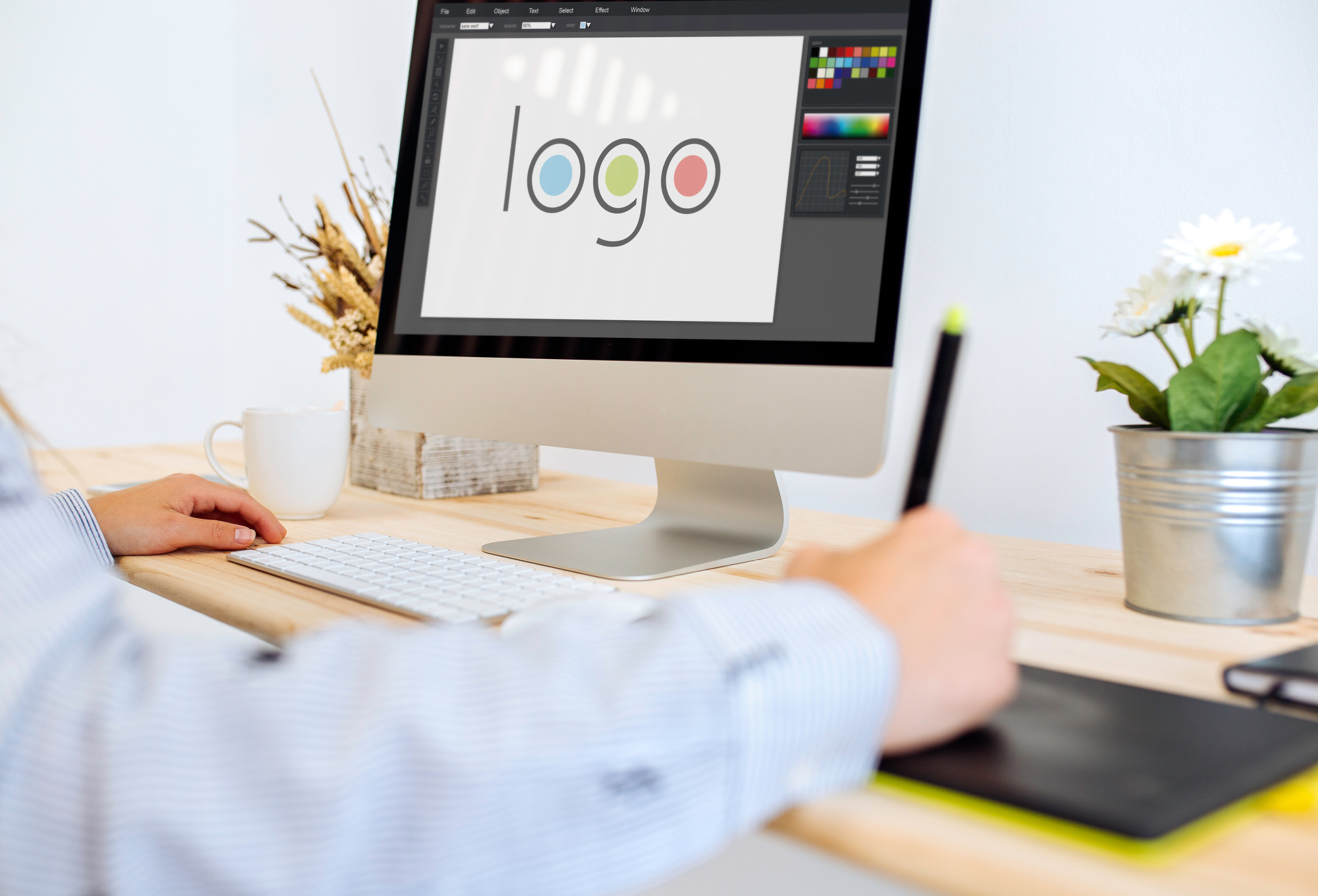
Then, there’s the matter of whether or not a company uses vector format logos. This is an essential part of logo creation. A logo can only do so much for you if it’s saved as a PNG file or it’s rasterized.
In fact, this goes for all graphic design as a whole – whenever you can save something as a vector, do it. If you aren’t sure what a vector is, keep reading to find out more about logo vectors and why they’re the best choice for a logo.
What Are Vector Format Logos?
To create something in a vector format is basically the cleanest way to create a digital design. Vectors are made of mathematic equations instead of color pixels. This allows them to scale as large as a billboard and as small as a logo for a business card without compromising quality.
Rasterized images, PNGs, and other file formats, on the other hand, will be pixelated when the sizes change in such dramatic ways. Not only that, but the proportions of a design may change as well. This looks blurry, it’s hard to understand, and it’s outright sloppy.
Thankfully, you can avoid such a situation by always saving your logo as a vectorized logo.
Beware that vectors can be rasterized, but rasterized images cannot become vectors. You always have to start with the latter, then use the former if you happen to need it.
More often than not, though, you can do everything you need with a vector logo. If you’re still not convinced that this is the optimal file format to use, check out the following reasons to make a vector logo.
5 Reasons to Make a Vector Logo
Before you start making excuses as to why you shouldn’t make a vector logo, consider all the reasons this is of benefit to you. Then, look into how to make this happen – which is arguably going to be easier than you think, considering all the vector illustration software programs out there.
Here’s why you should design a logo with such a program.
1. To Have Something Ready for All Your Campaigns
Think about all the various uses of your logo.
One day you’re using it to design company t-shirts, and the next, you need it for a sign or banner of an event you’re sponsoring. You’re also going to need your logo if you ever redesign your website or need new product packaging designs.
Other uses of a logo include business cards, car wraps, and promotional products of all kinds. Even if you’re not planning on using some of these things now, you never know what may happen in the future. It’s always better to be prepared for situations like this than to be playing catch-up.
2. To Put Watermarks on Company Images
Just as you’re going to have to make a logo bigger and smaller for all the uses above, you need a logo to watermark images too.
Think of all the professional company photos you’ve paid for and invested your time in. Don’t you owe it to yourself to make sure these don’t get stolen and reused without your approval? A vector logo can help you prevent such copyright issues.
When you use your logo to watermark a photo, it’s practically impossible for someone else to use it. Think of this as a form of insurance for all the content you’ve worked hard to create.
3. To Save Time
Speaking of working hard, how long does it usually take you to put a marketing campaign together?
Whether it’s digital or print, it surely takes a significant amount of effort to go from idea generation to completion. Having a vector logo ready can speed the process.
Instead of having to make a new version of your logo every time, or finding ways to compensate for pixels and blurriness, you can get the perfect image no matter what the campaign involves.
A vector logo makes it easy to create large uses of your logo one day, then scale it down the next.
4. To Save Money
When you save time, you save money. This is especially true if you aren’t much of a graphic designer, or if you don’t have one on your team. If you didn’t have a vector logo ready, a situation like this would mean you would always need to hire someone in order to make your logo the right size for a certain project.
Considering all the marketing that goes into a business, that’s a lot of back and forth and plenty of transactions to get a clear logo image at the ideal size. Save yourself the trouble, the stress, the time, and the money by making your vector a logo right off the bat.
5. To Express Your Level of Professionalism
The final benefit to consider is your brand as a whole. No one is going to take you seriously if you have an illegible logo on your business card or a sloppy design on your company apparel.
It’s in your best interest to always look sharp, which is exactly what a vectorized logo can help you do. Regardless of the logo design, this is the main thing that will preserve the integrity of the overall aesthetic appeal.
How to Make Your Logo the Right Way
It’s one thing to understand that you need vector format logos, and another to know what goes into making this happen. Thankfully, we’ve made the process easy for you.
With our logo design system, you can make all your logo ideas come to life and save the final result in a vector format. The process is simple and incredibly efficient – all you have to do is get started.
Click here to create your new company logo!
5 Signs its Time for a Logo Change
Posted on August 12, 2018 by Logo Design Tips and Tricks
When it comes to representing your business to potential and current clients, few things are more important than your company’s logo.
Your logo is responsible for a huge amount of your company’s branding, including elements like establishing recognition and trust with clients, as well as amping up your company’s financial value in general.
So, does it feel as though your company’s logo has been pulling its weight?
If not, it may have something to do with factors like how long it’s been since the logo was last update, or whether it was professionally designed in the first place.
Your logo could be detracting from your company’s success and relevance in clients’ minds–and if so, a fresh logo change may be just what you need to get back on top!
But how can you tell if your logo is due for a change? Here are 5 of the biggest signs it’s time to freshen that little guy up!
1. Your Logo Looks Out-of-Date
One of the easiest ways to tell you’re in desperate need of a new logo is to look at your current one with a critical eye and decide whether or not it looks…well…old. If your logo was super trendy at the time it was made, it’s likely it hasn’t withstood the test of time. If your logo looks cheesy or tacky on second glance…it’s time for a new logo.
Some logo designs are simple and classic enough that they’re really pretty timeless and aren’t easily subject to poor aging–but, unfortunately, logos like this are pretty few and far between. Your logo should always appear as cutting-edge and customer-based as your services are.
Sometimes, when it comes to logos that feel a little outdated, a simple-but-modern revision is enough to kick your design into gear again. Either way, though, if your logo has started to look old, something’s gotta change!
2. You’ve Evolved…But Your Logo Hasn’t
Businesses change. They become more complex, their missions become different, and the clients they serve evolve. As startups, Apple and Microsoft had no idea what they’d evolve into! But over time, as they did change, their logos changed along with them.
Chances are, if your company has been around for a while, it’s done some significant changing over the course of its existence. If your company is still sporting the same logo from its startup marketing materials, there’s a good chance it’s outgrown its logo.
This is a really important consideration to recognize, since you’ll want to be sure your clients know you’re staying flexible and on top of things, rather than getting lazy and set in out-of-date old ways.
3. Your Logo isn’t Attracting Clients
Your logo’s #1 responsibility is to represent your company and to attract new clients to your services. Current and potential clients should see your logo and immediately be interested in your services and what it is your company is about. If your logo isn’t managing this, it’s definitely time for a new one.
The reason your logo is failing when it comes to attracting new clients could be any number of things–an evolved audience or changed demographic–or just good old fashioned ugly logo design.
Whatever the exact reason may be, if your logo isn’t attracting traffic, it’s time for a change. A really sleek, cutting edge logo may be just what you need to drive the clients to your page! A logo is a small-but-mighty tool. Be sure to take full advantage of its potential power.
4. Your Logo Blends in with the Competition
One of the other main goals of a logo should be to help your company stand out against all other logos in the world, and against the logos of your company’s competition. If your logo is too cookie-cutter or trendy-driven to do that…you might just need a whole new logo!
Just because the services you offer are similar to other similar companies’ services doesn’t mean it’s alright to blend in when it comes to your company’s branding. Other companies offer similar services–but yours are the best, right? Your logo should help prove this.
If it’s not working to set your company apart from the rest, you logo isn’t working! A brand new logo may be the perfect refresh-button your company needs to make your services stand out from others. Plus, a fresh look can work wonders for sparking clients’ interest in your company for the first time or all over again!
5. Your Logo is Just…Well…Bad
Even if your logo is new and different, there’s a chance it’s still…uh…not great. If you have a hunch that your logo isn’t working as well as it should be, it’s probably not.
Good logo design is super hard to accomplish. The principles of good design and other marketing concepts are what ultimately determines the success of your logo. If your logo designer isn’t versed in these things or in the technologies used to make most logos, there’s a good chance your logo isn’t as good as it should be.
Your logo might have a poor color scheme or lack of balance. Maybe it doesn’t agree with the tone of your company, doesn’t look professional or polished enough, or just feels “off” somehow. It might be all-around too-busy or…well, ugly.
If it seems like your logo could benefit from enlisting some more professional logo design services, chances are, you should definitely, absolutely seek these out and nab a new logo as soon as possible!
So…Ready for a Logo Change?
The bottom line is that, if you’ve got a feeling you might maybe possibly be due for a logo change–you probably are.
Whether it’s been a while since your last update, or you’ve just got the feeling it’s time for a logo reset, go for it.
If you’ve determined that your logo is, in fact, a no-go, start your revamp with us! Check out our awesome online logo maker and other services to amp your logo up so it’s as awesome as everything else about your company.
How to Convey Brand Personality Through a Logo
Posted on August 11, 2018 by Logo Design Tips and Tricks

There are almost 28 million small businesses in the United States. So as a small business owner, you’ve got a lot of competition out there.
Well, one of the best ways to make a lasting impression on your audience is through having a strong logo.
In fact, the best logos showcase your brand’s personality. But it can be hard to make that happen.
That’s why we created this guide to help you portray your brand personality through your logo. Read more below!
The Basics
Let’s start with the basics. What is a logo and why is important? Well, a logo is a brand element that gives a face to your brand.
In other words, it’s your visual identity. It’s a key way for your audience to recognize your company.
Since there is so much competition out there, it’s crucial that you stand out from the crowd. When someone sees your logo, they should understand a little bit about your brand’s personality.
In fact, in many cases your logo is the first impression someone receives about your company. What do you want people to think about you when they see your logo? Thinking through this question will help you develop a logo that correctly conveys your brand values.
It’s easy to wonder why corporations spend so much money on logo creation. Often, companies that have been around a while go through extensive logo updates. This is because industries and trends evolve and change.
Fashion changes over time and so does design. So you should be conscious that your logo is up to date so you don’t come off as outdated or behind the curve.
Next, let’s go over the key parts of your logo.
The Graphic
First, let’s start with the graphic element of your logo. This can be an illustration, an icon, or a pattern. If you think about logos you know, there’s a huge range of graphic elements used.
Apple uses a simple apple as their graphic. Burger King has a burger. Almost every sports team uses a little illustration of their mascot.
Some graphics are more conceptual and less concrete. This could be a pattern or a line.
A great example of this is the Nike swoosh. When taken out of context, the swoosh is just a simple curved line, but now through years of successful branding, the swoosh has come to represent Nike.
The Typography & Font
Fonts can say a lot about your business. Fonts themselves convey feelings and personalities.
For example, Times New Roman is known for being stoic, professional, but also a little boring. Comic Sans, on the other hand, is the classic font for more playful or youthful settings.
Think about your brand values and personality. What adjectives do you want people to use when they describe your company? These answers will help guide your typography choices.
In everything you do with fonts, make sure they’re legible. Also make them unique. Don’t just use a common font that anyone could find in Microsoft Word.
Instead, work to find a unique font that conveys your brand’s personality well.
The Colors
The third and final crucial element of your logo is your color palette. The colors you choose will also convey specific things about your company’s personality. You want to make sure they convey the right things.
Think about the emotions you want people to associate with your brand. It’s simply not enough to choose colors because you like them.
For example, in design blue is often used because it comes across as friendly, authoritative, peaceful, and trustworthy. But every shade of blue is a little different and can mean different things.
At the end of the day, the key here is that you think through your color choice and experiment with different options and combinations before making a final decision.
Need help with your logo design? Check out our online logo maker.
Choose a Design Style that Matches Your Brand Personality
Now that you’ve gone through deciding on graphic, typography, and color, it’s time to put it all together. The most important thing here is that your logo design style matches up with your brand personality.
But the truth is that while this is all great information, it can be hard to know how to move forward without seeing a few examples. So here are some common brand personality traits and brands that you can draw inspiration from.
Simple vs. Complex
Think about the McDonald’s logo. It’s just a simple M. But the key here is that it’s in a unique font that has turned into an iconic symbol.
Their M is so iconic that it even has it’s own name: the golden arches. But at the end of the day, it’s just a letter in a unique font.
On the other end of the spectrum is Unilever. Their logo is also a letter, this time a capital U. But it’s very complex.
Inside it has all types of illustrations and elaborate decorations. This is because Unilever is a large corporation with more than 400 different brands in all types of categories.
Playful vs. Serious
Do you want your brand to come off as playful and fun or serious and experienced? It totally depends on your industry and your brand positioning.
When it comes to playful, Toys R Us is a perfect example. They use a super fun font and bright colors that grab both kids’ and parents’ attention. They also utilize their friendly giraffe mascot often in their branding, which is the perfect graphic element for their lighthearted toy store brand.
Think about most law firms on the other hand. They typically use darker colors in a serif font. This portrays seriousness and expertise.
When you’re in need of a lawyer, you want someone you can trust who knows what they’re doing. You’re paying them a lot of money and you want them to win your case.
So in this case, straightforward, serious branding works perfectly.
Closing Thoughts
Now that you’ve read all about portraying brand personality through logo design, it’s time to try these tips out with your logo!
7 Photography Logo Concepts and Ideas That Help You Tell The Right Brand Story
Posted on August 08, 2018 by Logo Design Tips and Tricks
The photography industry is riding a wave of rapid growth fueled by an increase in entrepreneurs opening up shop who need quality photos to differentiate themselves from the competition. To that end, looking at the United States alone, photography is an 11 billion dollar a year industry.
Add to that total the amount of worth other countries add into the mix and the picture becomes clear – photography is a valuable trade that’s here to stay.
Whether you’re an established photographer or are looking to break into the industry, it’s important that you understand the value of creating an excellent photography logo.
Logos for photographers communicate information to consumers with just a few words or a single image.
What that information tells people will have a profound impact on your success.
Below, our team has put together seven photography logo ideas and concepts to help inspire your logo creation journey.
1. Incorporate Camera Related Elements
Your logo should be telling of who you are. Given that you’re a photographer, a good photographer’s logo should find a way to incorporate camera elements into its design.
By far the most popular element you might choose to lean on is a lens.
Incorporating camera elements into your photographer’s logo is better done subtly than dramatically. We recommend doing something like using a lens as the “dot” over an “i” or something else along those lines.
Here’s an example of subtle, interesting lens implementation.
2. Quality Matters
Quality in all logos matter but in photography logos, the importance of doing something that looks visually pleasing is additionally important.
Why?
Because photography is a visual medium, and so are logos.
If your logo is bad, consumers can infer that your poor design aesthetic extends to your photographs.
To make sure that doesn’t happen, go out of your way to really make your logo pleasing to the eye. If you struggle with basic graphic design, enlist the help of a more graphically inclined friend for help with your photographer’s logo.
3. Start in Black and White
Color is an incredibly important visual tool that helps add extra layers of meaning to any logo. Many inexperienced designers get too caught up in color and don’t spend enough time making sure their design works on a foundational level.
To ensure your logo is built on a strong foundation, make sure it works as a sketch before playing with colors.
Let color enhance your logo. Not make it.
You could also opt to just keep your photographer’s logo in black and white as is popular among many successful logos.
Here’s a great example of a black and white photography logo that really works.
4. Consider Leaning on Custom Fonts
Not every logo needs to be made up of an image. Logos can be equally effective by just leveraging fonts creatively (look no further than the Coca-Cola logo to understand what we’re talking about).
So, when creating your photographer’s logo, if you find yourself at a loss when playing with imagery, take a break and try spelling out your brand name in creative ways.
You may stumble onto something that’s simple, clean and effective like the logo used by Pixel Pix.
5. Simplicity, Simplicity, Simplicity
“Brevity is the soul of wit.”
That saying holds true not only in verbal and written communication but also with visuals. For that reason, no matter what your design is, make sure that you keep it simple.
Busy designs often confuse consumers and hurt their ability to retain information. A good logo strips away all of the bells and whistles and attempts to communicate one core idea in a catchy way that creates a branding anchor in people’s brains.
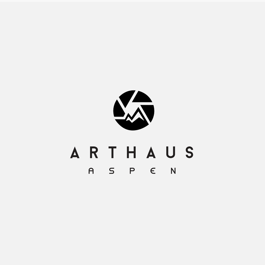
Here’s a logo idea for photography that we feel does exactly what we’re describing. There are a lens and a mountain which say “photographer that works in a mountain town” (Aspen in this photographer’s case).
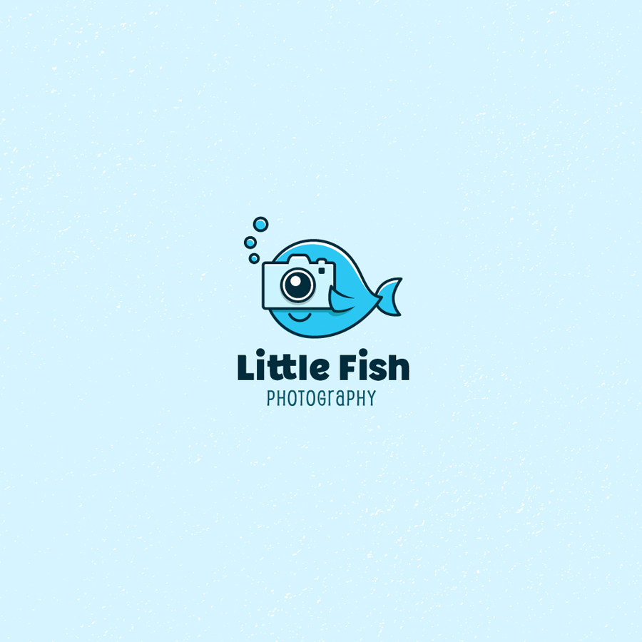
6. Try an Active Logo
All logos are comprised of still imagery and therefore, are not active… right?
Wrong.
Through effective use of art, a logo can incorporate motion into its imagery that not only makes it more eye-catching but also communicates extra meaning to consumers.
Here’s an example of what we’re talking about. The whale in the logo is actively taking a picture and the bubbles are actively floating upwards.
While it’s not always appropriate to incorporate activity into your photographer’s logo, we definitely feel like it’s something you should try.
7. Make Sure Your Logo Says Something About You
We’ve touched on this point passively through a few of these points but really wanted to give this subject the attention it deserves since it’s probably the most important aspect of a logo.
Every facet of your photography logo should communicate something to consumers and that something should be a truth about who you are as a brand.
This concept may be hard for some readers to grasp so before designing your logo, take out a piece of paper and answer some important questions about yourself.
“What makes your photography brand different?” “What type of consumers would best appreciate your artistic style?” “Why do you love about photography?”
Once you’ve answered those questions, keep your answers close by as you start trying out different photography designs. Whenever you’re picking a color or element, ask yourself, “What does this color, element, etc. do to communicate what makes me different, what my passion is and what type of consumers love my work?”
Doing that will help guide your design decisions in a way that helps you create something truly unique.
Wrapping Up Photography Logo Tips and Ideas
When creating your photography logo, you’ll want to make sure that you’re inspired by ideas and concepts from successful logos that are already out there. Core concepts borrowed from the iconic simplicity of the Nike Swoosh to the text-only splendor of the Coca-Cola logo are great jumping-off points.
To take your photographer’s logo a step further, be sure to follow our tips above.
Concepts like making sure your brand define who you are as a photographer and incorporating camera elements into your imagery will help you make a logo that tells your brand story as a photographer effectively!
If you want to get started creating your photography logo now with one of the most powerful tools available, click here to get started with Online Logo Maker for free!


