How to Make a Text Logo: A Complete Guide
Posted on August 28, 2018 by Logo Design Tips and Tricks
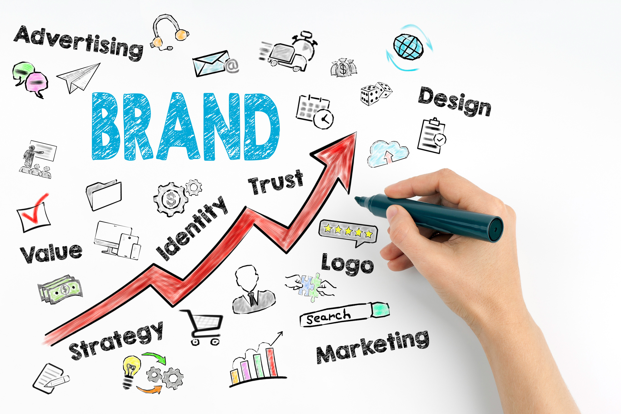
All great logo designers always have a tough decision to make before beginning their next project: should the logo be an abstract, creative graphics or a text logo?
There are pros and cons to both sides. Abstract logos are innovative. They’re eye-catching and easy to memorize when the designer knows how to pull it off.
Text logos, on the other hand, are often misjudged as boring. These aren’t usually the first thing that comes to mind when a business owner says they want a game-changing, iconic logo.
However, think of Marvel Entertainment, Supreme Clothing, and FedEx Shipping. All of these logos are known and loved around the world; they’re a prime example of everything great text logos can be.
If you want to master how to make a text logo people will pay attention to, here are all the steps you need to follow.
1. Choose Your Font Carefully
The font is the main visual attraction of any text logo. When it’s good, it’s stunning, and when it’s bad, it’s a huge turn-off. In other words, every other aspect of your logo can be spot-on, but if you miss the mark with the font you choose, it’s game over.
So, take your time to get it right. Do some research on which fonts are most powerful online versus in print. Think about the characteristics of your brand and how those would translate with a stiff, sharp-edged font or a flowy, free-hand looking type.
Don’t be afraid to compare a few fonts side by side, either. You won’t always know which direction to take your logo in right off the bat. Make the effort to put a few ideas through the design process if you truly want to end up with the best result.
2. Play with Spacing
As important as the ideal font is, it can’t carry the strength of your final logo design. The next thing to consider is spacing.
Imagine if FedEx spaced their letters the way Delta Airlines does. It wouldn’t be the same logo anymore, because the arrow between the “E” and the “x” would be much harder to recognize.
Even if there isn’t any symbolism in your logo, there’s power in the way each letter is separated. Some logos start with letters close together then progressively create more spacing, while others do this approach in the opposite manner. More often than not, though, a text logo’s spacing is the same throughout; you just have to make it perfect in order for it to mean something.
3. Find the Perfect Color
Another element of the logo worth picking apart until it reaches perfection is the color. If you already have your brand colors chosen, stick with those for the logo. Make one of them the primary brand color or play with the thought of using multiple colors in the logo.
If you have no brand colors to work with yet, your text logo will help decide what they will be. Brainstorm different color combinations and think about the emotions you want to be associated with your brand. Then, find the colors to make such sentiments occur in the hearts and minds of your audience.
It may take some time for you to find the best choice, but when you do, the best option will be crystal clear. Keep in mind you can always stick with black and white if you want your text logo to be totally classic.
4. Consider Adding a Bonus Message
Here’s something to think about: making your text logo mean something other than your brand name. Sure, the brand’s name has to be displayed. But, why not find ways to incorporate a hidden message, or at least consider the thought of a tagline below the main text?
These are additional features that make all the difference. They give users reason to do a double-take, and they create stronger connections with your audience.
People will feel like they’re in on a secret message when they find the hidden meaning in your logo. More so, something as simple as displaying your brand values or company mission under the main text can be quite powerful. Each has a way of tugging at people’s heartstrings and making them remember your brand.
5. Ask for Feedback
Just when you think you’ve created the best logo with text possible, think again. There are always a few edits worth making when a logo is in its first stages. The more you take the time to fine-tune every detail, the better the overall outcome will be.
If you’re having trouble finding any opportunities for improvement, get another set of eyes on your logo. Send it to your business partners and your friends and family.
Partners will have a practical eye; they won’t be afraid to tell you what isn’t on-brand or how to best represent the company. Those who aren’t in your industry and are looking at it from a supportive perspective, though, will be able to offer fresh ideas to the table. They may have a suggestion you hadn’t even thought of yet.
Still, all the notes are worth hearing and acting on. You don’t have to change the vision for a text logo entirely just to please someone else. But, it’s worth listening to what others have to say and recognizing when their points are valid.
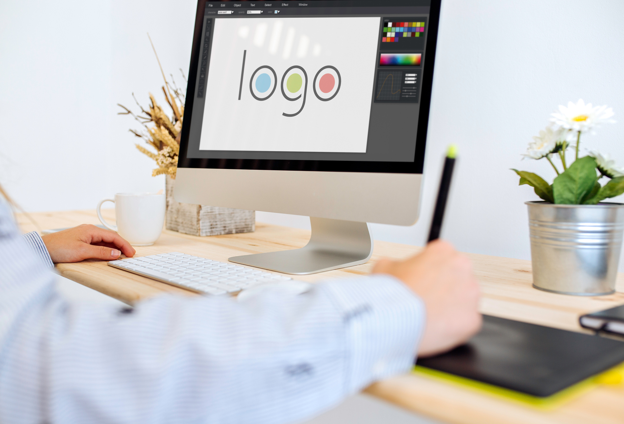
How to Make a Text Logo with OnlineLogoMaker
It’s one thing to know how to make a text logo that the world will love and another to know how to operate a logo-making system! Not all logo design platforms are alike.
If you’re using OnlineLogoMaker for the first time, relax. The software is easy to understand and it’s sure to give you all the tools you need to make something amazing.
For help getting started, click here.
Logo Formats: Your Guide to Using the Best File Types
Posted on August 28, 2018 by Logo Design Tips and Tricks
A logo is your business image. It’s often the first impression you’ll make on somebody unfamiliar with your brand.
Choosing the right logo is important, but quality, color, and scalability can all be affected by the graphics format you choose.
So which file format should you use for your logo?
If you can’t decide, here’s a list of the best logo formats you should be using for a variety of purposes.
Portable Network Graphic (PNG)
If you’re looking for an all-rounder, the PNG format is a particularly good first option to consider if you’re not entirely sure what you plan on using your logo for.
PNG files offer a richness in color, meaning any logos you print will look more realistic. You can also compress or enlarge the file size of a PNG file, which makes it a versatile option for any use you might have.
PNG logos will look great as website graphics, in documents, or on social media posts.
Scalable Vector Graphic (SVG)
The biggest benefit of the Scalable Vector Graphic format is in the name – it’s scalable. You can increase the size a thousand times and you won’t get any pixelation. It’s just not how SVG files work.
That makes it the perfect option for images used on the web or on rich, color displays. It doesn’t matter what your size requirements are, because SVG logos will look great big or small.
The filesize of the SVG format isn’t large either, making it a good option to provide to professional printers for merchandise, or to offer on a responsive website.
Encapsulated PostScript (EPS)
The EPS format was developed by graphics behemoth Adobe, but despite its proprietary nature, it’s still accessible in other software packages.
EPS files allow you to regularly make changes and edits as required. It’s a ‘vector’ file format, similar to the SVG, that can be scaled at will without pixelation.
Because they can be edited, they’re a good file to work from if you’re in your design phase and can be used to satisfy any logo requirement you might have, from t-shirt printing to a letterhead.
Joint Photographic Experts Group (JPG/JPEG)
The most common graphics format you’ll see on the web today is the JPEG or JPG format. This particular logo file format is popular for two reasons.
First, logos you save in JPG format will still look pretty good, even if you have to compress them or lower their quality. The downside is that you will lose some quality when you do this, and the smaller the file, the lower the quality.
The upside you get with JPG files is that they’re universal. You won’t find a computer, laptop or tech device that won’t be able to display it. Any kind of printer should be able to print a JPG file with ease, too.
They’re the ultimate web image format because they’ll still look great, even if you need to reduce the file size.
This helpful guide can help you decide whether to use a JPG or a PNG.
Photoshop Document (PSD)
Like the EPS format, the Photoshop Document file format (or PSD for short) is another file you can save and work from. It’s the ultimate editing file for Adobe Photoshop designers.
If you want to use the full range of Photoshop features, or you need your designer to do so, the PSD format is the format you’ll need to choose.
The downside with PSD comes, as you might expect, in the name. It’s proprietary but unlike the EPS format, it’s not widely accessible outside of Photoshop or other Adobe products.
Unless you’re working with Adobe products exclusively, you might find other formats better for your needs.
Graphics Interchange Format (GIF)
The GIF format would be a little unusual to choose as a logo file format but that might be your thing.
They’re a format that is largely best used for moving images. If that’s what you’re looking for, then a GIF is all you need.
Unfortunately, you’re not really going to get much in the way of quality from a GIF. You get 256 colors, so you won’t find the richness you find with a PNG. Your best use of a GIF as a logo (if you can avoid making it look tacky) is on a website.
GIFs do offer something a little different compared to more traditional image formats, though. Here are 5 ways you could use GIFs in a digital marketing strategy, for instance.
Tagged Image File Format (TIFF)
We’ve mentioned graphics that are suited for the web so far, but you might be looking for a format that lends itself towards printing in the highest quality.
For that, the TIFF format is perfect.
Almost every photo-editing or viewing software can view a TIFF file, so you won’t struggle to work with it. It doesn’t do any trickery with the format to make it bigger or smaller, so the file size will become large if the quality is high.
That’s can be beneficial, depending on your viewpoint. It isn’t really a web format, so you don’t need to worry about load times with large files. If you need to print in quality, you won’t lose anything with a TIFF.
However, you may not notice much difference in quality between a high-quality JPG and a TIFF, so you should look to try out both file formats.
The Right Logo Formats for the Right Purpose
Planning on using your logo on your website or merchandise? Do you need it scaled up or reduced in size? As we’ve discussed, different logo formats are needed for different purposes, so follow our guide and choose the right format for you.
You don’t have to wait to get started, either. Begin designing your best logo with our online logo maker.
Need help with your design? You’re in luck! Check out some of our articles on logo design to help you get started.
Why are Logos Important for Small Business?
Posted on August 24, 2018 by Logo Design Tips and Tricks

“Why are logos important for a small business?”
If you own a small business and you don’t have a logo at the moment, this is a question you’ve probably pondered over and over again.
On the one hand, there have likely been plenty of people who have told you that you need to get a logo as soon as possible. But on the other, creating a logo is an additional cost that you need to take on, and you might not be convinced that the cost is really worth it.
We’re here to tell you that it is worth it and that you’ll reap a lot of rewards when you take the time to design a logo for your small business. You’ll wonder why you didn’t do it sooner once you have a logo in place.
Here are a few reasons why logos are so important for small businesses.
A Logo Will Help Communicate What Your Business Is All About
What kinds of products and services does your small business provide for your customers?
In some cases, customers might be able to figure out what products or services you sell simply by looking at your name. But in others, they won’t have the slightest clue what it is that you do based on your name alone.
An effective logo can help bridge the gap between your business name and the products or services you have to offer. The logo can serve as a strong indication of what people can expect when they visit your business.
If you own a hamburger joint, a logo with a burger in it can let others know that you have the best burger in town. If you own an office supply store, a logo with a pen and pad in it will be enough to show people that they can come in and get office supplies from you.
Your logo doesn’t always have to be that literal. But it can be used to communicate what people can expect from your small business.
It’ll Convey a Certain Emotion That People Will Associate With Your Business
The color that you choose when creating your business logo will be almost as important, if not more important, than the logo design itself. The color will convey a certain emotion and will ideally make your customers feel something when they see it.
If you look at any iconic business logo, it utilizes color to convey emotion to the customers of the company that created it. For example, McDonald’s didn’t choose to make their golden arches golden on a whim. They did it because yellow is a color that makes people feel happy.
You can use color in the same way. You can make people feel calm, excited, or happy when they enter your small business by greeting them with a strong logo that incorporates the right color or colors into it.
It’ll Create Brand Recognition and Customer Loyalty for Your Business
As a small business owner, one of your goals should be to convince people to be loyal to your brand. Whether you’re flipping burgers or providing financial planning services, you want your customers to come back to you time and time again in the future.
You’ll increase your chances of creating brand recognition for your business and make your customers more loyal to you with an effective logo. People will see your logo out in the world and automatically associate it with the products or services you provide for them.
Once you start advertising your business through TV commercials, newspaper ads, and billboards, having a logo will be a big benefit to you. It’ll help you stand out in the crowd when people are able to see your logo and make the connection to your small business.
If you’re lucky and you create a logo that’s especially effective, people won’t mind wearing your logo around and advertising your business for you. They’ll gladly snatch up T-shirts, hats, pins, and more with your logo on it and wear it around town.
This is one of the simplest ways to build a buzz around your brand and get people interested in it.
It’ll Give You Something to Use on Signs, Business Cards, Email Signatures, and More
If you create a sign to hang up outside of your business and you don’t have a logo to put on it, what are you going to put on it to catch people’s eyes?
If you pass out business cards to potential customers and clients and you don’t have a logo to put on it, how are you going to make your cards stand out from all the rest?
If you create an email signature for your business email account and you don’t have a logo to put on it, are people going to even notice it?
When you’re creating signs, business cards, email signatures, and so much more, it’ll help you to have a logo to put on all of them. It’ll make them unique from all the other signs, business cards, and email signatures out there.
It’ll Make Your Business Look a Lot More Official
If you don’t design a logo for your small business for any other reason, do it because it’ll make your business look official. It’ll show that you took the time to try and legitimize your business by putting a logo into place.
You’ll notice customers and clients taking you more seriously when you have a logo. The logo doesn’t necessarily have to cost you a fortune or be too crazy and over the top. But it should serve to symbolize your small business and what you can provide for others.
Why Are Logos Important? Because a Small Business Can’t Function Without One
The question “Why are logos important?” shouldn’t really be a question at all for small business owners.
In 2018, it’s just about impossible to run a successful business if you don’t take the time to put a logo into place. People aren’t going to think you’re committed to running a successful business if you skimp on a logo.
Check out our blog to see how to create an effective logo that will generate more business for your company.
What is a Logo? Understanding Logos and Their Purpose
Posted on August 20, 2018 by Logo Design Tips and Tricks
What is a logo?
What a loaded question!
A logo is more than just a simple text or image we attach to our business. It’s a symbol; a message that says not only what your business is, but who it is.
In this blog, we dig deep into the significance of a logo and why its a necessary part of your brand, no matter how big or small your business may be.
What is a Logo?
Merriam-Webster Dictionary defines a logo as an “identifying symbol” or “identifying statement”. Think about that for a moment… a symbol and a statement.
That’s a lot to pack into a 2D image or text, yet that’s exactly what businesses do. They package their identity, their brand, and their purpose into a small representation of who they are and what they do.
It’s effective, too. Think about the logos that stick into your mind today:
- McDonald’s golden arches
- Nike’s swoosh
- Starbucks’ two-tailed mermaid
- Apple’s half-eaten… well, Apple
You get the point. They stick with you as a mental image of the brands you’ve come to know. It’s a symbol and a statement that embodies the business.
Why Does My Business Need a Logo?
Big or small, corporate or independent, your business needs a logo. It’s used in multiple aspects of your business, from your print collateral to social media, advertisements, and products.
Your logo plays a key role in marketing and branding, including:
- Business cards
- Uniforms
- Letterhead
- Signage
- Banners
- Promotional materials (shirts, mugs, pens, etc.)
- Website design
- Social media accounts
- Email signatures
- And more…
Simply put, it’s everywhere you are: online, on paper, and in person. It’s a first impression packed into a glance.
When done right, people will remember your logo, and, in turn, your business. But if you design a poor logo, it can make your business appear unprofessional or forgettable.
That’s why quality matters. You achieve this by putting conscious thought into your design. Below you’ll find tips on how to create a logo that your customers will keep top-of-mind.
How to Create a Logo
There are two main options for designing a logo: you can hire someone to create one for you or do it yourself. There are pros and cons to each option and deciding which is right for your business depends upon your budget, skills, and tools.
When you hire a graphic designer, you hire someone who is trained in logo design. He or she will have both the expertise to help you choose a color scheme and design that looks professional.
Depending upon the graphic designer’s level of experience, you can expect to pay less than $300 (on average) for a logo design. This includes mockups, proofs, edits, and your final design.
However, if you’re just starting out with a small business or you already have a keen idea of your logo design in mind, you may choose to create a logo yourself. There are several resources available to help you do this.
If you already have experience in design, all you really need is a design program, such as Adobe Photoshop or Adobe Illustrator. But if you aren’t a design guru, you’ll need a little more help.
That’s where logo maker programs come into play. These typically easy-to-use programs are complete with stock graphics and fonts. You don’t need any design expertise. Instead, the program walks you through the design process step-by-step.
What to Consider Before Designing a Logo
Whether you hire someone or plan to tackle your logo design yourself, there are a few dos and don’ts to keep in mind as you hit the drawing board.
1. Aim to Stand Out
Forget what’s trending and what you’ve seen before. Your logo should be unique to your business. Think outside the box.
Start by identifying what makes your business unique from its competition, then expand on that. Drive your special attributes home with a special logo that sets you apart.
Some businesses may use an animal in their logo they feel represents their company’s culture and mission. UC Browser is a great example. They chose a squirrel because it’s fast, smart, and strong.
The animal has a personality, which influences their brand’s voice.
2. Consider How Your Idea Will Look in Black and White
It’s important when designing a logo to make sure it looks good no matter how it’s printed. This includes grayscale formats.
A best practice is to design your logo in black and white first. This will keep you from getting too attached to a color scheme only to realize it won’t work.
You can always add color to a black and white photo, but it’s much harder to fix a color logo when you realize it disappears or doesn’t make sense when converted to a colorless format.
3. Keep It Simple and Scaleable
Simplicity is important in a logo. It should be easy to recognize at a glance. Whether your design is shrunk to fit onto an address label or enlarged to cover a trade show banner, people should be able to read and recognize it.
As you design your logo, take out any excess or unnecessary details. Also, make it a point to test it out in different sizes. This will help you prevent or correct problems before you present your logo to the public.
4. Give It Meaning
All good logos have meaning. That meaning may not be philosophical or life-changing, but it does have to make sense. Before you settle on a logo design, ask yourself what it means to you or your business.
This answer may be as simple as a word or as complex as a narrative. So long as you can explain it, you’re good to go!
Whip Up Your Next Logo Online
If you’ve just discovered the answer to “What is a logo?” and realized you desperately need one of your own, don’t fret! We have the perfect solution. With our online logo maker, you can whip up a custom logo in minutes.
Get started with our free logo making program now and start breathing new life into your brand.


