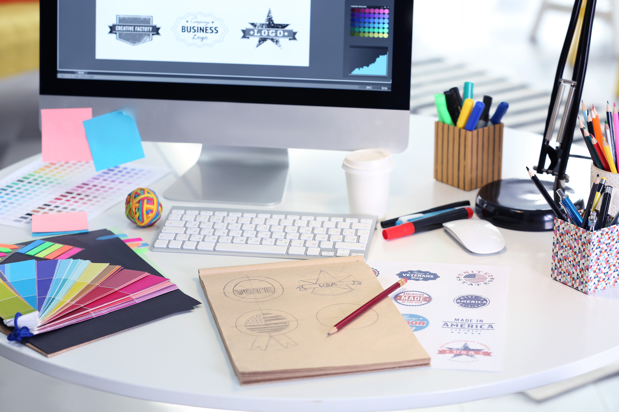
Where to Find Great Inspiration for Your Logo Design Ideas
Posted on September 28, 2018 by Logo Design Tips and Tricks
Most of us probably won’t have an epiphany in the middle of the night which inspires us to create the perfect logo. But that doesn’t mean all hope is lost.
While it’s a bit of a challenge to find great logo ideas, it’s not impossible. You just have to know where to look.
Of course, knowing where to look is half the battle. Most business owners have no idea where to even start looking for creative logo design ideas.
We want to help you get started. Keep reading to learn where to look for great logo design ideas.
Look at Other Logo Design Ideas
One way to find logo design inspiration is to look at other logos that have already been created. Take a look at the logos that your competition have on their websites.
Note what you like best about their logos and what you like least about them. But don’t just look at your competition.
Do some research on the most successful and creative logo design ideas of all time. But you should also take a look at the logo ideas that failed as well.
You can learn from failure just as much as you can from success. Looking at both types of designs will help you learn what to do and what to avoid.
Be Creative Rather Than Obvious
Just because you own a brewery doesn’t mean your logo must include beer in it. That’s obvious.
Get your logo inspiration from something that still has something in common with beer but is more creative than obvious. Look for ideas that grab your eye and peak your interest.
If you are that captivated by a symbol or color, chances are others will be, too.
Choose the Right Colors
Choosing which colors you use are an important part of logo inspiration. Each color has a different meaning which you can use as part of your company’s brand. However, don’t go crazy and choose too many colors.
Get logo ideas from company’s who have used bold colors. Then take a look at the company’s who chose black and white for their logos.
Make sure you don’t just look at colors that are trending now. While they might be popular in 2018, it may look silly five years from now. Choose colors with staying power.
Brainstorm on Your Own
Think back to your high school art and creative writing classes. The teacher would have you brainstorm for ideas first.
They did that because it’s effective. If you’re looking for logo design inspiration, get out some markers, a pencil, and some paper and just start doodling.
We’re not saying you’ll end up with a masterpiece that makes logo design history, but it is a good start to figuring out what you want.
Use a Logo Generator Tool
Don’t forget to ask for help. A logo generator tool is a great way to get logo ideas where you can see what they look like.
Click here for a tutorial on how to use the logo generator tool. Use this tool more than once so you’ll have a few options to choose from.
Get Input From Others
Getting input from others can help you with logo designs inspiration. You don’t have to do this on your own.
Gather your employees and have them brainstorm ideas. Ask them to design a logo for you and then have everyone vote on the best one.
You can even take different ideas from the various logos your employees created. Ask your social media followers for their input on great logo ideas.
The more people giving their opinions, the more likely you’ll end up with a design that is universally appealing. Especially when you ask your niche market to help you design one.
Ask Professional Logo Designers for Creative Logo Design Ideas
Look at different professional logo design sites. If you can find a few design sites that cater to your specific type of business, even better.
Take a look at their work for logo inspiration. If you find one you like, you can work with them.
These people use logo design inspiration to create a successful business. Chances are, they can help you design a great logo that aligns with your brand.
Focus on Your Brand
The whole point of creating a logo is to further push your brand into the public’s eye. Go back to the roots of your brand because that’s where you’ll find the best logo ideas.
Write down the five words that best describe your business. Create logos that reflect those words.
Look at your businesses values for inspiration. You want to convey those values to your niche audience so it’s a great place to get logo ideas.
Learn About What Different Shapes Mean
Colors aren’t the only thing that conveys meaning. Geometric shapes also have meaning.
Do research on what each shape means before you create your logo. Find shapes that inspire you and best represent your business.
If you choose to use the shape of an animate or inanimate object, do research on the symbolic meaning behind the shape.
Keep it Simple
Think about how you feel when you walk into a cluttered space. Most people tend to feel immediately disoriented and overwhelmed. They usually don’t notice much of anything except the clutter.
The same effect happens when you overcomplicate a logo design. Instead, keep your design simple.
You want your design to pop because it speaks to people, not because they’re immediately confused.
Choose the Right Font
Like colors and shapes, the font you choose should also be carefully considered. When you’re looking at fonts for creative logo design ideas, make sure it’s easy to read the font.
Using cursive may look fancy but it’s not always easy to read. Block letters are bold but may not work for a company going for a softer feel.
Register Here
Once you’ve collected a few of your favorite logo design ideas, it’s time to see how they look. Our online logo maker will help create the perfect logo for your business.
To get started, click here to register.
5 Professional Fonts for Real Estate Logo Design
Posted on September 19, 2018 by Logo Design Tips and Tricks
When it comes to your real estate logo design, you know that the colors, copy, and images you choose matter.
However, don’t overlook the importance of typography.
Choose the right font, and your branding will connect with customers no matter where you put your logo. Choose the wrong one, and your logo could look unprofessional or outright illegible.
In this post, we’ll give you 5 examples of fonts that will increase your brand recognition and help you get your message across in a matter of seconds.
1. Times New Roman
Especially in today’s era of minimalist trends in logo design, there’s nothing that quite says “professionalism” like this classic font.
For example, let’s say you primarily sell and rent condos that are run by private landlords.
Using Times New Roman in your logo design will help assure potential clients that you’ve done your due diligence when it comes to vetting these landlords. It communicates a message of thoroughness and authority, as it’s used in so many newspapers.
2. Arial
If you know that your logo will be displayed in a variety of locations, then Arial is an excellent font choice for you.
This font is easy-to-read no matter the size of your logo. So, if you need to resize your design to place it on business cards, “For Sale” signs, and your social media accounts, go for this option.
3. Proxima Nova
This is one of the newer fonts on our list, but you might recognize it from the logos of Spotify and Twitter.
Using a font that’s associated with the millennial market is a great way to connect with buyers who are purchasing their first homes.
Especially if your real estate business has a popular blog and several social media platforms, this font will help you find your ideal client.
4. Bodoni
Looking for a font that helps you to connect with a specific section of the housing market?
If so, look no further than Bodoni.
This font, used by Vogue Magazine, Calvin Klein, and other luxury-associated brands, is perfect for real estate agents that deal in penthouses and sprawling estates.
5. Go Custom
Don’t see the perfect font for your real estate business on this list?
If not, then it may be time to create one for yourself. Hire a professional font designer to create a vision for your logo’s copy that’s all your own.
Having a unique font won’t just help you to stand out from your competition. It will also work to build brand recognition, as people will associate your specific font with your company.
Start the Real Estate Logo Design Process
Just like finding the perfect house for a client, you likely won’t get your real estate logo design right the first time.
Using the information contained in this post and the countless others on our website, draw up several potential designs. Then, poll your coworkers, friends, and followers to see which one is the most effective.
Designing your next logo is simple with our free online logo maker tool — so check it out today, and start creating.
A Complete Guide to Construction Logo Design
Posted on September 17, 2018 by Logo Design Tips and Tricks

As technology continues to influence the construction industry, you’ve likely already had to evaluate and evolve your own construction/building business.
But does your current logo communicate the changes you’ve made?
No matter what phase of business you’re in, having a logo that stands out from the competition is essential. It should relay what you do for clients in milliseconds.
We’re here to help. Whether you’re updating an old logo or creating one for your new construction business, we’ll fill you in on the construction logo design tips you need to throw a wrecking ball at the competition.
Avoid Cliches
One of the most difficult aspects of logo design in any industry is striking the balance between recognizable and cliched images.
Think about the construction logos you frequently see around your service area.
We’re willing to bet that a large portion of them include images of houses, tools, roofs, and skyscraper-like buildings.
Do you really want to communicate to potential clients that you’re just an average, run-of-the-mill construction company?
We didn’t think so.
However, you have a very limited time to let your customers know what it is you do — and you need them to remember your logo.
What To Do Instead…
We suggest putting a new spin on familiar design elements.
For example, instead of a completed house, try a design showing a roofing or floor plan. Instead of a completed skyscraper, show one that’s half-completed, and half-scaffolding.
Also, use your font to communicate your services. Don’t be afraid to go with big, bold block lettering.
You want your logo to be eye-catching, on-brand, and let your customers know your work will withstand the elements and the test of time.
This will leave potential clients wanting to learn more about insulation services, or whatever products and services you offer.
Keep It Active And Colorful
Cliches can also come in colors. If you’re thinking of using yellow and black, or white and orange, in your logo design, think again.
Not only has this been done to death, it also shows that you’re trying to imitate known construction suppliers and companies.
Instead, use colors that highlight the unique aspects of your business.
For example, if you focus on using eco-friendly construction methods, use blues and greens in your logo design. If you primarily work in commercial construction, use silver and dark blues to indicate the power of corporations.
No matter the color, font, or central image you end up choosing, make sure it’s consistent with the specific services you offer and clientele you serve.
Construction Logo Design Process From the Ground Up
Thanks to this post, you now have a firm grasp on what to do — and what to avoid — to make your construction logo design shine.
Of course, as with anything in life, you don’t always get it right the first time.
Use our free online logo maker tool to create a few possible designs. Then, have your office or social media followers vote on their favorite option.
For more design tips and tricks, be sure to check back with our blog.
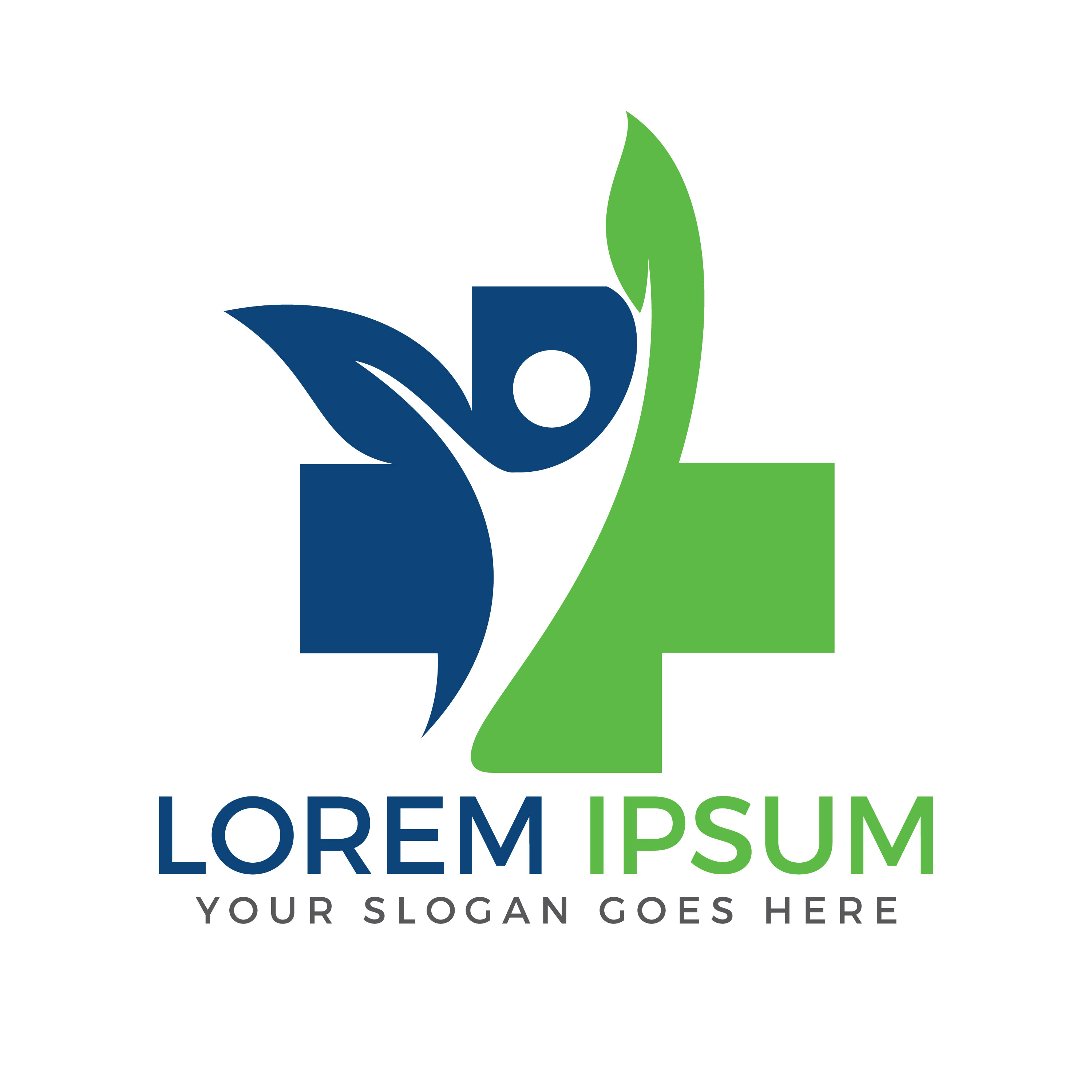
5 Key Medical Logo Design Tips for a Clinic
Posted on September 13, 2018 by Logo Design Tips and Tricks
When’s the last time you designed a medical logo?
Probably a while ago, if ever. That’s because medical logos are airtight, and don’t need much changing after their initial conception. Medical logo design has a few key quality elements that make them incredibly long-lasting.
Got a medical logo to design? Keep reading to find out just what those elements are.
Keep It Modern
Modern medical logos show that a practice or clinic is changing with the times. It shows that the practice is updated and knowing. They leave their old, dusty manuals in the dust in favor of bright, new ones.
In our modern technological age, new developments are made in the medical community all the time. Modern medical logo design helps instill trust in the patient that their practice is able to keep up.
Keep your edges rounded, like Tueo Health‘s logo. Incorporate strong elements of curvature, and try to shy away from rectangular or triangular shapes. Don’t add too many elements to the logo to keep it as minimal as possible.
Simplicity Is Key
Minimal design is important when it comes to medical logos. You don’t want the logo to be too difficult to understand, because you’re trying to touch a very broad and very diverse audience with your logo.
The logo needs to be easy to recognize on signs and billboards for a large audience. When a medical practitioner is needed, your logo will be a beacon of hope for the afflicted. Allow it to register quickly in their minds.
Don’t clutter up your logo with too many colors or lines. Stick to geometric shapes and clean fonts.
Consider Color
In an effort to maximize visibility and keep it simple, try to stick to two colors maximum, like the logo for Arrowhead Clinic. Note that the colors used are dark and soothing, versus bright and jarring.
That’s valuable to a patient. They’re under enough stress already, and studies show that color has a big effect on our psyche.
Blues and greens tend to have the strongest calming effect, and yellow is the most uplifting color. Try to user darker reds rather than bright reds so as not to remind patients of blood.
Make It Relevant
Not all medical practices are the same, and their logos should reflect that. For a children’s hospital, keep the logo cute to relate to children and help them feel safe, like Nicklaus Children’s Hospital‘s logo.
Wellness clinics or fitness related medical logos could include elements of nature, to parallel the patient’s efforts to get in touch with theirs. Include lots of green, circles, and leaves.
Logos designed for emergency rooms or surgery centers should include sharp edges to represent the importance of precision.
Make It Flexible
The best medical logos are the only logos used. That means the same logo can be seen across all platforms, from signs to pamphlets to social media.
Quality medical logo design can be transposed from platform to platform and still appear relevant and strong. It’s a plus for you, because this inspires longevity in a logo, making yours stand out for decades to come in a sea of other medical logo design.
Get Started on Your Medical Logo Design
Check out some more specific tips for individual practices’ logo design. Then, head over to our logo maker to begin your next design! It’s easy to use, simple, and free!


