9 Valuable Tips to Take Your Initial Logo Design to the Next Level
Posted on October 10, 2018 by Logo Design Tips and Tricks
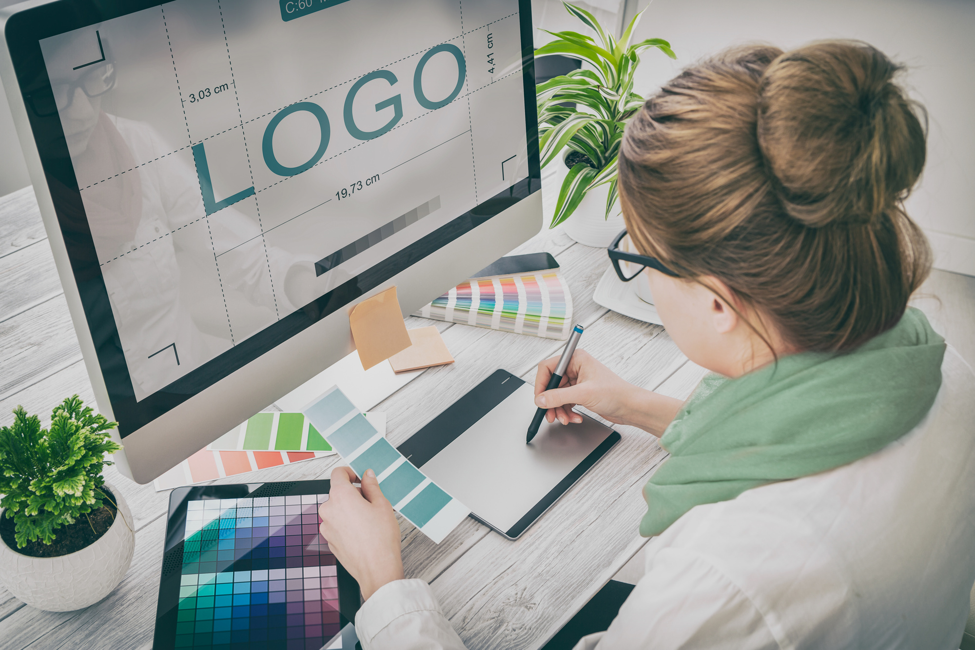
Coming up with a new logo for your company can be fun. it can also be challenging. You need to take time and consider the best way to design your logo. Whether you are trying to come up with a new logo or are trying to improve your initial logo design, you need to do some research.
Your logo is you. It should be able to stand up and represent you and your company for a long as you are in business, and beyond. Designing the perfect logo is possible.
Your vision of your company is expressed through your logo. You want the customer to see it, as well. When it becomes recognizable, people associate it with your company and product. It’s the purpose of having one.
Here are a few important tips to get you started.
Perfecting Your Initial Logo Design
Your logo is more than something that looks nice. It has to represent you and your brand. It’s important to get it right so people recognize it. When they see it, they’ll see you.
1. Use Color
The colors you choose are important. Color plays an important role in our everyday lives. We all have associations to certain colors. Incorporate colors into your logo that represent your company.
Colors can represent fire, heat, fresh, sunshine, and health, but they can have negative connotations, as well. Don’t pick a color simply because you like it. Find one that works for your product.
If you have uniforms or your product is a particular color or has a distinctive color in its label or packaging, work that into your logo fora better brand association. It helps to tie everything all together and make it all one package.
2. Keep it Simple
Don’t overcomplicate things. A logo with too much of anything will be quickly discarded. People have the attention span of a gnat. Keep the logo simple and easily recognizable.
Simple lines, one or two colors, and empty space work well. If people have to work to figure it all out, they won’t. It needs to get the message across and be memorable. Too much fuss turns people off.
3. Incorporate Your Product
Find creative and fun ways to get your product in the logo. With a simple outline or symbol, it becomes associated to you and your company. Don’t make it too complicated.
A barber might use scissors, a landscaper may use a lawnmower, and a baker could use a pie. It just needs to a simple, recognizable image that people easily see and understand.
4. Be Original
It’s important to find out what is trending and avoid it. You want to be original as your product. Chances are you have a lot of competition, so your logo is the first thing to set you apart from the rest.
Try to avoid using a certain shape or design that is regularly used. You want to stand out amongst your competitors. It’s always tempting to jump on the bandwagon of what seems to be successful, but you’ll be happier to make your own success.
5. Make it Relatable
A simple image, symbol, or word makes a strong clear message. Your potential customers like something familiar. It’s very comforting. It’s very important that the images, fonts, and colors all relate to your brand.
Work with what you have. Don’t pick an image or design you like and try to build your product around it. The design must come from the product. People like familiar and recognizable.
6. Use Humor
Using humor can work for any product or service. It doesn’t need to be ‘roll on the floor’ funny, but humor takes the sting out of being sold something. It’s particularly effective if you are selling something that isn’t always immediately associated with humor.
Dentists, lawyers, and plumbers have had great success by taking a swipe at their own professions by using humor. It tells your clients you understand their pain. It’s comforting and helps people relax. It’s also very memorable.
7. Test It
Don’t just jump on the first one you like. Design a few and test them. Ask for advice on them from people you trust. You can also do a random test with a focus group.
Take a few that you really like and sit on them for a while. Asking for advice is a good way to weed out the ones that are less effective. Don’t lock yourself into something you may end up hating later.
8. Font Matters
Take some time to test a few fonts for your logo, if you are using them. Some fonts have a stronger line, some give off a softer feel and some can just be too complicated to read.
Talk to a graphic designer for the best advice for what font will work best for your brand. You need to understand the impact it will have. It can work in favor just as easily as work against you.
9. Consider All Platforms
Your logo is going to travel. You want to have a design that will work on your website, your social media platforms, your stationery and business cards, on your vehicle, your uniform, and whatever else you plan on using it on.
It needs to be readable and recognizable on all platforms, in all sizes, and not lose anything in translation. Something that looks fantastic on your van might become a blue blob when shrunken down for your website.
Go-Go A Logo
If your initial logo design just isn’t cutting it anymore, hopefully, we have got you started to a new one. You want your customers and potential customers to recognize it and keep coming back to it.
You should enjoy designing your logo and you should also understand the importance it plays in your overall marketing. It’s meant to be the face of the product, you want to get it right.
Why not try out a few logos to see what is available. It’s easy to do online and there are hundreds of options. Once you have a design in mind, please continue here to make your free logo.
How to Create a Classic Logo Design for Your Healthcare Business
Posted on October 06, 2018 by Logo Design Tips and Tricks
It’s difficult to define exactly what comprises classic logo design, but what we do know is that some logos make a more lasting impression than others.
The world’s best-known logos all have a few things in common. Here’s how you can imitate their timeless style.
Use these design guidelines to craft a logo to take your healthcare brand to the next level.
Classic Logo Design Should be Simple
People don’t want to spend time figuring out what your logo means. There are enough complications in the modern world.
An intricate logo implies chaos. That’s the last impression you want to give customers about your healthcare business.
The cleaner, neater and more obvious your logo is, the better. These kinds of logos are recognizable and memorable. They look good in print, on merchandise and online.
Do some research to get inspiration for designing a logo that works in the medical industry.
Don’t Be Too Generic
Simple doesn’t mean you need to download the first clipart image you see.
A stethoscope is too generic. Try to think of items you use in your practice every day that you could use as part of your logo.
Symbols that represent good health can be very effective in medical logo design too.
Images that suggest growth and renewal are a good match for a rehabilitation center or mental health clinic.
You can turn to nature for inspiration in this regard. Creating a logo that features symbolic shapes like water and greenery will inspire people to find out more about what you have on offer.
Keep it Classy
Medicine is serious business. Gaudy colors and haphazard design will not create the professional impression you want.
Think about what your patients want from you when how to design a logo
Green and blue are popular colors for medical logo design as they have a calming and soothing effect on people. Red and yellow can represent vitality and happiness.
The same applies to your choice of font. Choose a clear, simple, elegant font to get your message across.
Shapes Matter
Placing your logo inside a circle or choosing a circular design will soften the edges, giving it a comforting feel.
Studies show that circular logos give the impression that your company is caring, warm, and sensitive.
Logos with hard edges create an aura of reliability and durability. This can work well for a laboratory or pharmaceutical logo.
Triangles are usually associated with religion, science, law, and power.
Getting Down to It
When you think you’ve ticked all the boxes about classic logo design for your healthcare business, it’s time to get started on designing a logo for yourself.
You can either do it yourself or get a professional graphic designer trained in how to design logos to do it.
No matter how much time and money your logo costs, the right design will be worth it in the end.
How to Follow the Logo Design Process That the Pros Use
Posted on October 06, 2018 by Logo Design Tips and Tricks
Ever stopped to marvel at distinct company logos everyone can remember? Almost everyone can, in the blink of an eye, identify the logos for Nike, McDonald’s, Starbucks, and Apple.
Speaking of Apple, did you know its market dominance with smartphones is at 12.1% globally? A big reason behind this isn’t because of the iPhone’s capabilities but of brand recognition. People know the logo, they trust the brand and hence buy their products.
As a small business, this is a good example to follow. That said, you need to have a good grasp of the logo design process companies use since it helps people understand your brand.
Experts don’t make logos on a whim.
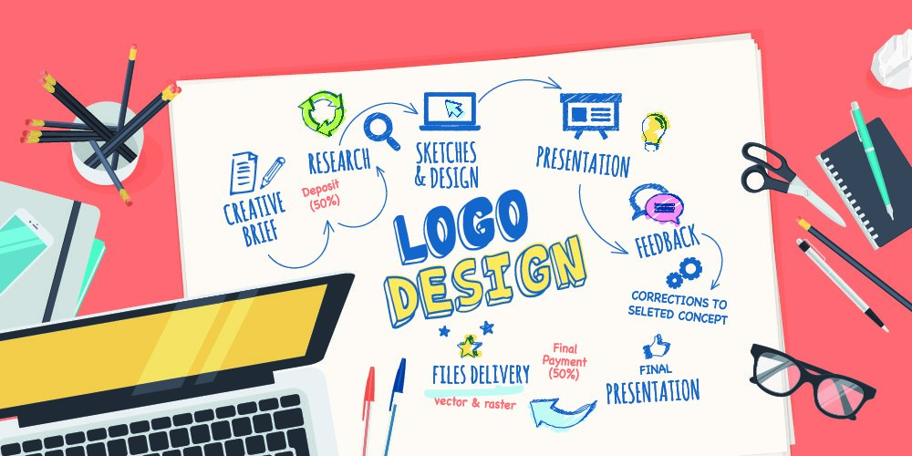
There are intricate steps that most logo design professionals follow. Not sure what these steps are? Read on to learn every step and what you can do to make the best logo possible:
1. Discover the Client
One of the first steps to create a logo is for the logo maker to have a long conversation with their client. This meeting helps them learn a lot more about your company’s culture as well as your values and your means of doing business. This allows them to show off that message when designing your company’s logo.
After all, aspiring for a great logo means expressing your company’s values and reflects the ideals you want to show people. You can compare this to an employee with the sole purpose of representing your company in its best possible light while maintaining its distinctive features. You can’t give a good representation without making the wrong assumptions if you aren’t asking for professional help.
Completing this step ensures that the designer creates a logo that you and everyone in your company can relate with. It’s important that they ask the personality you want your brand to project and the kind of customers you have.
2. Discover the Industry
After getting to know your company, the designer then attempts to know your company’s audience and your competition. Knowing the former allows them to have the understanding of the specific kind of logo style you need to appeal to them. For example, working in a market that caters to teenagers needs something mainstream and catchy.
That’s the reason designers will ask for thorough answers when it comes to the customers that you cater to. The more they know about it, the easier it is for them to give the logo your audience can appreciate and get behind with.
Knowing your competition is a more important part of the process. They need to know if there are other logos out there that look similar to something they might design. Doing a logo identical to your competitors’ is a big business blunder, so it’s important that they design one that sets you apart from the key competitors that need your consideration.
3. Discover Logo Usage
This step in the logo designing process is about the designer knowing how and where the logo gets usage. Logo application refers to the different possible uses of your company’s logo. It’s important since it allows the designer to set what can and what cannot happen in terms of the logo’s design perspective.
Web-based companies, for example, can let designers use the full spectrum of the RGB for the logo. After all, the digital devices that view it won’t have problems with the color. It helps the logo stand out but it can become horrible when printed as physical copies.
With this, you need to consult your designer and tell them the medium you’ll use for the logo. This ensures that they only use the ideas your company can execute without having to spend more.
4. Lots of Sketching
Some design schools urge their students to formulate around 100 ideas before deciding the right pick amongst the bunch. It’s a practice that ensures you have a lot of choices. It allows your designer to separate the good ideas you have from the bad ones.
It’s a simple truth but if you want your logo to have the identity it deserves, your designer needs to sketch lots of logo ideas while brainstorming. Once they do, they pick from a handful of decent designs to present to you. It might sound difficult, but the process isn’t that long since it can take less than a minute to sketch each depending on the complexity of the logo.
5. Design Drafts
After sketching, your designer will now pick the top 5-7 of their ideas and create drafts of its designs. They aren’t necessarily the nicest-looking designs but they all have the capability to make you stand out in the industry. They will often present the black and white versions of their designs, keeping them focused on the ideas without the need to gloss over the tiny details.
You need to give them the feedback for the rough ideas. It helps them know which ones are worth refining.
6. Refining Logos
This logo creation process step is the longest. The reason is the fact that it needs lots of back and forth when it comes to the necessary improvements and updates to the drafts they present to you. There are times when you pick one idea from their drafts but it’s often ideal to pick at least three and see where they end up once they get refined.
This is the part where they add the colors and details. It’s up to you if you wish to add, change, or throw away the ideas that don’t appeal to you. Once the final logo gets chosen, you can now help in developing its identity and use it for your company’s sake.
Learn the Logo Design Process Today!
With branding firms asking for at least $1,000-$50,000 to help develop your brand identity, you need to know the logo design process to ensure you get what you pay for. Of course, there are some cheap ones out there but you don’t want to pay those since they don’t give you the best results. It becomes worse if you ask people to do it for free.
It all comes to how much you’re willing to spend. In any case, you often get what you pay for.
Do you need answers for your logo-making questions? Contact us today and we’re more than happy to assist you.
How to Create an Awesome Insurance Logo That Really Connects With Your Customers
Posted on October 05, 2018 by Logo Design Tips and Tricks
Is your logo optimized to represent your brand and attract customers? Having a killer logo is imperative to your insurance company’s success.
If you’re struggling to create your logo, you’re in the right place.
There are a ton of different ways to optimize your logo, from design to legalities. You can easily get the logo you want by following these tips. Keep reading to learn how to create the perfect insurance logo.
1. Fully Realize Your Identity
Before you even start to design a logo, you need to have a strong understanding of who you are. Consider what your brand stands for, what it represents, and its mission statement.
Who are your ideal customers? What interests does this group have and what are the trends?
Develop a complete profile of your brand’s identity. Then, check out how your competition is using their logos. You can find great Esurance reviews that will give you insight into what customers want.
2. Use Color Science
Did you know that certain colors evoke specific emotions? For example, red signifies boldness, energy, and courage. It also inspires the appetite of viewers.
Decide what emotion you want your insurance logo to evoke.
You likely want potential customers to feel they’re in safe hands with your company. It’s important to come off as a trustworthy company, which happens to correlate with blues and greens.
3. Choose the Right Name
You need to decide if you want your logo to say your business name or a symbol. Some brands, like Coca-Cola, use their name in the logo. They can do this because it’s a unique name, unlike its competitors.
Luxury car brands like Mercedes choose to use a symbol as their logo. The moment you see that emblem on the car, you know what company made it.
Would your insurance company benefit more from a unique symbol? Or is the company name unique and short enough to stand alone?
4. Own Your Logo
If you plan on being a highly successful company, it’s crucial you legally protect your logo. You don’t want your competitor’s ripping off your great logo design.
You can make your logo “ownable” by making every aspect of it unique to your brand. From the font, lines, and colors, every feature should be unique to you.
Then, look into trademarking your logo. If your design hasn’t isn’t being used by anyone else, you can make sure you’re the only one legally allowed to use it.
5. Keep it Simple
It’s tempting to make your logo complicated and intricate to be unique. Unfortunately, you’ll be more successful with a simpler and easy to recognize logo.
Use crisp, clean lines in your logo. Customers shouldn’t have to squint to understand what’s going on in the design. In fact, if they don’t understand what your logo’s saying, they’ll move on to a competitor.
Ready to Create Your Insurance Logo?
Forget hiring a professional graphic design company. You can easily create your own insurance logo by following the tips listed above.
Remember to stay true to your brand’s identity and focus on your customer’s perspective.
Do you need a logo for another business or side hustle? Check out our blog for more tips, tricks, and guides to creating the perfect logo for your brand.


