How to Create a Fun Basketball Logo
Posted on October 22, 2018 by Logo Design Tips and Tricks
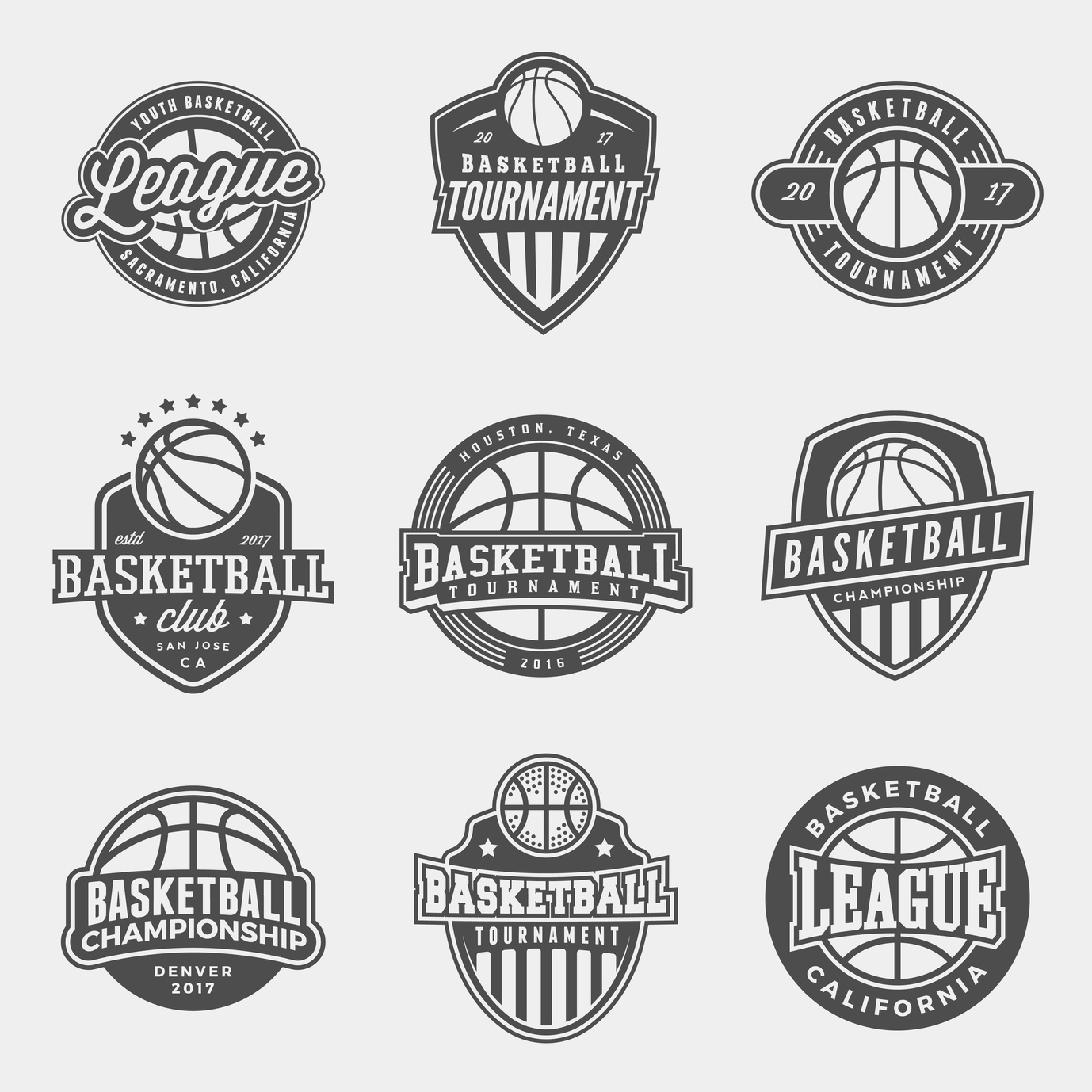
Have you been asked to design a basketball logo?
With basketball increasing its share in the sports market each year, it’s no surprise new teams are popping up all over the place.
As a result, older teams are looking to refresh their image.
A creative basketball logo helps a team to stand out. Not to mention, it can seriously increase merchandise sales. Here are the top tips for creating a perfect logo for your team, or for refreshing that old logo.
3 Tips for Creating a Fun Basketball Logo
1. Color
It’s key to have colors that stand out. High contrast and distinct color combinations will help the logo pop out on merchandise.
For example, if you visit this site about basketball hoop installation, you’ll see their logo uses yellow and green. The contrast of colors draws in your eye right away.
Try contrasting colors or simple black and white. The logo should also match the team’s uniforms, so it’s easily associated with them.
2. Get Inspired by the Game
Just like these classic NFL logos, you want your basketball logo to be inspired by the game itself.
Think about the classic NBA logo.
It’s a silhouette image of a player, in the dynamic movement of the game, running down the court, ball in hand. The image captures the excitement of the game — but is also clearly about basketball.
Gather inspiration from the game of basketball itself. The ball, the hoop, the players… all these elements can be used to capture the essence of the sport.
Keep in mind the icons you choose don’t need to be an exact depiction. Logos are known for being interpretive in their design. The image can be manipulated and stylized as long as it’s recognizable.
3. Think Simple
While it’s important to use imagery that speaks to the game, it’s equally important to keep it simple.
Choose one basic image and work off its premise. Don’t combine too many elements. The logo will be hard to remember and too crowded.
The most classic logos are extremely basic. Think of the golden arches, Nike swoosh, and classic Apple icon. They all have two things in common — simplicity and memorability.
Words also can be a part of the logo. But when it’s on merchandise or in the fine print, the words need to be easily read. Make sure your logo is recognizable no matter what size it is.
Many amazing logos in the NBA have the name of the team or town incorporated into them.
For example, the team logos for the Lakers, the Nicks, and the Raptors all incorporate their names into their logos.
Their logo, however, is still recognizable without the words. This is great for merchandising purposes.
Make Your Logo
You’re ready to make an awesome basketball logo. Just remember to:
- Think about color
- Get inspired by the game
- Keep it simple
If you use these three logo tips in your design, you’ll be sure to make a logo that resonates with basketball fans.
Need some more inspiration? Check out these sports logo ideas to get the ball rolling.
5 Smart Design Tips for the Perfect Plumbing Logo
Posted on October 19, 2018 by Logo Design Tips and Tricks

If you’ve just started a plumbing business, you’re likely interested in how you develop the perfect logo. But if you have little to no design experience, you may not know where to start.
This is a normal situation and can be easily solved once you’re aware of some basics.
Keep reading to learn 5 smart design tips that’ll help you create the perfect plumbing logo. By the time you’re done reading, you’ll know how to create a logo that’ll impress customers and even competitors.
Let’s begin!
1. Hire a Professional That Has Experience
If you want a professional looking logo, you need to hire a professional.
This might sound obvious yet when you consider the number of people offering logo design services it starts to make sense. That’s because many of these people aren’t good at designing logos. They’ll just take a templated approach and use a basic form of software to design your logo.
A professional, though, will ask you some questions about what you want.
They’ll also know how to make your logo express certain aspects of your business. For instance, suppose you provide special services for a specific area. An example might be hot water Canberra services. A professional can work out how to take this aspect of your business and incorporate it into the logo.
2. Don’t Rush
If you want your logo to look good, it’s important you don’t rush the process.
Make sure you take your time when working with a logo designer. If there’s something you don’t like, be sure to let them know and give them enough time to work on a new version.
3. Get the Opinions of Other People
It can help to get the opinions of other people. Consider asking a wide range of individuals what they think of your logo.
Be sure to get specific answers based on what they do and don’t like. You can then give this feedback to your logo designer and ask them to make the needed adjustments.
4. Do Your Research
You should also spend some time doing some research.
Find logos you like and send them off to the designer. These logos don’t need to have any kind of relation to plumbing. As long as they provide the designer with a sense of what you like, they’re fine.
5. Be Willing to Spend Enough Money
If you want a good logo it’s important you’re willing to spend enough money.
If you don’t you may end up with a logo that doesn’t look good. This can lead to it hurting the brand of your plumbing business.
Do You Know How to Design a Plumbing Logo?
Designing a plumbing logo is something that can be challenging if you don’t have a lot of design experience. But with the right tips, you should be able to make things easier on yourself.
You should think about hiring a professional and paying them a decent sum. You also want to be sure you have some examples of logos you like, which can help inspire the designer you’ve hired.
It can take some time to have your logo designed. But if you go through the needed process, you’ll eventually have something that truly meets your needs.
Designing a personal logo? Check out this post for some tips on how you can make your logo unique.
Designing a Personal Logo: How to Make Your Logo Unique
Posted on October 18, 2018 by Logo Design Tips and Tricks

Are you looking to design a logo for your personal business? Not sure where to start, or how to go about designing a personal logo that’s unique and awesome? Well, no need to fear, we’re here to help!
In this article, we’ll be covering the ins-and-outs of logo design, including tips and tricks on how to differentiate your business through the power of design. After reading, you’ll have the knowledge needed to create a unique logo that will wow customers and help boost your business!
So, What is a Logo Exactly?
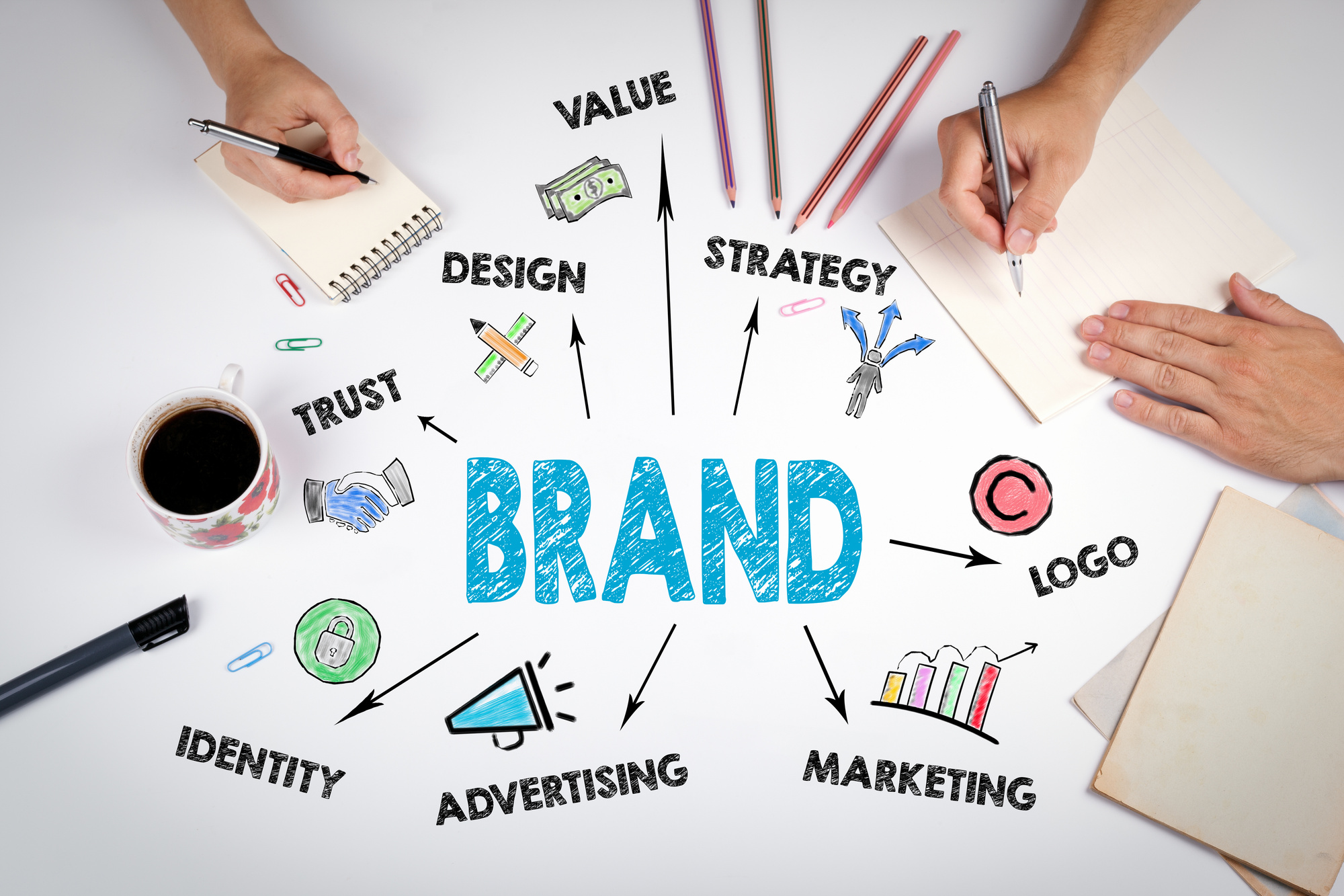
A logo is basically a visual symbol that helps connects customers with your business by making it familiar and appealing. A logo sets your business apart from other businesses and gives your business an identity that audiences can identify with and latch onto. When truly great, a logo can build a personal and emotional connection with audiences, so that they’re driven to try out your business or continue to engage with it.
Here are the 3 most common logos types you should know:
- Illustrative logos (illustrate what you do)
- Graphic logos (symbol that links to your brand)
-
Font-based logo (such as Fed Ex, Google, or Coca Cola)
Every type of logo has its pros and cons, so it’s best to explore every option and see which one ultimately works best for your business.
What’s Included in a Logo?
Logos consist of three important elements: a logotype, a brandmark, and a tagline. Here’s a breakdown of these three things:
Logotype
The logotype is the name of your business. It’s the typographic treatment of your business, which helps customers quickly identify your business. It’s also commonly referred to as a wordmark.
Brandmark
This is the visual element that provides visual recognition of your brand. It usually encompasses smaller elements like your logo’s coloring and overall aesthetic design. The arrow in the Amazon logo is an example of a brandmark.
Tagline
Last but certainly not least is the tagline, the text that accompanies the other two elements. An effective tagline serves the following functions:
- It grabs the attention of customers
- It specifies your brand’s message
- It makes your brand more memorable
- It creates a need for a customer
- It captures a certain desired brand feeling
When writing your tagline, focus on making it short, honest, and easy to remember. It should also capture the right tone of voice for your audience.
How Should I Approach Making a Personal Logo?
Before you jump into the visual design of your logo, it’s best to take a step back and do some research to determine which direction you should take it in. Here are some important tasks to do and questions to answer prior to making your personal logo:
Decide How You Want to be Seen
The first step in designing a logo is determining how you want people to perceive your personal brand. Do you want them to see you as relaxed and casual or more elegant and elevated? Write down some keywords you’d use to describe your brand and then try to capture those words in your visual design.
Think About Your Audience & Competitors
A logo is a form of communication, so it’s important you know who you’re ultimately trying to talk to.
Think about your target audience, who they are and what they like, and other places they shop, to inform how you should be talking to them. Create a profile of your typical audience member and make them as real as possible so you can find ways of communicating with them that come across as organic.
It’s also incredibly important to know what your competitors are doing, and how they’re talking to your potential customers. What do they do well, and what does their logo say about them and their brand?
Think about the ways in which you’re different from your competitors, and how that impacts how you talk to your customer. How can you visually differentiate yourself from competitors without alienating yourself from customers?
By answering this question, you can create a personal logo that sets your brand apart while still winning over customers.
Designing a Personal Logo
Now that you know what goes into a logo, let’s jump into everything you should know about the design process. Here are some tips and best practices for designing a unique personal logo:
Focus on What Makes You Different
The main focus of your logo at first should be creating one that is visually distinct from your competitors. In order to do this, think about all the things that make you unique or different from your competitors, and how you can incorporate those things into the design.
Also, consider any existing imagery or visuals you may have that you can leverage for your logo.
Beyond imagery, look into different font options that can make your logo stand out. Don’t focus on making it too loud or expressive, but rather try to make it reflect the tone and voice of your business. It should be unique enough, however, so that you’re not accused of copying competitors.
Make it Clean & Clear
The best logos are simple and clean. So, do your best to avoid making your logo complicated or elaborate, and don’t try to cram in too many design elements to make it stand out. Overloading your logo will only make it visually unappealing and distract customers from what you can offer them.
Another best practice is to make your logo as symmetrical as possible. Use familiar shapes and sizes for your logo to avoid making it seem off-balance. Another good rule of thumb is to only use two colors in your logo, as any more will make it seem cluttered.
Design Tips for Logos
Are you not familiar with the design process? Need help starting your logo design? Well, the good news is that there are great online tools that make it easy for you to create a logo for your business.
If you are using an online logo designer, just make sure to keep the following logo design principles in mind as you use it:
- Simplicity
- Versatility
- Timelessness
- Memorability
By keeping these design principles in mind, you can create a truly great logo!
Final Thoughts on Designing a Personal Logo
Designing a personal logo isn’t easy. A lot of time, energy, and effort goes into it. By following the tips and tricks in this article, however, you can approach the design process in the best way possible and create a truly amazing logo for your business.
Ready to take a stab at your logo? Get started with our free online logo maker!
Branding Tips: 9 Ways to Help Build Your Brand
Posted on October 14, 2018 by Logo Design Tips and Tricks
What do you think of when we mention the colors red and white along with a family of polar bears? Unless you’ve had your head in the sand for the last half-century, you likely conjured up images of those heartwarming Coca-Cola Christmas adverts.
This, in essence, is what branding is all about. Using as few words or details as possible to create something that sticks in the minds of your customers.
And while we may not be able to help you become the next Coca-Cola or McDonald’s, we can help you understand more about branding practices and the principles behind them.
Ready to take your brand to the next level? Check out these nine awesome branding tips.
1. The Significance of Semiotics
You’ll need to understand the ‘Why’ before you understand the ‘How.’
There’s so much more to branding than awesome logos and catchy slogans. And if you want to create a truly effective branding campaign, you’re going to need to understand that.
That all begins with a quick lesson in semiotics. In short, semiotics is the academic term for the study of signs and signals along with how we interpret them.
Think of a traffic light, for example. The colors red, yellow, and green don’t really mean anything on their own. It’s only when we assign meaning to them — stop, slow down, and go, respectively — that they actually hold a value.
Semiotics and branding go hand-in-hand. Take our Coca-Cola example, for instance! Those colors and images have become synonymous with soda through decades of branding.
But we don’t just know these things. It takes tons of repetition and brand awareness to make these work for you.
2. Call In The SWOT Team
Fortunately, this doesn’t actually involve calling in any sort of militant presence. Instead, it involves you and your team sitting down to take a good hard look at your company’s past and present to determine its future.
SWOT is an acronym for strengths, weaknesses, opportunities, and threats.
The former two are quite self-explanatory, but the latter half of the acronym is where you’ll really start to flex your marketing muscles. Who is your biggest competition and what opportunities are they seizing that your company currently isn’t?
The more you flesh out your company’s standing in the market, the more successful your efforts will be.
3. Analyze Your Values
Whether conscious of it or not, every brand exudes certain values. A surefire way to make branding a business easier is by taking a hold of those values and leveraging them in a positive way.
What is it that you set out to do when you first created your company? Furthermore, what sets you apart from any other business in your field?
Admittedly, these questions can be difficult to answer. However, they’re often actionable responses, such as an increased focus on customer service or an open mind and desire to help the local community as your business grows.
Whatever the case, your brand has values, and you’ll want to make sure they’re sending the right message.
4. Assess Your Audience
Whether you’re in the midst of a campaign that isn’t quite making its mark or you’ve never launched a branding campaign before, you’ll want to take a closer look at your market.
Who, exactly, are you trying to sell your goods or services to and why did you choose that market?
5. Create A Customer Avatar
This step works in perfect tandem with your assessment. Once you have a clearer picture of who you want to sell to, you’ll want to create a fictional individual that exemplifies your audience.
Personifying your audience can make your marketing seem more tangible, in a way, as you’re no longer selling to a faceless group. Now, you’ll have an (albeit fictional) person to market toward.
Include at least basic elements such as their age, gender, income level, language style, and degree of education.
6. Develop Your Brand’s Voice
Branding a business is about setting your company apart from the pack. And part of that includes humanizing yourself, as well as your audience.
One fantastic way to achieve that humanization is to develop a voice for your brand in conjunction with your customer persona.
Speak like your audience speaks. If they’re using casual language, go casual. If you’re trying to sell directly to other businesses, use a more formal, buttoned-up approach.
It is worth noting, though, that warmer language and more personalized content tend to generate better results. So even if you’re a B2B company, try and implement warmer, friendlier language.
7. Make A Memorable Logo
While the more humanistic aspects, such as your brand’s voice and customer persona, matter a great deal, it’s likely your logo that is going to best stick in customers’ minds.
It’s hard to nail down what makes a great logo, but every successful logo has a few things in common:
As you begin to create your logo, think of how you can use each element together to create something your audience will remember.
8. Establish Branding Guidelines
If your marketing team consists of 15 people, and each of those 15 people has their own ideas of what is and isn’t going to help your branding, it’s safe to say that your campaign is going to be quite muddled.
We recommend teams work together to create a set of guidelines and best practices for their personal brand so that branding remains consistent across channels like social media, your website, advertising, and pamphlets.
9. Be Patient
As the saying goes, Rome wasn’t built in a day. And, unfortunately, your branding won’t be, either.
Be patient throughout your campaign and don’t expect results to flood in instantaneously. It’s going to take some time for your efforts to have a noticeable effect.
These Branding Tips Can Make A Corporation A True Brand
These branding tips are designed to give you the basic outline of a strong branding campaign. Now, it’s up to you and your team to create something truly revolutionary!
Ready to get started on your branding? Make sure to check out our free logo-making program that can help you create the next memorable design. And best of all, it’s completely free!


