Moving Matters: 8 Tips for Logistics Logos
Posted on January 04, 2019 by Logo Design Tips and Tricks

A brand’s logo can have a profound effect on the level of loyalty and rate in which a company experiences repeat business from customers.
For many business owners, that fact comes as no surprise. After all, with the number of companies flooding today’s marketplace, branding elements like logos are at the forefront of telling people that you’re different and are worth working with over their many other options.
Therein lies the value of making sure that your logistics logos move people as well as you move your customer’s products.
But how can non-experts create outstanding logos?
While the creation of a “good logo” is a subjective and personal process, there are levers you can pull which will help improve your chances of coming up with a logistics logo that’s truly extraordinary.
Below, our team shares a few tips that all logistics services providers should consider when crafting their logo.
1. Think About Your Company’s Core Values
The first and most important step you should take when crafting your logistics logo is to put down your mouse, set down your pencil, and take the time to reflect.
Remember, a logo is a piece of branding that works to set you apart from your competition. In order to craft one that’s effective, you first have to ask yourself the vital question of, “What makes me different?”
Is it your superb customer service? Is it a special guarantee you offer?
Keeping in mind what sets your logistics company apart and what elements of your culture are most instrumental to who you are will help you craft logistics logos that speak earnestly to your brand’s DNA.
When you’ve come up with a few differentiating factors, write them down. You’ll want to keep them handy as you move through the stages of the logo crafting process.
2. Analyze Your Competitors
Finding inspiration is critical to being able to do your best work and to avoid time wasting mental blocks. The best place to find inspiration for logistics logos is to look at logos successful logistics companies are sporting today.
Logos that come to mind when we think of logistics are the brown UPS logo, USPS’ eagle, the simple red and yellow branding leveraged by DHL and more.
Take a few moments to pour over logos that have worked for other logistics providers. Note what you like about them and what doesn’t jive with you. Use your insight to help you guide the creation of your own logo.
3. Start in Black and White
Creating logistics logos can be an exciting process, especially if you’re finding yourself inspired. While that excitement and inspiration may make it so you want to rush to pump our your final product, we caution against that.
Great art is rarely done in a single pass. Instead, the creation process is done in steps.
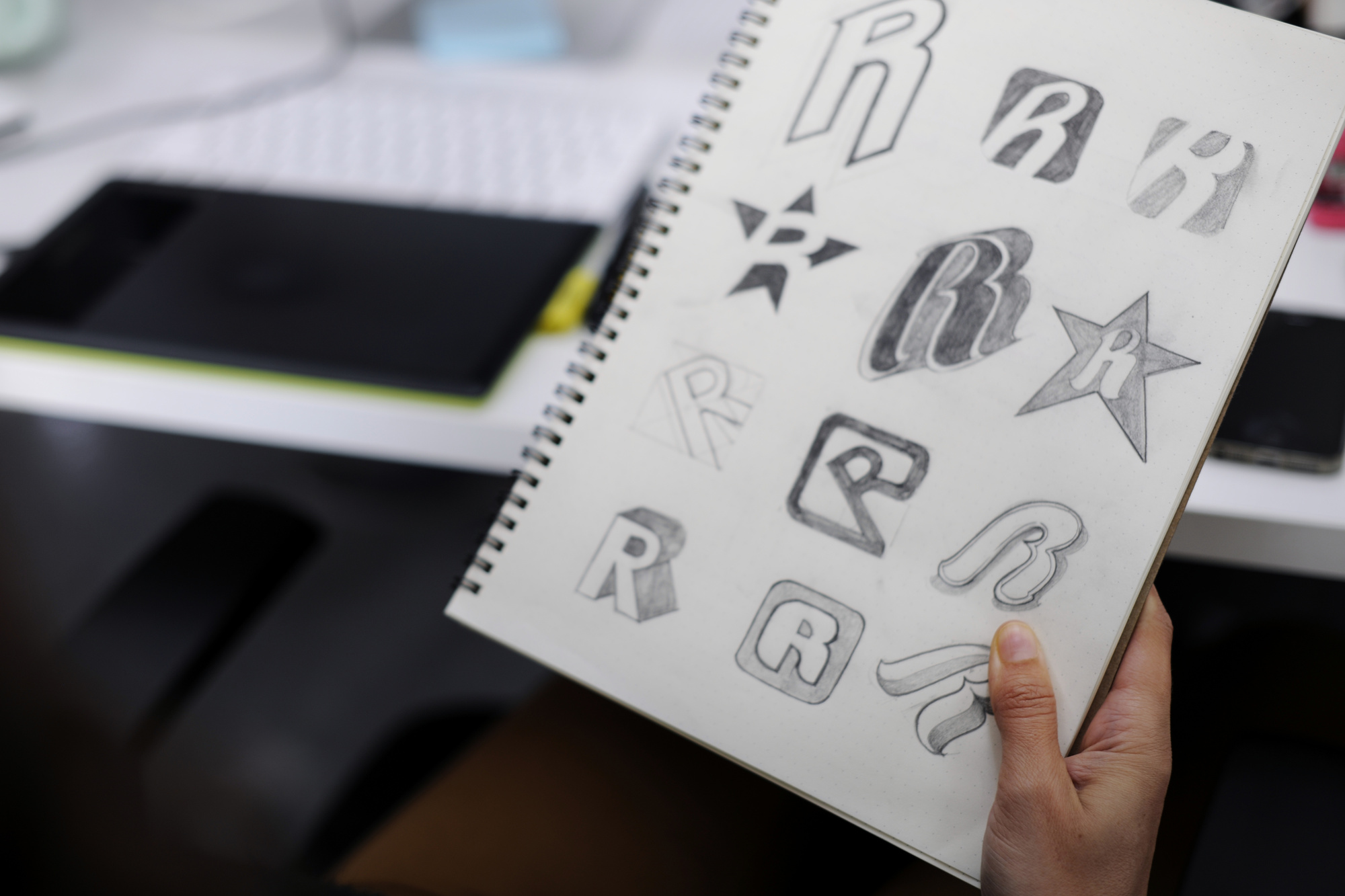
Our recommendation is to begin your logo crafting journey by putting away your colors and by just sketching out a few ideas. Once you have some basic designs you like, ask yourself, “Do these logos work without color?”
A lot of people make the mistake of using color as a mask to cover up a weak logo silhouette. In order to make sure that your design works at its foundation, it should resonant without color.
Think of color as icing on the cake, not as the cake itself.
4. Use Color Intelligently
With a good logistics logos foundation in place, it’s time to add some color to help your creation really get its stride.
Color is very important to logos and branding in general because it does a tremendous amount to evoke emotions in people.
Think, what comes to mind when you see black? Death? Evil? Darkness?
What comes to mind when you see green? Growth? Sustainability? Harmony?
Because of the feelings and associations humanity has with color, it’s important that you tactfully pick which ones you’re going to incorporate into your logo. That way people can get a feel for what you’re about just by looking at it.
This guide is very useful in helping deduce the meaning of color. We recommend that you look it over and tastefully utilize colors that mean something in your logistics logos.
5. Consider Playing With Motion
Logistics companies move things. Because of that, we think that it’s worth considering adding motion to your logistics logos.
How do you add motion to a still image? A lot of ways.
Think about the famous Nike swoosh. The way in which the designer went about drawing what appears to be a simple check mark adds an element of speed and activity that fits perfectly with the active nature of the brand.
Compare that logo to a stationary logo like the Twitter bird. The bird is flat, balanced, and appears to be frozen as opposed to being in motion.
The suggestion of adding motion to your logistics logos is just that, a suggestion. It’s not something that’s necessary but may be worth mulling over to create something that pops.
6. Pay Attention to Typefaces
Amateurs think solely about graphics when they’re crafting logos.
They think about wine bottles when they’re crafting logos for wine. They think about glasses when they’re crafting logos for optometrists. They think about wheels when they’re crafting logos for a logistics company.
These are not bad thought trains and we appreciate that it’s natural to make those basic associations.
Still, if you get too cliche with your design, your branding will fade into the background. To come to your logo from a unique angle, consider focusing on typefaces.
Typefaces are a fancy word for the text that appears in your logo. In some cases, you’ll have typefaces in your logo that compliment an image. In other cases, a unique typeface will make up your whole logo (think DHL).
Ensuring that your typeface is receiving just as much thought as the graphics in your logo is extremely important to understand all of your design options. It will also prevent you from making something that feels too familiar.
7. Complete Multiple Drafts
Creating fantastic logistics logos isn’t a one and done process. As a matter of fact, creating logos for any niche isn’t a one and done process.
Any logo you’ve ever admired is a by-product of creating drafts, getting feedback, making revisions and repeating the cycle over and over again. Many logos for the world’s biggest brands evolve over the years in a non-stop aim to improve (think Starbucks).
Understanding that, don’t feel discouraged if you’re not in love with the first logo you put out. Instead, celebrate your progress and relish the opportunity to get feedback.
Talk to friends, family and your professional peers about your logo. Poll your customers.
You’ll be amazed by how far your logo can come with just 2 or 3 critique and improvement cycles!
8. When You Look at Your Logo, It Should Mean Something
We’ve said it in varying ways throughout this article and we’ll say it again… Your logo needs to have meaning.
People can get so lost in their logo creation process that they lose sight of the original values they wanted to incorporate into their final product.
To make sure that your logo didn’t lose its meaning during its creation, look at your final draft and describe what each of its elements means. Ask other people to look at your logo and ask them what feelings it evokes.
If you or your spectators are at a loss as to why certain colors and shapes are present in your logistics logos, head back to the drawing board.
There are too many companies out there competing with you to feel comfortable with bringing a subpar logo to market. If you’re not sure yours is communicating what it should, take the time you need to fix it.
Learning More About Logistics Logos
Logistics companies are increasingly putting time and effort into their logistics logos. This trend is picking up momentum given the increased understanding of the physiological effects excellent logos can have on customers.
We hope that our tips will help inspire logistics logos in you that are every bit as impressive as your business! If you should need help crafting your next masterpiece, consider leveraging the 100% free logo making tools we offer on Online Logo Maker.
We’ve provided thousands of businesses with the tools they needed to craft the logo of their dreams. Let us provide you with the same value.
You can also browse more content on our blog for additional information and inspiration.
Structured Finance, Structured Logo: Financial Logo Ideas to Inspire Any Finance, Banking, or Accounting Firm
Posted on January 02, 2019 by Logo Design Tips and Tricks

You realize that your financial service firm is not cut from the same cloth as your competition. You are different — and for all of the right reasons. So, shouldn’t you create a logo that makes you stand out accordingly?
Your brand logo helps you to build credibility and create recognition, so how you design your logo isn’t something you should take lightly.
The trick with creating a logo is that you want your firm’s logo to be memorable. But it also needs to be appropriate and simple.
In other words, creativity does have its limits when it comes to financial logo design.
If you’re looking to improve the brand image of your financial services firm, here are some financial logo ideas to inspire you.
Let’s dig in!
Promote Stability in Your Financial Logo
The logo you create for your financial service firm should represent your brand well. For this reason, stability is one of the most critical traits that your logo should exude.
Your customers entrust their business profits or life savings to you. In addition, they trust you with their data (which is why using a data management solutions provider like Umlaut is a good idea). Because your customers place so much trust in you, they have to ensure that your firm has the stability necessary to fulfill your promise to them of keeping their assets safe.
This is why you should use symbolism representing firmness, strength, and longevity to make your firm’s logo.
Promote Professionalism
In addition to making your company appear strong, your logo should make you look professional.
Modern bankers are now accepting the idea of incorporating colors into their brand logos. However, your symbols and images should still look sophisticated.
Let’s take a look at a few examples of financial service firm logs that illustrate both stability and professionalism.
Deutsche Bank Example
First up is Deutsche Bank. The bank’s logo is essentially a white square outlined in blue and with a blue rising line inside it.
This company’s logo, designed by Anthony Stankowsky in the 1970s, stands out because it is striking yet simple, representing sustainability, stable growth, and financial gain. It’s the type of logo that generates recognition.
Note that squares are often used in the banking industry to build stability and trust, as they represent a controlled and secure environment. Also, the bank logo’s rising line surrounded by the square symbolizes financial gain and stable growth.
TD Bank, N.A. Example
This famous bank’s logo is basically a light-green square with the dark green letters “TD” inside of it, followed by a dark-green “Bank” after it on a white background.
The square represents a settlement, enclosure, or home idea and thus symbolizes stability. Meanwhile, the green color symbolizes money and vitality. And the ligature symbolizes coherence and connection.
Incorporating these types of elements into your firm’s logo design can help you to draw clients and keep them long term.
How We Can Help
We are a leading online logo maker, offering the tools you need to create high-quality logos without spending a lot of money and time doing so.
With our tool, you can simply add text, add a symbol and upload an image to produce a logo.
Get in touch with us to find out more about our services and how we can help you to create the perfect financial logo for your financial service firm in 2019.
We’re in This Together: Co-working Space Logos to Take Inspiration From
Posted on January 02, 2019 by Logo Design Tips and Tricks

A logo is a customer’s first contact with a business’s brand. It is also their first opportunity to form an impression.
Co-working spaces across the globe have been cropping up to help the ambitious entrepreneurs. They have defined their own brand while offering others the space to do so.
Keep reading to discover how co-working space logos communicate their brand.
Elements of a Great Logo
Before you start drafting up your logo think about your brand’s mission. What are you trying to accomplish? Write down 7 words come to mind when you think about your mission and brand. These will inform the choices you make in color and style of your logo.
Clarity
A logo is a symbol of your company. Take the information you wrote down before and incorporate it into your design.
If your business feels more serious, using lots of dynamic colors and fonts may not be for you. These elements may fit more with a business that wants to convey a fun vibe.
The elements of the logo provide insight into the company. Be sure that all aspects of the logo blend together. For instance, if you are going for something serious, don’t blend a serious symbol with comic sans.
Simplicity
The best way to visually promote a concept is with simplicity. You can have complete clarity of vision by keeping your logo simple. You want your target audience to immediately recognize your brand.
A logo that is too cluttered is more confusing than inspiring. Use a few elements that are fundamental to what you want to convey.
Make It Memorable
A logo that is clear and simple is memorable. A logo will often on get a glances worth of attention. You want someone to be able to recognize it based off a glance. A cluttered, confusing logo will be quickly dismissed.
Understanding the psychological effects of colors can help you create a lasting impression.
Unique and Timeless
Search your industry to see what your competitors are doing for logos. You don’t want to make a logo that looks like theirs. While it may seem great to do something similar, you will ruin your chances of standing out among the crowd.
Companies update their logos from time to time to modernize it. When creating a logo, choose elements outside of something trendy. Trendy designs will look great for today, but you’re in for a re-design when the trend dies.
Versatile
Think about the placement of your logo. If you’ll be printing it on t-shirts, fanny packs and pens, you’ll need something versatile. A cluttered design will be harder to read on different mediums.
Whether you are designing for packaging or business cards, keep clarity of vision in mind.
Co-Working Space Logos for Inspiration
Here are a few logos from around the world:
Campus
A campus is a number of spaces owned by Google for entrepreneurs all over the globe. Their logo is a combination of text and illustration. The illustration is a 3D cube in the shape of the letter ‘C’. The text is the business name and location.
The 3D cube frame acts as a symbol of open space and the unique uses for the Campus spaces.
The Hoxton Mix
The Hoxton Mix is a co-working space located in London. Their space is a modern high-end office building for those in need of a remote office location. They convey this with a dynamic typographical logo. It displays bright, eye-catching colors and sleek letters that form into each other.
This logo is simple but immediately recognizable.
Innov8 New Dehli
Innov8 has several coworking spaces throughout the major cities of India. These spaces cater to young creatives and professionals alike. To convey this idea their logo uses a combination of elements.
First, it is a combination of italicized and straight fonts. Second, it uses bright colors. These combine to show a modern, playful yet professional taste.
Final Thoughts
When building a great logo, brand communication should be the foremost in your mind. A well thought out logo will be simple, clear, and memorable.
Successful co-working space logos display these elements.
To create your own unique logo, click here.
How to Attract Customers to Your Store with Clever Store Displays
Posted on December 28, 2018 by Logo Design Tips and Tricks

Does your store window use the same tired props every season? Are you stuck for ideas to tempt new customers over the threshold?
It can be tough to know how to attract customers to your store with a new display every month. When you factor in the changes to in-store displays, signage, and advertising, that’s a lot of visual merchandising techniques you need to consider.
Here’s how to rejuvenate your store displays and boost footfall through your door.
How to Attract Customers to Your Store in Four Easy Steps
Visual merchandising is huge business for a reason. However, there are some easy and affordable tactics you can use to spruce up your displays without spending the annual marketing budget in one go.
1. Get All Staff Involved
A fresh perspective could be all it takes to shake up your displays and take them from drab to fab. Give each team member the opportunity to come up with an idea for a seasonal display. You could even run a competition for the best one!
Research your products and ideal customer online, too. Use social media to look at how items are used – and photographed – by the type of person you’d like to shop in your store.
This will give you great store display ideas that’ll attract the right people through the door.
2. Offer Temptation (Instead of Putting the Best Goods on Display)
You want people to walk through the door and continue to enjoy what they see! Many store displays use the best products available, which leads to disappointment when customers walk further into the store.
Tempt customers in with a few key items, and use in-store displays to keep them visually entertained and interested. Highlight key areas in the store with marketing solutions like branded flags or roller banners to make important products and promotions completely unmissable.
Grouping products together – such as a cookery book, a mixing bowl, and a designer apron – will boost additional sales, too. Customers are more likely to buy additional related items if it is easy to do so.
3. Use Digital Signs for Real-Time Updates
Digital signs can be as simple as hooking up a large TV screen to an app like OptiSigns Digital Signage & Instagram. Choose your hashtag or chosen topic, connect your TV to the app, and that’s it!
A stream of related content will continue to update and show off your products, or generate ideas of how your items can be used in a lifestyle setting.
For example, if you want to sell yoga mats, you could use a digital sign to run a stream of #YogaStretch Instagram posts in the background. Customers will then easily visualize how the product could be used and this will encourage them to buy.
4. Subconsciously Guide Your Customer on a Journey
Lead your customer from window front to interior display, to wall display, to product racks. This will build a subconscious journey that, with each step, builds a customer’s commitment to purchase.
For example, use spotlights at different levels to lead the eye from one product to another. Strip lighting on the floor will create a pathway, while soft lighting in fitting rooms is enticing and flattering.
If you’re using mannequins in the window have their head turned towards a product. The same goes for printed signs and advertising: use models who are looking at the product, not out at the customer. This has been proven to boost product sales!
Consider Your Branding, Too
Knowing how to attract customers to your store is more than creating intriguing shop displays. A strong brand personality will influence the colors, fonts, and even photography style you use to entice people to buy from you.
A good brand stems from a great logo. It should encompass your key colors, fonts, and that all-important personality that you want to convey. Have a go on our free logo maker tool to see how your updated brand could rejuvenate your stagnant displays!


