Offline, Anyone? 7 Traditional Advertising Methods That Drive Sales
Posted on May 06, 2019 by Logo Design Tips and Tricks
There’s no arguing that digital marketing is the way of the future. In fact, according to studies, chief marketing officers (CMOs) spend two-thirds of their marketing budgets on digital strategies.
However, this influx of dollars and expected continued popularity has led the digital space to become extremely crowded. Consumers are increasingly turned off by digital ads that can feel intrusive and even creepy.
At a time when everybody else seems to be all about getting ahead in the digital marketplace, the key to success may lie in taking a step back, kicking it old-school, and focusing on traditional advertising.
If you’re still not convinced that offline advertising deserves at least a part of your marketing budget, stick with us. Here are seven extremely effective methods that you’ll definitely want to try!
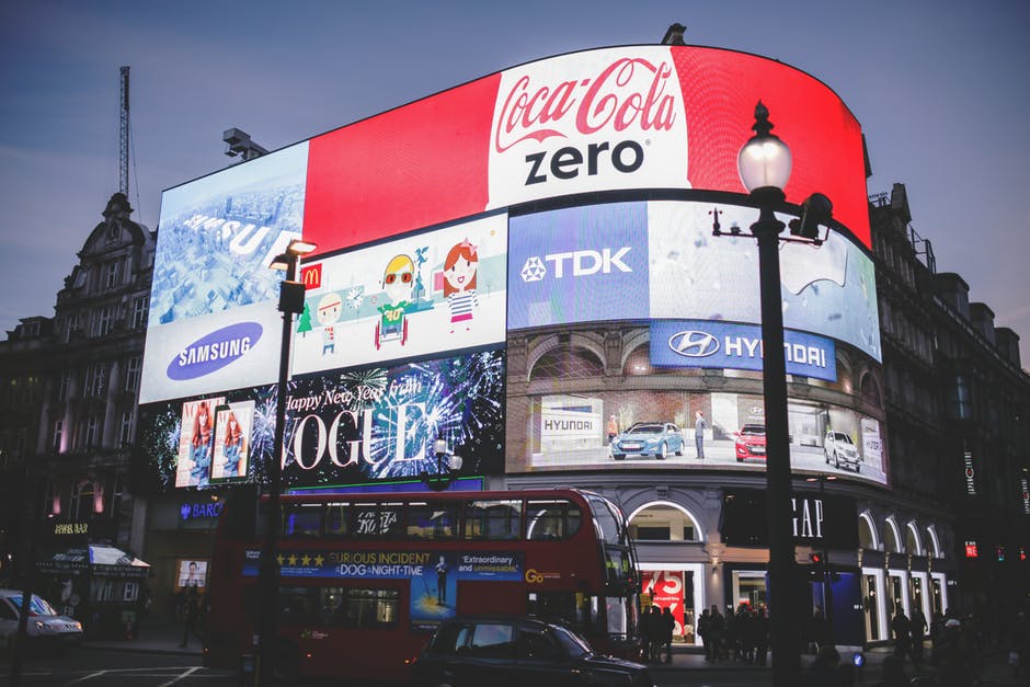
#1 Traditional Advertising Technique: Television and Radio
Although digital marketing is the big dog in town, there’s still plenty to be said for television and radio advertising. Most people watch television, in fact, there are 119.9 million TV households in the U.S. alone. And 227 million people also still listen to AM/FM radio, primarily in their cars.
It’s easy to see that allocating a portion of your marketing plan to these media outlets can help you reach a large audience. And, since so many companies are leaning away from this type of advertisement, it’s an easier space for you to make a name for yourself.
6 More Marketing Ideas You Need to Try
Although TV and radio ads continue to be an excellent option, many business owners just can’t stomach the expense. For this reason, they tend to lean towards other traditional marketing methods that are less expensive but possibly just as effective. Check out these six exciting ideas.
1. Word-of-Mouth Marketing
Word-of-mouth marketing is extremely effective and is also one of the least expensive traditional marketing methods. This strategy often focuses on online review sites like Google, Yelp, and Facebook recommendations.
Since 80 percent of people ask for a personal referral before choosing a vendor, managing your online reputation is critical. Consider offering incentives to your happy clients to provide you with positive reviews on these types of sites. Also, always monitor your reviews and respond to negative comments immediately to reduce potential damage.
2. Vehicle Advertising
Wrapping your car with branded advertising is an excellent way to market your business. Every time you get into your car, you’re essentially a mobile billboard.
If you’re not ready to go for a full wrap yet, consider branded car decals. These are far less expensive and easier to remove if you change your branding or are no longer happy with the look.
Driving a branded car also shows that you’re committed to your business and are proud to represent it no matter where you go. This can help with goodwill, especially in smaller communities where people are likely to start recognizing your business’s vehicles.
One word of warning, however. Make sure that anyone who drives your branded vehicles understands that they are representing your company when they’re behind the wheel. The last thing you want is road-rage or some other incident tarnishing the brand you’ve worked so hard to establish.
3. Printed Ads
Printed ads are another old-school marketing technique that isn’t going anywhere. In a world where you can read a book, search the internet, chat, and visit social media all from the same device, the distractions can get overwhelming. For this reason, many people are once again starting to lean towards printed media as their go-to source for information.
Magazine ads and newspaper flyers are an excellent way to capture the audience that’s simply exhausted by the constant flood of digital media. To succeed in this space, you’ll need eye-catching artwork and a tagline that hooks the reader, pulling them in.
4. In-Store Displays
If you’re selling a product that someone can purchase in a store, then eye-catching in-store displays is another great way to grab your customers’ attention.
Done right, these displays can stop shoppers in their tracks. Since they’ll already be in the store, it’s super-easy for them to pick up your product and toss it in the cart.
You make money, the store makes money, and the client gets instant gratification. That’s what we call a win-win!
5. Direct Mail
Did you know there were approximately 281 billion emails sent last year? When you’re looking at a huge number like that, it’s easy to see that you’ll have some competition while fighting for attention in someone’s inbox.
On the other hand, there are far fewer businesses sending out direct mail. When your ad lands in someone’s physical mailbox, you’re more likely to at least get a glance. If your ad is well made with attention-grabbing visuals and headlines, you might even connect with your ideal customer.
6. Event Marketing
If there’s one surefire way to earn goodwill among your ideal customers, it’s by making your brand visible at the events they attend. This is especially true for local businesses who sponsor area charity and community events.
When you sponsor an event, you’re often able to include your logo on banners and signage, on the back of t-shirts, and more. You may also have the opportunity to included branded promotional items and/or discount coupons in swag bags that go out to all of the attendees.
When seeking out events to sponsor, look for those that fit well with your brand or that you are truly passionate about. This will help you make true connections with the right types of prospective customers.
Is Your Brand Positioned for Effective Marketing?
Now that you have some excellent ideas to incorporate traditional advertising into your marketing plan, you’ll want to make sure you have your brand positioning ready to go. This includes having a killer logo design.
Even if you already have a logo, giving it a refresh can breathe new life into your brand. Check out our tutorial to learn how you can make a new logo for free! Once your update is complete, you’ll be ready to move forward with your new and improved marketing plan.
3 Mistakes You’re Making With Your Realtor Logo
Posted on May 04, 2019 by Logo Design Tips and Tricks
Are you looking to design or redesign your realtor logo, but not sure which direction to take?
Whether you’re a first-time realtor or a seasoned vet looking to do some rebranding, your logo is one of the most important things to consider.
Creativity alone is not enough to make an awesome logo. You need to make sure your logo is sending the right message to clients.
There are a few common mistakes that people make when designing logos. And if you’re making one of these mistakes, there’s a good chance you’re costing yourself some clients.
Keep reading to find out the top 3 mistakes you’re making with your realtor logo — and how to avoid them.
Mistake #1: Your Logo is Too Cluttered
Crazy fonts, bright colors, multiple images. With everything you need to consider, it certainly can be easy to get carried away when designing a logo.
While it’s important to make sure your logo conveys a message to your target audience, you don’t want to go overboard.
If your logo has too much going on, it can be hard for your audience to make out the texts and the images. Not to mention, a cluttered logo can make you appear unprofessional and even somewhat desperate. No business wants that!
But how do you fix a logo that’s too cluttered?
If you want to make a great impression on your clients, you need to create a realtor logo that is clear and concise. Take a hard look at your logo. Then, go ahead and remove anything that isn’t necessary. Stick to only one font. Try to pick only a couple of colors that work well together.
While minimalistic logos may seem boring, they send the message that you rely on your services to make the sale.
Mistake #2: Sticking to Cliches
Obviously, if you’re in the business of selling houses, you want to create a logo that lets your audience know that’s what you do.
However, the real estate industry is already littered with logos that contain pictures of houses.
To avoid this cliche, try to think of ways you can take the house image to another level. Or, pick a different image that speaks to the name of your brand. Great Blue Real Estate did this with their logo, and it works flawlessly.
Mistake #3: Following Trends
Remember the unicorn color trend that everyone was excited about for all of five minutes?
While it’s fun to hop on trends as a consumer, you don’t want to be using them as inspiration for your logo design. This is because, as we all know, trends come and go.
If you try to make your design too trendy, you run the risk of becoming dated.
Instead, go with classic, timeless designs that you won’t need to update every few months.
Realtor Logo: Wrap Up
We hope this article helps you get on the right track for your logo design.
If you have any questions regarding your real estate logo, please do not hesitate to get in touch with us.
5 Travel Logo Design Ideas That Will Attract Tourists
Posted on May 03, 2019 by Logo Design Tips and Tricks
There are as many different kinds of logos as there are colors and styles.
With so many out on the market, how do you even begin to make a good and memorable travel logo design?
We’re here to help you figure that out! Read on to learn more!
1. Share the Excitement
When a person is on the look out for a great vacation, they want it to be stress-free and full of fun adventures.
You want your logo to jump out at your customers and let them practically feel what it would be to travel with you. Your logo is one of the very first things a customer will see when researching your company, so it has to make a lasting impression.
Don’t be afraid to have a lot of fun when it comes to a travel logo design. If you’re having fun making it, other people will be able to feel that excitement.
2. Showcase the Location
Share bits and pieces of the location your customers will be traveling to. Not only will it make for an interesting and unique logo, but it will also give them a taste that makes them want more.
Be sure to pick out certain traits about your location that really show off its best qualities. For example, a travel logo design for a cruise to Australia would be completely different from one meant for a Saigon tour.
Show off what makes your location special by sharing it in your logo.
3. Font Choice
Use the font in your logo to portray the type of style your company is all about. Each kind of font can give off a different type of feeling, so make sure to choose one that works best.
If you offer a more business-like kind of service, then using bold and professional text styles would be best. However, if your audience is mostly families with kids, then you should try to make use of loose and cartoon-like fonts that really give off the feeling of fun and joy.
4. Bright Colors
All colors invoke different kinds of emotions to their viewers subconsciously. You should keep that in mind when coming up with your logo so that you can be certain to give off the exact kind of emotion you want your customers to feel.
In general, we’d suggest bright and bold colors that can give a feeling of happiness and fun. Although you should try to match the colors with bits of your company’s chosen colors so that it can help to build up your branding at the same time.
5. Give a Message
A good logo tells a story. For a travel-specific logo, this trait is even more important. Everyone loves a good story, and it’s up to you to provide one to your customers.
Figure out what you want your company to represent, what you want to really tell people. Then find a way to incorporate that into your logo design.
A logo is a quick way to shine a spotlight on all the best things about your company and what you can offer to your customers.
You Don’t Have to Go Far to Create a Great Travel Logo Design
With all of this, you have the equipment you need to start designing that perfect logo that your customers will love. Just remember to try and have a little fun with it and the rest will come naturally!
Having some trouble? We can help!
How to Make Your Finance Company Logo Stand Out
Posted on May 01, 2019 by Logo Design Tips and Tricks

When consumers make a choice between competing businesses there are motivations that help them decide.
For business owners, the trick has always been to recognize what their potential customers want ahead of time.
There is nowhere this is more important than in designing a finance company logo. Nearly 30,000 planners exited the business in 2015, a fact that shows how fiercely competitive the industry is.
The right finance company logo can help you attract and retain clients. You will communicate integrity, success, and longevity if you put these design ideas to good use.
Make your logo stand out! Here’s how:
A Finance Company Logo Signals Success
A memorable logo will attract the eye of your clients. It’s not enough to just catch a fleeting glance though.
Your design for a finance company or financial advisor should communicate success. Before you begin to hit the drawing board, ask yourself what signals success to you.
Is it high priced items? Glitter? Gold? Thinking of your symbols of success can help you decide what colors, designs, and textures conjure success in your mind.
Keep Your Clients in Mind
Knowing your audience is a cornerstone of any business. It’s not enough to want more business.
At the center of any marketing campaign is learning to understand your customers and anticipate their needs. This is especially true in financial services.
If your core demographic is younger clients looking to aggressively build wealth, this should inform your logo design. High contrast, warm colors, will signal excitement and strength.
On the other hand, the stability and calming effect of cool tones and stable lines will communicate something different altogether. You may appeal more to older or wealthier customers who require caution.
Would you prefer to attract clients who are drawn to the excitement of wealth building or the assurance of wealth preservation? Knowing what your clients want is important.
Build Your Brand
Companies spend millions of dollars on brand management. They want to control how clients perceive their goods and services.
Every marketing campaign, external outreach, and client interaction affects your brand. And at the heart of brand management is logo design.
A finance company logo should be shaped by what your clients want as well as who you are as a company. A finance company in a tropical paradise could feature a palm tree.
Don’t laugh: Signaling both offshore banking opportunities and a connection to paradise could be a great background to a logo.
Inversely, if you are located in a busy urban area, a skyscraper elevating wealth to new heights could be a key image.
Logo design is about color, line, and image. But just as important is your customer and your brand.
Find the Inspiration
After you spend some time reflecting on the direction of your company, the needs of your clients, and your core principles of success, you are ready to start experimenting.
Finding inspiration is easier than you think.
Online Logo Maker has tools to help you make your own free logo. What could be more simple?
Come try out our tools and find the inspiration you need to make your logo stand out today!