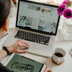
Web Design Matters: All About the Importance of Website Design
Posted on July 22, 2019 by Logo Design Tips and Tricks
The world of business is evolving all the time, many of the most recent innovations have to do with the internet. Today, about 17% of sales are done online.
Therefore, the importance of website design cannot be emphasized enough. Having an organized, navigable website with a decent logo can be the difference between a successful business and an unsuccessful one.
Unfortunately, most of us are not computer technicians or experts on the world wide web, so making a good website can seem like a daunting task.
The good news is that you’re not alone. We’ve made a list of some features that every website should have (and why) in the paragraphs below.
1. Business Information
The first thing anybody should know when visiting your website is why it exists. Do you sell cakes? Used cars? Legal services? The purpose of your business should be clear almost instantly.
The purpose of your business should be clear on the front page and in the domain name. If you sell bouncy castles, for instance, bouncekingdom.com would be a great domain name. A more vague name like aircastles.com would not be as good. In general, using a domain name with five letters or less can make your brand easier to remember and type.
Not only will you need to communicate the purpose of your business, but other information should be easy to find as well. If your company has a logo, it should be visible on every page, without taking attention away from everything else.
It should also be easy to get a hold of the business. Usually, this is done through the use of a ‘contact us’ page. Most websites display these prominently so that the customer will be able to reach out to them without any difficulty.
If you’re looking for a company to help with web design Richmond, Virginia is a great place to start.
2. Other Content
In the earlier days of the internet, having a website that was exclusively about business was common. However, recent years have seen the rise of a new trend, often referred to as link building or search engine optimization.
The basic idea behind this is to put articles on your website related to your particular business or industry. By sharing relevant advice and information, you can use the sheer power of human curiosity to increase your website traffic.
This may seem like a strange tactic, but it works, especially for small businesses.
Maybe Valentine’s Day is coming up, and I’m not in the market for flowers, or an engagement ring, or any related gifts. However, I see an article on the origin of Valentine’s Day, and now I visit the website just to learn more.
3. Mobile Friendly
Since late 2016, mobile browsing has consistently accounted for roughly half of all internet use. If your website isn’t capable of being navigated from a phone or other device, you’ve already lost a gigantic customer base.
Whatever website design you end up going with, mobile use needs to be a necessity.
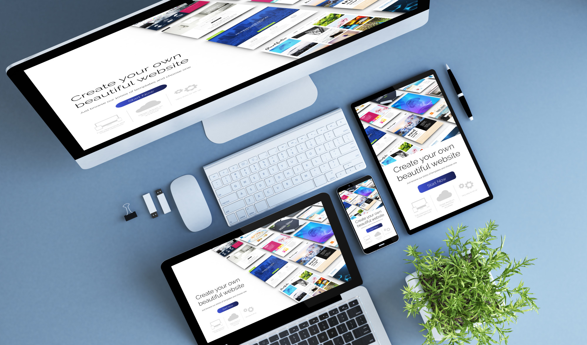
The Importance of Website Design
The importance of website design must be understood when running any kind of business. We’ve mentioned only a few of the things your website must have above, but there’s more out there.
We encourage you to do more research on your own.
If you want to know more about business logos or are looking to have one made, please check out the rest of our site.
5 Ways a Logo Redesign Can Improve Your Sales Strategy
Posted on July 19, 2019 by Logo Design Tips and Tricks
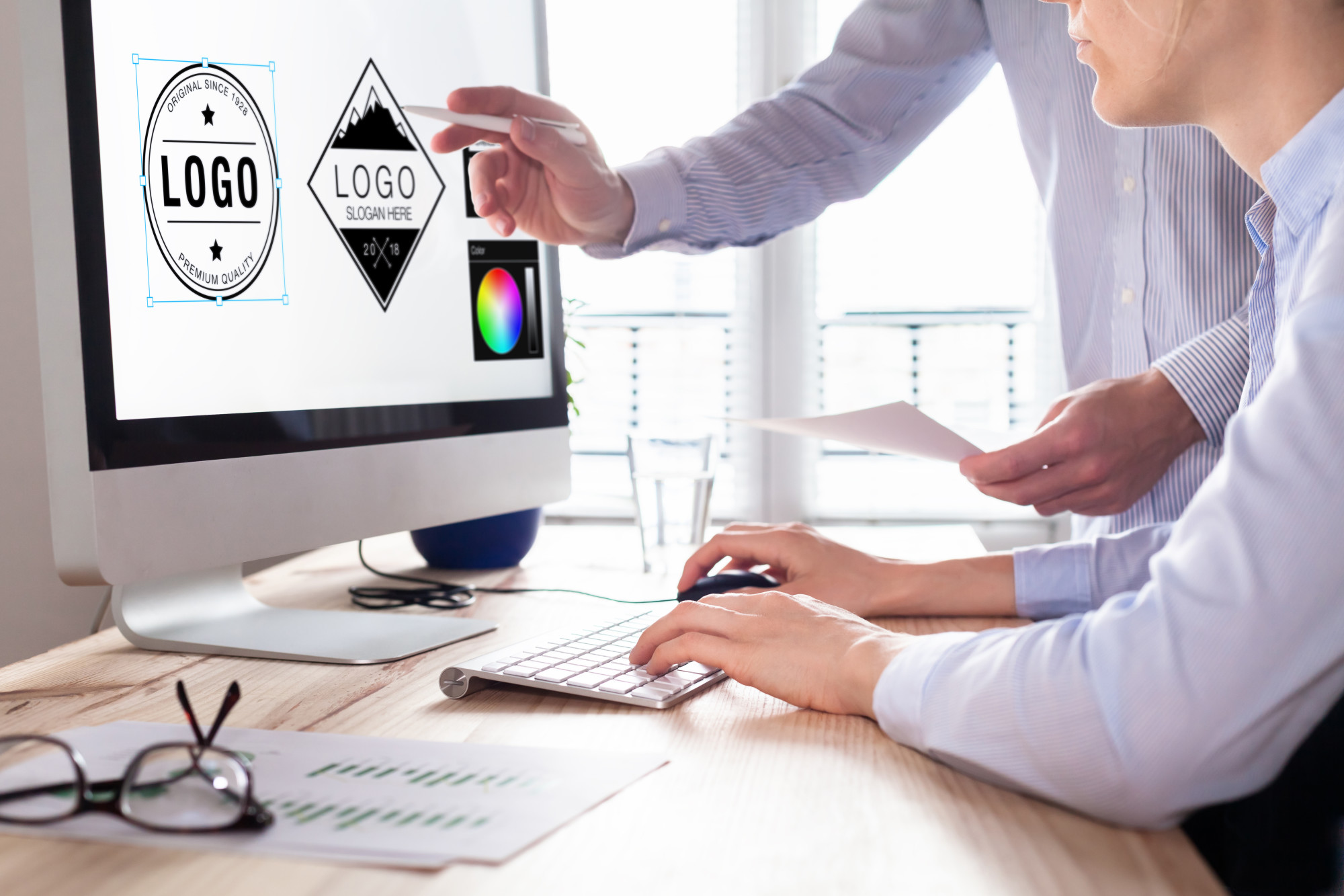
When you think of successful company logos, you might think of the most recognizable logo in the world, the Nike Swoosh. And if you’re looking to do a logo redesign to boost sales, you might think it’ll cost a fortune.
Think again. The Swoosh was designed by Portland State student Carolyn Davidson for $35. She also really thought it through, using an image that depicted the product benefits: speed and movement, like victory goddess Nike.
The Swoosh and Nike were so successful that Davidson was later celebrated and given 500 shares of stock worth about $1 million today.
The lesson? You too can have a successful sales-boosting logo without spending a fortune. But you need a smart redesign that nails brand and you need to be smart with marketing strategy to drive sales.
But how can a logo drive sales? Keep reading for five ways a new logo can supercharge sales.
1. A Logo Creates a Feeling
When you do your branding, you want to create a feeling — like warm, confident, happiness. Your customers associate this feeling with your product.
They believe that your product will give them this feeling. If your logo is designed to convey this feeling, it can help you convey your brand and feeling and help drive sales.
2. A Logo Makes Your Product and Brand Instantly Recognizable
Your logo is the face of your product out there in the world and if it pops, people will notice. And if people see it over and over because you’re doing your job with your marketing, especially online, it will become recognizable.
Then, in the future, every time they see it, they’ll know exactly what it represents. Just like when you see the Swoosh, you know is the athletic show. And when you see golden arches, you know a hamburger, fries, and coke await.
To take full advantage, be sure to try one of our favorite tactics, which is an automated marketing system like websuitable that takes full advantage of your logo to nurture customers to drive them to your site and close sales.
The logo adds familiarity which then builds trust and also brings them that feeling that makes them want to buy your product.
3. It Builds Trust
As your logo becomes recognizable and familiarity grows, people start to believe that your product and company have been around a while and that they’re, therefore, trustworthy.
People would rather buy from a trusted company than one that they’re not so familiar with. They’re also more willing to try something new from a company that’s trustworthy.
4. It Can Make Your Company and Product Shine Brighter Than Others
A great logo builds trust and will catch the attention of customers. If you have a lot of competition in the market, this can make you and your product stand out. Especially online, this can help you drive traffic and ultimately sales.
5. It Can Help You Make A Great First Impression
If you have a clever logo that really nails your product in a fun, stand-out way, people will notice. And you’ll get points if you make them think, laugh, or invoke that emotion. This will help them remember you, which in turn will make you and your brand and product familiar and, therefore, trustworthy, which can lead to sales.
Supercharge Sales With Your New Logo Redesign
Now that you know some ways that you can boost sales using your new logo, it’s time to get that new look and begin taking steps to drive sales.
You can start by trying out our online logo maker to test out ideas. Then, once you have the best logo design to represent your brand, give it a go. And take advantage of the online marketing team that can help you give your whole website a boost too to take full advantage.
Self Starter: 11 Entrepreneurial Business Opportunities for Veterans
Posted on July 15, 2019 by Logo Design Tips and Tricks
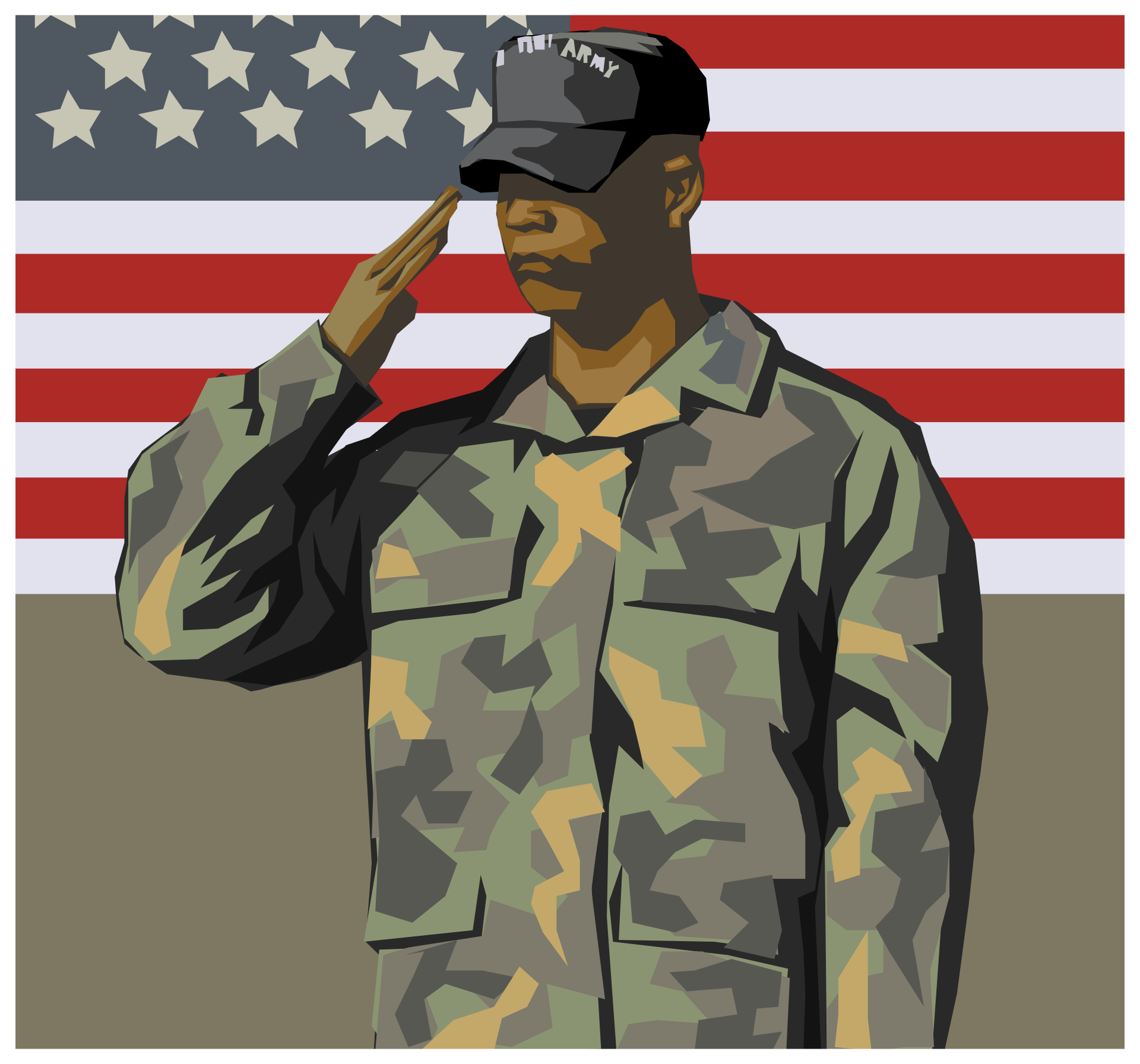
There were around 20.4 million veterans in 2016 in the USA. Being a veteran in itself is a challenge, having to come home and readjust to a new life.
Looking for work and staying afloat can be a challenge so perhaps starting a veteran-owned business from the ground up is the right route for you? There are so many opportunities that can work well for a veteran.
These specific business opportunities for veterans are for any former service member who knows best. Keep reading to see which business suits you.
1. Buy a Franchise
One of the most obvious options is to look into purchasing an established brand. Going this route means that you purchase a business that already has a reputation, and it saves you from putting in the legwork to establish an identity.
Purchasing a franchise also means that you have access to advanced systems and procedures that have already been proven to work.
Many of the US-based franchises offer discounts for veterans so it’s a great option if you have some startup capital available.
2. Government Contracting
Contracting to the government is a great option if you have a certain set of skills that you mastered in the military. You might have been a mechanic, a medic or even based in operations.
Support and Research
If you were based on military intelligence, you can use the skills you gained to start a small business based on research and administrative abilities. Many companies outsource this part of their business as they don’t have the resources to allocate full-time.
Logistics and Transport
Logistics and transport services are always needed. Perhaps you have some capital that you’re able to purchase a small delivery van or even two, and you could start to offer a logistics service and transportation company within your home area. Your knowledge of your neighborhood will also be a great asset. Being in the military might also give you the advantage to transport ‘valuable’ goods, and this could be your unique selling point.
Medical Work
Being a medic in the army is tough, bringing these skills and expertise into the real world is a good idea. You could look at starting a first aid and emergency planning consultancy business for organizations based in your area.
3. Retail Store
As a veteran, you’re not looking for long hours or starting from the bottom in the retail world. But perhaps starting a retail store in an ideal location is a good idea. Find a perfect spot with great exposure, decide on the type of items you’d like to sell and invest a little in branding to get your store noticed.
You should shop this site for inspiration on custom made items you could include on your shelves.
4. Online eCommerce Store
This follows on from the above. Perhaps you live in a rather ‘expensive’ city and renting a location is not an option for you. Then consider starting an online eCommerce store.
It’s virtually startup cost free, and you can look into setting up partnerships with shipping companies to keep your costs down for the first few months.
5. Extreme Adventure Trips
Being in the military means that sometimes it can be difficult to settle back into a quiet life. If you’re not quite ready to let go of the adrenaline that came with it, then perhaps starting a company that does extreme adventure trips is the option for you?
You could offer trips around the US, or even globally where you take a group of people on a guided tour to do off-road driving, bungee-jumping, and other exciting activities.
6. Grocery Delivery Business
This idea is also a great one if you don’t have much startup capital available. You can advertise in local papers and magazines offering a grocery delivery business.
People in your neighborhood can send through their weekly or monthly grocery lists, you go out and do their shopping and you deliver to their door, for a fee of course.
7. Disaster Preparation and Planning
Another veteran business idea that takes the skills you learned and used, and puts them to good use. Nobody can be prepared for a disaster and plan for such, better than someone from the military.
Start a small consultancy business where you go in and assist corporate organizations in disaster planning and preparation, educating their workforce in what to do when the worst happens.
8. Self Defense Classes
Self-defense is necessary no matter where you live. You could offer specialized classes for woman and children or even group classes at your local park.
There’s even an option to go into large businesses and do workshops as a team-building initiative for their workforce. Everybody will love being able to say they were trained by a real-life veteran and they know what to do when trouble strikes.
9. Residential Security Operator
Being a residential security consultant is another great business idea for veterans. It may cost quite a bit to get this one off the ground, but you could look into options in one city or neighborhood block and work your way forward from there.
Offer 24-hour call-out assistance to older people who might need emergency assistance but cannot afford exorbitant security company call-out fees.
10. Personal Fitness Training
If you’re a veteran that is still in good shape, you should consider starting a personal training business centered around fitness. There are always hundreds of people looking for somebody to help them lose weight.
You can offer classes in your local park or public meet-up points. Be their drill sergeant and get them into shape for a monthly fee!
11. Property and Rental Management
This is a great business idea because it can be done from the comfort of your own home. Offering a property management service to people who spend a lot of their time out of town. They’ll need somebody to make sure their lawns are maintained and their houses are kept clean.
To extend on this service, you could offer to manage their rentals and check-ins if they rent their home out to holidaymakers.
Business Opportunities for Veterans
The world is your oyster. This list of business opportunities for veterans is a small drop in the ocean.
Do some homework and figure out how much budget you can put aside to start your business idea and how long that amount of money can keep you afloat.
Focus on budgeting and be realistic with your business goals, remember it is going to take time to get completely off the ground.
Don’t forget that as important as starting your business is the identity that you give it, use our logo maker and look around our site to get started.
5 Powerful Logo Designs in the Fashion Industry
Posted on July 11, 2019 by Logo Design Tips and Tricks

What do McDonald’s, Starbucks, Gucci, and Nike all have in common?
Every single one of these companies has created a logo that is easily recognizable and identifies each business.
Logos can be whatever you want, you can be as creative as you desire. However, there are certain designs that frequently show up, and for a good reason. They work!
Continue reading about the top 5 logo designs used in the fashion industry that will help you stand out above the rest.
The Top 5 Logo Designs Used in the Fashion Industry
Logo designs are one of the most important things that a business should put thought into. Logos give you the opportunity to tell a story about your business, brand yourself, and even attract customers.
The Gucci logo is one of the most well-known logos and can be seen on almost every product they have. Below are some of the best logo designs that are used in the fashion industry.
1. The Traditional Route
Vintage, classic, and retro looks are a great way to get your company some attention. This style of logos would be best with a company that sells vintage and unique items. The retro look is common in businesses that sell pieces of clothing influenced by the 20th century.
Fonts that are block shaped and monograms are great touches that you can add to your logo if you feel it supports your business.
2. Appeal to Multiple Crowds
When making your fashion logo, you should keep in mind if it is going to be used for kids. When marketing to kids, you have to simultaneously market to the parents who will be buying the product.
Cartoon characters, drawings, and cool fonts are eye-catching for kids. Be sure that this will also be appealing to the adult.
3. Luxurious Logos
Many high-end sellers often have logos that are of equal quality. When selling your product you must make sure that your logo supports your business. In order to make a logo appear more luxurious, you can add small details, gold colors, cursive and thin fonts, and monograms.
Silver, platinum, and black are also colors that embody this type of design. These details will let your customers know that quality is in all aspects of your business.
4. Embrace the Modern World
These days, everything is simplified. Everything has a purpose and looks clean because of the minimalistic style. Companies are beginning to put technology symbols icons in their logos and people are loving it.
If you decide to go with a modern look, you can always spice it up by incorporating vintage and luxury styles.
5. Be Unique
There are common themes that can be found over the years for logo designs but one that will never change is customizing a logo specific to your company. You have the ability to make a logo that is one of a kind, just like your business.
Many companies accomplish a unique look by incorporating a piece of their story or including company icons that people are familiar with. On average, people only spend 5-15 minutes designing a logo, putting in a little more time can give you the chance to create your unique branding.
Tell Your Story
Don’t just design a logo because you need one, make your logo have a purpose. There are many logo designs that can help you reflect a certain image on your company.
Taking the time to focus on what is most important in the company to create a logo could be what shapes your brand. There are no shortages on the types of fashion logos that can be created.
Take a step back and look at your logo, does it portray your company the way you want?