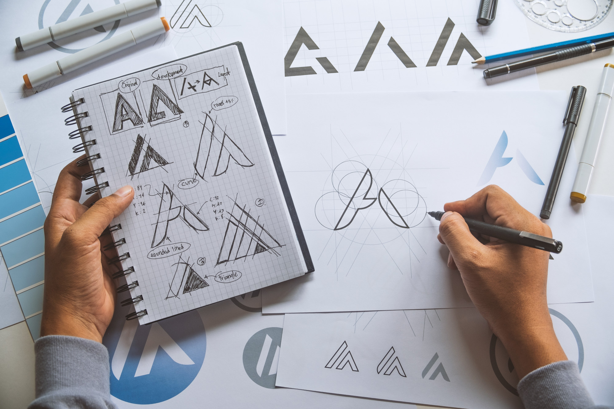
How to Put a Logo on a Shirt: Top Design Tips
Posted on September 05, 2019 by Logo Design Tips and Tricks

A great t-shirt design can be used as a ‘free’ walking advertisement for your company. Some of the best t-shirt designs are simple logos on the right colored shirt.
What makes a great t-shirt and how do you design one?
In this article, we will go through our top design tips for how to put a logo on a shirt, so you can avoid a fashion faux pas.
How to Put a Logo on a Shirt: Our Top Design Tips
Follow our 7 top t-shirt design tips below to help you design a great shirt.
1. Sizing
This is one of the most important factors when you are deciding to put a logo onto a t-shirt.
If the logo is encompassed in a circle or square shape, you really need to choose the size wisely. Always print out different sizes and place them on a sample t-shirt to get a better idea of how the finished product will look.
Also, remember that you may have to scale the image for different sized t-shirts. The same size logo will look very different on an XS vs an XXL.
Consider the different t-shirt shapes too. Women’s t-shirts are shaped at the waist, while men’s and unisex t-shirts are straight up and down. This could affect the placement of the logo.
2. Placement
The print placement could make or break a great t-shirt design. You don’t want your logo to sit around the wearer’s waistline, nor do you want it so close to the sleeve that it can’t be seen.
There are standard placement areas and we can suggest these areas when you have finalized your design.
3. Fonts
If your design includes text, make sure it’s in a readable font and in a large enough size. Enough said.
4. Layout
If you have a complex design with different words, fonts and graphics then make sure your design is laid out correctly. The same text and graphics can look very amateur if they are laid out in a different way.
5. Quality
Any graphics or text you use in the logo should be the highest quality available. Once printed, you should check that the text is legible and the images are clear.
Always use vector file images as they scale to print, and you won’t run into any resolution issues.
6. Colors and Contrast
If you are printing the same design on different colored shirts, ensure that the design is clear on each color or create different designs for different colored shirts.
The colors should contrast each other enough to be readable. Don’t use light yellow on white, or dark grey on black, for example.
7. Borders & Edges
Printing photographs or portraits onto a t-shirt can be a great design on its own. Ensure the borders are correctly edited so just the portrait is printed, and not the surrounding background.
Keep It Simple!
Now you know how to put a logo on a shirt and incorporate good design practices for the best results.
Remember, if in doubt, keep the design simple.
For more logo design tips, check out the other articles on our blog.
Moving With the Times: 6 Modern Logo Design Trends for 2019
Posted on September 03, 2019 by Logo Design Tips and Tricks
Did you know that adding color to your logo can increase brand recognition by up to 80%? that’s because humans are naturally inclined to recognize bold colors and they will remember your business easier if you use them.
But what if you already have a logo for your business? You cannot just change it up, right? Well, you shouldn’t change it, but you can definitely update it and make it look like a modern logo.
You’re not alone if you do this. Apple has changed their logo over the years and most people still recognize the familiar bitten fruit on multiple devices such as smartphones, tablets, and laptops.
If you don’t know how to update your logo yet then keep reading this article. You’ll find great logo design inspiration to help you stand out from the crowd.
Modern Logo Design Trends to Follow in 2019
There are numerous ways you can update your logo and make it look slightly different while preserving its essence and core values. Here’s how professional logo designers do it.
1. Incorporate Gradients Into Logos
As a good rule of thumb, designers don’t really recommend incorporating gradients in logos. That’s because gradients can be hard to reproduce accurately on various devices as well as print.
If you don’t already know, a gradient represents the incremental fading of one color to another one similar to it. For example, you can start with yellow and gradually fade it until it turns into orange, creating a beautiful visual effect.
Gradients can be used in logos because they add depth and personality to your brand. You can use the colors of your brand and mix them up to create beautiful gradients. If you don’t want to use the colors of your brand, make sure that you pick ones which are close on the color wheel. This will add a sense of unity to your logo and prevent confusing your audience.
2. Go for a Vintage Look
You can also update your logo and make it look retro like a billboard from the 80s. nearly 40 years ago, designers used bold colors, badges, and cool fonts for the logos of various companies. In 2019, this trend is coming back and it provides a great way to stand up from the crowd.
For example, you can add a certain unusual visual pattern to your logo to make it look vintage. You can also choose bolder colors such as bright red, orange, purple, blue or forest green. Tweak your font to make it appear at an angle as this is what caught everyone’s attention back in the 80s.
If this seems like too much for you to handle, you should learn more on how to work with a professional logo designer who can help you achieve the look you want for your logo.
3. Opt for a Semi-Flat Logo
Especially if your business is based mostly online, you might want to go with what’s popular on the internet. Today’s logo designers agree that flat-looking logos are highly appreciated by the broad audience. In 2019, they expect people to like semi-flat logos which preserve the cleanliness of flat ones but also incorporate a bit of 3D features.
For example, a semi-flat logo has simple shapes and a few colors. It looks like someone just pressed an object against a wall and make it look completely flat. These logos are popular because they’re easy to recognize and clean. However, designers also add a simple shadow to flat logos to make them semi-flat and give them have a 3D appearance. The shadow raises the logo a bit, making it look like it’s getting out of the screen.
4. Use Text Boxes
If you’re really into simplistic and minimalist logos then adding a text box might be the right thing to do in your case. Just as the name implies, a text box incorporates a rectangular shape with a few words inside. Most designers use just one or two colors for the box border and words to keep it neat and simple.
Adding a text box doesn’t mean that you have to get rid of your current logo. You can simply add it under the current logo and mention the core values of your business such as “integrity”, “passion”, “quality”, etc. The combination of a graphic logo with a text box underneath will make it much easier for your audience to remember your brand.
5. Go for Neon Logos
A neon logo looks amazing, particularly in digital formats. It basically consists of bright colors which represent your brand and create a powerful visual statement. Neon logos were a big thing back in the 80s, so you can actually add a little bit of vintage feel to your company if you choose this option.
Best of all, it’s not that hard to convert an existing logo to its neon variant. A logo designer might help you with that and the end result can contain the actual colors of your brand. Neon logos also have simple shapes and curved lines, so they will appear simplistic and attractive to everyone.
6. Go for a Simple Picture Logo
They say that a picture can say more than a thousand words and this is true, especially when it comes to logos. Famous companies such as Apple and Instagram use a simple picture as their logo and they’re doing pretty well nowadays. Why shouldn’t you do the same?
If your business sells music equipment, you can simply have a guitar with a flat appearance as your logo. If you run a gym, a dumbbell would also be ideal as the symbol of your logo. If you run an IT business, a simple picture of an integrated circuit board might do the trick. You don’t have to add any text or shapes, the image will speak by itself.
Ready to Design Your Own Logo Now?
Whether you work with a professional designer to create a modern logo or you do it by yourself, it’s good to update it once in a while. As long as you don’t stray too far from the current version of your logo, you should be fine and your audience might even appreciate the change.
If you liked this article, check out our other blog posts to learn more about logo design and how you can make your audience remember it for years to come!
Business Van Branding Guide: Putting Logos and Images on a Vehicle
Posted on September 01, 2019 by Logo Design Tips and Tricks

It’s time to get attention for your business but how do you do it?
One of the best ways to get attention is through van branding. If you’re going to be driving around with these vehicles anyway, why not use them to get customers?
While putting logos and images on your van will cost some money, the money you’ll make from the customers you pull in will help you recoup your investment.
Continue reading this article to learn more about the best practices for branding your company’s van.
The 411 on Van Branding and Getting Attention for Your Business
It’s not as hard or expensive as you think to get started with branded vehicles. These tips will help you get started.
1. Know Your Advertising Goals
Before you start branding your vehicle, make sure you know what your advertising goal is.
Do you want people to contact you for a free estimate? Do you want them to book an appointment?
Maybe you want people to buy a certain product?
Knowing what you want to get out of your advertising is key before you start spending money on the actual work.
2. Get the Best Graphics
Don’t skimp on graphic design. Use a great company like Full Sail Graphics to get a design that looks as professional as your work. A weak graphic signals low quality work so you don’t want to have any part in that.
3. Go Big
You want people to be able to see your wording from far away. Go as big as possible when you’re putting text on your vehicle. If only the car behind you can see your text, you’re missing out.
4. Be Careful with Fonts
While fancy fonts might look cool, if people can’t read what your van says, it’s not going to do your company any good. Even if your normal brand font is something funky, consider doing something more traditional like Arial font so people can easily read what you’re trying to communicate.
5. What’s Unique About Your Company?
There may be ten other people in your city that do the same thing you do. Why are you different?
Use your van to spread the message of why people should use your company instead of one of the other many people that offer your services.
Maybe you’re family-owned and operated or you offer a discount to veterans. Whatever it is, make sure people know about it.
A Picture Is Worth a Thousand Words
Now that you know more about van branding, why not use it to your advantage? When people see well-done graphics on a company vehicle, it builds trust in the brand.
There are many other things you can learn on our site as well. Learning best practices before you start putting your logo on your vehicles will allow you to get the best results.
Browse our site, find your favorite section, drop a bookmark and come back soon for more great reads.
Top Tips and Tricks for Designing Brilliant Large Banners
Posted on August 29, 2019 by Logo Design Tips and Tricks
Do you want to create a big banner for your business to hang during an upcoming event? It’s a great way to make sure that your company stands out in the crowd.
There are probably going to be lots of other large banners hanging during the event, though, and the last thing you want is for your banner to get lost in the shuffle. Therefore, it’s important for you to design a banner that’s brilliant in every way.
You should carefully consider every individual aspect of your banner during the design process. Take a look at seven tips and tricks that will make your banner a huge hit.
1. Decide How Big You Want Your Banner to Be
Exactly how big do you want your company’s large banners to be? That’s one of the first questions that you should ask yourself when you’re designing one.
You can design a banner that is anywhere from 1 foot wide to 100 feet wide depending on where you’re going to hang it. You should pick out the appropriate size based on where you’re planning to put it during your event.
You don’t want your big banner to fall short in comparison to other banners at an event. At the same time, you don’t want it to be so large that people think it looks obnoxious.
Try to find the right size for your banner before you do anything else. It’ll let you know how much space you have to play around with when designing the banner itself.
2. Choose the Right Type of Banner
Do you want a banner that you can hang up on a wall? Do you want one that will hang on a stand? Or do you want one that you can fasten to a table?
There are a bunch of different types of banners that you can buy when you’re in the market for large banners. Each one will be designed to hang in a different way.
You should, again, think about the event that you’ll be attending and consider how you want to hang your banner up. You don’t want to buy a banner to hang on, say, a wall only to find that there isn’t any available wall space at your event.
3. Pick Out the Right Banner Materials
Most of the companies that invest in large banners choose to buy vinyl banners. They do this because vinyl banners are very durable and can be reused over and over again without showing any signs of wear and tear.
There are, however, other banner materials that you can choose from if you want. For example, some companies go with mesh banners, while others choose fabric banners.
The materials that make up your banners will determine how long your banners last to some degree. They’ll also alter the look of your banners and make a statement to those who see them.
4. Consider Which Colors to Use on Your Banner
When you’re going through the process of designing large banners, you can put any colors that you want on them. But you should think long and hard about which colors you choose since the colors will evoke certain emotions in those who see them.
Red, for instance, is a color that will express a sense of urgency to those who see your sign. You’ll get people’s blood pumping if you make your sign bright red.
Green, on the other hand, is known to calm people down and put their minds at ease. It’s a great choice for those who want to make people feel more relaxed at an event.
It’ll be up to you to figure out how you want people to feel when they see your banner and choose the corresponding colors. You should try not to use too many colors since that could make your banner more confusing than you want it to be.
5. Utilize a Font That’s Easy to Read on Your Banner
Most companies put at least a few words on their large banners. They’ll put things like their business names, their slogans, and their websites on them.
If you’re planning on doing this, find a font that will be easy for people to read at an event. In a perfect world, it should be easy to read both up close and from a distance.
It doesn’t matter how big you make words. If the font that’s used to write them out isn’t decipherable, it’s not going to matter.
6. Make Sure Your Company Logo Is Prominently Positioned on Your Banner
Your company logo is one of the most important marketing tools you have. You should stick your logo on everything that you create, including banners.
You should avoid sticking it in some corner of your banner where people won’t look, too. You want your logo to be front and center where everyone will see it as soon as they look at your banner.
By doing this, you’ll build up your brand recognition. People won’t have any trouble identifying which company is associated with your banner.
7. Trust the Best Company to Bring Your Banner to Life
Designing the perfect banner for an event is only half the battle. You also need to hire the right company to take your designs and bring them to life.
View here to learn more about a company that can help you make the most of the large banners that you’re creating.
Let Large Banners Set the Right Tone for Your Company at Events
When your company is in attendance at an event, you want to make sure that you and your employees mix and mingle with people to make your presence felt. But you also want to make your presence felt without having to say a single word.
Large banners can help make this possible. You can communicate with everyone at an event without actually talking to them through banners. They’ll help set the tone for your company and show others what you’re all about.
Check out our blog for some useful tips on incorporating a great logo into your banners and other marketing tools.


