SEO for Photographers: 4 Must Know SEO Tips Every Photographer Needs to Know
Posted on September 28, 2019 by Logo Design Tips and Tricks

Being a photographer in the digital age means you’re responsible for a lot more than capturing and editing images. You’re probably also a one-person marketing department, sales team, and web designer.
If you’re working hard to fill all of these roles but are still having trouble getting your art discovered, the problem may lie in your search engine optimization strategies.
If that sounds like some web development jargon that you don’t know what to do with, don’t worry. We’ve rounded up 4 tips about SEO for photographers that can help your site climb the Google ranks.
1. Optimize Your Photos for Web
This is a rookie mistake that can have huge consequences for photographers. Whenever you upload an image to your website, resist the urge to use the full-sized, high-resolution version.
Instead, opt for a compressed image. If you don’t, people will click away from your site because they’re tired of waiting for pictures to load. This increases your bounce rate, which is bad for SEO.
2. Use Alt Titles and Tags
Did you know that you can hide important keywords in your photos that help search engines identify them? These keywords are called Alt tags and Alt titles, and they’re the things that help your photos show up in an image search results page. The process for adding them in is different for every web platform but is usually very simple.
3. Produce the Right Kind of Content
It’s fairly common knowledge at this point that putting out regular content—via a blog, podcast, or social media network—helps people to find your business online. But did you know that you need to be careful about the type of content you create? As a photographer, you need to make sure that every piece of content is relevant and showcases your work.
Want to write a blog post about taking your kids strawberry picking? Awesome! But you need to make sure it includes beautiful images of the event and keywords that will help your post show up when people search for lifestyle or family photography.
As an added bonus, when people find and enjoy your content, they’ll share it on their websites and social media profiles. This helps you build natural backlinks, making quality content production a two-for-one SEO strategy.
4. SEO for Photographers: Is It Worth Outsourcing?
If you’ve gotten to the bottom of this list and aren’t sure you want to tackle the SEO challenge by yourself, that’s okay too! Tons of small businesses and independent entrepreneurs outsource their SEO to an idea agency.
To decide if this is the option for you, take a close look at your available budget and compare it with the time and frustration it would take you to do it yourself. If you can make more money taking photos in the time you would have spent on SEO than it costs to hire someone else, the choice is clear.
Boosting Your Search Rankings Helps People Find Your Art
SEO for photographers can be the difference between business growth and stagnation. So make sure to follow these tips to help future fans of your work discover you online!
Short on time but want to get started right away? Take a look at our 15 minute SEO checklist.
Here’s How to Choose the Best Logo Colors for Your Brand
Posted on September 26, 2019 by Logo Design Tips and Tricks
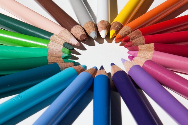
The color of a brand is one of the first things we notice when we look at a logo. In fact, colors have a psychological effect on how we react.
That’s why choosing the best colors for logos is so important. These colors will have a longlasting effect on your brand and marketing.
When we think of successful companies like McDonald’s, we imagine red and yellow. Amazon is black and yellow, while Facebook is blue. Picking the right color can help your business make a lasting impression.
The right logo colors can improve a customer’s brand perception and enhance your client base. Continue reading to learn how to choose the best colors for logos.
Less is More
When it comes to creating a logo, choosing fewer colors is best. This is because too many colors can make it difficult to print your logo on different backgrounds. You will also need your logo to look good at various sizes.
For example, if you were to make a label with your logo on it. It should be just as identifiable at that size as if it were on a t-shirt or printed wall decal. This is known as scalability.
Having only a few colors on your logo makes it easier to be consistent with your brand. Repetition is key when it comes to marketing. If you are able to use the same colors on all of your products and merchandise, it will stick better in your customer’s minds.
Know Your Industry
Before you can create your logo and choose colors, you must first understand your target audience and what will appeal to them. Knowing what appeals to your demographic will affect what colors you use along with how your logo will look overall.
The colors you use have a strong impact on who you are trying to attract. So be sure to research your industry before picking a color. In fact, each color has its own psychological meaning.
For example, red is a color that evokes power, passion, and strong energy. Pink is considered a more feminine color and tends to make us think of vulnerability, love, and tenderness. Green is fresh and reminds us of nature, growth, and prosperity.
The shade of the color you choose can also determine its meaning. So keep that in mind.
How Will it Look?
Depending on where you will be printing your logo, on a t-shirt, paper, or decal, the colors you choose may look different. This is because the ink of your printer may not be as complex as the digital color palette you’ve chosen for your logo.
Find a professional graphic designer who can help you choose colors that look great no matter what medium you put your logo onto. Sometimes it’s better to go with simpler colors so that they are easier to reproduce.
Best Colors for Logos
We hope this guide helps you choose the best colors for your logos. Each brand is unique and some colors may work better than others for your industry. With some research and strategic planning, you’ll find the perfect colors for your business!
Looking for more tips on improving your logo? Check out our blog for more amazing ideas.
5 Tips For Designing a Printed Graphic
Posted on September 21, 2019 by Logo Design Tips and Tricks
When converting a design concept into a properly printed graphic, several potential pitfalls could cause your work to turn out differently than you might expect or hope.
Let’s look at the origin of these issues, and some tips to avoid running into them altogether.
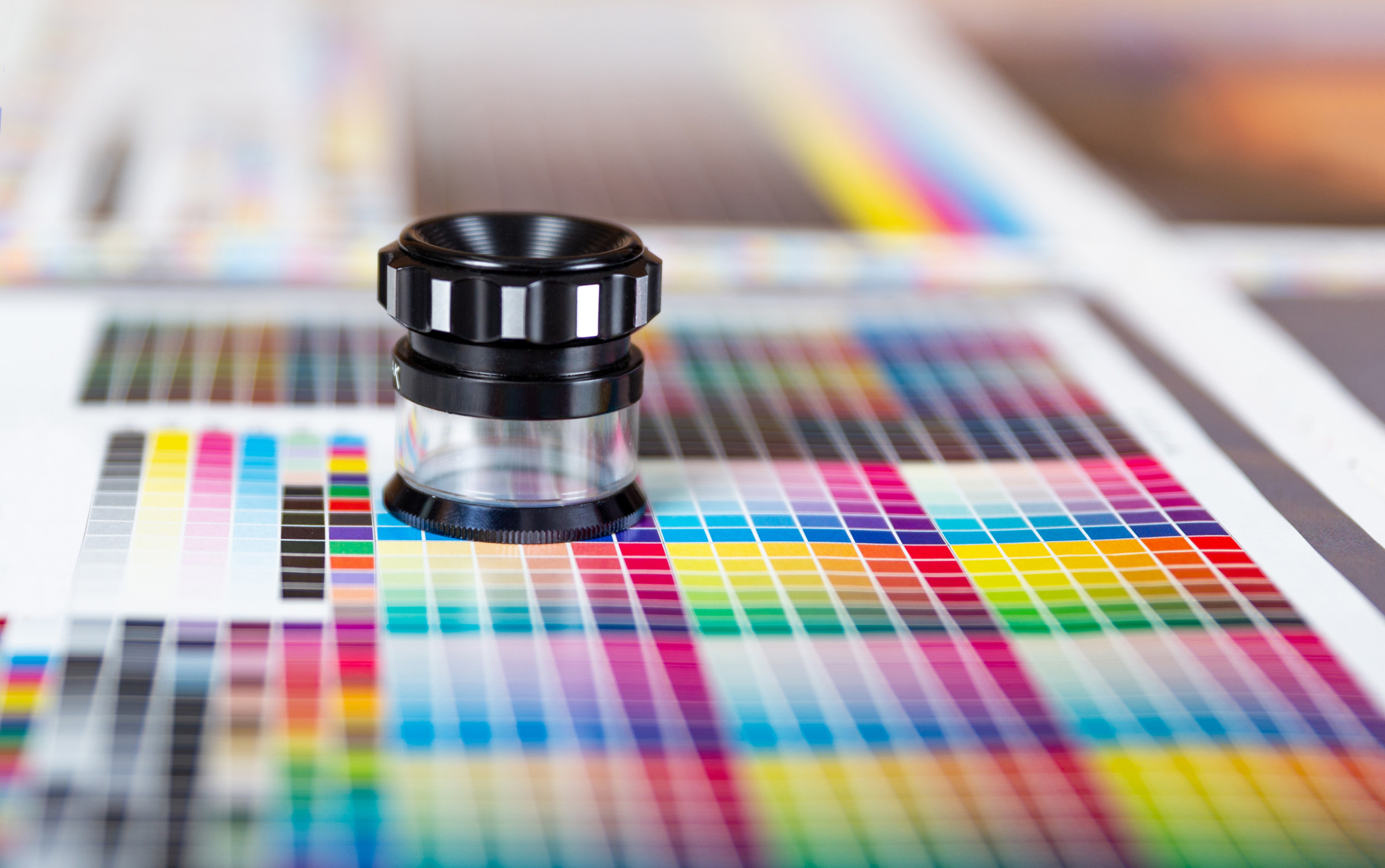
A Little Bit of Color Theory
First, let’s cover how creating colors works. There are two fundamental models of color – additive and subtractive.
The additive color model concerns adding different wavelengths of light, starting from black. Think about pointing different colored lights at a wall to mix the colors – this is additive color since you’re adding light together to get the desired color.
Additive color works differently from what many people are used to since the three colors of light needed to get white light are red, green, and blue.
The subtractive color model centers around subtracting different wavelengths of light, starting from white light. Remember, white light contains the entire spectrum of colors – this is why a prism can refract it into a full rainbow.
By subtracting different colors from white light, you can get a specific color. Think about shining a white light through a red piece of glass – by removing all the other colors, you end up with red light.
How Does This Effect Making a Printed Graphic?
All things that use light to create color operate on the additive color model. That means your computer monitor, your phone, a movie projector; anything that puts out light.
Meanwhile, anything that doesn’t put out light, or incorporates pigment, uses the subtractive color model. Examples include things like a printed graphic t-shirt, text on a page, or a pretty rock.
Those who work in print and design have to work around this, which can be tricky. Most displays can show a little over 16 million colors, but most printers can only print a few thousand, and the ranges of colors for each don’t necessarily overlap.
So Why Does Your Design Look Weird?
There could be a lot of reasons your design looks off. The colors in your printer don’t match the colors of your screen. Two colors that may be meaningfully distinct in the RGB color space (on your screen) could be identical to one another in the CMYK color space (in print).
Consider converting an image to black and white – often, two completely different colors will end up the same shade of grey. Colors overlapping, as above, can lead to a print design losing meaningful visual boundaries.
How Do You Design A Printed Graphic That’s Error-Free?
1. Change the Color Space in Your Design Program
You can limit the color space you work in for creating your designs and match it to your materials. For instance, if your printer uses cyan, magenta, yellow, and black (also called ‘key’) ink cartridges – you would change your design program to the CMYK color space.
2. Color Separations
If your target is screen printing (as on t-shirts), you’ll want to look into color separations. Color separations are the complex process of converting a multi-colored design into a sufficiently limited gamut to print efficiently.
A talented designer can take you through this process without losing the feeling of the original.
3. Rework Your Thematic Pallete for Contrast
As mentioned above, colors that have a sharp contrast on the screen may not have that contrast in CMYK. Print off a color card with primary and secondary thematic colors of your design to check their visual contrast.
4. Start Small, Go Big
When in doubt, start your design process with a more limited gamut. You can always adjust to having more colors to work with, but the reverse is often quite a painful process.
5. Black and White
Finally, you should always check how your design will look when converted to either pure black and white or grayscale. This tip goes double for logos, which may need to be embossed (depth doesn’t have a color).
Even traditional graphics should at least get a cursory glance with a grayscale filter. After all – you never know how the emphasis in your design might change when viewed in a different light.
Remember, Simple Does Not Mean Bad
If you find yourself drowning in the minutiae, trying to separate a finely detailed design for your printed graphic into distinctive enough blocks to be recognizable, even though you can only use three colors, remember that you can keep it simple.
The human visual process loves engaging imagination; turning craters on the moon into faces, and clouds into fantastic creatures. So in this world of ever-increasing complexity, a pocket of minimalism and simplicity can draw the eye.
Are you looking for help with your logo? Check out our blog for practical advice you can use and try out our logo maker today!
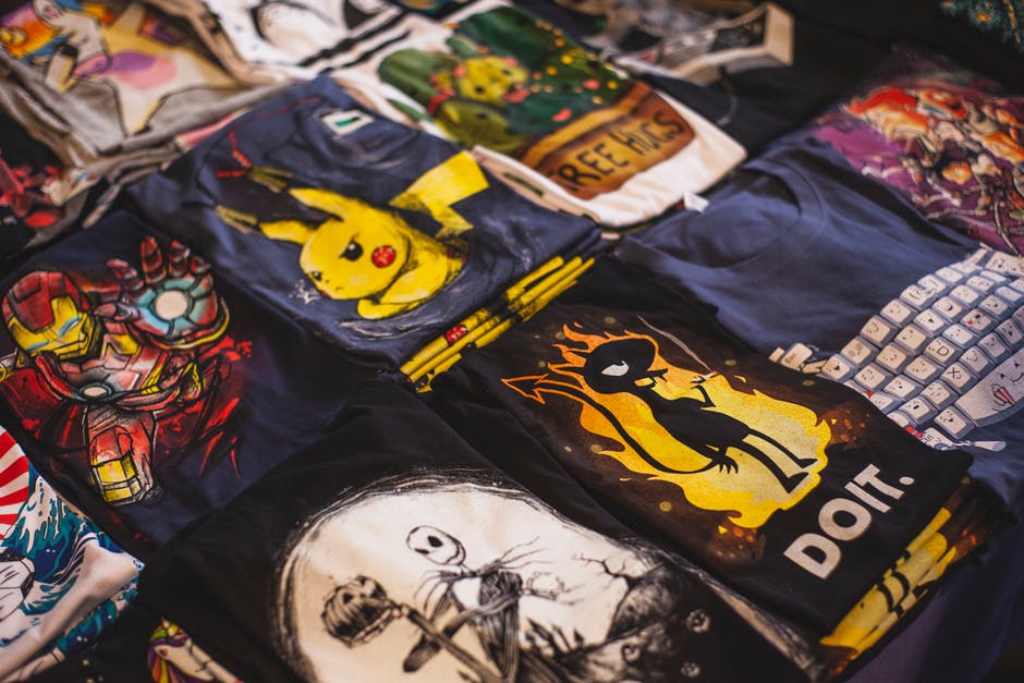
5 Ways to Figure out Eye-Catching T-Shirt Design Ideas for Promotional Giveaways
Posted on September 18, 2019 by Logo Design Tips and Tricks
As a business, using promotional giveaways to convert new customers and boost your reputation is a no-brainer. They’re affordable, fun, and create instant interaction with customers.
T-shirts are a favorite among consumers. However, creating a good design isn’t as easy as it seems.
That last thing you want to do is produce a shirt that doesn’t get peoples’ attention. That’s why we’re discussing five tips for coming up with great t-shirt design ideas.
1. Think About Your Target Audience
Before you start thinking about designs, it’s important to consider your target audience. Your t-shirt will prove more effective if it appeals to people interested in your business.
For example, if your target audience is young men, a promotional shirt that employs current men’s fashion trends will attract more eyes. Winners of your giveaway are also more likely to wear the shirt.
If you’re not sure about your target audience, start by creating a customer profile. This will help you better understand who to focus on.
2. Consider Your Current Branding
When it comes to branding and marketing strategies, consistency is critical. Using elements of your current branding in your shirt design is a great way to establish a solid reputation.
Think about things like your business colors and logos when designing your shirt. Incorporating these will help increase brand recognition and make your shirt memorable.
Keep in mind that you don’t have to force your brand down peoples’ throats. Subtlety can work to your benefit.
3. Brainstorm With Your Team
When you’re coming up with a design, it helps to get many brains involved. Trying to create something on your own may prove difficult and result in a lackluster design.
Ask several people on your marketing team to submit a few ideas. Then, have a meeting and look at everyone’s concepts together.
Gauging everyone’s reaction to each design is a great way to narrow down your options. After that, the team can start revising the idea until you’ve created the perfect shirt.
4. Be Creative With Color
When it comes to clothing, color is the best way to get attention. However, you need to be sure you don’t go overboard.
Think of the fabric of your t-shirt as the background color. What your printing on it should stand out well and compliment it at the same time.
Avoid creating a t-shirt that’s hard to read. If you want to make a huge impression, companies like Flashion Statement create shirts with LED printing.
5. Originality is Your Best Friend
If you want to stand out, you need to be unique. This may seem hard to do if you’ve never designed a t-shirt before.
It doesn’t hurt to look at your competition and see what they’re doing. Just make sure you don’t mimic their designs.
Check out old-school t-shirt designs and put a modern spin on a classic design element. Or, be abstract and come up with something people have to think about.
Make Your T-shirt Design Ideas Turn Heads
A promotional giveaway is only effective if the item you’re featuring is attractive to your audience. Before you start printing your t-shirts, make sure your design pops.
Use these tips for creating awesome t-shirt design ideas and make your giveaway a success.
We hope you’ve found this article informative. Feel free to browse our site for additional information on graphic design.


