3 Design Tips for Your Health and Safety Logo
Posted on October 04, 2019 by Logo Design Tips and Tricks

When you think about health and safety, what do you think of?
You probably think of that warm and cozy feeling of security. You feel protected. Like a guardian angel is watching over you.
So how do you convey this message in your health and safety logo when trying to bring in new clients for your training business? You want quality.
Keep reading, we’ve got three tips to take your logo from “ugh” to “ugh-mazing”.
Your Health and Safety Logo
Shape up
When you think of health and safety logs, you may think of crosses.
The most famous example of this is the Red Cross.
You have also seen a similar looking green cross. The difference is the green cross is a universal sign for life and represents professional healthcare and the red cross is copyright-protected. So you cannot use the red cross without permission.
The International Standards Organization recommends using a white cross on a green background to represent first aid.
Origins
The cross does have religious significance and has for nearly two thousand years. However, the use in first aid didn’t come about until the 1800s.
It was adopted as a way to communicate with combatants that those who wore the cross were on the battlefield to administer first aid and help wounded soldiers to safety.
It quickly because known as a way of saying “Please don’t shoot”. Here we are, nearly two centuries later, and the symbol has found its way into almost every first aid and healthcare logo that exists today.
Dare to be different. While using a cross is perfectly acceptable, make your logo stand out with something newer and bolder.
Colors
Red, green, and white are used in the everyday health and safety logo for a reason. But they’re also boring.
Your logo is part of your brand. Do you want your brand to be washed away in a sea of green and red crosses with every other training business out there?
Use yellow and gold to depict clarity and warmth like The American Society of Safety Engineers.
Oranges and blues are being used by tech start-ups across the board. Think about Firefox, Amazon, Walmart, IBM.
Not only do these color schemes look great when paired together, they also provide part of their brand message. Blue symbolizes dependability, trust, and strength while orange represents cheerful confidence and friendliness.
The combination says, “We’re here for you and have great customer service!”
Throw in a touch of green with your health and safety logo and your brand will scream the right message to your customers.
Utilize What Isn’t There
Use your negative and white space in a health and safety logo. Crosses and circular life rafts are boring and dated.
Think of how NBC uses the peacock and how Fex Ex uses the arrow in their logo.
Find ways to stick in the classic symbols of health and safety without actually putting them into the logo itself!
Logo creation can be an expensive and tedious task. Luckily, we’ve got you covered. If you’re having issues with visualization, check out our free logo maker tool.
What Are the Best Fonts for Fitness Logo Design?
Posted on October 02, 2019 by Logo Design Tips and Tricks

Whether you’re opening your own fitness studio or trying to get your YouTube workout channel off the ground, you know that the way you brand yourself is incredibly important.
There’s probably no aspect that’s more important to the success of your brand than your logo.
Fitness experts may spend hours creating the perfect image and coming up with a great company name. But rarely do they spend enough time on typography, or font when it comes to their fitness logo design.
Typography is crucial when it comes to branding.
But which is the best typography option for your fitness logo? Here are a few of the best ones!
1. Modesto
Are you looking to catch a potential client’s attention from hundreds of feet away? Are you planning to advertise on billboards or signs?
If so, Modesto, created in 2000, has exactly what you need.
It’s eye-catching without being aggressive and can work with a variety of colors. It’s all-caps look communicates to clients that you’re serious about helping them with weight loss and their other fitness goals.
For those not afraid to sweat, it’s a great choice!
2. Helvetica
Sometimes, there’s nothing wrong with going with a classic. Especially if your gym is primarily focused on strength training or high-intensity workouts like kickboxing, this is a great solution.
It looks best in black and white.
3. Rockwell
If you want your fitness logo design to call to mind rugged Americana (think Olympic champions) then this bold option is a great choice for you.
It’s easy to read, even from a distance, and it can be easily resized to stay legible both online and in print. Use it in red or blue for an extra pop!
4. Bobber
If your fitness business does things a little outside of the box, then this is the option for you. It caters to a more “hipster” clientele, which means it’s great for the millennial market in a larger city.
Plus, especially if you own a cycling studio, this font (inspired by motorcycles) is a great fit!
5. Custom Typography
Of course, the last and perhaps the strongest typography option for a fitness logo design is to have a unique font created specifically for your brand.
It not only ensures that no one else has it, but it communicates to your clients that you’re willing to go the extra mile — just like they should be!
It’s an investment in your branding and one more thing that makes you that much more memorable.
Especially if you advertise online, where the market is even more competitive, this will really help to set you apart.
Create Your Fitness Logo Design Today
Thanks to this post, you now know some of the best typography options you can use when dreaming up your fitness logo.
What else can you to to take your logo to the next level? Try out your designs in our free online logo maker tool.
Also be sure that you keep reading our blog for more branding tips as your fitness business continues to grow!
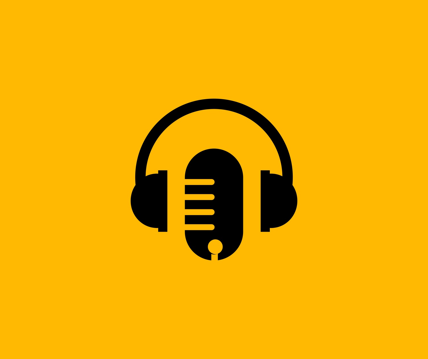
5 Tips to Create a Killer Music Logo Design
Posted on September 30, 2019 by Logo Design Tips and Tricks
As a musician, your band is everything to you.
But when it’s time to create a music logo design, it might be a challenge to come up with an option that does your sound — and your fans — justice.
Sometimes, the process is just as tough as cutting an album! You’ll have conflicting opinions, creative blocks, and more.
Don’t worry — we’re here to help. Read on for our top 5 design tips for band logos.
1. Get Inspiration From Your Lyrics
If you’re feeling stuck, you can always look to your lyrics for an answer! Think of your biggest hit. Is there a particular line that your fans love to scream out with you at concerts?
Use those lyrics to inspire your logo design!
2. Get Your Own Font
Typography, or font, plays a huge role in logo design. Even if you decide to switch up the colors or even design of your logo later on, having a font that’s all your own can help you to keep things consistent.
Most bands will likely want to have a custom font created, especially as their fan base grows. If you can’t afford that yet, just focus on making a few letters stand out! You can color them a different shade, make designs out of them — pretty much anything you can think of.
3. Choose Your Colors Wisely
The colors you choose can also say a lot about the type of music your band plays. Blacks, reds, and silvers will work well for the heavy metal genre. If you’re into easy listening music, go for relaxing greens and blues.
Make sure you have at least two colors in your design to help things really pop –especially if you plan to wear your own merch onstage.
4. Let Your Genre Guide You
If you’re a classical music group, it probably won’t make much sense for you to have a logo that includes spotlights of different colors, raining glitter, or neon hues.
But if you create popular techno songs, that design would be a great fit!
Make sure that your design is consistent with the type of music you play. Keep in mind that if you’ve recently changed your sound, it might be time for a logo redesign.
5. Let Your Fans Help
You’d be nothing without your fan base! Show them you appreciate their input by letting them influence your music logo design.
You can ask them to help you to create images, have them vote on the final options, or just drop hints about your upcoming logo reveal on your social media accounts.
Remember, these are the people who will wear your logo and advertise your band. You have to make them happy.
You’re Ready To Make An Awesome Music Logo Design!
Thanks to this post, you probably have more than one idea you’re itching to try out.
Creating a music logo design is a lot like writing a song — you might not always get it right the first time. To test out your options before you make a final decision, use our free online logo maker tool.
Also, be sure to check out our blog and website for more advice on how to turn your band into a brand (while staying true to yourself and your music.)
9 Best Uses of Domed Labels for Your Brand
Posted on September 29, 2019 by Logo Design Tips and Tricks

With so many startups and short-lived businesses how do make your business successful. Standing out from the crowd is the key. You have to come up with new ideas, make a lasting impression and grab attention.
Domed labels can make your branded products stand out from your competitors’ products. Learn the best uses of domed labels here.
What Are Domed Labels?
Domed labels are urethane coated stickers. The coating is a clear raised surface that creates a 3-D effect.
The labels have a backing that covers an adhesive layer. The adhesive sticks to most sound surfaces.
Custom domed labels can be designed and printed in many shapes and colors. Custom artwork means these dome labels can match your logo and branding. They can also carry messages and other information.
Advantages of Domed Stickers
Domed labels stand out because of their 3-D effect. The domed surface creates a glossy look that makes an otherwise standard label, much more eye-catching.
The urethane coating protects the label making it much more durable than a basic paper or polyester label. The coating is protective. It’s soft, cushioning effect means it can withstand bumps and knocks.
As the label is resistant to UV rays it does not fade or yellow as quickly as conventional labels. The labels can be wiped to refresh them if dirt or dust covers them. The result of this protective coating is that the label underneath doesn’t scratch or wear as alternative labels do.
Scratches or even small dents don’t cause permanent damage to domed labels. The resin is self-healing after a little while.
1. Fridge Magnets
Domed labels are attractive looking and so can be used for promotional messaging. A domed label can be attached using the adhesive backing to a magnet. The result is a promotional fridge magnet.
Using your logo or promotional message, you can turn a domed label into a fridge magnet that will keep your brand in front of your customers. Fridge magnets have a long life and so you get excellent brand exposure very cost-effectively.
2. Pins
A domed label can be attached to a pin backing. The result is an attractive eye-catching pin. Use it to promote your brand or for identification.
A durable pin can be used to identify members of an organization, an award or commemorate an occasion. Pins are often sought after and the more eye-catching the better.
3. Medical and Hygiene
In environments where visibility and quality are important a domed label is especially appropriate. Medical applications are an example of this. They can be used to label medical equipment, drugs, and facilities.
The wipe-clean surface and durability communicate high standards and reliability. Where hygiene standards are important a domed label is perfect. They are excellent in washrooms, hospitals, and dental surgeries.
4. Electrical Appliances
Labels on electrical appliances often need to be attached to the appliance to label buttons or to give instructions for use. A domed label is a perfect solution. They are durable and so stay on the appliance throughout its life.
Electrical appliances are often designed to be aesthetically attractive. Consider the clean lines of a washing machine or audio-video equipment. Labels need to be in keeping with this appearance so domed labels are often used.
Labeling of buttons and user instructions are some of the common uses of domed labels. Many of these appliances will be cleaned from time to time with a damp cloth so labels need to be wipeable and durable.
When appliances are high tech the labels need to reflect this too. The 3-D effect is in keeping with this. The labels are also soft and pleasant to the touch making them ideal as covers for buttons.
5. Computer Equipment
High technology computer equipment needs labels that are in keeping. The glossy appearance goes well with shiny metal and glass equipment. The domed surface emphasizes the label underneath and so strongly communicates the brand or logo.
In premium products such as high technology products, a poor-quality label can undermine the brand. A domed label exudes quality, enhancing the perception of value.
6. Tools
Tools of various sorts require labels. These include safety instructions, operating instructions, branding, and logos. An adhesive domed label can fulfill these needs.
The durability of the labels means they can be used in dirty, dusty and even grimy environments. They can be easily cleaned along with the tools with no detriment to their appearance.
Tools sometimes take a great deal of rough treatment. Domed labels have a robust surface so that most bumps and knocks have little effect. The cushioning effect can be protective to some extent.
When tools are used in environments where there are chemicals that would damage conventional labels these labels can be damaged, cease to be legible and cease to be useful. Domed labels last longer, stay clear and legible and in fact continue to be attractive and eye-catching.
7. Door Buffer
Doors, cupboards, and drawers sometimes close noisily especially if they have automatic closures. The noise is unpleasant but noise also indicates that over time this might be damaging to the wooden door or drawer.
Domed stickers can reduce this noise and also the impact. Apply the self-adhesive sticker to the door or surround where the wood makes contact. The soft durable surface cushions the surface.
Furniture manufacturers and kitchen fitters can use these buffers to create a quality, quiet feel to door and drawer closers. It’s also a convenient and discrete place to put a logo for the manufacturer or contractor to brand their work.
8. Chopping Board Feet
A kitchen chopping board needs to be stable and steady when used for chopping food with a sharp knife. Placing domed stickers in four locations on the underside of a chopping board creates a stable base that won’t move. The slightly soft surface of the domed sticker provides a slight adherence to the countertop preventing the chopping board from moving.
9. Vehicles
Domed labels can be applied to the painted surfaces of motor vehicles of all sorts. They are an effective means of branding, post-production. This is something that dealerships will often want to do but without being detrimental to the massive investment in car design.
The labels appearance can replicate high gloss vehicle paint. They are also durable withstanding external weather conditions.
Stand Out
Use a domed label when you want to stand out from the crowd. They are a step above other labels. Chose domed labels for eye-catching quality and durability.
Check out our blog for more great branding ideas.


