Your Guide to Implementing Seasonal Design in Your Branding
Posted on December 15, 2019 by Logo Design Tips and Tricks

Even if you avoid looking at the calendar, you know when it’s getting close to the holiday season. Whether it’s pumpkin spice or frosty snowflakes, it seems like every business jumps aboard the holiday train by adding seasonal design elements to their brand.
While holiday branding can help with your brand awareness, there’s a fine line between spreading joy and seasonal overkill.
Before you make the season part of your brand, read our short guide to seasonal products and branding.
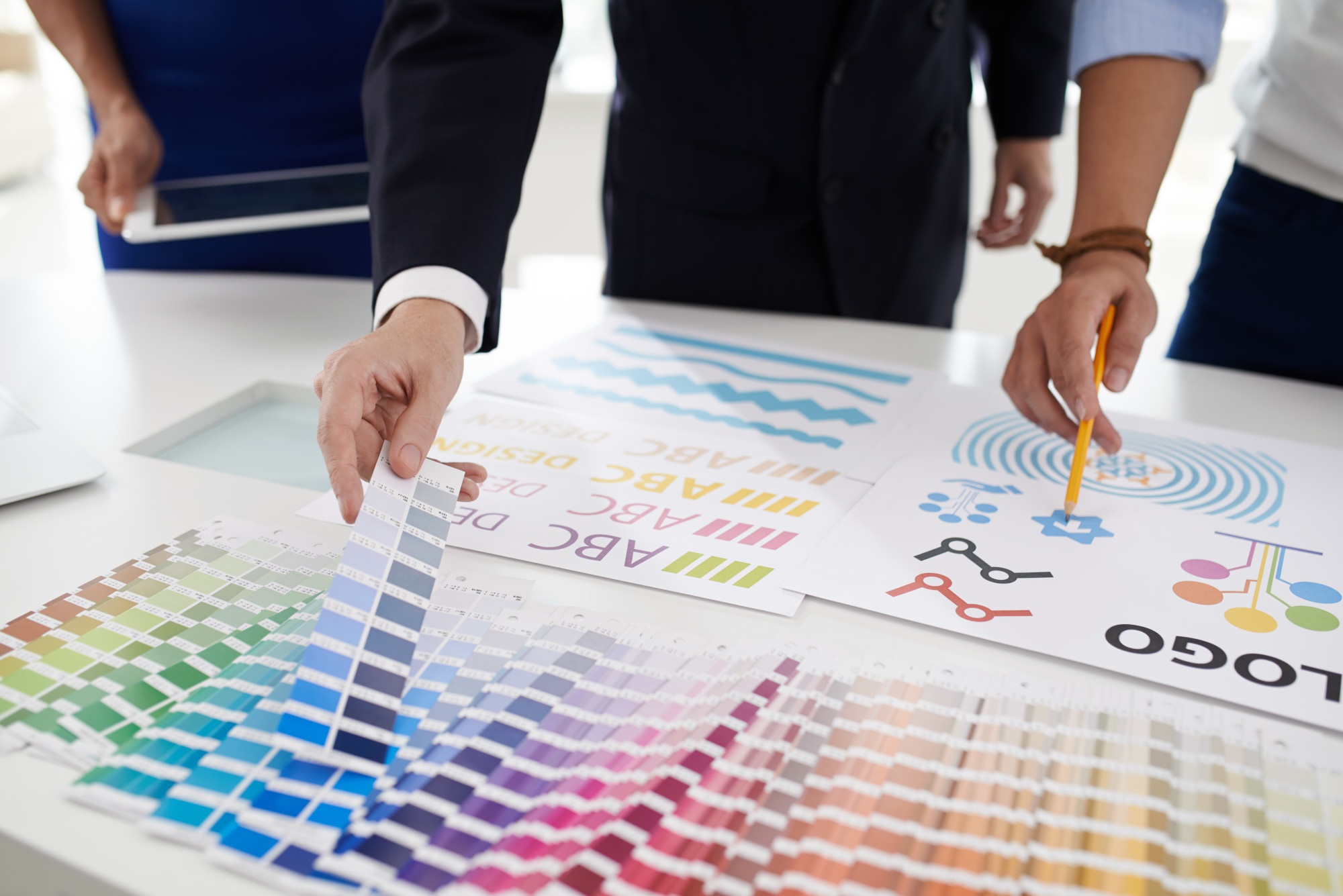
Let Your Logo Say Happy Holidays
Your logo speaks volumes about your business and what message you strive to relay to customers. A logo reflects quality, professionalism, and gives the world insight into the culture you’re building at your company.
Using a holiday theme, give your logo a subtle change by using holiday color schemes in place of your usual palette. Have fun and embellish your logo with a pumpkin, snowman, or bright red holly berries.
Notice the word subtle—keep in mind the critical part your logo plays in your brand identity. You don’t want to change the logo so much your customers no longer recognize it. Have fun with a seasonal design but keep your company’s voice speaking over the din of pumpkins and Santa hats.
Speaking of seasons, don’t limit your business to only using seasonal design elements during the winter holidays. Take advantage of the range of seasons, including those specific to your industry.
Seasonal Designs and Social Media
Social media is the ideal platform to implement seasonal design elements.
You can update your Facebook cover photo with a temporary design inspired by holidays. Switch your usual Twitter header for a seasonal-inspired design with a cozy, inviting message. Greet customers who visit your various social media pages with seasonal imagery and messages.
Make things easy and use a Logo Scheduler Plugin to seamlessly update your logo across email and social media pages for the seasons.
If your company has a blog, post content appropriate for the season. For example, if your business promotes sustainability or you offer green products, write a post about decorating with eco-friendly holiday lighting.
Tie Your Brand in with the Season
When you think about seasonal design, you’ll notice familiar elements that everyone associates with a particular season or holiday.
Even if your brand doesn’t represent pumpkin spice or snowmen, you can find ways to tie your brand into the season.
For example, if you run a cleaning company, create a festive holiday theme on your Facebook page and promote how your services help busy people prepare for the holiday rush or the company party.
There’s no limit to how you can use seasonal design to promote brand awareness.
Ready to Use Seasonal Design in Your Brand?
We hope we’ve inspired you to add a little seasonal cheer to your brand by using touches of seasonal design.
Whether you make subtle changes to your logo, or go all out with seasonal images on your social pages, have fun with it!
If you’ve enjoyed reading this post, continue browsing our blog. You’ll find an array of articles interesting to small business and branding.
4 Key Strategies Companies with Good Marketing Use
Posted on December 06, 2019 by Logo Design Tips and Tricks

When you’re looking to create campaigns for your advertising it makes sense to look to the big boys.
After all, what better way to pattern yourself than after companies with good marketing.
You don’t even need a comparable budget to get there.
So, if you’re wondering what tried and tested methods of marketing are available then read on and we’ll show you some of the proven ways that companies have gotten ahead.
1.Brand Consistency
Delivering a repeated, consistent message across all platforms is something used by brands to get ahead.
Think of it this way: you’d know it’s a Coke commercial when you watch it even if the bottle wasn’t labeled. They’ve built an empire on repeating the same message in slightly different ways for decades.
You may not have the reach of Coke, but if you do it right then customers will think of you whenever the emotional association pops up. It’s a long road, but it’s a proven way to build something which lasts for years to come.
2. Telling Stories
Storytelling is all the rage these days. Many brands miss the mark, however, by telling a story simply for the sake of telling one.
Don’t take a page out of the book of recipe websites that tell you long, rambling stories before getting to the point.
Instead, you need to work in your brand and product naturally over the course of any given piece of marketing. Tell your viewers a story they’ll love right from the beginning and you’re well on your way to forming a lasting impression in their minds.
3. Content Marketing
Intertwined with storytelling is the idea of content marketing.
Many people make the mistake of thinking of their content as simply a means to one simple end: their search engine optimization.
That’s a huge mistake. Instead, you can use your content marketing to intertwine more high-concept ideas for your products and services.
SEO is still important but content marketing can be used across platforms to deliver your message to those reading, watching, and generally enjoying your content.
And that’s the key: content marketing should always be enjoyable to go through. It’s not about slipping a sales letter into an article and snagging higher Google ranks. It’s about people viewing your company as a content creator, in addition to selling your products.
4. Staying Mobile
A huge percentage of your viewers are going to be using phones or tablets to view your marketing.
That means a tight focus on mobile marketing is key to ensuring you’re ahead of the competition.
It’s not just about reactive web themes either. Focus on how people use their phones. Are you targeting the sorts of questions a person might actually ask their phone when making a search?
Does your website load cleanly on mobile? Are ads interfering with the user’s experience?
Design things with mobile devices in mind for the best end result.
Emulate Companies With Good Marketing
Copying companies with good marketing isn’t hard. Think about the things that you know for sure about the big brands that most of us use in our daily lives and scale them down to suit your own business model.
The sky’s the limit and you don’t need to split test every idea that comes to mind when you can just steal a page from the big boys.
So, consider, how can you modify your marketing today to bring it in line with industry titans?
For more informative reads, bookmark our site, and share this post if you found it useful.
5 2020 Logo Design Trends to Keep an Eye On
Posted on December 05, 2019 by Logo Design Tips and Tricks
Are you in the process of starting a new business? If so, you’ll want to create a visual symbol that makes your brand immediately recognizable to customers and sets you apart from your competition. A high-quality logo can help you accomplish that.
Unclear about what goes into a good logo design? Not sure what trends to chase, or what you should include or exclude to create a great one? We’re here to help!
In this article, we’re covering 2020 logo trends and best practices you should know. So you can create a logo that’s fresh yet familiar and makes people want to engage with your brand.
2020 Logo Design Trends, 5 to Keep an Eye On
Need some fresh inspiration to create your business’s logo? Here are 5 major trends that can help you start off on the right foot.
Simplicity is King
One of the longest-running trends in logo design is simplicity. That’s because simplicity is impactful. Customers are much more likely to remember something simple and clear than a cluttered visual that’s hard to comprehend.
Simple logos are also a lot more scalable. The more visual elements you add to a logo, the harder it is to discern once it’s presented on a different platform in a different size.
One way to embrace minimalism and simplicity in your design is by incorporating simple geometric shapes. Lines, squares, dots, and curves can make a design feel cleaner, clearer, and simpler. They can also provide an often-needed balance to your design.
Animation
One of the newest trends in logo design is animation. It adds a layer of whimsy to any design and can make a brand seem friendlier and more easy-going. To take it a step further, add a cartoon-style layer to the logo to up the whimsy and playfulness of your brand.
Retro is Back
Retro style logos are officially back in 2020. That means retro patterns, color schemes, and fonts. These style elements can give your brand a laidback and approachable vibe.
Specific Colors
This year we’ll also see a number of brands incorporating specific shades of color into their brand. One trending color will be mustard, which has already been popping up in a variety of fashion and design company logos.
That’s because mustard is a warm color that denotes maturity and sophistication in a friendly way. It’s also an effective alternative to gold for any brands looking for a higher-end logo.
Mint will also play a more prominent part in logos come 2020. Mint can help your brand feel more uplifting and fresher with its soft green hue. It’s also versatile. It’s fresh and fun nature makes it great for a variety of brands, including health and wellness, lifestyle, and home.
Lilac, while already popular, will continue to be a trending color in 2020 as well.
Responsive Design
UX design is on everyone’s mind now when it comes to design. This emphasis on user-friendly, functional design will most likely extend to logos. Responsive logos reflect how advanced a company is within the digital space and make branded experiences clear and clean regardless of platform or device. By creating a responsive logo, you can guarantee that your brand always looks polished and professional.
Ready to Create Your Logo?
Creating a visual representation of your brand can seem tricky and complicated. But it doesn’t have to be. By checking out these 2020 logo trends, you can get the inspiration you need to create a dream logo with ease.
Did you find the tips and trends in this article helpful? Need more advice? Check out the rest of our website for more insights.
The Psychology of Design: Choosing the Best Colors for a Logo
Posted on November 19, 2019 by Logo Design Tips and Tricks

Did you know that 85% of consumers buy from a certain brand because of the colors used in their marketing materials?
So, if you were thinking of using your favorite color for your logo, think again, as that might not be the best strategy.
Keep reading as we go through the meaning of some of the most commonly used colors in marketing and other tips that’ll be useful for creating your logo. By the end, you’ll have all the tools you need to pick the best colors for a logo!
1. Blue
Blue invokes calmness and confidence. It makes the brand look intelligent, safe and trustworthy. If you want your logo to look professional as can be, this is your color.
Popular for: IT and healthcare
Not so popular for: Food and fashion
2. Red
We all know that red is the color of passion and seduction. This color is often used by marketers because it creates a sense of urgency in the consumer, which many times leads to sales.
Popular for: Sports and food
Not so popular for: Transportation services and baby products
3. Green
As environmental awareness grows, so does the usage of green by brands. This color represents nature, peace, and freshness, and it’s definitely the one to choose if you want to create an eco-friendly brand.
Popular for: Health brands and energy
Not so popular for: Car brands and fashion
4. Orange
If you want your brand to have a friendly image, you should make orange your logo’s main color. It symbolizes energy and boldness, and it’s the ideal one if you want to appeal to young people.
Popular for: Food and entertainment
Not so popular for: Finance and fashion
6. Yellow
Finally, yellow is a very optimistic color, so it’s the way to go if you want to create a joyful, warm image of your brand. This color is also very celebratory and action-oriented.
Popular for: Entertainment and food
Not so popular for: IT and fashion
Choosing the Best Colors for a Logo: Two Extra Tips
As you can see, there are entire definitions behind each color, and that’s something you can’t ignore when designing a logo. But there are other tips you can use in the process:
Choosing a palette will give you a lot more freedom when creating other visual pieces. If you’re not sure what other tones go with your main one, simply generate a color palette from images that are connected to your brand.
- Experiment, experiment, experiment
Even if the first logo you come up with looks good, try it out in other colors. This way you can also show your different creations to other people and ask for their opinion. Remember, many heads think better than one!
Too many strong colors and your logo will be overwhelming. Too many neutral ones and no one will notice it. The secret is in finding a balance between the two.
So, What Color Will It Be?
Don’t worry – you don’t have to make the decision right away. But now you are well-equipped to choose the best colors for a logo, so get thinking!
If you’d like to read more articles on how to create the perfect logo, make sure to keep exploring our blog.


