How to Make a YouTube Logo That Makes Your Channel Stand Out
Posted on March 13, 2020 by Logo Design Tips and Tricks
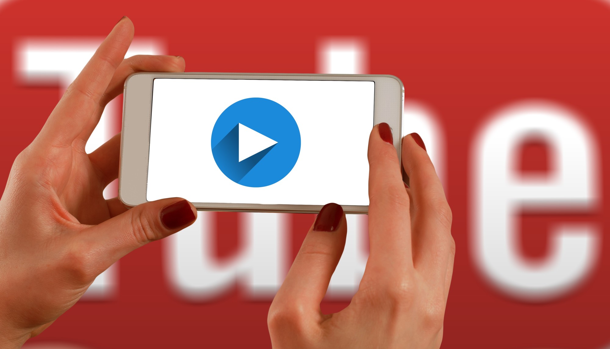
Youtube has over 2 billion users. If you want to get them to subscribe to your channel and watch your videos, you have to set yourself apart from the crowd.
One of the ways you can create a more professional-looking channel and get more views and attention is by having a great logo. Your logo shows up when you post comments on other videos and on your channel.
Keep reading to learn how to make a Youtube logo that will help you stand out.
What Elements to Include
Before we get into how to create your Youtube logo, let’s look at what it should contain. You need to combine these three elements if you want to have an amazing logo for your channel.
Bright Colors
People’s eyes are naturally drawn to bright colors or logos that have great contrast. That’s why you’ll want to pick a couple of bright colors to use in your logo. Make sure they don’t clash and don’t have more than two or three or else your logo could end up being too busy.
Simple Design
Speaking of business, you want your logo to be as simple as possible. Think of the simplicity of Youtube’s logo. It’s just the play button but everybody knows what it means.
It’s also important to remember your logo is small when commenting, so people need to be able to see what it is even when it’s small.
Reflects Your Channel
You also need to pick a logo that accurately reflects what your channel is all about. You may be passionate about cats, but don’t put one in your logo if you’re making a gaming channel. Unless, of course, you’re playing games that involve cats.
How to Make a Youtube Logo
Now let’s get into how to make a logo for Youtube. There are really only two steps involved, so you should be able to make a Youtube logo in a short amount of time.
Coming Up with Ideas
Get out a piece of paper and start drawing. Come up with as many ideas as you can, then start narrowing down your options until you have one that you love. Make sure it has the right colors, is simple, and reflects your channel before considering it a final design.
If you can’t draw, don’t worry. You just need to get your ideas out there for this step.
Creating the Logo
There are many free ways online to make a Youtube logo. Visit one of these sites, and you should be able to work quickly to bring your logo to life. Feel free to keep playing with the colors and design until you have one that you believe is perfect for you and your channel.
Need More Help with Logo Making?
Now you know how to make a Youtube logo that can help your channel be more unique and bring in more people to watch your videos and subscribe. As you can see, it takes just a few important elements to put together a great logo.
If you want more help with making a logo for Youtube or anything else, keep reading our blog. It’s full of information that will help you design the most amazing logo for any project.
7 Tips for Unique Logo Design for Your Creative Business
Posted on March 13, 2020 by Logo Design Tips and Tricks
Any type of creative business needs to have cutting edge branding material. Even if they provide non-graphic services, such as content, the way they look online has a huge impact on their reputation.
All brand personas start with a logo. This symbol is a unique identifier that forms a mental connection between a business and consumers.
If you own a creative organization, it’s critical to design an ideal logo before you fully brand yourself. Your logo will be a constant on all your marketing materials.
Keep reading to learn seven tips for creating a logo that sets you apart.
1. Understand Your Brand
It’s easy to jump the gun on your logo design because you want to get the process over with. However, it’s important you first understand your brand. This means pinpointing your target audience.
Think about what type of people require your service. If it helps, make a list of reasons why a person would hire you. Doing so will help expose your target client.
Then, think about your industry. Does your product create an emotional response or is it strictly technical? This factor has a huge impact on the vibe your logo should convey.
Finally, consider what your business is all about. If you’re forward-thinking, your logo should be ultra-modern. If you’re traditional, you may be able to get away with a classic approach to branding.
2. It’s All About Style
Once you’ve nailed down what kind of branding approach you’re going to take, you can start thinking about logo style. This refers to the aesthetic your logo design will have.
If you’re not in the graphic design industry, it’ll surprise you how many logo styles are out there. Professional designers can take things in any direction.
You may opt for a pictorial mark, which is a symbol used to represent your business. On the other side of the spectrum, a wood mark incorporates the name of your business.
If you want to convey a fun, playful tone, consider using a mascot as your logo. You could also go abstract and use geometric shapes that send an effective message.
This can be a tough decision, so don’t hesitate to hire a creative agency to help you out.
3. Embrace Simplicity
Many businesses make the mistake of trying to “wow” their audience with a logo. The result is often overwhelming to the eye, which is a no-no when it comes to logo design.
The opposite approach (simplicity) is better. A clean, subtle logo can be much more effective than a bunch of bells and whistles.
Don’t be afraid to use white space when coming up with logo prototypes. A well-positioned symbol with a sharp design can be very attractive.
The primary thing to keep in mind is that your logo should be straightforward. All it needs to do is get the message across and stick in people’s minds.
Consider the logos for companies like Apple, Target, and Twitter. They use one or two colors and a lot of white space. It’s all about the execution.
4. The Science of Color
Even if you’re going for the most minimal logo possible, the colors you use are critical. Colors can evoke emotional responses, which means you need to spend a lot of time thinking about which ones to use.
You’ll need to consider what kind of business you are when deciding on a color. This is your chance to convey compassion, creativity, assertiveness, empathy, or any other feeling.
Blue is always good for creative businesses. It evokes collaboration, innovation, and intelligence.
Red is a strong, energetic color. However, it’s loud and can evoke aggression, so be careful with how you use it.
Muted or earthy tones evoke classiness and trustworthiness. Black is always good for conveying power and credibility.
5. Fun With Fonts
This is another element that’s easy to gloss over. However, the typography of your logo speaks volumes.
Fonts have the power to exude personality. This is your chance to get creative and set yourself apart from the competition.
The great thing is, there are thousands of fonts to choose from. Look for a program that provides you with a good selection.
Like the other elements of a logo we’ve discussed, you’ll need to think about your business persona when choosing a font. You’ll also need to make sure there’s no mistaking what your font says. Remember, your business name is foreign to many people.
6. Make a Lasting Impression
Your ultimate goal is to create a logo that’s unique and eye-catching. Unfortunately, this is hard to do in today’s competitive marketplace where seemingly countless businesses are vying for attention.
Take a look at the logos of your closest competitors. Write down what stands out about them and what you feel they lack.
Then, brainstorm a logo concept using your business principles and with your target audience in mind. You’ll need to come up with several mock-ups and revise them.
Don’t hesitate to get other employees’ opinions. There’s always a chance someone will provide a perspective you’ve never considered.
Once you have a final prototype, show it to people and ask for their impression of it. If it’s not getting the reaction you want, keep working on it.
7. Scalability
Your final logo will go on all your marketing materials. It needs to be easily scalable.
This means that when it gets sized up or down, it will still look good. You wouldn’t want to add it to a print advertisement and realize after the fact that you can’t read the tagline.
You’ll need to work with a graphic designer to ensure good logo scalability. They have the software and knowledge needed to do this.
It’s also important to keep in mind that your logo will need to go on your website. Make sure you design something that looks good in a digital format and doesn’t have too much information included.
Start Designing Your Ideal Logo Today
Even if you plan to work with a professional graphic designer, you can start thinking about your ideal logo concept now. Going in with a good sense of what you want will prove helpful.
Use the tips discussed above and create a logo that makes your business stand out.
We hope this article has been informative. Browse our site for additional design-related content and more.
The 5 Best YouTube Logos and What You Can Learn From Them
Posted on March 13, 2020 by Logo Design Tips and Tricks
Do you want to start a Youtube channel but don’t know where to start?
One of the things you’ll need to draw attention to your channel and start gaining subscribers is a logo. To get some inspiration, we recommend looking at the Youtube logos from some of the most popular channels to see what you can learn from their examples.
Keep reading to learn more about what makes these popular Youtube channel logos amazing so you can incorporate some of these ideas into your logo.
1. Mr. Beast
With a wide range of fun videos that often have a charitable spin, Mr. Beast has a logo that reflects his brand name and his unique personality. It’s a simple rendering of a teal cougar with a pink lightning bolt coming from its eye.
What we like about this one is how eye-catching the bright colors are and how the logo makes you want to click to learn more about who’s behind it.
2. Flavia Pavanelli
Beauty guru Flavia Pavanelli has a huge Youtube channel on which she gives beauty tips and shows aspects of her life. She displays her logo in her channel cover, which is her name with a mascara wand serving as an exclamation point.
We like her Youtube logo because it’s simple and easy to see exactly what her channel is about. It only takes a glance at the fancy font and the mascara wand to know it’s a beauty channel.
3. Markiplier
Primarily a gamer, Markiplier’s Youtube logo is a cartoon image of himself. This works well because of his popularity, people are likely to recognize him by his logo and be interested in learning more about him.
4. Howcast
No matter what you want to learn, Howcast is there to teach it to you with their team of experts. Their logo has the letter “H” set at a diagonal so that it looks like an arrow.
What makes this a great logo is it’s easily recognizable and it cleverly combines the first letter of their channel name with a subtle encouragement to check them out.
5. Luccas Neto
Now let’s take a closer look at the logo of one of the most popular children’s Youtube channels, Luccas Neto. His logo reads “Luccas TOON” in bright yellow letters.
This is a great example of a logo that works well for kids. It clearly lets viewers know whose channel it is and what it’s about. Coupled with the bright colors, it’s sure to get the attention of young kids.
Learn More About Making Youtube Logos
Now you know the best features of some of the Youtube logos from popular channels. As you can see, there’s something to be learned from each of them. Overall, you want a logo that’s eye-catching, simple, and reflects your brand.
If you want to learn more about how you can make logos for your Youtube channel or any online business you may want to start, keep reading our blog. It’s full of information you can use to make unique logos.
7 Key Ways to Make Your Brand Stand Out With an Animated Logo Design
Posted on February 24, 2020 by Logo Design Tips and Tricks
As you build your company’s brand identity, you will find yourself looking for several ways to get ahead of the competition that you’re facing.
What aspects of branding can you use that they aren’t? Which avenues can you go down with your marketing to stand out above the rest?
One of the best ways is to design an animated logo for your business. Your logo will take action while everyone else’s stays put.
So, what are the different ways that you can use this to your advantage? Here are several ways you can use an animated logo to push your brand out to the world.
1. Trade Show Booths with Action
Imagine walking around at a local sales convention and coming across a sales booth that has an animated logo in the background. You would drop everything else to stop by that booth, right?
That’s the power that an animated logo can offer you. It gives off an advanced impression of your brand that can’t be matched.
Pair your animated logo with an interactive trade show booth and you’ll be the talk of the entire convention.
People will flock to your table to see what separates you from all the other companies in attendance. Then your products and services will seal the deal on why they should work with you!
2. Improve Brand Recall
Looking for ways to make your brand more recognizable to your prospects and clientele? What better way to do that than with a logo that has animation throughout it?
While all the other logos of the world are static and hold one position, your logo has action.
Customers will remember it as the logo with the running horse or the logo that winks at them anytime they see it.
No matter what the actual animation is, it will help people put a face to the name of the logo. If they meet you along with the logo, they’ll have it ingrained in their head that you are the face of that franchise.
3. A First Impression Unlike Any Other
Your company’s first impression to your prospects is of vital importance. If that first impression is negative, it can be hard to shake. In fact, it’s safe to say that prospects will never give your brand an ounce of attention ever again. Harsh, but true.
As such, you need something that will raise their eyebrows. Something that they don’t see every day. An element of your brand that they associate only the “big companies” like Coca-Cola and Sony to have: animated logos.
That’s right, ladies and gentlemen, an animated logo can create that kind of the first impression for your business.
Considering the fact that clients only give you a few seconds of their time as is, your animated logo will make it count. Then, they’ll be intrigued to learn more about what your business is and how it can help them.
4. A Story to Tell
Animated logos aren’t long. In fact, the shorter they are, the better. That said, there is a lot of storytelling you can do with those few precious seconds.
This gives you an opportunity to grow your brand within the logo itself. You can tell your company’s story and add layers to your overall brand identity in the client’s eyes.
For example, if you’re a clothing company whose mission is to design clothes with eco-friendly operations, that can easily be captured within the animated logo you have.
From then on, any client that sees it will immediately understand what separates your brand from the rest. They’ll understand that your clothes are designed with a greener Earth in mind.
5. Show Emotions of Your Brand
The more personable your brand is in the client’s eyes, the more relatable that it becomes.
Gone are the days where companies have to abide by the professional suit and tie identity for their branding. Customers only want to work with the companies they understand.
You can capitalize on that with a logo that gives your brand emotion. Whether it’s a smiling face, a logo that gives a thumbs up, or anything else, it will create personability.
6. Sets a Professional Tone
Don’t get “emotion” confused with “unprofessional”. Your animated logo can create emotion and professionalism at the same time. If it achieves that, it becomes that much more unique for your branding.
Animated logos are commonly associated with top-notch brands. Think of the Intel jingle and animated logo that they use in all of their commercials or the Pepsi logo that fills up and bubbles like a freshly-poured soda.
You can add a professional element to your brand by merely having an animated logo in your repertoire.
7. Use for All Marketing Outlets
Any type of marketing that you use from this day forward can be capitalized on with your animated logo.
Pay for the animated logo to be designed once and have access to it in all your marketing material from this day forward. That means all commercials, social media videos, tweets, paid ads, etc. can end with your new logo.
Consider it the cherry on top of your sundae ice cream. It takes your marketing material from “good” to “great”. It brings a whole new layer of legitimacy to your brand.
Create Your Custom Animated Logo Today!
Now that you’ve seen all the different ways you can thrive with an animated logo, it’s time to get yours created.
Try to figure out different options for your animation and how you can best deliver on the brand you’re trying to convey.
Be sure to browse our website for more articles relating to marketing advice, as well as other helpful topics.


