A Comprehensive Guide to Web Ads: Types and Formats
Posted on July 23, 2020 by Logo Design Tips and Tricks

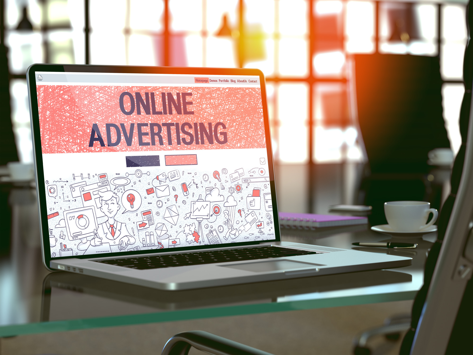
The average clickthrough rate of a web ad is less than .5%. You might think that’s low, but display ads deliver a lot of value in brand awareness, recognition, and ROI.
Do you want to make your marketing more effective? You might be ready to launch a paid advertising campaign. That means you’ll have to work on advertising creative for your ads.
You need to know the web ad specs for each display ad network because the wrong ad size could leave your ad distorted. That’s not a good look for your company and it won’t get many clicks.
Read on to find out what the best web ad networks are, the ad specs, and how you can design effective ad campaigns.
Google Display Ads
Google’s Display Ad Network is a broad network of websites that offer you the opportunity to advertise your products. You can make sure that your ads appear on the right sites with perfect targeting.
You can use retargeting campaigns, which target people who already visited your website. This is an effective way to create top of mind awareness of your brand without spending a small fortune to do so.
You can also run a general display ad campaign that is effective and highly targeted to your audience.
There are about 10 display ad sizes that you can use in your advertising. Check out https://www.digitallogic.co/blog/google-display-ad-sizes/. This site has all of them listed out in a graphic that’s easy to understand.
Facebook Audience Network
Facebook has its own ad network, which can help you extend your reach beyond advertising on Facebook and Instagram. You can set up your ads through the Ad manager.
Facebook ads are styled according to your objectives. You can try to increase conversions, brand awareness, sales, or app installations. Your ads would appear on mobile websites and within apps.
The Facebook Audience Network says that ad sizes should utilize a 16:9 or 9:16 aspect ratio. Your ads shouldn’t have more than 20% text.
Watch Out for Apple
Apple hasn’t been mentioned much in the ad network conversation. That’s because most people can advertise their apps in the App Store.
Apple isn’t like Facebook or Google because those two companies are highly dependent on advertising revenue for survival. Apple makes most of its money from device sales.
That’s going to change shortly. Apple is said to be expanding its ad capabilities, but it wants to do so in a way that still protects user privacy. That’s an interesting balance because digital ads rely on user data for targeting.
You’ll want to keep an eye on this development for sure.
Web Ad on Your Website
Bloggers and businesses are also using web ads on their own websites. They’ll use these ads to promote conversions on their sites. Here’s how they do it.
They have something called a lead magnet. This is usually a downloadable guide or a free email course to get you to sign up for to their list. This is usually a quick win for a potential client.
A fitness instructor may have a free weight loss course. A food blogger could offer an ebook of recipes. A business can offer case studies.
The website may have a landing page on its website that showcases the benefits of the lead magnet and how it will help someone solve a very specific problem. That’s where you would sign up.
Instead of having a random sign up form on the website, these sites will use display ads. The ads will be featured in blog posts and along the sidebar of the site. These ads are linked to the landing pages, where people go to sign up.
The most successful sites will offer several lead magnets to appeal to different interests. The fitness instructor may have workouts and recipes on their site. They’ll have one lead magnet for recipe pages, such as a nutrition guide. The content that features workouts will have a lead magnet about building strength.
Once you’re on their list, you make it more likely that the person will buy from you eventually.
You can do the exact same thing on your website. You have to figure out what a compelling lead magnet would be to entice your audience.
When you design the online ads, use sizes that people are already familiar with, such as the standard Google display ads. You’ll also make it much easier on yourself.
Designing Ad Creative
When you design your web ads, it’s important to create an ad that will get attention on desktop and mobile devices. Decide on the colors to use in your ad. The colors should be part of your brand and provide contrast to get attention. Bright and bold colors work well here.
You also need to think about what the viewer is doing when they look at the ad. They will look at your ad for about a second. The design needs to have the right context. Context is the reason why the same ad will work great on one network but not on another.
How should you design ad creative for Facebook ads? Since the ad network doesn’t recommend that you use more than 20% text in your ads, focus on the product in use.
Let’s say that you’re advertising a pair of stylish jeans. Use a little text, but have a picture of a person who looks great in those jeans.
Making the Best Web Ad
No matter which ad network you choose, you have to make a great looking web ad that will attract attention from users. You need to design an ad that sells by demonstrating the end result of the product or defines the problem in a way that people relate to.
Then you can focus on telling that story within the ad specs and deliver an incredible ad. If you want more great design tips and tricks, head over to the blog of this site for the latest articles.
Business Card Graphics: How to Design a Business Card That Stands Out
Posted on July 15, 2020 by Logo Design Tips and Tricks

You might be under the impression that computers, smartphones, and other gadgets helped kill off the business card. But that couldn’t be further from the truth!
Even though the business world is deeply entrenched in the digital age right now, business cards are as relevant as ever. More than 27 million of them are printed every single day.
If you’re in the process of putting some together for your company, you should add the right business card graphics to them. You should also take other steps to ensure you end up with the most effective business cards possible.
Here are some useful tips on how to design a business card that stands out in the crowd.
Order Business Cards Printed on Heavy-Duty Paper Stock
Far too often, companies will spend a ton of time designing a business card only to turn around and print it on cheap paper in an effort to save money. Don’t make this mistake!
Instead, have your business cards printed on heavy-duty paper stock that will guarantee they last for a long time. You might even want to go with something like the suede or thick cotton business cards available through New Era Print Solutions.
Consider Going With Something Other Than a Standard Size Business Card
For years, the rules on how to make a good business card dictated that people had to have them designed to fit on 3.5-inch by 2-inch business card paper. But those rules don’t necessarily apply anymore.
You’re still welcome to create a standard size business card if you would like to go that route. But you might also want to consider the idea of printing business cards that are much bigger or much smaller than that.
This is one of the simplest ways to separate your business cards from the business cards created by all the other companies out there.
Be Mindful of Which Business Card Graphics You Use
At the end of the day, the paper stock that you use for your business cards and the size of the business cards that you create won’t matter without the right business card graphics.
You shouldn’t try to squeeze too many graphics onto your business cards. But you should add things like your name and title, your company logo, and your contact information to your cards.
You should also find small ways to personalize your cards so that they’re unique to you without cluttering things up. Many people are opting to add their social media handles to their business cards these days to make it easy for others to connect with them virtually.
Start Designing the Best Possible Business Cards for Your Company
If you’re going to go through the trouble of designing business cards, shouldn’t you make it worth your while? You can do this by picking out the right kind of paper for your cards and using the right business card graphics on them.
Use the tips found here to bring your next batch of business cards to life. You’ll be able to hand your business cards out with confidence when you feel great about the way they look.
Check out our blog for more business-related tips and tricks.
5 Really Cool Retail Display Ideas to Get Attention
Posted on July 03, 2020 by Logo Design Tips and Tricks

Do you need storefront display ideas to improve your business? The use of a creative retail merchandising display can have a positive impact on your customers.
Artistic store displays can increase your sales conversions or make people curious about your business.
Let’s take a look at some exciting retail display ideas that you can implement.
1. Use Colorful Displays
A colorful display is eye-catching and interesting. Keep in mind that bright and colorful displays can have a strong influence on customers.
Regardless of the products you’re selling, your colorful displays can evoke a positive reaction from customers you’re trying to attract. You can use oranges and browns to make your customers feel comfortable and positive.
Retail displays such as bright reds, blues, and yellows can also grab a customer’s attention.
2. Contact a Professional
A professional designer can help you to get a stylish display that is suitable for your business needs. Professional designers have the skill and expertise to provide you with a perfect design that fits your target audience.
If you’re unable to come up with your artistic idea, you can learn about getting creative, visual design displays at Designmfg.com
3. Create Your Focal Point
What do you want customers to see? Create a focal point when you’re styling your display.
A hot spot on your display can increase your chances of making a sale. For example, you can set up stylish mannequin displays to create a focal point in your store.
You can also use mannequin heads as a window display.
Once a customer walks into your store, their eyes will be drawn to your display. Your display can cause a customer to linger in your store or make them eager to buy more products.
You can even create a focal point for different types of products. This is the best way to pique a customer’s interest and to make them eager to enter your store.
4. Show Kid-Friendly Displays
Child-friendly displays can increase your sales. You can use innovative and interactive displays that attract young children.
You can use doll displays, candy displays, cartoon character displays, and other ideas. Realistic looking displays are exciting to look at and create a great impression on customers.
These displays are easy to design and may help you to transform the look of your store.
5. Create Educational Displays
Educational displays are unique, easy to understand, and engaging. Your educational displays can provide information that people need before they decide to buy something from your store.
Educational displays are very trendy and may help you to get more sales. This is a great concept that you can use to engage more of your customers.
Experiment With Different Retail Display Ideas
There are many factors for you to consider when you’re using store displays. When you need retail display ideas, you can experiment with different designs to determine which one gives you the best results.
Using these ideas could help you to achieve more success for your business.
If you want more design tips for your business, take a look at the rest of our website.
Branding Clients Trust: 5 Important Things to Know About Law Firm Branding
Posted on June 10, 2020 by Logo Design Tips and Tricks

Lawyers don’t like to think of themselves as a product like Coca-cola. However, in a highly competitive marketplace, law firms must utilize marketing tactics just like any other goods or service in order to grab the attention of potential clients.
Law firm branding may not be the same as branding for consumer goods like soda or potato chips. However, it does need to follow some basic marketing precepts.
Here are five concepts your law firm branding should follow in order to be effective.
1. Different
A brand is literally what sets you apart from your competitors. You can even get in trouble if your brand too closely resembles that of another law firm.
Brands are more than a logo. They are a representation of who you are and what you do.
A brand for a small firm like Sweet Lawyers that focuses on automobile accidents must be completely different from that of a large corporate law firm. It also must be different from the logo and other branding used by other car accident law firms in the same geographic area.
2. Reproducible
Your logo and other branding will appear on all materials representing your law firm. It will be prominent on your website and any ads or sponsorships you buy. It will also appear on your stationery.
Make sure your branding can be reproduced on all kinds of collateral. For example, a long firm name may not be visible on a pen, which is a giveaway of choice for some law firms. It should look equally impressive in color or in black and white.
You will also want to have branding in vertical and horizontal positioning for different purposes like banners or digital ads.
3. Reflective
Your brand arises from your values, your strengths, and your focus. Often, an effective brand has a strong backstory, which is reflected in the imagery, font, and messaging in all marketing materials.
If your firm has a niche practice, your brand may even be reflected in the name. However, you should be aware of any relevant state laws about trade names if you choose a nontraditional law firm name.
4. Multi-Faceted
A brand must reflect many facets of your practice. It is not only visual. It may include the ways in which you demonstrate your values to the community and your employees.
A criminal defense firm may refect its values by donating time to civil rights organizations. A real estate firm focused on residential properties may want to promote its brand through sponsoring family-oriented activities like parades and sports clubs.
A law firm should spend time and energy on the development of a brand identity that will serve its larger business objectives.
5. Memorable
The point of a good law firm brand is to make people remember you when they need you. It is an integral part of business development.
For example, if someone has had a vehicular accident and needs a lawyer, you want them to decide to call you because they remember that this is your specialty. Your brand remained in their memory.
Law Firm Branding: It Should Accurately Represent You
Law firm branding can be an essential tool in promoting your practice to potential clients. When your branding is a mirror of what you do and what you stand for, people are more likely to remember you when they need what you provide.
From the look and feel of your website to your letterhead and giveaways, make sure your law firm presents a unified and consistent reflection that will stick in the minds of potential consumers.
For more tips on branding your business or organization, keep checking back.


