3 Key Ways to Build an Eco-Friendly Business
Posted on January 28, 2021 by Logo Design Tips and Tricks

The benefits of running an eco-friendly business are well-documented: reduced operating costs, improves customer loyalty, helps save the environment, and the brand gets a reputation boost.
As an entrepreneur, if your business isn’t eco-friendly, you’re leaving a lot of money on the table. And if you’re an environmentally-conscious person, you’re probably feeling that you’re doing the planet a big disservice.
So, what can you do to run an eco-friendly business?
In this article, we’re sharing a number of steps, small and large, you can take to build a green business.
Read on!
1. Embrace Green Energy
One of the biggest steps you can take to make your business eco-friendly is to embrace green energy.
If you’re still using electricity generated by fossil power plants, you’re not only doing our planet great harm but also missing out on the several advantages of using green power. For starters, green energy is cheaper. For example, solar power is more cost-effective than fossil fuel power.
What’s more, there are different types of green energy you could use. Solar energy is the most common, but you can also use wind power, hydropower, and biomass. Biomass is especially ideal for farming businesses.
Although transitioning to 100 percent green energy can be costly and almost out of reach if you’re running on a shoestring budget, you can start by switching to LED bulbs and using smart lighting and heating and cooling systems.
2. Go Paperless
Even with office technologies being so commonplace, paper simply refuses to go away. Every year, the average office worker uses about 10,000 sheets of paper. If you’ve got 10 employees, you can imagine the sheer amount of paper your business is using.
Paper has its indisputable benefits, but when your goal is to build an eco-friendly business, you have to go paperless. This typically means investing in a wide range of software and apps, such as the MSDS app, which eliminates about half of all clerical functions done by your environmental professionals.
3. Build a Green Team
Building a truly eco-friendly business isn’t an individual effort. It’s a team effort.
This is why it’s important to build a green team and task it with ensuring everyone in the organization knows the importance of sustainability and what they can do to ensure the organization achieves and maintains sustainability.
A green team doesn’t need to be large. In fact, as a small business, all you need to do is hire a sustainability specialist. Among other tasks, this professional will be responsible for sensitizing other workers on eco-friendly practices.
You Can Build an Eco-Friendly Business
Building an eco-friendly business might not be a priority for you, but it should. The benefits you’ll reap are tangible. If you were thinking going green only involves taking major steps, you’re wrong. This article has fleshed out the various steps you can take to make your business sustainable.
Stay tuned to our blog for more small business tips and insights.
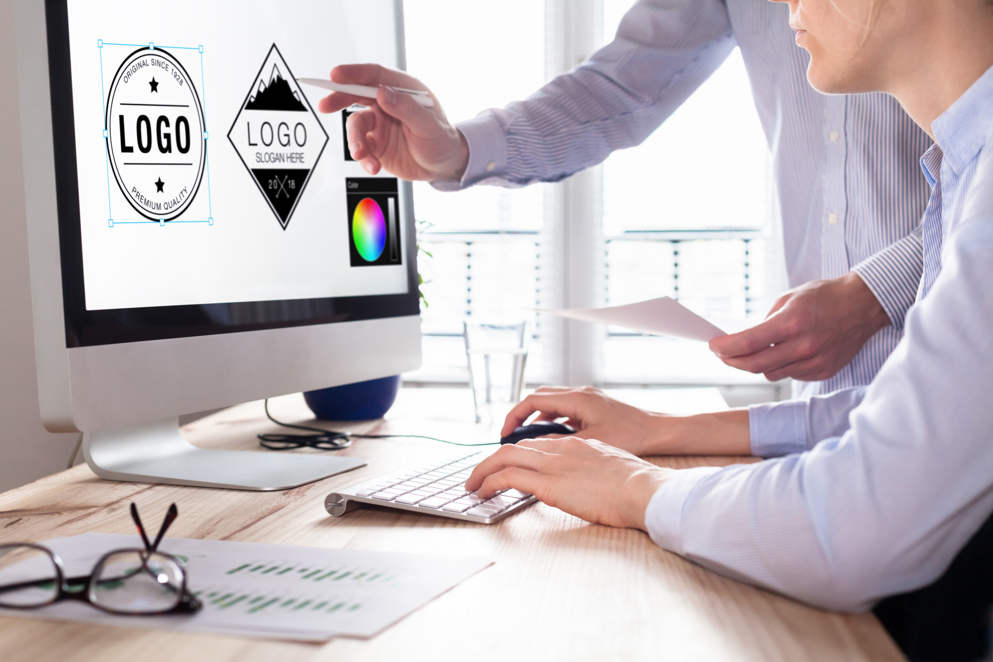
8 Things You Need To Consider When Designing a Logo
Posted on January 24, 2021 by Logo Design Tips and Tricks

Your logo is one of the most important aspects of your business. It can set the tone for your style and be the one feature that customers remember. That’s why it’s so essential to get the logo right.
But what makes a good logo? There isn’t just one element that makes a logo a winner. All good logos have multiple amazing elements that come together to create something memorable.
Then if there are so many contributors to a good logo, how do you create one? Here are eight tips to consider when designing a logo.
1. Consider Your Audience
Before you start your business or brand, you have to know who your target audience is. This will help you make all of the future decisions that will help grow your business or brand. But you also need to take your target audience into account with your logo.
That’s because your logo helps to create your brand identity. Your logo can help establish the service or product you offer and who that service or product is for.
Your brand logo will look different if you’re target audience is children than if your target audience is young adults. Your audience can determine all the other factors within your logo.
2. Trendy vs. Unique
Your logo should keep up with the trends so that it feels current and refreshing. But there is a fine line between following the trends and being too trendy. You don’t want your logo design to stand out in the wrong way.
But you do want your design to stand out in a unique way. To get ahead of competitors, you should get creative with your logo design. No matter what style you choose, your logo should relate to your product or services.
Choose images and elements that relate to your brand. Hardware tools don’t make much sense on a logo for a retreat and spa.
3. Lean Into Typography
Typography can make or break your design. The font within your logo is just as important as any other design element. Your typography should complement the other elements, be easy to read, and make sense for your brand.
If you have a lot of delicate strokes and thin lines, then a font with bold, heavy strokes may look out of place. Consider your product or service when choosing the typography as well. A hardware store will need a different font than a tech company.
Above all, your typography should be easy for your customers to read. If no one knows what your logo says, then how are they supposed to find your business?
4. Conversion is Everything
On the technical side, your logo should be able to convert to different file formats. JPG, GIF, PNG, WMP, and TIFF are only a few options you should explore. They allow for your logo to render as a single element rather than separate elements.
This allows you to scale your logo up or down and be used on the web and printing a logo. Whether you design or your own logo or have it professionally designed, you want to have as many file formats as possible.
This will allow you to effectively use your logo on various mediums while maintaining the design’s clarity.
5. The Logo Has to Look Good
It comes as no surprise that a logo has to look good. If a consumer is faced with a decision, more often than not, they will choose a business or brand with a better design. But your logo also has to look good on everything.
You won’t use your logo in just one format because you’ll want to use it for various purposes. The logo has to look just as good small on a business card as it does large, on a banner, and everything in between.
Consider also the material of promotional items. From cotton t-shirts to ceramic mugs to paper business cards, you want your logo to look good on all mediums. Allow your logo to be flexible enough to work on any medium at any size.
6. Don’t Over Complicate
When it comes to a logo, simplicity is better than complicated. It may seem tempting to add in a lot of elements to get your point across. But with a logo, less is always more.
Think of some of the most well-recognized logos. They utilize a few colors, have a memorable, or may even be only one image. A simple design looks best when sticker printing, letterheads, or on social media.
Avoid overcrowding your design and pare down your logo to the essential elements. A simple image or striking font can be more memorable and pleasing to the eye.
7. Think About Color
Color can be one of the most useful tools in your logo design. There are so many brands, large and small, that can be recognized by color alone. Your logo color can determine the entire feeling of your brand.
Choose shades that complement each other by using a color wheel. You should also look into the meaning behind color to help you make your decision. As important as color is, you also consider how your logo looks in black and white.
8. Do Your Research
This is one of the most vital steps you can take when considering a logo design. Do some research on your target audience as well as competitor brands and businesses.
Find out what kind of logos customers best respond to and utilize those elements in your own branding. You can also see the logos that your competitors are using to stay ahead of the trend.
Designing A Logo That’s Memorable
Have you ever scrolled through social media or browsed the internet and stumbled upon a business that had a great memorable logo? Doesn’t it make the brand and business feel more cohesive and trustworthy?
If you had a choice between two businesses, with one having a stunning logo and the other only having plain text, which are you more likely to purchase from? That’s the power of designing a logo that returning and potential customers can’t forget.
But there’s much more to creating the perfect logo than meets the eye. These eight tips are great to consider before you start designing a logo for your business or brand.
Did you find this article helpful? Share it with a friend and check out more marketing and advertising advice.
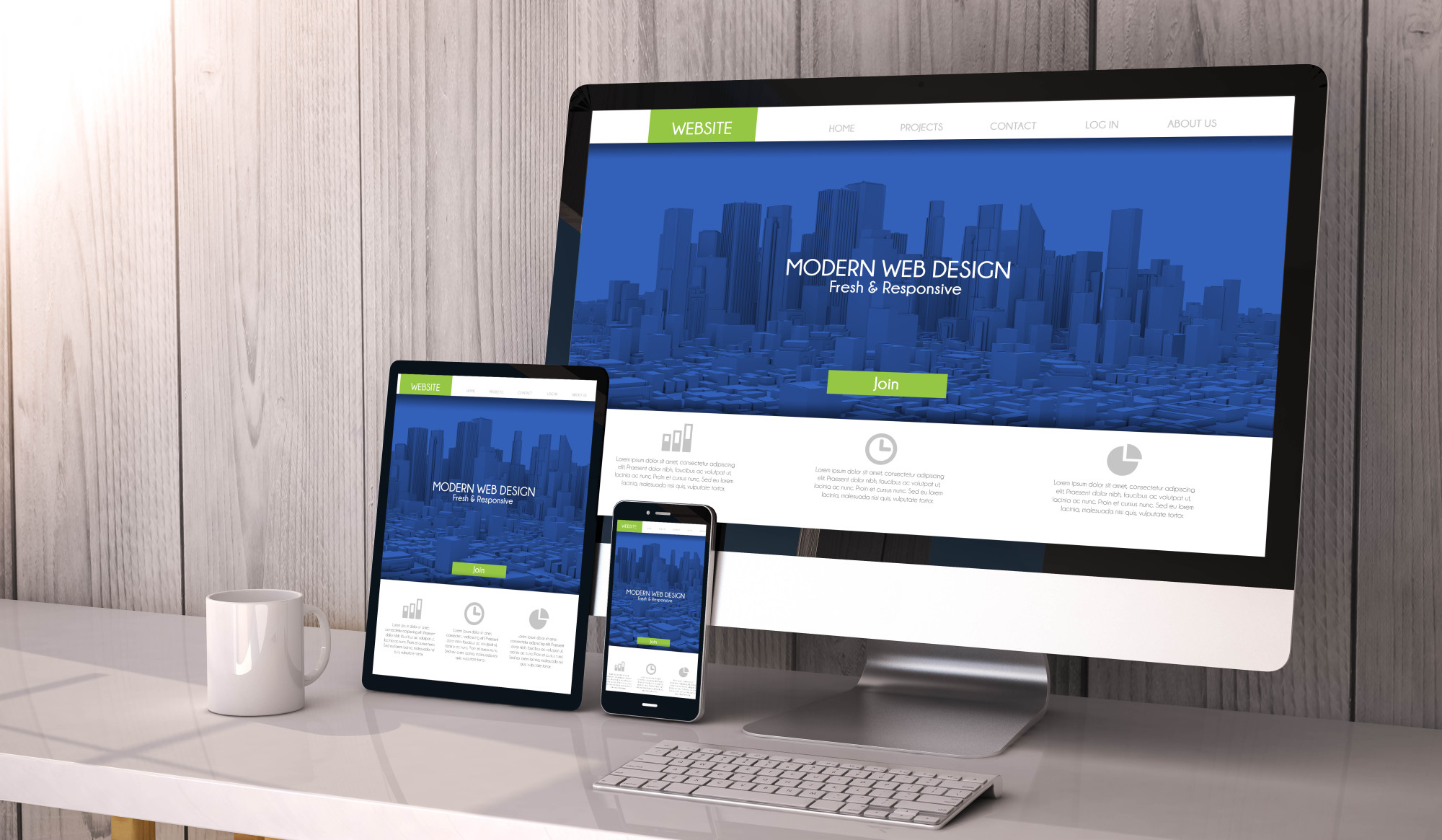
How to Create a Business Website: 8 Tips for Good Web Design
Posted on January 20, 2021 by Logo Design Tips and Tricks

Did you know: in 2020, 28% of online searches for local businesses led to a sale? With the internet playing such an unprecedented role in our lives, businesses simply cannot do without an effective website.
But, you might be wondering how to create a business website? Or what are the different elements your website needs to incorporate?
Keep reading for our guide to having a great website design for your business.
1. Get Interactive
The first of our web design tips is to include interactive elements on your website. These are useful for many reasons. First, they encourage the user to stay on your page for longer.
By including fun elements like a quiz, you create a stronger connection with your potential customer, and they are likely to increase their interest in making a purchase.
Next, interactive elements can also help with lead generation. By including options to sign up for a newsletter or filling in contact details to make an appointment, visitors to your website are providing you with their personal details which you can then target with your marketing strategy.
2. Consider Your Business Objectives
Next, when you’re considering how to make a business website, this process needs to be driven by your business objectives. Take a look at your Key Performance Indicators (KPIs) and explore how a website can help you meet these targets.
For example, younger businesses might be placing a greater focus on building brand awareness and brand recall. They will want to include regular blog content and focus on establishing consistent branding.
Meanwhile, a business with sales-driven objectives will want to ensure that the user journey from the website landing page to checkout is as simple as possible.
3. Don’t Forget Branding
One of our most important small business website tips is to focus on your branding. This includes the color scheme, font, images, logo, and tone of voice used in the website content.
Each of your webpages should be consistent in your branding, presenting your business in the way you wish to appear to customers. This might be as a friendly, family-run business, or as a professional consultant with vast experience.
You also need to include prominent links to your social media pages. This includes Facebook, Twitter, LinkedIn, TikTok, and YouTube, if possible.
The branding across your digital presence and in email marketing should be consistent too. Remember to direct customers to your website in your social media posts and bios, as well as in your email campaigns.
4. Include a Blog
For those small-business owners wondering how to drive traffic to your website, a great way to improve your SEO is by including a blog section in your website. Try to publish articles that address common questions that might arise in relation to your products or services.
This way, someone might enter their question into a search engine, then come across your blog that provides the answer. It is likely that they will then remain on your website and explore whether you can meet their needs.
Make sure your blog is easy to find, and include a search function so that visitors can find exactly what they are looking for.
5. Make Navigation Simple
One of the worst mistakes a business can make is to set up a website with all the essential pages and features, but make it difficult for visitors to navigate. Avoid confusing layouts, and try to anticipate what the most popular pages of your website will be.
These can go at the top of drop-down lists, or in the center of your website to make them easy to find. Don’t forget that you can use analytics dashboards to find out exactly which of your website’s pages gets the most hits.
6. Review and Test
An essential element of web design is to continually review how your website is performing and to test different options to find out what works best. Many website managers and analytics programs offer the possibility of A/B testing. This allows you to compare like-for-like options, such as different images or landing pages, to see which performs better.
You also need to look into digital experience analytics to make sure your website is as effective as possible. This includes heat mapping, session replays, and other tools that let you optimize the user experience.
7. Set Goals
A component of web design that goes hand in hand with reviewing your website’s performance is setting goals. You should set reasonable objectives for metrics you want your website to achieve.
This will help you determine whether you are increasing traffic and sales thanks to your website.
Some of the key numbers to look at are the number of site visits, the time spent on your site, the conversion rate for your visitors, and interactions per visit.
8. Don’t Forget Contact Details
If one of the purposes of a business website is to create leads, a common error business owners make is to make it difficult for potential customers to contact them. One of the ways around this is a footer across your website with your business’s information.
This should include your business address (if applicable), as well as a phone number and email address that are monitored regularly.
You could also consider an FAQ page that might divert users away from your support team, and allow them to help themselves.
That’s How to Create a Business Website
Now that we’ve provided our top web design tips and tricks, it’s time to set up a website that will attract potential customers and help move them down the sales funnel until they become loyal, returning customers. Don’t forget that web design is a process of continual improvement and that the job is never truly ‘done’.
If you found this article about how to create a business website useful, be sure to check out our other business-related posts!
Top 10 SEO Logos of 2020
Posted on January 10, 2021 by Logo Design Tips and Tricks

The McDonald’s logo is worth $110 billion, which is the equivalent value of 275 White Houses.
Top brand logos are worth much more than even the most expensive real estate in the world but many companies hardly give their designs a second thought.
While logos in the digital marketing world may not be worth dozens of White Houses, there are still some good ones around. Let’s look at the top 10 SEO logos of 2020.
Common Design Cues in SEO Logos
If you compare different companies’ logos in the SEO and digital marketing space, you’ll see some common design cues. They often focus on abstract shapes and symbols that indicate growth or ideas.
Abstract Shapes
Illustrated logos aren’t very common with digital marketing services. Most logos use abstract geometrical shapes and designs meant to illustrate their technological focus.
These shapes also tend to have some kind of relevance to business growth, website traffic growth, revenue growth, or other things that would be a logical goal for any companies working with them.
Images of Graphs
Graph imagery is also popular with SEO companies. You’ll see a lot of line or bar graphs in logos, alluding to the company’s ability to increase your conversion rates, revenue, website traffic, and so on. These logos always show an upward trend in the graph.
Strategy and Idea Metaphors
Images like lightbulbs and mind maps are also popular with digital marketing firms. These logos are meant to show how they can help you come up with new ideas and strategies to grow your business.
Communication Symbols
Communication symbols like speech bubbles, messaging icons, and envelopes are also popular in SEO branding. The internet is all about communication in one form or another so this is a natural fit for any web-based service, digital marketing or otherwise.
Top 10 Digital Marketing Logo Ideas
There is quite a bit of variety in the top SEO logos for 2020. Some use abstract symbols, others typographic or mascot-based logos, while some are quite unusual.
Abstract Symbols
Abstract logos often use symbols that have a symbolic meaning in addition to looking good. This helps them stand out from their competition and become more memorable in their market.
1. True North Digital Marketing
True North’s logo uses a line-based design similar to a mind map but also includes a “compass” arrow in the center. This arrow is pointing up, naturally — to true north.
2. Growth Pro
Growth Pro has an image of a plant or flower growing out of what looks like a stack of coins. This is a good metaphor for SEO and PPC marketing, with the money you put into your campaigns creating growth for your company.
3. Hammer and Stone Agency
The Hammer and Stone logo uses iconography that looks exactly like a hammer and stone. Neither one is a literal interpretation but there’s little doubt that’s what the design is meant to be. It uses negative space effectively to create the handle of the hammer within the stone icon.
Typographic Logos
Typographic logos focus on the brand name by making it the focus. But they use fonts and type designs to make the name itself into an icon for the logo.
4. BRND.TV
BRND TV is a video-based digital marketing platform. Their logo is simply the name of the company but it focuses your eye on the BRND name by using a smaller font for “TV”. The logo also adds a bit of color by way of a green highlight under the “TV” text. That green is used throughout their website to create a consistent look and feel.
5. SearchQuake Marketing
SearchQuake Marketing uses a simple two-letter “SQ” design for their logo. The letters are two different colors and overlap slightly. The line where they overlap uses a jagged style that’s meant to look like a fault line or the tracking line on seismic equipment, bringing to mind an earthquake.
6. Befrank Digital Marketing
Befrank Digital uses a simple logo design that incorporates the “B” and “D” from its name into a single shape. That shape also looks like a magnet, indicating how they can help you draw in more website visitors and clients.
Animal Mascots
Companies that have animals in their name often use that animal in their logo in some way. Sometimes it’s a major part of the logo and sometimes it’s more subtle.
7. Bear Fox Marketing
Bear Fox Marketing uses both animals in its logo. The fox is superimposed on the bear using negative space. With a quick glance, it looks like the bear is stepping forward, indicating how the agency can help move your business forward.
8. Dog Bite Media
Dog Bite Media has a simple text-based logo design with a caricature of a dog’s head. This design is about as straightforward as you can get, with an easy-to-read name and a simple graphic to help improve its branding.
Unusual Designs
Some logos are a little more offbeat. They may use humor as part of the logo or they sometimes combine two seemingly unrelated ideas in the design.
9. Clever Digital
Clever Digital’s logo is an egg with glasses. This evokes the stereotypical “egghead” that knows a lot about computers and technology. The idea here is that they’re those eggheads that can help you grow your business online.
10. Hyper Ghost Media
Hyper Ghost Media has a mostly typography-based logo but the “H” in Hyper has a ghost instead of the horizontal line. This is a straightforward way to create a brandable logo from the company’s name.
Which Logos Are the Most Memorable for You?
Which of these SEO logos are the most memorable for you? If you’re thinking about a new logo for your company, consider what makes you remember these and see if you can work something similar into your own design.
Be sure to check out the rest of our blog for more helpful ideas about designing great logos.
