Does your logo feel outdated, inconsistent with where you are now as a brand, or irrelevant to your target market?
If you answered “yes” to any of those questions, it’s likely time to start considering a re-branding.
Confused about where to start? Don’t worry — we’re here to help you find a little inspiration. In this post, we’ll share with you some of the most memorable new logos from this year.
Hopefully by the end, we’ll have you convinced that creating new logos for your company is a brilliant branding strategy!
Calvin Klein
Fashion giant Calvin Klein’s new logo is all about celebrating the history of this iconic fashion brand. In February of 2017, the brand debuted an updated logo that made quite a statement.
While Calvin Klein has always been rooted in minimalism, they still wanted to make an impact. That’s why they switched to an all-caps logo, with a bolder typography that replaced the slender lettering of the past.
It was also a wonderful way to usher in the house’s new designer, former Dior Darling Raf Simons. This subtle switch heralded a new era for the house — and attracted lots of attention.
The Evolution Of Kodak
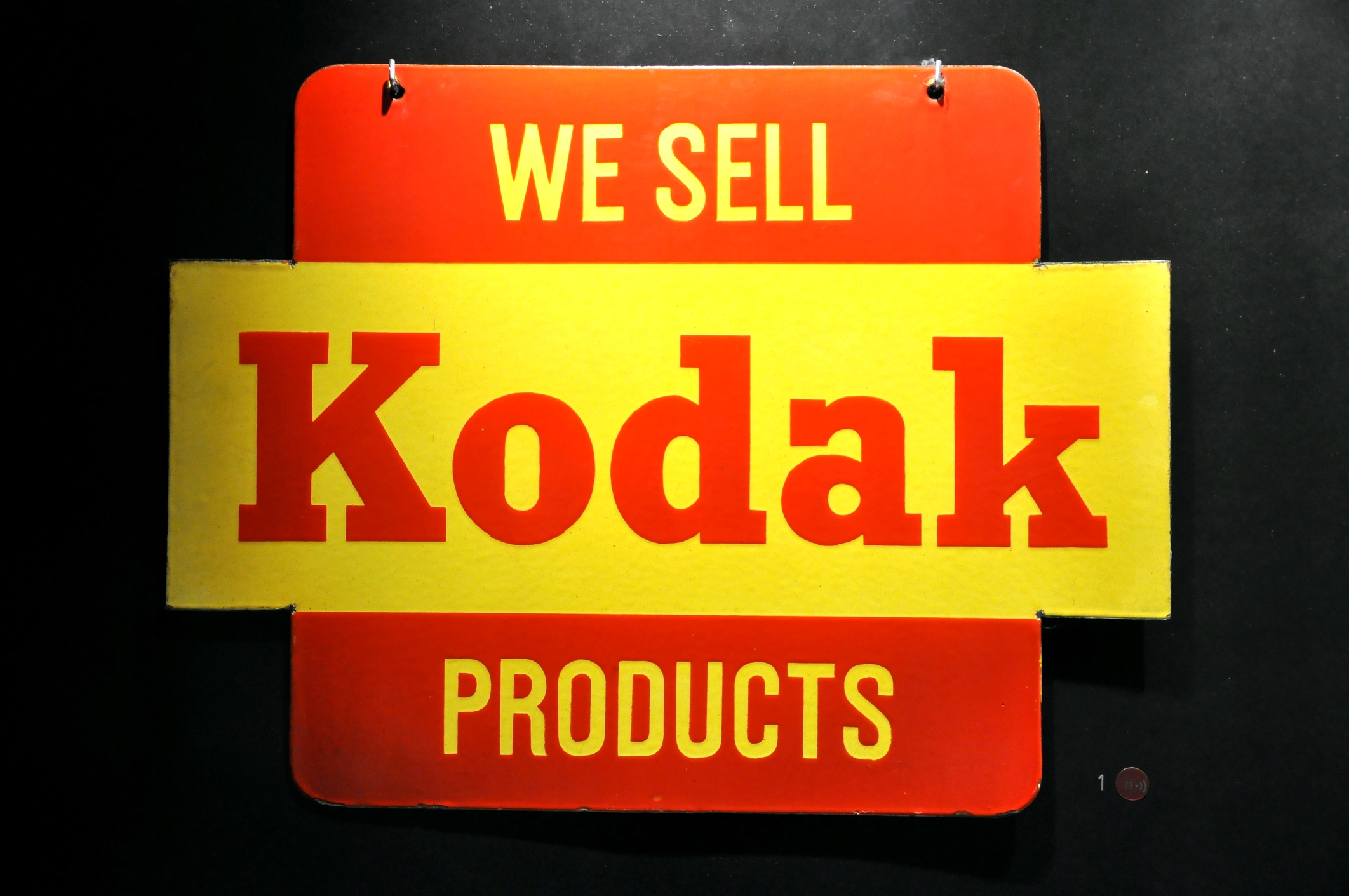
Camera giant Kodak is certainly no stranger to switching up its logo. But this year, it took a decided risk — hopping on the “retro” trend bandwagon. Now, Kodak is using the same logo that it did in 1971.
It’s a risk that paid off without muddling the company’s branding. The “K” is still completely recognizable, and the smart use of the company colors — red and yellow — ensure that consumers never forget the legacy of Kodak.
Subway Sandwiches
Sometimes, companies need to re-brand for more unpleasant reasons. After the sandwich giant’s spokesperson, Jared Fogle, was convicted of a particularly hideous crime, Subway made a smart move by choosing to rebrand.
In the past, Subway’s logo was somewhat three-dimensional. It centered on showing off the three colors of the brand — yellow, white, and green. Perhaps the most famous feature of the logo was the 2 subway arrows, pointing in the “uptown” and “downtown” directions on the first and last letters.
The new logo has kept the iconic arrows and colors but shows the brand in a new light. Now, the lettering is solid, with a bolder, more crisp font.
Subway has also done a wonderful job of taking advantage of all the re-branding opportunities that come with a logo redesign. They’ve also released videos of customers talking about their own “transformative journeys.”
Ready To Start Creating New Logos?
As you can see from the examples above, re-branding is a wonderful way to give your company and its image new life.
A logo re-design can introduce you to an entirely new customer base, pump up your social media presence, and show your competition that you’re not afraid to get with the times.
We know you’re ready to start creating new logos now! To get started, use our free online logo maker tool to play around with your options. Always remember to keep checking back with our blog for the latest innovations and trends in logo design!


Leave a comment