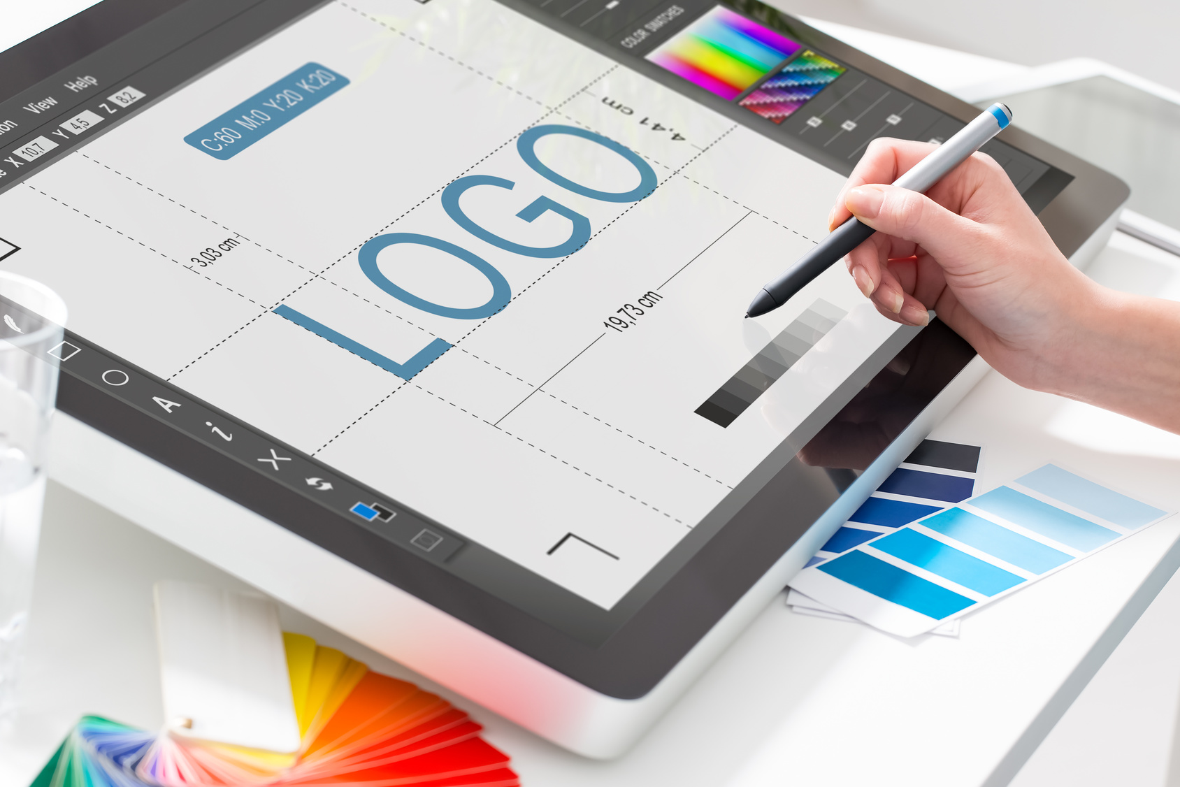
The days are long gone when you could grab new business with a listing in a telephone book. Even shop signs in the street need to be eye-catching to snag attention.
Designing logos for orthodontics companies doesn’t need to be difficult. They’re marketing their services, just like any other service provider.
With almost 80% of American teenagers and 25% of adults visiting the orthodontist, it’s also a growing sector.
Read on to find out how to design a new logo for an orthodontics company.
1) Don’t Use Cliches in Your New Logo
The logo needs to communicate what the practice does and what services they offer. Patients need to understand this at a glance.
But don’t confuse a logo with an advertisement. There’s no need to shoehorn every service into the logo itself.
That’ll lead to confusion among potential patients and split your audience base. Stick to one main proposition for the new logo and let their advertisements fill in the blanks.
That way, patients will come to associate the logo with the company values.
But try to stay away from using images of teeth. It’s too obvious and the logo will be lost among a sea of similar logos.
Look at the logo for Orthodontic Associates as an example. Not a tooth in sight!
Instead, they use the essence of what they do to inform the shape of the logo.
2) Pay Attention to Font and Color
Choosing typography can make or break a logo. Serif fonts can look serious and professional, but also too formal and dated. San-serif fonts can look friendly and modern, or boring and generic.
Never, ever use Comic Sans in a logo, especially for a medical service provider.
Try out a range of fonts to see which ones best communicate the values of the company.
You can also make the logo recognizable through a use of color. Pale blues or greens help reinforce ideas around hygiene and care.
Patients automatically associate orthodontists with those colors. That saves you needing to use obvious imagery in the design.
Check it makes sense in monochrome. You never know when someone may only have a black and white printer!
3) Consider Sizing Options
A logo doesn’t just exist as a single entity. It appears across websites, business cards, invoices, signage, and even vehicles.
An orthodontics company is likely to use the logo on staff uniforms. So make sure the logo works with equipment like embroidery machines. Otherwise fine lines or details may be lost.
Check to see how the logo looks at larger sizes too. The company may want to use it splashed across the window of their office.
Designing a logo that works across a range of formats will limit your choice of fonts, shapes, and colors anyway. You can focus on sharing the vision of the orthodontist without being distracted by design options.
Next Steps
Remember the key points to logo design: keep it simple, make it recognizable, and ensure it works in different forms.
Now fire up the logo maker and get started on the new logo.


Leave a comment