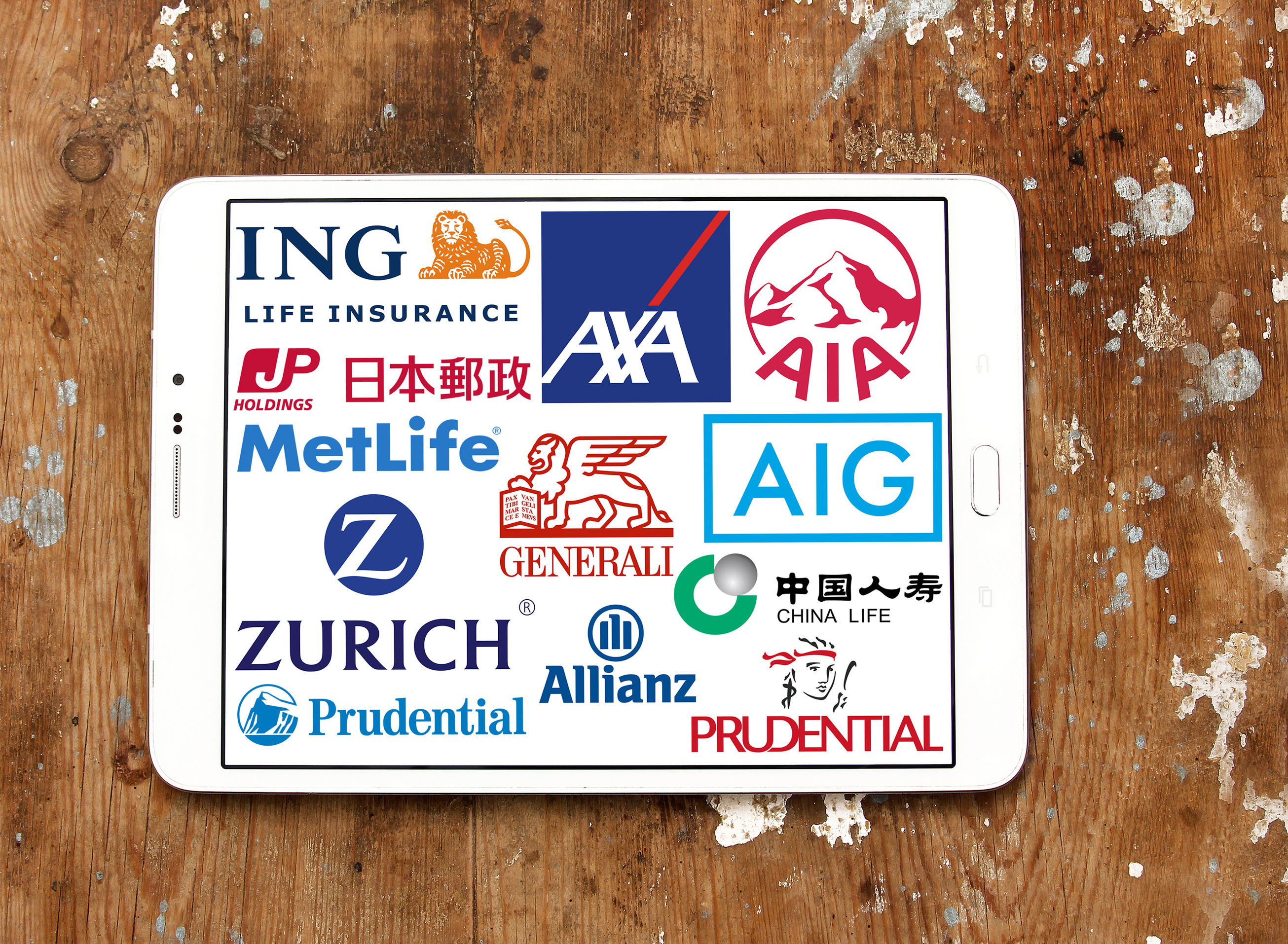
Like all businesses, logos are vital to life insurance companies, serving as the public-facing image of the brand.
With more serious subject matter at hand—namely the event of the buyer’s death, there are some design challenges insurers face, as compared to other industries.
So, with life insurance logos, designers need to approach the process with a bit more sensitivity. The logo should be respectful, authoritative and most of all, memorable.
Read on for some best practices for designing a life insurance logo to remember.
Beware of Being “Too Cute.”
At Online Logo Maker, we’re well aware that a logo needs to be both unique and clever to stand above the rest.
While we’re big fans of visual puns or double entendres, cheeky logos don’t quite work as well when it comes to designing a successful life insurance logo.
Show with Symbolism Basics
The major design elements have to do with the basics; shape, color, and typography.
What we mean is—you’ll want to create something that speaks on a psychological level.
Certain colors (i.e. gray, blue, black) traditionally work to evoke authority and security—concepts that have life insurance written all over them.
Or, you may want to create something a bit more modern.
Try stirring up feelings of warmth and safety by using reds, oranges or other warm colors. Or try using soft, rounded shapes that signify themes like family.
Life insurance has that warmer side, too, providing protection for your loved ones.
While it’s wise to avoid things edgy or cute, illustrating your point through the right color combination and the font to back it up is the way to go.
What Does Life Insurance Represent?
Take Mass Mutual, for example. The 166-year old company recently did a logo redesign, which they claim, represents people coming together to take care of each other.
To convey this sentiment, the company opted to go with a series of dots, which form an “M” in the center.
While that’s just one example, those tasked with designing a logo with such heft behind it could take a cue. ‘
Another example is Top Quote Life insurance.
Out of the best life insurance companies, Top Quote has a standout logo.
The contrasting blues suggest health, while the human-esque icon draws your eye back to the brand name.
In the end, we come back to this idea that a good logo is good for business. It serves to draw in potential customers while maintaining recognition from those who are more familiar.
Still, the company behind the logo must deliver on the promises advertised.
In Need of a Great Life Insurance Logo?
If the “face” of your company needs a bit of a lift, or you’re starting from scratch, Online Logo Maker has the tools you need to breathe some “life” into your life insurance logo.
With unlimited saves and downloads and a quick, easy approach to design, Online Logo Maker’s free logo tool makes branding a breeze. Try it today–free of charge!


Leave a comment