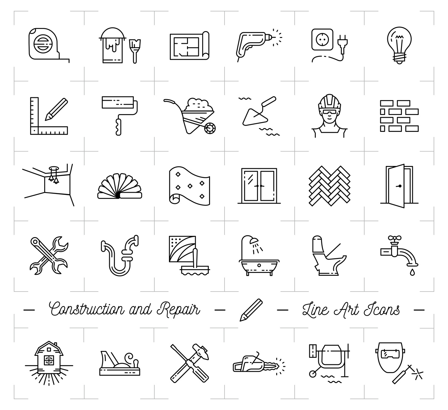
Your logo says a lot about your business. A great renovation logo can grab a customer’s attention while setting you apart from the competition.
Our world is painted in brand logos. The best logos communicate to customers with a few simple features that stick in their minds and create familiarity.
If you’re about to design a new renovation logo for your business, there are several key factors you’ll want to keep in mind.
Let’s take a closer look.
Think Outside the Box
You want a logo that distinguishes your brand from your competitors. It’s vitally important that your logo clearly stands out from the rest.
While imitation may be the best form of flattery in some areas of life, that’s not true with logo design.
You might be tempted to throw a cliche industry icon into your logo.
Don’t do it.
Think of it this way, Apple’s logo isn’t a computer. Virgin Atlantic’s logo isn’t an airplane. Mercedes’ logo isn’t a car.
Think of what defines your business as being unique and incorporate that into your logo design.
Define Your Color
First, think about the personality of your renovation business.
While bold and bright colors might grab attention, they can also seem brash and out of place.
More muted colors boast of sophistication but could be more easily overlooked.
Did know that every color in the spectrum will bring a different feeling and emotion to your logo’s message?
It’s called the Psychology of Color and it works like this:
- Orange: Friendly, youthful and creative
- Red: Sexy, bold and energetic
- Green: Organic, instructional and growth-driven
- Yellow: Optimistic, inventive and sunny
- Purple: Evocative, spiritual and wise
- Blue: Medical, tranquil, professional and trustworthy
- Pink: Fun and flirty
- White: Simple, pure and clean
- Black: Powerful and credible
- Brown: Steady, rural and historical
You can see that many of these colors will convey specific messages about your renovation business that are very relevant.
For example, if you’re running a bathroom remodeling showroom, you’d want to promote tranquility (blue), boldness (red), and credibility (black).
Keep it Simple
You want your logo to have a balanced combination of quirky and simple. It has to be interesting but at the same time, you don’t want people sitting there analyzing it.
The FedEx logo is a good example. It’s a simple Logotype with a bit of a twist. The image uses negative space that creates an arrow which indicates speed, direction, and precision.
Amazon also uses only its name but refers to its vast amount of inventory with an arrow pointing from A to Z.
You can get inspiration from these, and other successful logos.
Your Renovation Logo Helps Define Your Business
These are a few simple tips to help you create a great logo for your chosen industry.
Take time to design a few different variations and run them past friends, family members, and long-time customers. Sometimes it takes another set of eyes to help you see what you couldn’t see on your own.
Now it’s time for you to get started on your new renovation logo.
Make it great!


Leave a comment