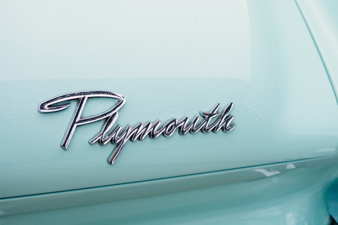
It’s difficult to define exactly what comprises classic logo design, but what we do know is that some logos make a more lasting impression than others.
The world’s best-known logos all have a few things in common. Here’s how you can imitate their timeless style.
Use these design guidelines to craft a logo to take your healthcare brand to the next level.
Classic Logo Design Should be Simple
People don’t want to spend time figuring out what your logo means. There are enough complications in the modern world.
An intricate logo implies chaos. That’s the last impression you want to give customers about your healthcare business.
The cleaner, neater and more obvious your logo is, the better. These kinds of logos are recognizable and memorable. They look good in print, on merchandise and online.
Do some research to get inspiration for designing a logo that works in the medical industry.
Don’t Be Too Generic
Simple doesn’t mean you need to download the first clipart image you see.
A stethoscope is too generic. Try to think of items you use in your practice every day that you could use as part of your logo.
Symbols that represent good health can be very effective in medical logo design too.
Images that suggest growth and renewal are a good match for a rehabilitation center or mental health clinic.
You can turn to nature for inspiration in this regard. Creating a logo that features symbolic shapes like water and greenery will inspire people to find out more about what you have on offer.
Keep it Classy
Medicine is serious business. Gaudy colors and haphazard design will not create the professional impression you want.
Think about what your patients want from you when how to design a logo
Green and blue are popular colors for medical logo design as they have a calming and soothing effect on people. Red and yellow can represent vitality and happiness.
The same applies to your choice of font. Choose a clear, simple, elegant font to get your message across.
Shapes Matter
Placing your logo inside a circle or choosing a circular design will soften the edges, giving it a comforting feel.
Studies show that circular logos give the impression that your company is caring, warm, and sensitive.
Logos with hard edges create an aura of reliability and durability. This can work well for a laboratory or pharmaceutical logo.
Triangles are usually associated with religion, science, law, and power.
Getting Down to It
When you think you’ve ticked all the boxes about classic logo design for your healthcare business, it’s time to get started on designing a logo for yourself.
You can either do it yourself or get a professional graphic designer trained in how to design logos to do it.
No matter how much time and money your logo costs, the right design will be worth it in the end.


