Whether you need to write a business proposal or an email, you’re faced with choosing how you want your letters to look.
While Times New Roman is often the basic standard for corporations and students alike, no one dares use the highly loathed Comic Sans for anything in the business world — unless you want your colleagues to think you’re a six-year-old.
Knowing the importance of how your letters look means you get to make choices. But sometimes those choices can get confusing when it comes to the technicality of it all. Words like type font vs typeface sometimes seem as if they mean the same thing – but they don’t.
Don’t fret, though, because we are here to help you make sense of these often mixed-up terms. Continue reading for the full explanation.
The History of Typography
In order to have a better understanding of the difference between font vs typeface, we’re going to take it all the way back to 1st century Rome. After the Latin alphabet was created, several centuries would pass before lowercase letters would appear.
Students of the Holy Roman Empire were required to write in a standardized combination of upper and lower-case script. As the style of writing evolved, it wouldn’t be until the 11th century that a more uniform look would emerge.
Scribes took great lengths to transform the alphabet’s fluidity in style. Thicker type bodies were replaced with thinner, more elegant shapes and strokes became thicker and heavier. Fifteenth-century black letter would become the foundation for the modern-day type we know called Gothic.
Gothic type was often used in Germany for printing biblical passages and laws. However, the Italians felt the medieval look of Gothic was out of step with the Humanist movement. It would be the look of an early edition of a Cicero that prompted the 15th-century introduction to Antiqua – a nod to a typeface of yesteryears.
Antiqua would soon become what is known today as roman type. It grew in popularity throughout western Europe, despite its rejection in Germany, who still preferred Gothic. Gothic type would eventually retire in 1940 from its beloved dominance after an order was given to cease printing.
The creation of italics had roots in ancient scribe writings as well. Based on cursive, italics were meant to be written in quick bursts to make the clerks work faster. Claude Garamond and Simon de Colines, both well-known printers in France, would also heavily influence the development of the elegant 16th-century type known as Garamond.
With the onset of the Gutenberg printing press, Gothic, Roman, Garamond, and italics were detrimental typeface styles that would shape the world of printing as it is recognized today.
What Became of Calligraphy?
Although the time-honored art of calligraphy has faded since the introduction of the printing press, it still heavily influences a variety of typestyles. Frequently used for wedding invitations, birth announcements, and family tree records, the elegance, and grace of calligraphy’s artistic strokes have international roots.
The Arabic, Indian, Korean, Persian, Chinese, and Islamic languages all have this type of lettering that is handwritten in pen and paintbrush.
Bibles frequently used calligraphy in its texts, as did other religious scriptures, often beginning the first letter of every sentence with a calligraphy letter. Calligraphy influences can be found on your computer in today’s Unicode “Script” and Latin alphabets like “Fraktur.”
Font vs Typeface
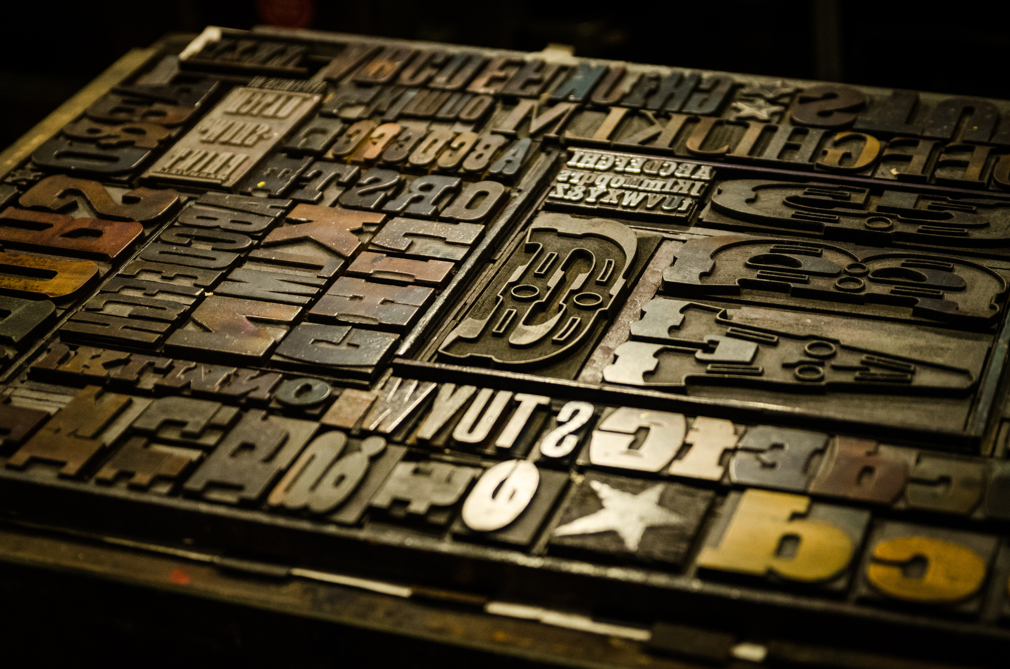
So now that we’ve got the history of type behind us, let’s dig into the difference between font vs typeface. In the past, a page layout for any type of printed materials needed a few important things: metal letters, a frame, ink, and paper.
Among the hundreds, if not thousands, of metal letter blocks, were characters known as typeface. For each typeface, no matter what style, a separate block was used for every size and weight imaginable.
Typeface is the name of the style of each one of those tiny metal blocks in the same exact style as one another. For example, the Garamond alphabet and numerals are all in the same typeface because of the way it was designed.
Font is often a term that is confusing. Although it relates to typography, a font is actually very different than typeface. Fonts describe the variety of how the typeface is presented through weight and size.
An easy way to tell the difference is by the specifics. For example, the font of Gothic 11-point in italics looks very different from a bolded Gothic 22-point font. Same goes for an italicized bold Garamond 22 point versus an unbolded Garamond 14-point font.
Cut Through the Confusion
Although our computers don’t seem to help us understand these differences, the words simply reflect the fact that we are not choosing individual metal blocks for our emails and college term papers. Because we are frequently asked in our writing program’s drop-down window to choose a “font”, it only adds to the confusion.
So when it comes to the style of the letters, remember that font means how the letters look. To communicate your ideas to a designer, keep these terms in mind if you’re creating a company logo. If you wanted a more literal term from days gone by, then typeface is the precise word choice.
Ready to Create the Ultimate Logo?
We hope we cleared up any misconceptions you might have had about these two terms. Now that you know the difference between font vs typeface, you can move forward with confidence that you are using the right words.
For more helpful logo tips and articles, make sure to visit our blog and also check out our free logo maker tutorial today!


Leave a comment