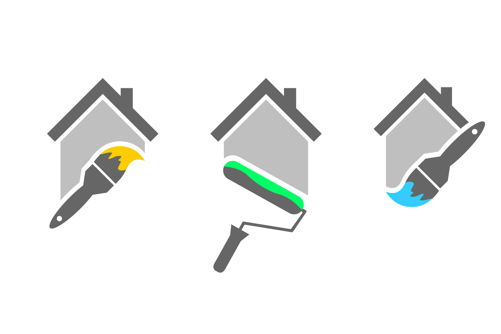
What’s the secret to designing a stellar logo for your company? It all starts with selecting the right color scheme.
Your logo is one of the first things people think of in association to your brand. The right color palette is so instrumental in branding that it can increase brand recognition by up to 80%.
Color has more of an impact on people’s emotions and decisions than you might think. Before landing on a color scheme, you need to first understand how your customers react to certain colors.
Painting companies can’t afford to get their logo’s color scheme wrong. Let’s find the perfect painting company logo colors the first time around. Read on to learn more.
The Best Color Schemes
There’s no one color scheme that creates the perfect painting company logo.
Colors are at their most effective when they fit the companies brand and brand message. Each color evokes a different response in people. You need to be aware of the different responses and if your color scheme fits your brand.
For example, bright colors are a great way to grab a potential customers attention. However, they can also seem aggressive in some peoples eyes.
Conversely, quieter color schemes can make a logo look more professional. They also can be overlooked in favor of bolder colors.
Let’s take a look at an example of a good color scheme. Rhino Shield of California combines both light and dark colors in their logo.
In other circumstances, a large black figure in your logo could spell certain doom. It could prevent the logo from catching anyone’s attention. However, this logo does a great job of contrasting the darkness with light blue and yellow.
This color scheme helps to create a logo that is both on brand and attention grabbing. This is what you should aim for when deciding between color schemes.
Colors and Responses
A painting company logo should have the right mix of colors in their scheme. The best way to approach this is to understand the types of responses associated with each color.
Let’s first consider the bright colors. These are colors that create strong responses – for better or worse. They can make people feel energetic, warm, or aggressive.
Red is a bright color that evokes a strong response. If you’re looking for something more understated, you could consider an orange or yellow.
Orange is an approachable color that’s associated with fun and energetic brands. Yellow can make customers feel cautious, but it’s also warm and inviting.
Blue is a popular choice for businesses trying to give off a corporate or professional vibe. While not the best choice for painting companies, it can be a good fit for more serious brands. Green is typically associated with earthly brands such as landscaping or food companies.
Typically, it’s best to stick to one or two colors in your logo design. Adding too many colors can make logo’s too busy and hard to read.
A popular alternative to having multiple colors is to add different shades to your logo. This is a great way to spice up a logo without altering the brand message.
If you’re still having trouble deciding on your color scheme, try using a logo maker tool. Play around with it until you find a scheme that’s satisfying.
Your Painting Company Logo
Are you ready to make your logo?
Remember that color schemes are only effective when they stay true to your brand. Make sure you pick a color that fits your company and evokes the desired response from your audience.
Contact us to get started making your great logo today.


Leave a comment