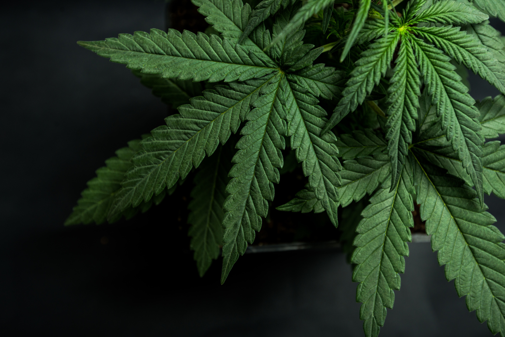
Do you think it’s time to lose the leaf in cannabis logos? We do.
Since 2001, every dispensary, grower, and supplier put a marijuana leaf in the logo. Worse than being cliche is the fact that all the logos look the same. There isn’t any distinction between brands to convey quality, products or type of business.
The sale of medicinal and recreational cannabis is evolving into a billion dollar industry in the US and Canada. As the marijuana market evolves the logos become sophisticated branding tools.
In the beginning, everyone was happy at the prospect of legal marijuana. They didn’t care about specifics. Now the cannabis business has matured, and so have consumer preferences. It’s important for customers to be able to recognize and differentiate between brands and companies.
Ten of the best leafless logos are shown below.
10 Sleek Cannabis Logo Designs
-
Dope Mail
Dope Mail’s logo uses a fresh, modern font paired with a lively green bud. It’s a clean, readable logo. The name conveys the Dope Mail weed online service dedicated to safe, legal, and discreet doorstep delivery via Canada Post. The company name is a fun play on words since dope is slang for awesome.
-
Wyld Canna
Wyld Canna is a Pacific Northwest company that celebrates adventurous lifestyles. The deer antler logo conjures images of the great outdoors and wildlife.
-
Aurora. The Healing Power of Nature
A mountain, water, sun, and wind are arranged on each side of a plus sign to represent elements in harmony. Aurora plants are grown in the foothills of the Canadian Rockies with mountain water, gentle breezes, and ideal lighting conditions.
-
Emblem Corporation
An informal red graphic of a hunter and a deer is simple, bright, and recognizable. It evokes the image of traditional outdoor activities. The idea matches the tagline “cultivated with love, and locally grown.”
-
Aphria, Inc.
Aphria has a sleek, modern logo that uses blue and green to represent the earth and sky. The letter A wrapped in a circle of fresh, natural colors symbolizes 100% greenhouse grown in natural sunlight.
-
Canopy Growth Corporation
Canopy is the most corporate-looking logo on the list. It shows how the industry has changed. Instead of a leaf, a mighty oak represents strength and longevity. Canopy is a diversified cannabis company that operates a collection of brands.
-
Emerald Health Botanicals
The Emerald logo depicts a drop of oil in the shape of an e. Cool greens and blues are soothing, as are the words Health Botanicals. The logo illustrates the goal of bridging the gap between cannabinoids and medicine.
-
Ionic
Iconic’s logo is a slick gold wordmark with two distinct red circles hovering above it. The logo acknowledges the past but reaches for the future with inspired luxury. The elegant Ionic logo is iconic.
-
Burnwell Cannabis Company
Burnwell’s logo is a B knocked out of gorgeous nature backgrounds on its website. The company is focused on sustainability and green business practices. The simple B logo seems determined not to intrude on its surroundings.
-
Marley Natural
Marley Natural previously had cannabis leaves in its logo. The company has grown into a strong, socially conscious brand of products and outreach. That mission is reflected in the proud lion and clean bold type on their new logo.
Today, cannabis is a professional industry dedicated to helping people who suffer from a number of conditions and disorders. The logos need to be eye-catching, informative and engaging to keep pace with the changing marijuana industry.


Leave a comment