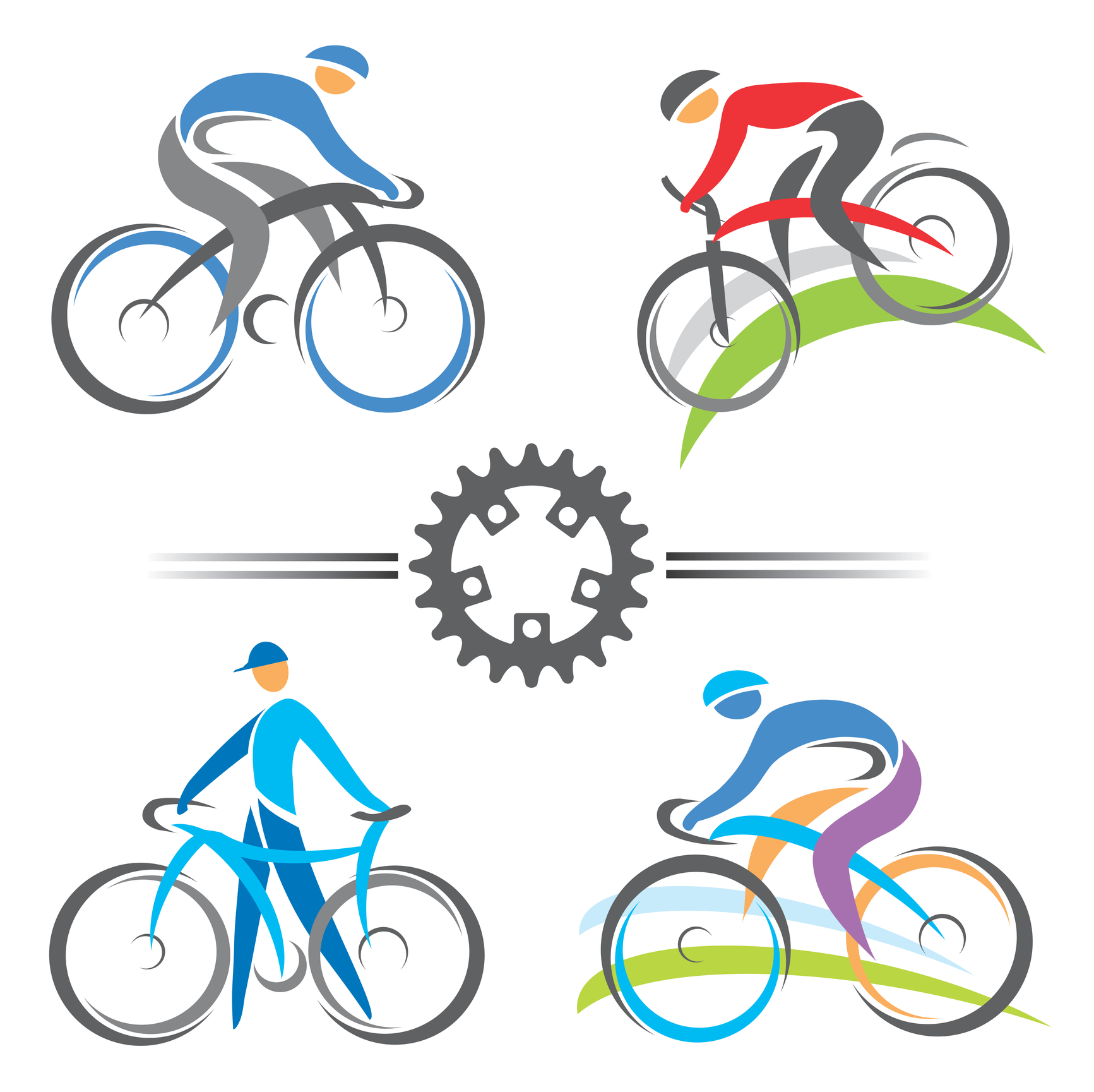
Mountain biking isn’t just an incredible way to explore the world around you — it’s also a great workout!
If you’re a company selling mountain bikes and gear, you know it can be tough to highlight all the awesome features of your products while still keeping your logo and branding designs simple.
We’re here to help!
In this post, we’ll show you how to create an impactful mountain bike logo that says all the right things without overwhelming your market.
Focus On Action
When you think of mountain biking, you think first and foremost of movement: zipping down hills, slamming on brakes, maybe even flying through the air.
Your logo should reflect that sense of motion by showing action.
For example, instead of showing a row of mountain bikes, it’s much more effective to depict a singular riding flying down a hill. You can even show the wind moving the rider’s hair!
Remember, you’re trying to sell people on the experience of mountain biking just as much as you’re trying to sell them your products.
Showing motion helps you to do just that.
Use Colors To Entice Customers
Sure, reading a Roadmaster mountain bike review and other customer testimonials can convince your target market to make a purchase.
However, you can also use the psychology of colors to make your customers feel like they’re in the great outdoors — when in reality, they’re just browsing your site on their desktop computers.
When deciding on colors for your logo, you want to combine that sense of adventure with the natural world. This means you’ll need to use multiple colors.
Greens and blues may be closely associated with nature, and make consumers think of taking their bike out on a trail. However, blue and green are also used to help calm consumers.
So on their own, they might not light a fire underneath your consumers — and they don’t match the thrill-seeking market of mountain bikers. To balance things out, we suggest adding a splash of red or orange to your logo.
These colors create excitement — and even raise blood pressure levels — to better replicate the thrill of riding.
Select A Font Consistent With Your Branding
Typography, or font, is the secret weapon of branding.
If you really want to set yourself apart from your competition, you should have a unique font created for your logo. This will help to increase customer recognition and will cause customers to give your site a second look.
Keep in mind that this font shouldn’t exclusively be used on your mountain bike logo. If you really want to build your brand, use this font in every aspect of your marketing strategy.
Create Your Mountain Bike Logo With Us!
Now that have the inspiration and information needed to create a mountain bike logo that’s as epic as your favorite trails, it’s time to bring it to life.
Use our free online logo maker tool to test out several options and to crowdsource your favorite designs with your office and customers.
Looking for more tips on how to create a branding strategy that’s logo-centric? Be sure to check out our blog for more!


Leave a comment