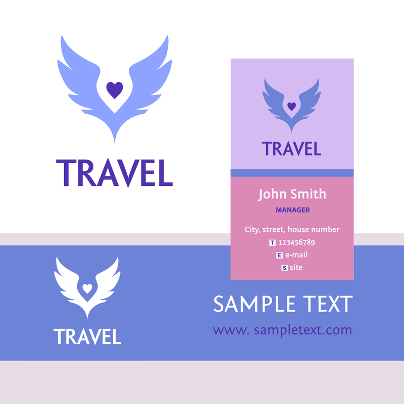
Are you having trouble finding the right logo font? Having a great logo helps to ensure your company stands out from the competition.
Updating your logo is a process that is made up of several parts. One especially important part of logo creation is the font choice.
You don’t want to pick the first font you come across since uninspired font choices can make a business look boring.
It’s important to have the right style, color, and spacing for the font of your logo. In this article, you will learn how to choose the best tour logo for your company.
Begin by Choosing a Popular Typeface
You’ll want to choose a well-known typeface for your font. Two main kinds of typefaces are serif and sans-serif. Serif fonts have more of a classic appeal while sans-serif fonts have more of a modern appearance.
Helvetica is a sans-serif font style, commonly used in public transportation. This font style looks especially great on large billboards. It’s no wonder many companies use Helvetica for their logos.
Garamond is an old style serif font that works well for established companies.
Futura is a sans-serif font with bold, block letters commonly seen on film posters.
You’ll want to fine tune your text after finding the right typeface.
It’s Time to Fine-Tune Your Font
The next step is to fine-tune the font of your logo. Rounded fonts, including Comic Sans MS, invoke feelings of lightheartedness.
Making a font too sharp could make it difficult to read. Rounded lettering makes your logo look more family friendly.
80% of consumers link color to brand recognition which makes color choice important.
Green brings to mind feelings of being in nature. Blue is an extremely popular logo color choice which invokes feelings of trust. Match font colors with emotions you want your audience to feel.
A company providing the best Colosseum tours may want a font that looks historical.
Ensure Letters are Properly Spaced
It’s tough to grow a business when no one can read your logo. You’ll want to choose a font where letters have the proper space.
Fonts with close letters cause a sort of blur effect. Letters too close together often end up looking line a smudge of color.
A logo must be easy to read in any situation. Have people around you look at the logo and read it off. You’ll want to make a clearer font if a reader hesitates for even a moment.
Use Font that is Easy to Adapt to Many Platforms
It’s wise to test fonts on many platforms. You’ll need a logo that looks great on everything ranging from business cards to billboards.
The best way to choose an adaptable font is to test it out across several platforms. You’ll want a font that is easy to read both on small spaces and large surfaces.
Creating a company logo takes time and effort but it’s worth it. Follow these tips and you’ll have the perfect tour company logo that consumers will love.


Leave a comment