How to match font and image on your design
Posted on April 19, 2017 by Luanna
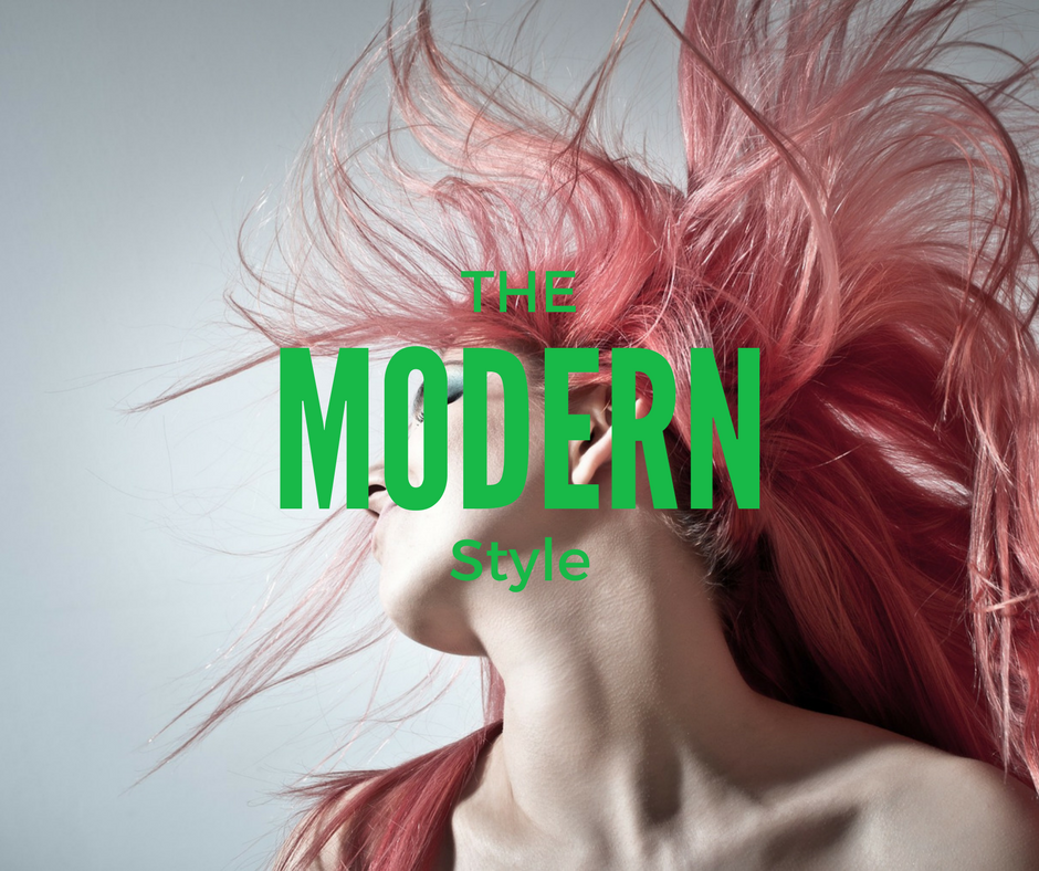
The great part of a designer’s work is to find right combinations. But how to match font and image on your design? Images and fonts need to connect with its context. But how? When we work with images and texts at the same time, we need to take special care to match the elements. A classic concept in Comic Sans would be at least weird, right?
Of course Comic Sans is not very indicated for most of the designs and has become a joke between designers. But instead of judging your design, we will give you some hints to get better results at matching fonts and images.
Classic/Serious Images
For example, if your project use serious or classic photos for a message of tradition, authority and respect. We highly recommend serif fonts. They will probably fit better. This type of fonts transmit a connexion to classic and traditional. So in this case, fonts like:
Continue Reading
OLM Malala Yousafzai Scholarship 2017-2018
Posted on February 22, 2017 by Luanna
 Many scholarships are tailored especially to the younger crowd, assuming that everyone follows the straight and narrow path from high school to college. But we all know that it is just not the way life works. For whatever reason, a women’s path may diverge. Instead of studying you may have had a child, started working or something just interrupted your dreams.
But if you want to enter or come back to college after some kind of hiatus, don’t panic! Attending college after 30’s is a great move for your life and career. However if you don’t have enough money, it is possible with some finantial aid. There are all sorts of opportunities out there for you.
Thinking about it, Online Logo Maker decided to provide an annual scholarship for minorities as an act for education. So I’m proud to announce our scholarship named after the great activist Malala Yousafzai, known for fighting for education.
Continue Reading
How to Choose a Font?
Posted on October 19, 2016 by Luanna
When designing a logo, an infographic, a business card or your blog you have to worry about the font you will choose. The typography style needs to represent the name behind your material and follow the same message you want to transmit with it. It’s not only the color or the shape that matters. Each font has its own characteristics, you just need to choose the one (or the ones) that matches your objectives.
“OK, that’s easy!” you might say, “But how?”. Well, you know some fonts are elegant, others informal, traditional and so on, right? You just don’t know it by heart. That’s why we created this infographic. It gathers the 4 most common font families: Sans Serif, Serif, Script and Geometric and sum up:
– what message each font transmit;
– which types work good together;
– where we usually use them.
This is a great guide for you to save and share. Ask yourself what image you want to pass on and then look up to this infographic to feel secure about the choice you will make.
Besides that, don’t ever forget legibility. You should imagine this logo from an outdoor to a business card size. Thus it has to be easily readable or identified, there is a rule made by the designer Jessica Hiche that is mostly for sans serif types. It’s called “rule Il1”. Type “I” (i) on majuscule, a lowercase “l”(L) and the number (one) “1” side by side to see if you can distinguish them. In case you don’t, the ideal would be to change it right away so you don’t have problems in the future.

Let us know if you have any thoughts or questions on the comments below!
How to use Dramatic Typography in logos
Posted on July 28, 2016 by Luanna
Dramatic typography is a very strong trend in 2016, specially when it comes to logos. As you know, typography plays a huge part in the way brands are perceived and how successful brands become with consumers. A wise choice of type can make a logo more memorable, more trustworthy and more exciting. Minimal typographic logos are simple to achieve, and can often have more impact than a symbolic logo design.
We’ll take a look at how handwriting, letter stacking and all capital typographys (kinds of dramatic typography) can be used successfully to create logo designs. Check it out!
Handwriting

Continue Reading


