5 Really Cool Retail Display Ideas to Get Attention
Posted on July 03, 2020 by Logo Design Tips and Tricks

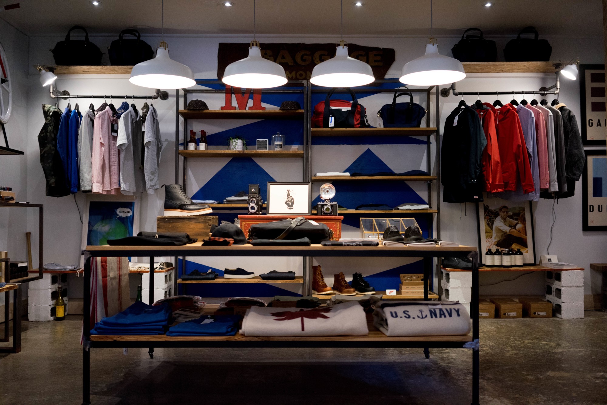
Do you need storefront display ideas to improve your business? The use of a creative retail merchandising display can have a positive impact on your customers.
Artistic store displays can increase your sales conversions or make people curious about your business.
Let’s take a look at some exciting retail display ideas that you can implement.
1. Use Colorful Displays
A colorful display is eye-catching and interesting. Keep in mind that bright and colorful displays can have a strong influence on customers.
Regardless of the products you’re selling, your colorful displays can evoke a positive reaction from customers you’re trying to attract. You can use oranges and browns to make your customers feel comfortable and positive.
Retail displays such as bright reds, blues, and yellows can also grab a customer’s attention.
2. Contact a Professional
A professional designer can help you to get a stylish display that is suitable for your business needs. Professional designers have the skill and expertise to provide you with a perfect design that fits your target audience.
If you’re unable to come up with your artistic idea, you can learn about getting creative, visual design displays at Designmfg.com
3. Create Your Focal Point
What do you want customers to see? Create a focal point when you’re styling your display.
A hot spot on your display can increase your chances of making a sale. For example, you can set up stylish mannequin displays to create a focal point in your store.
You can also use mannequin heads as a window display.
Once a customer walks into your store, their eyes will be drawn to your display. Your display can cause a customer to linger in your store or make them eager to buy more products.
You can even create a focal point for different types of products. This is the best way to pique a customer’s interest and to make them eager to enter your store.
4. Show Kid-Friendly Displays
Child-friendly displays can increase your sales. You can use innovative and interactive displays that attract young children.
You can use doll displays, candy displays, cartoon character displays, and other ideas. Realistic looking displays are exciting to look at and create a great impression on customers.
These displays are easy to design and may help you to transform the look of your store.
5. Create Educational Displays
Educational displays are unique, easy to understand, and engaging. Your educational displays can provide information that people need before they decide to buy something from your store.
Educational displays are very trendy and may help you to get more sales. This is a great concept that you can use to engage more of your customers.
Experiment With Different Retail Display Ideas
There are many factors for you to consider when you’re using store displays. When you need retail display ideas, you can experiment with different designs to determine which one gives you the best results.
Using these ideas could help you to achieve more success for your business.
If you want more design tips for your business, take a look at the rest of our website.
5 Tips For Selecting The Right Product Packaging
Posted on November 03, 2019 by Logo Design Tips and Tricks

You’ve spent thousands of dollars developing your product. Wouldn’t it be a shame to ruin its chances by choosing the wrong packaging?
We explore the basics of product packaging.
Things to Consider for Product Packaging
When you’re deciding how to package products, you’ll need to consider several things. Everything from size to budget and how the product will be shipped matters.
Let’s look at 5 different factors.
1. Budget
Packaging for products can get expensive, so it’s important to determine a budget. Knowing how much you can spend will dictate the type of materials you use, as well as the design.
2. Cost of Packaging
You need to determine how much you plan to charge when packaging products. You will need to consider your customers and calculate how much you think they will spend.
3. Packaging Materials
There are many different kinds of materials for packaging. Here are some common types of materials.
Paperboard – Coated white chipboard for folding cartons, trays and sleeves. Lightweight and suitable for food, dairy, pharmaceuticals, hardware items, and retail products.
Corrugated – Paperboard with fluted medium-stock paper laminated to it. Suitable for produce, fragile items, heavy items, subscription boxes, shipping boxes, and e-commerce packages.
Carded Packaging – You will find many options for produce, fragile items or for items that will be hanging on a display.
-
Blister packs – Pre-formed plastic packaging, which is used for consumer goods, perishables and pharmaceuticals.
-
Clamshells – Packaging that is made from two identical “shells” connected by a hinge.
-
Skin packs – The product is placed on a corrugated piece of cardboard. A see-through plastic sheet is then placed on top.
Shrink Films – Flexible, lightweight materials that work well when using printed designs.
Natural Fibers – Natural fibers give your product a cool “earthy” vibe, which may fit well with your brand and company values.
Seamless Tins – Packaging such as candle tins are perfect for shipping a wide range of products. Along with candles, you can ship lip balm, herbs, salves, and waxes.
4. Packaging Design and Branding
Your company has a brand or message you want to send. Packaging products play a role in branding your items, too.
You must determine your target audience. In other words, who is most likely to buy your product? Decide what will appeal most to that audience. The design of a product geared toward tween girls will be quite different than a product for seniors.
The colors, shapes, graphics, logos, and images of the packaging should all work to attract your audience.
5. Transportation and Shipping
Lastly, you need to consider how your products will be transported. Whether you put them on a truck or a plane, or if you deliver them yourself, the design must be functional and allow for easy shipment.
You also want to make sure the packing is durable so your products don’t get destroyed while they’re being shipped.
Packaging Makes the Product
A picture is worth a thousand words. So is product packaging. Use this handy guide to help you choose the right packaging so your products will be a complete success.
If you need more information about branding, marketing, and logo design, be sure to check out our resources and services.
5 Tips For Designing a Printed Graphic
Posted on September 21, 2019 by Logo Design Tips and Tricks

When converting a design concept into a properly printed graphic, several potential pitfalls could cause your work to turn out differently than you might expect or hope.
Let’s look at the origin of these issues, and some tips to avoid running into them altogether.
A Little Bit of Color Theory
First, let’s cover how creating colors works. There are two fundamental models of color – additive and subtractive.
The additive color model concerns adding different wavelengths of light, starting from black. Think about pointing different colored lights at a wall to mix the colors – this is additive color since you’re adding light together to get the desired color.
Additive color works differently from what many people are used to since the three colors of light needed to get white light are red, green, and blue.
The subtractive color model centers around subtracting different wavelengths of light, starting from white light. Remember, white light contains the entire spectrum of colors – this is why a prism can refract it into a full rainbow.
By subtracting different colors from white light, you can get a specific color. Think about shining a white light through a red piece of glass – by removing all the other colors, you end up with red light.
How Does This Effect Making a Printed Graphic?
All things that use light to create color operate on the additive color model. That means your computer monitor, your phone, a movie projector; anything that puts out light.
Meanwhile, anything that doesn’t put out light, or incorporates pigment, uses the subtractive color model. Examples include things like a printed graphic t-shirt, text on a page, or a pretty rock.
Those who work in print and design have to work around this, which can be tricky. Most displays can show a little over 16 million colors, but most printers can only print a few thousand, and the ranges of colors for each don’t necessarily overlap.
So Why Does Your Design Look Weird?
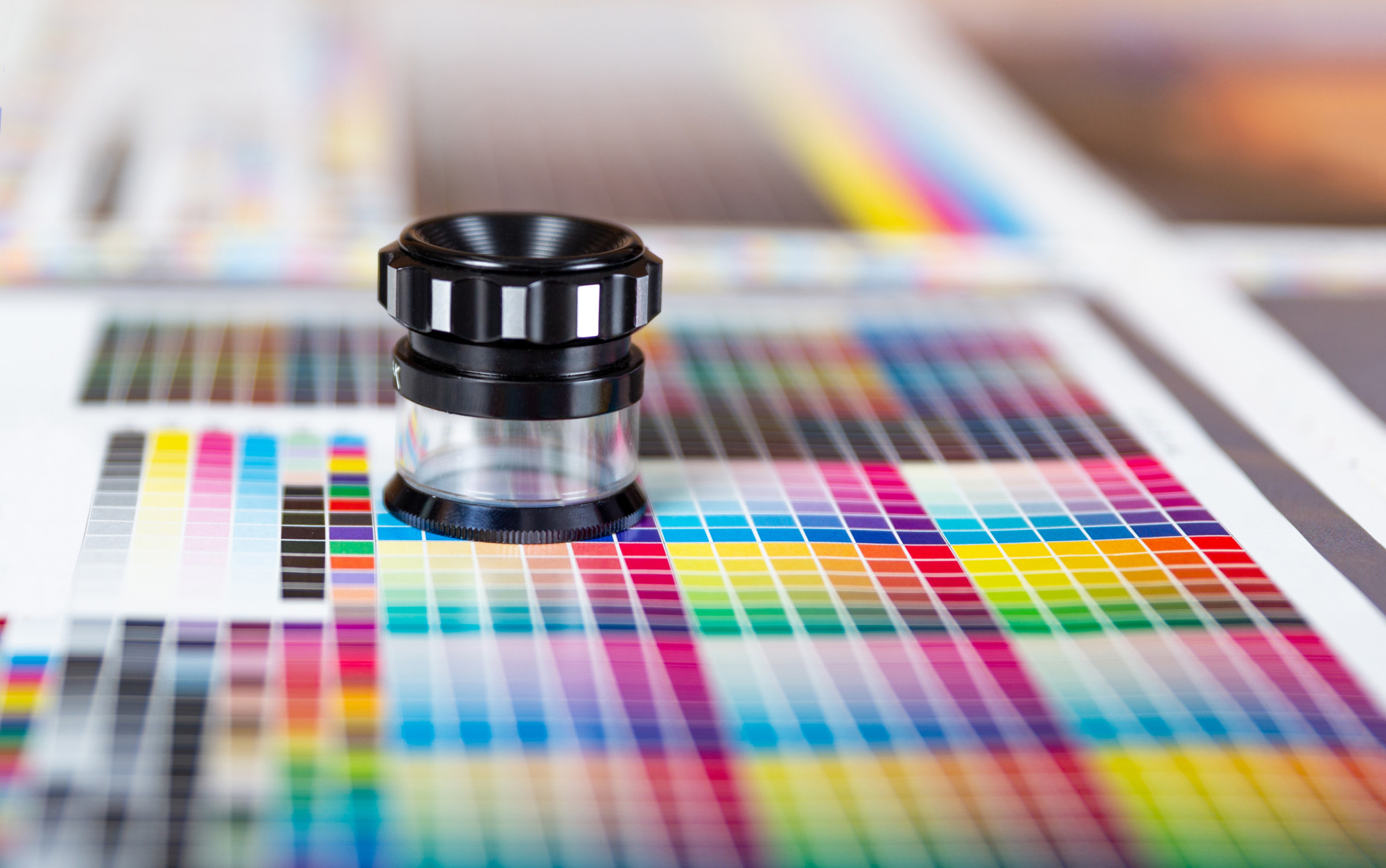
There could be a lot of reasons your design looks off. The colors in your printer don’t match the colors of your screen. Two colors that may be meaningfully distinct in the RGB color space (on your screen) could be identical to one another in the CMYK color space (in print).
Consider converting an image to black and white – often, two completely different colors will end up the same shade of grey. Colors overlapping, as above, can lead to a print design losing meaningful visual boundaries.
How Do You Design A Printed Graphic That’s Error-Free?
1. Change the Color Space in Your Design Program
You can limit the color space you work in for creating your designs and match it to your materials. For instance, if your printer uses cyan, magenta, yellow, and black (also called ‘key’) ink cartridges – you would change your design program to the CMYK color space.
2. Color Separations
If your target is screen printing (as on t-shirts), you’ll want to look into color separations. Color separations are the complex process of converting a multi-colored design into a sufficiently limited gamut to print efficiently.
A talented designer can take you through this process without losing the feeling of the original.
3. Rework Your Thematic Pallete for Contrast
As mentioned above, colors that have a sharp contrast on the screen may not have that contrast in CMYK. Print off a color card with primary and secondary thematic colors of your design to check their visual contrast.
4. Start Small, Go Big
When in doubt, start your design process with a more limited gamut. You can always adjust to having more colors to work with, but the reverse is often quite a painful process.
5. Black and White
Finally, you should always check how your design will look when converted to either pure black and white or grayscale. This tip goes double for logos, which may need to be embossed (depth doesn’t have a color).
Even traditional graphics should at least get a cursory glance with a grayscale filter. After all – you never know how the emphasis in your design might change when viewed in a different light.
Remember, Simple Does Not Mean Bad
If you find yourself drowning in the minutiae, trying to separate a finely detailed design for your printed graphic into distinctive enough blocks to be recognizable, even though you can only use three colors, remember that you can keep it simple.
The human visual process loves engaging imagination; turning craters on the moon into faces, and clouds into fantastic creatures. So in this world of ever-increasing complexity, a pocket of minimalism and simplicity can draw the eye.
Are you looking for help with your logo? Check out our blog for practical advice you can use and try out our logo maker today!
5 Ways to Figure out Eye-Catching T-Shirt Design Ideas for Promotional Giveaways
Posted on September 18, 2019 by Logo Design Tips and Tricks

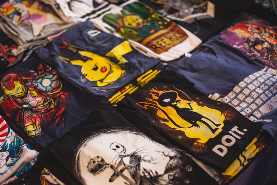
As a business, using promotional giveaways to convert new customers and boost your reputation is a no-brainer. They’re affordable, fun, and create instant interaction with customers.
T-shirts are a favorite among consumers. However, creating a good design isn’t as easy as it seems.
That last thing you want to do is produce a shirt that doesn’t get peoples’ attention. That’s why we’re discussing five tips for coming up with great t-shirt design ideas.
1. Think About Your Target Audience
Before you start thinking about designs, it’s important to consider your target audience. Your t-shirt will prove more effective if it appeals to people interested in your business.
For example, if your target audience is young men, a promotional shirt that employs current men’s fashion trends will attract more eyes. Winners of your giveaway are also more likely to wear the shirt.
If you’re not sure about your target audience, start by creating a customer profile. This will help you better understand who to focus on.
2. Consider Your Current Branding
When it comes to branding and marketing strategies, consistency is critical. Using elements of your current branding in your shirt design is a great way to establish a solid reputation.
Think about things like your business colors and logos when designing your shirt. Incorporating these will help increase brand recognition and make your shirt memorable.
Keep in mind that you don’t have to force your brand down peoples’ throats. Subtlety can work to your benefit.
3. Brainstorm With Your Team
When you’re coming up with a design, it helps to get many brains involved. Trying to create something on your own may prove difficult and result in a lackluster design.
Ask several people on your marketing team to submit a few ideas. Then, have a meeting and look at everyone’s concepts together.
Gauging everyone’s reaction to each design is a great way to narrow down your options. After that, the team can start revising the idea until you’ve created the perfect shirt.
4. Be Creative With Color
When it comes to clothing, color is the best way to get attention. However, you need to be sure you don’t go overboard.
Think of the fabric of your t-shirt as the background color. What your printing on it should stand out well and compliment it at the same time.
Avoid creating a t-shirt that’s hard to read. If you want to make a huge impression, companies like Flashion Statement create shirts with LED printing.
5. Originality is Your Best Friend
If you want to stand out, you need to be unique. This may seem hard to do if you’ve never designed a t-shirt before.
It doesn’t hurt to look at your competition and see what they’re doing. Just make sure you don’t mimic their designs.
Check out old-school t-shirt designs and put a modern spin on a classic design element. Or, be abstract and come up with something people have to think about.
Make Your T-shirt Design Ideas Turn Heads
A promotional giveaway is only effective if the item you’re featuring is attractive to your audience. Before you start printing your t-shirts, make sure your design pops.
Use these tips for creating awesome t-shirt design ideas and make your giveaway a success.
We hope you’ve found this article informative. Feel free to browse our site for additional information on graphic design.
