4 Awesome Designs for Your Automotive Website to Boost Business
Posted on October 12, 2020 by Logo Design Tips and Tricks

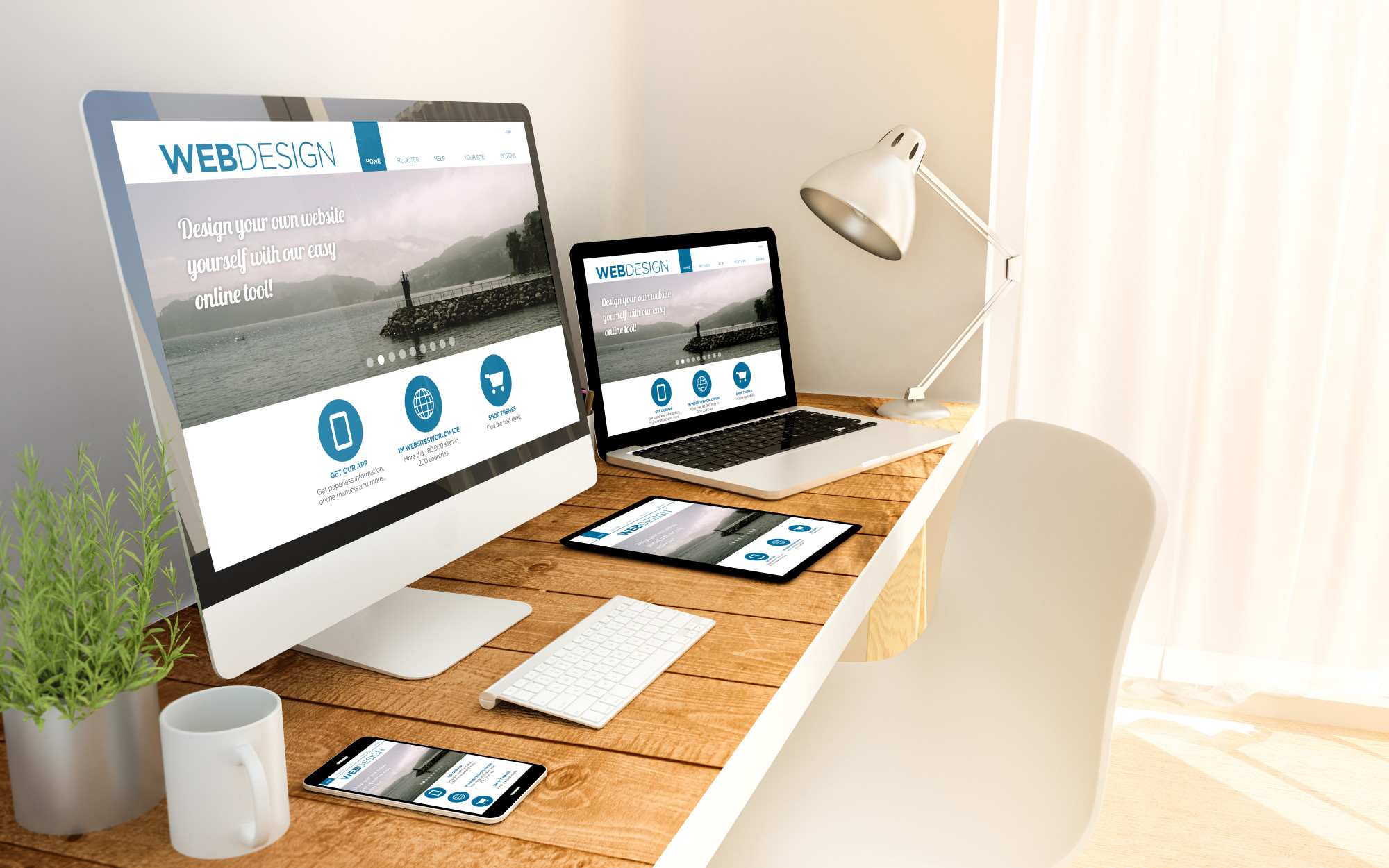
Web design for an automotive website is a tad challenging. On the one hand, you don’t want it to seem like any other automotive website, but on the other hand, you may not be such a creative. You can always create a dull and tasteless website, but it won’t do much to attract prospective customers.
The automotive business is more than just about selling cars. Some automotive enterprises sell parts, while others specialize in repairs, bodywork, or accessories. Regardless of your website niche, proper web design could be just what you need to take your website to the next level.
However, for most business owners who only know a smattering of IT, getting the best automotive web design is easier said than done. Fortunately, you don’t have to be a computer guru to have the best design for your automotive business. That’s because you’ll most likely outsource the web design to a third-party company.
For the greatest effect, you’ll have to be very involved in the web design process. Your input will be crucial in creating a web design that appeals to your specific demographic. This post will highlight a few incredible designs you should consider for your automotive site.
1. Minimalism
Minimalism is a great approach for an automotive site, especially if you’ve clamped down on the site’s objective. Minimalism stays away from the rather aggressive outlook of most automotive sites and instead adopts a more collected approach. This design is great for marketing family cars or attracting a rather chic demographic.
A minimalist design is not only pleasant to look at, but also makes for a seamless website. With only the basics in place, loading times will be lightning fast. If you’re for the minimalist design, you could try eliminating the following.
Sidebars – Only old-fashioned websites still have sidebars in this new decade. Start by getting rid of the sidebars for a smoother and better-looking website.
Menu items – This isn’t to say that you should eliminate the menu in its entirety. All this means is that you should whittle down your menu to only the essentials.
Stock photos – Similarly, you don’t want excess stock photos muddying up your website. Only use a few relevant photos.
Doing so will help you inch closer to a minimalist design for your website. However, before you embrace such a design, make sure you have your automotive site’s objective on lock. It’s way easier to come up with a minimalist design if you do so.
2. Consider the One-Page Design
The one-page design is just as the name suggests. Every web page consists of a single page containing all the information that you keep scrolling down. It’s the opposite of the fold design, where all relevant information is at the top of the page.
The fold is a great design, but not many users will scroll to the next page since everything they need is at the top of the first page. However, with the one-page design, visitors are more likely to scroll down to the bottom of the page. When Newegg adopted the one-page design, it led to a 30% increase in conversion.
Instead of the user going through several pages, confine them to a single page. You’d be surprised how something so little could boost your numbers, especially for automotive ecommerce.
3. Don’t Neglect Your Mobile Site
Folks spend, on average, about three hours and fifteen minutes on their phones every day. That’s why you should never overlook mobile devices during your web designing. In fact, designing for mobile devices is a great place to start your web design.
Having an incredible mobile design is a great way to capture a huge demographic of mobile users. Plus, Google announced the mobile-first index for search engine rankings. That means Google will prioritize sites with mobile websites in their SERP ranking.
However, you need a smooth and seamless mobile site to rank high on search engine results pages. So pay as much attention to your mobile site as you would to your desktop site.
4. Be Sharp With Your Content Formatting
Content is what sells your website and, by extension, your products, and services. As such, it’s essential to be sharp on how you format your content. Remember, ultimately, your site content is what your visitors come to see when they visit your automotive site.
You’d think content formatting would be a walk in the park for anyone who has ever used a word processor. However, web content formatting isn’t like your word processor formatting. For proper web formatting, you’ll have to place yourself in the shoes of your visitors.
The mistake most people make with web content is oversaturating their sites. While you want to give your visitors all that you can, overdoing it is a no-no. Most users find oversaturated content a bit overwhelming.
For precise content formatting, make sure you use the following.
Headings – Headings are a great way to structure your website and make it easier for your web users to read through your content. They are great anchor points for scanning through the website and focusing on the main points.
Paragraphs – paragraphs hep break down your content into small readable chunks and are also great for visual appeal. Don’t have a large blob of text, instead break it down into paragraphs.
Tweak your fonts – Get a little creative with your fonts to stand out from the pack. However, don’t do anything unorthodox, or it will look plain weird.
Work with your web designer for the best content formatting options. Also, do your best to switch it up once in a while to avoid having a stale website.
You Need a Standout Automotive Website
Having an amazing automotive website may be just what you need to take your automotive business to the next level. With the above tips, doing so should be a walk in the park. Remember, you’re never too good for professional help, especially if you’re in a very competitive niche.
Automotive sites aren’t our only area of specialization. For more informative reads, be sure to check out the other pieces on the site.
Applying to Online Jobs? This Is How to Improve Your Resume
Posted on September 30, 2020 by Logo Design Tips and Tricks

Has hunting for jobs on the internet left you frustrated? If you’re sick of still getting ghosted after months of searching, join the club.
A single job listing, even for a small company, can receive thousands of applications. This means that unless your resume is exceptional, a recruiter won’t even read it.
Even though applying for jobs online is a stacked numbers game, building a bot to auto-apply to every relevant listing will only get you so far. If you really want to stand out from the crowd, read on to learn how to improve your resume and stop relying on the shotgun approach.
How Online Applications Work
“How can I improve my resume quality?” is a common question among people who are new to the job search or are used to submitting paper applications. The characteristics that make a “quality” resume are different when you’re applying online, so the first step toward resume improvement is understanding how online applications work.
Most online jobs don’t reach a real person until they’ve already made it through a rigorous screening algorithm. Known as an applicant tracking system (ATS), this software looks for key features in resumes and cover letters.
If the resume isn’t in a readable format, is missing key terms, or contains too much irrelevant info, the ATS throws it out. Only the ones that check all the pre-programmed boxes will get sent on to a recruiter.
How to Improve Your Resume With Keywords
The good news about having an ATS scan your resume is that if you do include the right keywords, you boost your chances of making it through to a recruiter. These keywords may include years of experience, a college degree, or a specific license. Also, the hard and soft skills listed in the job title and description are almost guaranteed to be on the required keyword list.
No matter what, make sure your keywords are accurate and contextual—don’t try to “game the system”. If you haven’t written an internet-friendly resume on your own before, it’s worth seeking out resume writing assistance so someone with more experience can help fine-tune your keyword choice.
Getting the Formatting Right
Along with key terms, optimizing the format is the best way to improve your resume.
The goal here is to make sure your document is easily-scannable and attractive to both recruiters and an ATS. First, make sure to save your resume as a .docx or .pdf file unless otherwise specified. You can use Google Docs to save your files in these formats for free.
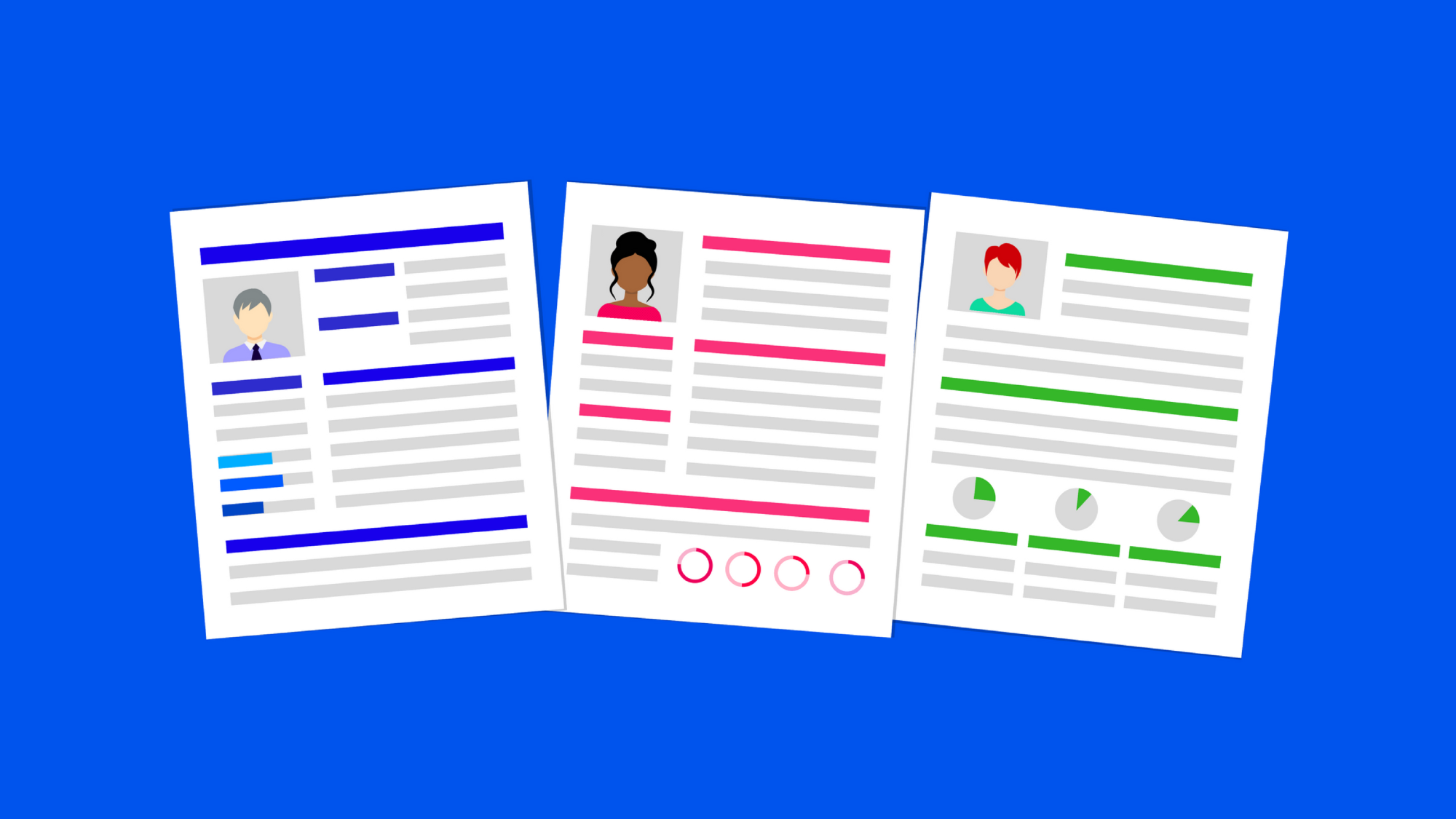
Next, organize your work experience in reverse chronological order, only including information that’s relevant to the position you’re applying for. Keep the font large enough to read, organize sections so they read from left to right, and don’t include photos or fancy graphics.
Try These Ways to Improve Your Resume
If you’ve been wondering how to improve your resume enough to get it in front of a recruiter’s eyes, give these tips a try. It’s likely to take some trial and error, but knowing how the online application system works increases your chances of landing an interview.
Make sure to read through the rest of our site for more tips on landing a job online.
Less Is More: 10 Advantages of a Minimalistic and Modern Web Design
Posted on September 06, 2020 by Logo Design Tips and Tricks

If you’re a business owner, then having a website for your company is absolutely essential to success. It can be a great way to reach new customers and keep existing ones up to date on any news or important announcements.
If you’re not sure where to start or how to build a user-friendly site, using modern web design has a variety of advantages that make it worth implementing. Here are 10 reasons why you should use this effective, classic style of design.
1. It’s Easy to Navigate
More simplistic web design means that your site will be much easier for users to navigate. Instead of having to process a lot of text, images, and navigation choices, users will be able to quickly understand what to focus on.
This means making good use of white space and taking a simpler approach to things like navigation menus.
This is crucial because it means users will have an easier time using your site and finding your call to action. The last thing you want is for a customer to be confused about where they need to go to find critical information.
2. You Can Take Advantage of a Great Image
Modern web design typically uses fewer images, which means the ones you do incorporate can have a dramatic impact. That means more minimal web design can be a great way to showcase dynamic images of your products.
These larger images can also make your site stand out and immediately grab attention when someone loads your page. A great first impression is crucial to getting people to stay on your website, and a gorgeous image is a good step to make sure that happens.
3. It’s a Classic Design Style
It’s currently on-trend and popular to have a minimalistic and modern web design. But it’s also something that won’t become passé. Large images and white space can make a site pop, and that will continue to be true in years to come.
While it can be tempting to try out the latest trends and features in web design, it’s important to think about what will be best long-term. Using this style means your content will always look professional and polished.
4. Modern Web Design Loads Quickly
One of the worst problems to have with a business or personal website is having it load slowly. Because more modern web design has fewer elements and images to load, it will pull up more quickly.
This eliminates frustration for users and avoids having them close the page before they even have a chance to look at it. If your site is bogged down by a ton of videos, a potential customer could leave your site and go to a competitor’s page instead.
5. It’s Good for SEO
Simple web pages are easier for search engines to crawl. This can improve your SEO and help you rank higher in search results.
Why is that important? SEO is essential if you want people to be able to find your website. SEO means you’ll show up higher in search results and will put your business in front of more eyes.
Driving traffic can in turn mean driving business, which is crucial to success and staying up and running.
6. It’s Less Complicated
It may sound simple, but having fewer elements to your web page means having fewer chances for things to go wrong. There are fewer opportunities for broken links or plug-ins.
This also means less maintenance and fewer updates will be required. This frees up time to focus on more important things when it comes to your business. It also reduces the chance that a customer will find your site while it’s not at 100 percent.
7. Your Site Will Stand Out
When it comes to web design for business, having an easy-to-navigate page that clearly communicates your products or services is essential.
Not overloading website visitors with information means it will be easier for them to retain and remember important info after leaving your site. By using minimal text and other elements, you can get users to remember what you want them to remember.
8. It Allows You to be Creative
Just because these designs are simple, it doesn’t mean you can’t use them to express your creativity. There are plenty of different ways to implement a modern website design.
You can incorporate custom illustrations or eye-catching headlines, for example. Just be sure to do your research on which formats will best help you display your company’s products and services.
Try looking around for examples of successful sites in a similar style to get a good handle on what works and what doesn’t.
9. It Can Be Easy to Build
Adding element after element and plug-in and after plug-in can make your site more complicated to build. By keeping things simple, you can get your business website up and running more quickly — while still having something that looks great.
A business website is crucial to success, so you don’t want to waste time getting this great marketing tool live.
10. It Translates to Mobile
In today’s digital world, having a mobile-friendly website is important. Many people will be visiting your page from their phones, so you want your site to look just as good on a small screen as it would on a desktop.
A minimal design is easy to translate for mobile since there are fewer elements to worry about. This creates a more straightforward and seamless experience for customers.
Create an Effective Web Design
When it comes to running a business, having a user-friendly website can be crucial to your success and to keep customers informed.
Choosing the design for your website doesn’t have to be difficult, either. There are plenty of benefits to using a modern web design when creating your site, from its clean and engaging look to its easy-to-navigate interface.
To learn more about marketing your business — including how to create a great logo — be sure to check out the rest of our site.
Business Card Graphics: How to Design a Business Card That Stands Out
Posted on July 15, 2020 by Logo Design Tips and Tricks

You might be under the impression that computers, smartphones, and other gadgets helped kill off the business card. But that couldn’t be further from the truth!
Even though the business world is deeply entrenched in the digital age right now, business cards are as relevant as ever. More than 27 million of them are printed every single day.
If you’re in the process of putting some together for your company, you should add the right business card graphics to them. You should also take other steps to ensure you end up with the most effective business cards possible.
Here are some useful tips on how to design a business card that stands out in the crowd.
Order Business Cards Printed on Heavy-Duty Paper Stock
Far too often, companies will spend a ton of time designing a business card only to turn around and print it on cheap paper in an effort to save money. Don’t make this mistake!
Instead, have your business cards printed on heavy-duty paper stock that will guarantee they last for a long time. You might even want to go with something like the suede or thick cotton business cards available through New Era Print Solutions.
Consider Going With Something Other Than a Standard Size Business Card
For years, the rules on how to make a good business card dictated that people had to have them designed to fit on 3.5-inch by 2-inch business card paper. But those rules don’t necessarily apply anymore.
You’re still welcome to create a standard size business card if you would like to go that route. But you might also want to consider the idea of printing business cards that are much bigger or much smaller than that.
This is one of the simplest ways to separate your business cards from the business cards created by all the other companies out there.
Be Mindful of Which Business Card Graphics You Use
At the end of the day, the paper stock that you use for your business cards and the size of the business cards that you create won’t matter without the right business card graphics.
You shouldn’t try to squeeze too many graphics onto your business cards. But you should add things like your name and title, your company logo, and your contact information to your cards.
You should also find small ways to personalize your cards so that they’re unique to you without cluttering things up. Many people are opting to add their social media handles to their business cards these days to make it easy for others to connect with them virtually.
Start Designing the Best Possible Business Cards for Your Company
If you’re going to go through the trouble of designing business cards, shouldn’t you make it worth your while? You can do this by picking out the right kind of paper for your cards and using the right business card graphics on them.
Use the tips found here to bring your next batch of business cards to life. You’ll be able to hand your business cards out with confidence when you feel great about the way they look.
Check out our blog for more business-related tips and tricks.
