8 Social Media Solutions for Your Logo
Posted on May 16, 2018 by Logo Design Tips and Tricks

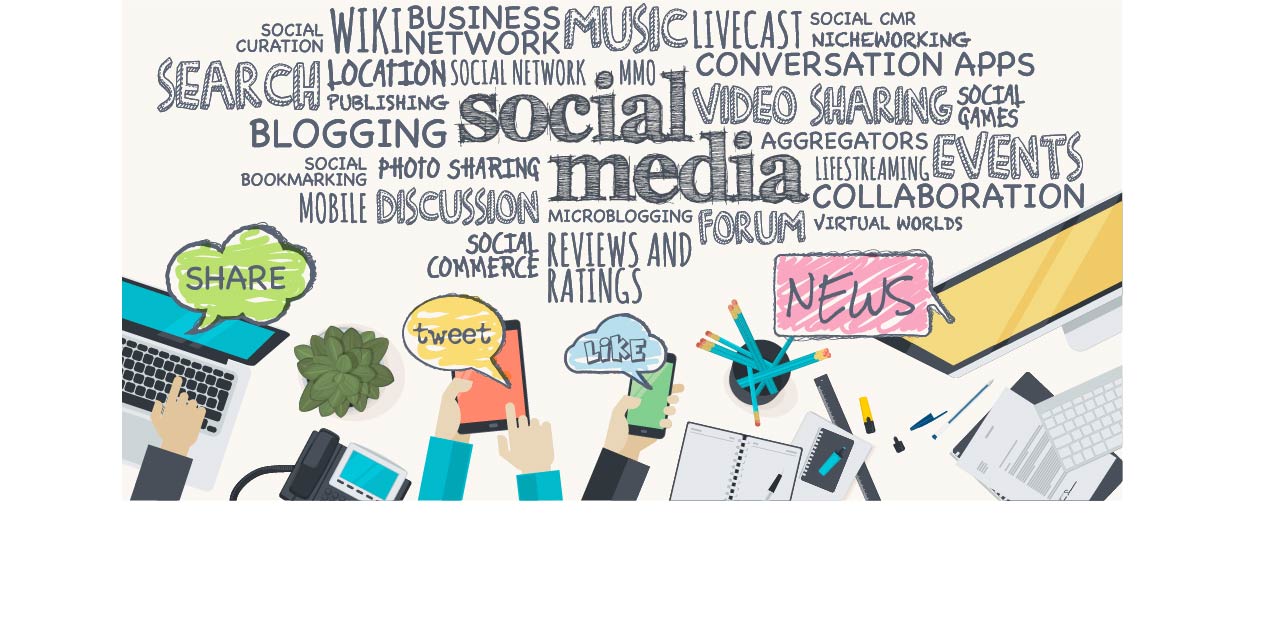
Your logo should be social media-friendly. Here are social media solutions for your logo that you can use.
Your logo is the face of your company. If it’s catchy enough, it will create a positive impression and stick in your customers’ heads.
You, too, can share your logo on social media with the world. It’s not too much to ask.
Here are 8 social media solutions for your logo:
1. Have a Symbol-Only Version of Your Logo
So you’ve come up with a beautiful, dynamic logo. Now, it’s time to simplify your logo into a symbol.
Having a trademarked symbol makes it easier to share on social media.
You can use the symbol as a social media profile picture. Meanwhile, you can use your bigger, non-symbolized logo as a cover photo.
Your symbol can resemble your photo or look entirely different. However, it’s best to leave “hints” of your logo in the symbol so people can recognize both.
When creating images of your logo, keep the following in mind:
2. Use PNG Logo Files
You want your logo to show up clearly at every size. Using PNG logo files is important.
PNG files are easier to resize. These images do not get all pixellated and distorted when resized.
JPEG images are no good for logos. They tend to get pixellated when resized.
You want to keep the social media platform in mind when uploading your logo onto it. No matter what, always do the following:
3. Stay Consistent: The Most Important of Social Media Solutions
Consistency is important. You should be using the same logo for all social media channels you use.
Be sure to keep your logo the same, color scheme and all, across all social media platforms.
You should also use the same fonts and sizes for your logo on every social media platform.
Be sure to position your logo the same way in all of your images. This will help you claim the image as belonging to your company. The social media user will make the connection quickly.
You want customers to draw a clear connection between your brand and the logo. Using different logos for different social media outlets will only confuse your customers.
Speaking of consistency, do the following as soon as possible:
4. Test Across Devices and Social Media Platforms
You should be testing out your logo on every social media platform you use. You want to know how it looks so you can confirm your logo’s appearance on every medium.
You’ll also want to test out your logo on your mobile phone as well as a regular computer. You want to make sure your logo is flattering everywhere it’s posted.
Send your logo to your friends and ask their opinion on it. A little bit of honesty can go a long way.
If you didn’t use a PNG file, your logo might look slightly different on different social media platforms. It might also look different on the web or mobile versions.
5. Get Creative With Fonts
Creative fonts help your logo stand out. These fonts can be so unique, they’re connected with your brand alone.
The fonts you choose convey messages about your brand. Your font should never be too hard to read so people can pick up on these messages.
Choose no more than three fonts and use them in your social media profiles. This helps your customers recognize your brand easier.
For more recognition, use the typeface most commonly associated with your brand. Your logo is counting on it.
Your fonts aren’t the only thing you should pay attention to:
6. Use Your Brand Colors
Your logo design should contain your brand colors. These brand colors make a statement on your company’s behalf. They convey the personality of your company.
You should choose two to four colors and work with them consistently. This will help your brand stand out. Study the psychology of color and learn about how colors evoke certain emotions or thoughts.
Your social media profile should also integrate these colors. This helps social media users make the connection between your brand and the content they’re looking at.
People will judge your company by the colors it uses. According to one color marketing study, around 90% of the snap judgments people make about your products and brand will be based on the colors you use.
You should be using these colors in ways that make them stand out on your profile and your logo. Incorporate these colors into the images you share on social media. That will also help social media users make the connection between your brand and the content.
7. Take Advantage of Catchy Images
Edit your logo onto images that your audience will remember. Pictures of people wearing your logo, your products, or scenic surroundings are especially popular.
Using visuals is one of the social media solutions that are necessary for social media success. You want as many people to like and share your content as possible. Using catchy images makes this more possible.
Social media posts with visuals get 94% more shares than social media posts without it. It’s important to incorporate your logo into images whenever possible.
You can use different images for different social media platforms. However, make sure all the images fit your brand. Incorporate your logo or your brand colors for increased brand recognition.
Be sure to pay attention to the colors of the images you use. Vibrant colors pop out and attract more people. Black gives your brand a more sophisticated feel.
8. Make Your Logo Available On Every Social Media Platform
This is the most straightforward of the social media solutions here. You want your social media presence to be as big as possible. Your logo should be highly visible on all of them.
When people search for your company, they should be able to see your logo immediately. Your logo is one of the first impressions they’ll make of your brand.
Set your logo as your main profile picture on all social media platforms. This will help social media users recognize your brand and the official account you’re using.
Your company should establish official accounts on Twitter, Instagram, Facebook, Pinterest, YouTube, and more. All of these accounts should be updated regularly with fresh content. Your logo should be placed wherever possible.
Add personality to your social media posts. Don’t make your posts sound too corporate or impersonal. You can do this while sneaking your logo into the post with an image.
Use Your Logo Wisely
Your logo can take you far in the world of social media. These social media solutions will help you share your logo and your brand with the world.
With social media, your brand and business can expand beyond your wildest dreams. And it all starts with your logo.
7 Logo Design Tips for Your Nonprofit Agency
Posted on December 21, 2017 by Logo Design Tips and Tricks

When people hear the word “brand”, they tend to think of major businesses like Apple, Nike, or Coca-Cola. But the reality is, branding and brand awareness is important for any organization, including nonprofits. Many organizations like the World Wildlife Fund, the Red Cross, and Good Will are widely recognized across the world, and proving just how impactful branding can be.
A great way to spread brand awareness for your nonprofit is by creating a high-quality logo. Not entirely sure how to do that? In this article, we’ll cover logo design tips for your nonprofit, so you can stand tall above the crowd and show the world how great your organization is.
What is a Logo?
A logo is a visual representation of your brand or nonprofit. It’s a symbol made up of text and images that help customers identify brands they like and use. Its purpose is to help people understand what you do, what you stand for, and what you value as a nonprofit.
Your nonprofit logo will usually consist of these three things: the logotype, the brandmark, and your tagline.
Logotype
The logotype is your nonprofit organization’s name. It’s the text-only treatment of your nonprofit, which you can then use as a way of identifying and branding your nonprofit.
Brandmark
The brand mark is the visual communicates the elements of your brand that can’t be expressed in words. It’s made of up things like color, design, and symbols. It can take a while for recognition and recall for a brandmark, but if you do it successfully, it can really help people remember your organization.
Tagline
The tagline is the catchphrase you pair with your logotype and brand mark. It’s where you can express the essence of your nonprofit in words, and it should stir a certain feeling in your intended audiences. It should tell a story, explain your nonprofit’s offering, but most importantly, it should be short and simple.
Here are the basic functions of an effective logo:
It Makes You Stand Out from the Competition
The most important function of a logo is that it gives your nonprofit a unique look that makes it different from other nonprofits. This element is very important, especially if your nonprofit offers services like another nonprofit or is easily confused. When it comes to logo design tips for your nonprofit, making your logo different and memorable is incredibly important.
It Identifies Key Information About Your Nonprofit
Your nonprofit logo should provide people with important info about your nonprofit, like the industry you exist in and the services you offer. It should also highlight your base audience and your brand values. So, when thinking about logo design tips for your nonprofit, think about how you can visually communicate this key information to people.
It Builds Brand Recognition
Your nonprofit logo needs to leave a visual impact on people, so that they’ll remember your organization and what you do long after they see it. Logos are great for creating strong visual associations with a business, and that association helps people keep your nonprofit in their mind.
Logo Design Tips for Your Nonprofit
Now that you know what a logo is, and how it can help your nonprofit, you can start working on your own! Here are some important logo design tips for your nonprofit.
1. Focus on the Unique Elements of Your Nonprofit
Even if your organization’s cause is broad, you should focus your energy on what makes it different from similar organizations. Try to come up with a short and specific description of that element, and then cut that description down to two words. By doing this, you can keep the most important ideas in mind when creating your logo.
These words should drive the visual elements of your logo, such as the images, color palettes, and typography.
2. Make it Memorable
The key to memorability is making a logo that is simple, unique, and easily recognizable. This means you should choose an easy-to-read font, use sharp colors, and have a clearly thought out design.
Before you make your logo, you should look at other logos of similar nonprofits, and develop a strategy for making it memorable. One way to test your memorability is to people your logo for fewer than 10 seconds and then see if they can re-draw it with relative accuracy. If they can’t, odds are your logo design isn’t memorable enough.
3. Use Color Effectively
Colors have a psychological habit of sparking emotions and associations in peoples’ brains, so your color palette should be tailored to the response you want to stir in people. When making your logo, think about the basic ideas and qualities of your nonprofit and cause, and reflect on what colors may speak to that best.
Here are some colors and what emotions and associations they spark in people:
- Blue: trustworthiness, tranquility, medical nature,
- Red: boldness, urgency, sexiness
- Yellow: optimism, youth, clarity, invention
- Green: nature, relaxation, growth
- Orange: energy, creativity, friendliness
- Purple: spirituality, wisdom, luxury
- Black: power, precision, sleekness
- Pink: femininity, tenderness, romance
- White: cleanliness, simplicity, purity
Borns Group, a nonprofit that provides fundraising solutions, uses blue and white in its logo. These colors communicate simplicity and trustworthiness, which are important in their field of work.
Regardless of the color you pick, you should always keep adaptability in mind. Your nonprofit logo should be able to be easily adapted to a variety of mediums, from business cards to billboards. You should also think what this logo would look like on t-shirts, how it would appear on black-and-white flyers, and how colors can affect printing costs.
4. Make It Adaptable
When making a logo for your nonprofit, you should always keep adaptability in mind. Your nonprofit logo should be able to be easily adapted to a variety of mediums, from business cards to billboards. If your logo has tiny print size or a lot of text, it’ll be difficult to read online, and if it’s overly complex or detailed, it won’t scale well if it’s enlarged.
5. Make It Lasting
The last thing you want is to make a logo that looks out of date after just a few years. You should aim for a classic design that will look good over time rather than chase after trends. You can make it long-lasting by working with a designer to create a logo that is simple and clean enough to age effectively.
6. Balance Design Elements
Whether you’re using illustration or typography, you need to make sure the design elements of your logo are balanced. If your logo is too cluttered, audiences will be turned off and be less likely to remember it. By balancing white space and giving all the design elements equal weight, you can make a design that is visually balanced and striking.
7.Embrace Key Logo Design Elements
While a nonprofit logo is a unique kind of logo, you should still follow best practices for general logos. Here are important design principles you should keep in mind:
- Simplicity
- Versatility
- Timelessness
- Memorability
- Originality
- Storytelling
Scalability
By implementing these logo design tips for your nonprofit, you can make a truly standout logo for your organization.
Final Thoughts
Crafting the perfect logo isn’t easy, especially if you’re a nonprofit with limited time and resources. The great thing is that there are free logo design tools you can use to bring your dream logo to life!
Are you a nonprofit looking to create your first logo? Are we missing any logo design tips for your nonprofit? Let us know in the comments!
How to Create an Amazing Chimney Services Logo
Posted on December 06, 2017 by Logo Design Tips and Tricks

People become extremely attached to their favorite logos.
This is why so many Uber customers voiced their displeasure when the transportation giant changed its logo. The old logo was a representation of the relationship the customers had with the brand.
You want people to develop the same level of attachment to your chimney services logo. But it’s hard to stand out in an industry where many logos look similar.
Let’s look at how you can make an amazing logo for your chimney services company!
Choose the Color Scheme
The colors you pick for you logo tell people what they can expect from your business. They affect how your target audience perceives your brand personality.
For example, Harley Davidson wouldn’t be as popular with rugged bikers if its logo was raspberry pink and Honolulu blue. But the color combo works very well for a brand like Baskin Robbins.
Thankfully, there are many colors you can use for a chimney services logo.
Blue can help you build an amazing logo. For one, it’s it the world’s favorite color. But people also associate it with reliability and professionalism.
Orange is another excellent choice for this industry. It signals sociability and affordability. Plus, it’s an energetic color that evokes feelings of happiness.
Use the color wheel to find complementary colors for your brand. However, try to avoid including more than three colors in your logo design. While Google, eBay, and NBC can pull it off, using four or more colors tends to give off more of an easy-going, fun vibe.
Select the Graphics
When beginning your design, look for inspiration from other chimney services logos. Take a few elements of successful designs, but avoid copying them outright.
In this industry, many logos feature a chimney, for obvious reasons. But simply placing a picture of a chimney next to a bland text won’t cut it. You need to put your own unique spin on the concept.
For starters, look at this example, which cleverly uses a ladder in place of the letter i. This is an excellent strategy as long as the readability of the logo doesn’t suffer.
If you’re still unsure how to approach your design, Click for More logo inspiration. Chimney Liner Pro does a great job of incorporating the ascender on the letter h into their graphic. It’s a very simple yet elegant design that delivers a clear message to the viewer.
You can choose to mix your graphic with the text, like the examples mentioned above. However, you can also place the graphic to the left or right of the text, or even above or below.
Pick a Font
Most chimney services companies use similar symbols in their logos. So what will really differentiate you from others is the written portion of your logo. You want the name of your business to stand out.
Choose a font that compliments your graphics. But no matter how good a font seems to you, make sure it’s readable.
ADAM.CG Pro is a very professional-looking font that pairs well with most graphics. It’s also easy to read from a distance.
Another great all-around font you can consider is Florencesans. It’s versatile and clean, and it suits the industry.
You can always include more than one font in the same logo. Just make sure that the two fonts aren’t similar, as this can be distracting. Try pairing serifs with sans serifs.
Finally, consider other aspects of your font as well. Switch between lowercase and uppercase to find something that looks eye-catching. Also, feel free to play around with the scaling of your font by condensing it or stretching it out.
Make it Versatile
One of the keys to an amazing logo is adaptability. For example, no matter how much you resize or change the color of the Apple logo, most people can recognize it.
An adaptable logo is simple, not chaotic. The more you have going on in your logo, the harder it will be to adapt it to different formats. You want your logo to look good whether it’s on a billboard, truck, Facebook profile, or t-shirt.
Never make a logo that’s too detailed. When you shrink your design down to use it on a business card, for example, a small bird in the distance can end up looking like a speck.
Also, don’t rely on colors to create a memorable logo either. In some cases, you might need to use a monochrome version of your design. So make sure it looks good in black and white before adding color to it.
Try Using Negative Space
If you look hard enough, you can see an arrow in the negative space between the letters E and X in the FedEx logo. You’ll also find a subtle peacock beak among the feathers in the NBC logo.
These two brands both use negative space to make their logos more distinctive. When done properly, negative space can take your amazing logo design to the next level.
To use negative space, start by placing your graphic on a white background. Think about how you can cut parts of it out to create a second shape that’s relevant to chimney services. You can also overlap new shapes or place white text over your graphic.
If you have a basic wordmark or lettermark logo, you can find shapes in the negative space of your letters. For instance, you can use the triangle found in the negative space of the letter V to add graphics.
Start Building Your Own Amazing Logo
Avoid trends as much as possible, because they come and go. Also, don’t copy the logos of other chimney services companies in your area. Your goal should be a unique, amazing logo that will be the face of your business for a decade or more.
Design the graphic before deciding the font. This way, you can scroll through the entire list of fonts and see which ones fit best with your graphic.
Are you ready to start designing? Use our free online logo maker tool to create an eye-catching logo for your chimney services business!
The Definitive Check List for Healthcare Logo Design
Posted on November 24, 2017 by Logo Design Tips and Tricks

“A picture is worth a thousand words”, but a great logo design says tens of thousands of words.
Do you want to create a great healthcare logo design for your healthcare company?
Remembering everything you need to include to produce a great healthcare logo can be overwhelming.
After all, the best logo designs are at the same time effective, memorable and recognizable.
To help you create your healthcare logo design, we’ve put together this definitive checklist.
1. Do You Have a Message?
When designing a healthcare logo, you need to ask yourself what message you want to convey.
Ask yourself what you want your healthcare company to be remembered by.
As a healthcare company, you probably want to convey a message of care and trust.
2. Is it Original?
The next thing on the checklist is originality and uniqueness. There are so many amazing and interesting logos out there. You have to make sure your logo stands out.
How do you create an original logo?
Think outside of the box. This may involve clever use of color, or maybe by selecting a striking font for your text.
Many of the best logos use negative space, background and shadow to create a logo like no other.
3. Is it Simple?
Many people assume that a great and original logo has to be complicated. However, this is absolutely untrue.
Think about Apple’s half-eaten apple logo or Nike’s Swoosh.
So simple, but still original.
The trick to this to focus on the message or idea you want to communicate and develop that in a simple manner.
4. Can it be Scaled Up and Down Again?
The best healthcare logo designs are versatile. This means they can be scaled up and down.
Some logos look incredible when they’re blown up but awful small size, and vice-versa.
This is why you have to consider carefully how you want to use your logo. You have to think from the perspective of the customer or patient.
Are you planning on using your new logo on your website? Or do you have a company vehicle? Or do you need to print it on some business cards?
5. Use Color Effectively
Color really matters when it comes to designing your company logo. This means going beyond splashing bright and wonderful colors everywhere.
You have to think carefully about the associations people make with particular colors.
Research shows that people associate the color red with power. Blue represents trust. Yellow refers to hope.
A great example of this is how Gentle Procedures uses the color blue and an image of holding hands to convey care and trust in their logo.
Decide what you sort of values you want to convey, and use color to design your logo accordingly.
Create Your Healthcare Logo Design
Make sure you go through our definitive checklist when you’re creating your logo design.
Our system is one of the easiest, most convenient ways to produce a great healthcare logo for your company.
Click here to start creating!


