What You Can Learn From Google’s Cloud Logo and Brand
Posted on August 10, 2017 by Logo Design Tips and Tricks

The sky is the limit.
That’s where Google wants your mind to go when you think of them and their cloud logo.
And it’s true. Think of every time you’ve logged on to the search engine and the logo is different. Dr. Seuss themed or holiday themed, the list stretches for miles.
Why does Google get to make its own rules and what can you learn from its logo and brand?
Keep reading to find out.
Learning From Google’s Cloud Logo
The answer is in simplicity.
When you think of Google’s logo, their Gmail logo, their browser logo, it’s all very simple. The color schemes are simple. Red, blue, green, and yellow. Their fonts are always easy to read.
Let’s take an even closer look at the history of Google’s logos.
Color
When you think of the Google’s main logo, you probably think about the upper case blue “G”. Why does that draw your attention and what does it mean?
The color blue says that a company is logical, innovative, professional, and non-invasive. It’s a universally loved color by all sexes and ethnicities. Essentially, it says “Everyone loves us”.
Google’s mission has always been, “Don’t be evil“. What’s the opposite of evil? Love! As in “everyone loves us”.
How is this incorporated into the cloud logo? Notice how it’s on top. It says that all of the things that we mentioned above are still a priority.
Red is a symbol of power and yellow in the logo symbolizes positivity and friendliness. Google is one of the most powerful corporations in the world and they provide free services all across the globe, so the color schemes make sense.
What’s truly unique about this color scheme is the spiraling of the colors. Notice how they touch, creating a complete loop inside of the hexagon.
This tells the customer that these principles are unwavering, unbreakable, and unified.
Something is Missing
In Google’s original logo, the upper case G was green. Green is still represented today in the lower case “g” near the end of the logo. It has been completely left out of the cloud logo.
What are they trying to say? Green is a universal symbol of youth and Google is making a bold statement by leaving this color out of their literal loop.
They’re saying, “We have come of age. We are no longer a new brand, we’re a mature company.”
Shape
There is a variety of shape usage within the logo. Above, we mentioned the loop within the hexagon.
This spiral effect, especially when it’s so cleverly placed inside of a straight lined shape, symbolizes creativity and growth. The spiral of colors has another purpose and that’s to funnel your eyes to the center of the logo. A circle. Void of color.
The circle represents a promise to the customer. It’s a symbol of community and trust.
Why do other cloud associated businesses use a cloud shape logo and Google uses something unrelated?
Because they don’t need to. They’re Google. This logo makes a powerful statement to the customer. One that a tired, boring cloud shape can’t possibly replicate.
If you’re looking for file archiving software, are you going to go with one of the companies that all have the same type of logo, or are you going with the trusted name of Google?
Bringing it all Together
So what is this promise that Google is trying to convey with their logo?
The colors. The lack of one particular color. Shapes inside of shapes.
Google is telling us to trust them with our valuable information. If we do so, we will be protected by not just their cyber security, but by their brand values.
This logo is a brilliant way to say so much in one tiny, seemingly simple cloud logo.
5 Famous Surgeons to Inspire Your Plastic Surgery Logo
Posted on August 03, 2017 by Logo Design Tips and Tricks

When most people look at celebrities, they think that they’ve got something the rest of the population doesn’t. Their success must be attributed to everything that’s so special about them.
It’s true that many celebrities got to the top because of their talent. But they’re also good at branding. Celebrities can sum up what they offer in a simple logo.
Branding is the difference between being an excellent plastic surgeon, which is attainable for anyone who works hard enough, and a celebrity plastic surgeon whose practice is overflowing with clients.
In that vein, take a look at some of the celebrity plastic surgeons who’ve made it big. Consider not only their surgery skills but also the ways they’re able to communicate their abilities through branding and their plastic surgery logo.
1. Dr. Terry Dubrow
Most of America knows Dr. Terry Dubrow from the E! television show Botched. But in addition to starring in a television show, Dr. Dubrow is also an innovator. He regularly publishes in journals and co-authored The Acne Cure.
Dr. Dubrow is able to capitalize on name recognition, but he also has a strong marketing strategy. His practice’s plastic surgery logo features his initials written in an elegant font carefully nestled against a beautiful woman’s body.
His marketing, including his use of color and images, shows how he focuses on aesthetic beauty. Dr. Dubrow has excellent clinical experience, but he also conveys the need to see beauty in the whole body. And he’s able to accomplish all this through his logo.
2. Dr. Paul Nassif
Dr. Paul Nassif co-stars with Dr. Dubrow on Botched and he’s also known for his appearances on the Bravo Real Housewives franchise.
Yet, Dr. Nassif doesn’t market himself as a reality TV star. He also emphasizes his commitment to medicine as a science and beauty as an art.
His branding and plastic surgery logo represent his commitment to the blend of science and art. When Dr. Nassif is selling his services, he’s not selling his celebrity or a product, he’s selling a distinct vision.
3. Dr. Raj Kanodia
Dr. Raj Kanodia is another celebrity surgeon, but he markets himself using the celebrities he’s worked with. Touting skin care reviews from Kim Kardashian-West and Britney Spears, his practice’s website focuses on using visual aids to tell its story.
In addition to filling his website with images of beautiful women and before-and-after photos, Dr. Kanodia also includes images of himself showing off his professional prowess. His homepage shows him speaking at conferences, talking to the press, and meeting with patients.
Dr. Kanodia’s branding is more visceral than Dr. Nassif or Dr. Dubrow’s branding. He uses his branding not to describe his ability to create a work of art. And his plastic surgery logo doesn’t pretend to be coy: it includes images of the greatest works of art like the Mona Lisa to make his point.
Dr. Kanodia is one of the best plastic surgeons in the world. But he’s sought after by Hollywood elite and mentioned across the media because of the way he’s branded his practice. He directly targets celebrities and fame – he calls himself the Hollywood Doctor.
So, it’s no surprise that celebrities and fame are what he gets.
4. Dr. Sherrell Aston
Dr. Aston is the first New York City-based plastic surgeon in this list.
He’s not only a practicing surgeon but also a Professor of Plastic Surgery at New York University. Other leadership positions include past President of the American Society for Aesthetic Plastic Surgery and twenty-three years as Chairman of the Plastic Surgery Department at the Manhattan Eye Ear & Throat Hospital.
The way Dr. Aston brands himself is different to the west coast group. Dr. Aston participates in the same press events and hosts his own show on SiriusXM. However, he touts himself as a scientist first and only implies the aesthetic aspect of plastic surgery.
He focuses less on the look achieved and more on the method of achieving it by emphasizing his participation in the latest advancements in the field.
In other words, Dr. Aston uses his medical credentials to brand himself. He supplements it with a plastic surgery marketing strategy that is refined, clean, and emphasizes professionalism over beauty.
Perhaps he does this because he’s operating in a different market. Hollywood and other Los Angeles clients are a different target market than New Yorkers. However, his use of color and photos demonstrates that he is the best in the business in his niche – and his marketing reflects that.
5. Dr. Olivier de Frahan
The final plastic surgeon on the list isn’t based in the U.S. at all. Dr. Olivier de Frahan splits his time between Paris and London.
Unlike his American counterparts, Dr. Frahan did away with the trappings of a full website. And it’s his minimalist website that’s earned him a place on this list.
Dr. Frahan has the air of exclusivity, and he markets himself this way. He uses a simple, elegant image on a clean background. His website includes a list of his professional qualifications and the phone number to reach him.
His website and logo are reminiscent of old glamor and elegance. It’s not concerned with the latest trends. Rather, he’s the epitome of old world Paris – in the best way. Of course, having an office in the most exclusive area of Paris doesn’t hurt his image.
What can plastic surgeons take away from Dr. Frahan? The rule to designing a plastic surgery logo targeting the Grace Kellys and Coco Chanels of today is ‘less is more.’
It’s not clear who Dr. Frahan’s clients are, but one can rest assured they’re beautiful.
Conclusion
Branding yourself like a celebrity plastic surgeon sounds impossible from the outset. But as they say, celebrities are just regular people.
All the doctors discussed above are at the top of their game, but they’re not super human. Rather, it’s the way they market themselves that sets them apart from other top surgeons in the field.
The key takeaway from studying these celebrity plastic surgeons is that it is possible to convey celebrity status through a plastic surgery logo. So, put thought, time, and care into designing a logo.
It might earn clients that catapult careers.
How to Brainstorm Creative Ideas For a Logo Drawing
Posted on July 13, 2017 by Logo Design Tips and Tricks

A logo is the visual representation of a company. At a glance, a logo tells potential customers the company’s purpose, what products or services are offered, or what type of experience they can expect. That’s a lot to cover in a few well-deigned pixels.
But remember: every brilliant logo design once started off as a simple logo drawing.
The long-term goal of any logo design is recognition. Use these brainstorming techniques to develop ideas and drawings for a logo that is unforgettable.
Plan for Creativity
Although brainstorming is an exercise in spontaneity, preparation is a key element to success.
The first step is to set aside a dedicated block of time specifically for the brainstorming session. Planning ahead helps minimize distractions — studies have shown it can take over 20 minutes to get back on track after an interruption.
Advanced planning also allows for playlist orchestration. Music is a powerful tool when it comes to creativity and choosing the right type of music is important. Instrumental music is highly recommended for maintaining focus on a creative task. Stay away from music with lyrics (it tends to block concentration).
Open the Observatory of Your Mind
Be as a student at all times. What shines bright and really catches the eye? Creating a list or file of logos, drawings, and designs that are intriguing and effective help spur creativity. Include notes about what makes each logo unique, describe the emotions evoked by the image and what makes it memorable. Evernote and Pinterest are great for keeping track of likes (and even dislikes).
Get Back to Nature
There is overwhelming evidence that exposure to nature not only promotes calmness but has a positive impact on creativity.
Images from nature have been the inspiration for the logos of many well-known brands (think Apple and Twitter), as well as companies with products or services that have nothing to do with nature.
A quiet bench in a neighborhood park, a sling chair on a pier, a wildlife viewing area off the interstate, or any serene location with trees and vegetation is a potential destination. The shapes, textures, sounds and even smells from natural surroundings will bring out the inner visionary, and hopefully some excellent logo drawings.
Go “Shopping” for Logo Drawing
Fortunately, this brainstorming adventure does not require a credit card. A stroll through the mall, an hour of window shopping along the boulevard or even a trek through the aisles at a local grocery store offers a wide range of logos and design ideas.
The selection of colors and designs, sizes and shapes, fonts and images are excellent ways to inspire multiple logo drawings. A smartphone camera is a perfect way to record styles and designs that jump out to get noticed.
Go with the Flow
Being aware of current trends is important to any creative process.
The latest styles in fashion design offer suggestions for use of patterns and insight for well-chosen color schemes.
Keep track of new and innovative font styles and experiment with various fonts when sketching logo drawings. Different fonts may stimulate even more ideas.
And, of course, always be in touch with what is trending in logo design itself.
A Final Note
Judgment and analysis of the ideas created during brainstorming should be left until the end of the session. Do not block creativity by critiquing.
When brainstorming is finished the best strategy is to close the sketchbook of logo drawings and take a break. Revisit a day or two later for a fresh perspective. Once the inspiration hits, don’t hesitate to get to work creating your new logo.
The Most Memorable New Logos of 2017
Posted on June 26, 2017 by Logo Design Tips and Tricks

Does your logo feel outdated, inconsistent with where you are now as a brand, or irrelevant to your target market?
If you answered “yes” to any of those questions, it’s likely time to start considering a re-branding.
Confused about where to start? Don’t worry — we’re here to help you find a little inspiration. In this post, we’ll share with you some of the most memorable new logos from this year.
Hopefully by the end, we’ll have you convinced that creating new logos for your company is a brilliant branding strategy!
Calvin Klein
Fashion giant Calvin Klein’s new logo is all about celebrating the history of this iconic fashion brand. In February of 2017, the brand debuted an updated logo that made quite a statement.
While Calvin Klein has always been rooted in minimalism, they still wanted to make an impact. That’s why they switched to an all-caps logo, with a bolder typography that replaced the slender lettering of the past.
It was also a wonderful way to usher in the house’s new designer, former Dior Darling Raf Simons. This subtle switch heralded a new era for the house — and attracted lots of attention.
The Evolution Of Kodak
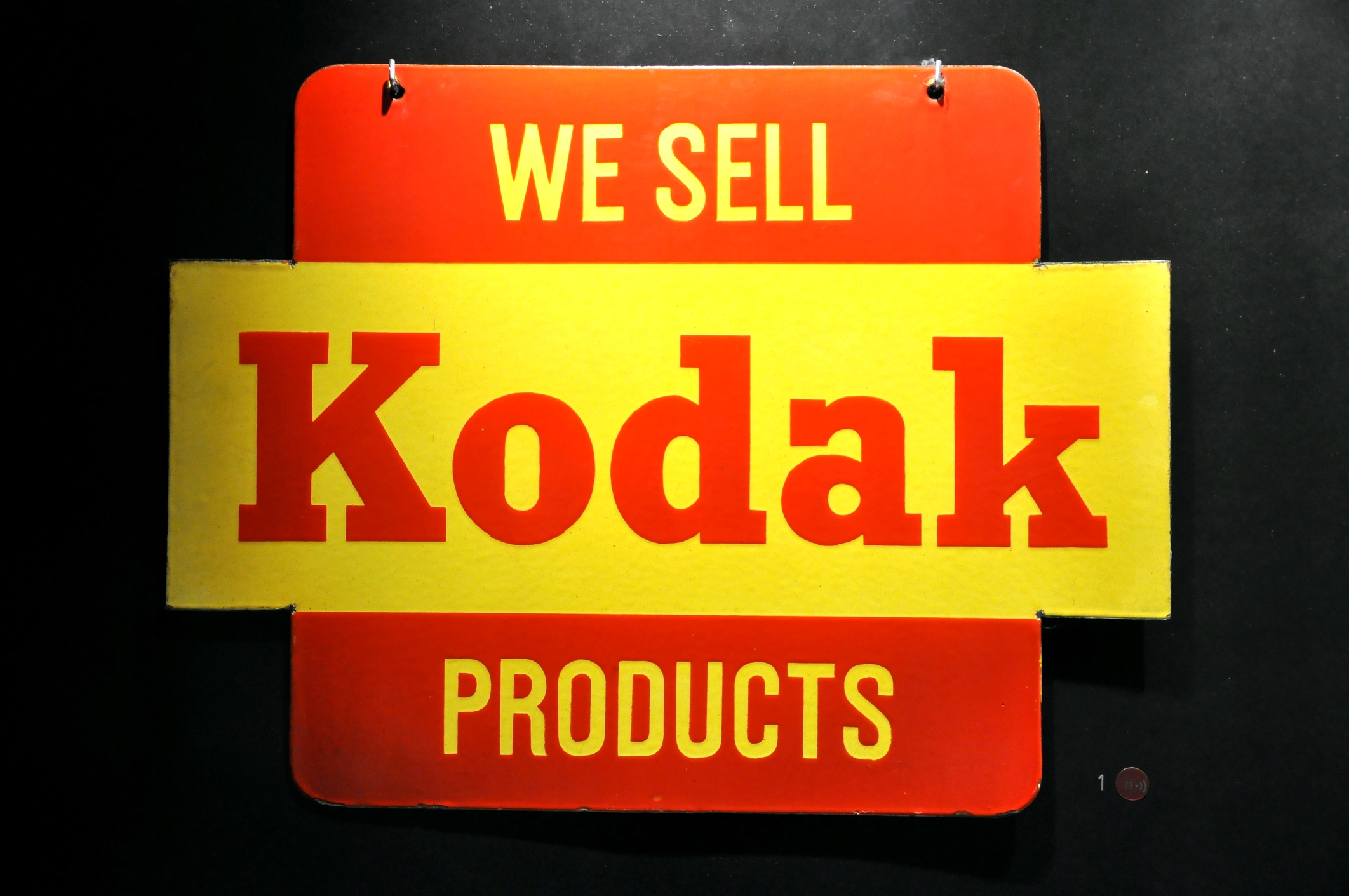
Camera giant Kodak is certainly no stranger to switching up its logo. But this year, it took a decided risk — hopping on the “retro” trend bandwagon. Now, Kodak is using the same logo that it did in 1971.
It’s a risk that paid off without muddling the company’s branding. The “K” is still completely recognizable, and the smart use of the company colors — red and yellow — ensure that consumers never forget the legacy of Kodak.
Subway Sandwiches
Sometimes, companies need to re-brand for more unpleasant reasons. After the sandwich giant’s spokesperson, Jared Fogle, was convicted of a particularly hideous crime, Subway made a smart move by choosing to rebrand.
In the past, Subway’s logo was somewhat three-dimensional. It centered on showing off the three colors of the brand — yellow, white, and green. Perhaps the most famous feature of the logo was the 2 subway arrows, pointing in the “uptown” and “downtown” directions on the first and last letters.
The new logo has kept the iconic arrows and colors but shows the brand in a new light. Now, the lettering is solid, with a bolder, more crisp font.
Subway has also done a wonderful job of taking advantage of all the re-branding opportunities that come with a logo redesign. They’ve also released videos of customers talking about their own “transformative journeys.”
Ready To Start Creating New Logos?
As you can see from the examples above, re-branding is a wonderful way to give your company and its image new life.
A logo re-design can introduce you to an entirely new customer base, pump up your social media presence, and show your competition that you’re not afraid to get with the times.
We know you’re ready to start creating new logos now! To get started, use our free online logo maker tool to play around with your options. Always remember to keep checking back with our blog for the latest innovations and trends in logo design!


