Why Building a Logo is Essential For Your Freelance Web Design Business
Posted on July 07, 2017 by Logo Design Tips and Tricks
Are you a freelance web designer who’s ready to get serious about their business?
Then building a logo should be at the top of your to-do list.
You might be thinking:
“Do I really need a logo?”
“A logo is a waste of time/money.”
“I’ll get a logo once my business is more established.”
Stop right there.
No matter what phase of business you’re in, creating a logo is essential. It’s the first step in turning yourself into a recognizable brand that people will remember – and buy services from.
If you’re not convinced, look at how much the most successful businesses invest in their logos.
In 2000, oil firm BP spent over $175m introducing their new logo.
Would they have bothered if logos weren’t that important?
No. If you’re ready to learn exactly why you need a great logo ASAP, you’re in the right place.
Get ready to discover the power of the logo.
What does a logo do?
A logo might seem small and insignificant, but that couldn’t be further from the truth. Your logo serves a variety of purposes, from making your business more memorable to advertising your skills.
Read on to find out what a good logo will do for you.
Helps clients remember you
Have you ever visited a restaurant with really unique decor?
Chances are it stuck in your mind.
The same concept applies to business logos.
A unique, memorable image helps clients to remember your brand and recognize you instantly. Maybe a client first notices your logo in a print ad. When they visit your website for the first time, they’ll remember who you are much more easily than if you didn’t have a logo.
This creates a feeling of familiarity and helps build trust, which is essential when you’re a new brand.
Gives an idea of what you do
Your logo should express who you are.
Maybe you specialize in web design for artists? Your logo could be a paintbrush overlapping a cursor. Or perhaps you mainly design websites for tradespeople? Your logo might combine a hammer with a computer monitor.
Whatever you decide on, your logo should give people a pretty clear idea of who you are and what you do.
It doesn’t have to be as obvious as the examples above.
If one of your brand values is simplicity, your logo could be very minimalist to reflect that. Just make sure your logo is unique to your business.
If you’re building a logo that looks like it could work for any web design business, it’s probably not quite right.
Makes your business look more professional
A business without a logo just doesn’t look professional.
A professional-looking logo goes a long way toward building trust and establishing yourself as a legitimate freelancer. This is especially important when starting out, so don’t wait until you’re turning a profit to start building a logo.
Why is a logo so important for freelance web designers?
While building a logo is important for every small business, it’s even more significant when you’re a freelance web designer.
Why?
Because your logo is the first example your customers will see of your design abilities.
If your logo looks sleek, professional and attractive, potential clients will be impressed. If it’s poorly-designed or doesn’t exist at all, nobody will be convinced that you’re up to the task of designing their site.
Who wants a web designer that can’t even design their own logo?
When designing your logo, you should consider the following questions:
- Does this reflect the type of web design I’m capable of?
- Would I be happy to use this logo on a client’s site?
- Does this logo look good online and in print?
- Is this a logo that will make people go, ‘Wow, that’s what I want, too’?
- Is there anything about this logo that could put clients off hiring me?
If the answers to these questions mean that you need a drastic redesign, don’t worry.
It’s better to take some time getting it right than lose clients because of a poor logo design.
How should you go about building a logo?
So, you’re convinced that you need a logo for your freelance web design business… but how do you build it?
Here are some tips to help the design process run smoothly.
Keep it simple
A logo should not be busy or overwhelming.
It’s a quick visual cue to remind people of your business – not a work of art. You should stick to simple shapes, a limited color palette, and not too much text. Remember that the more you add to your logo, the more mental effort it will take for clients to recognize it.
Before introducing a new element, ask yourself if it really needs to be included.
Very often, the answer will be no.
Experiment with designs
It’s rare to hit on the perfect design first time, so try a few different ideas for comparison.
You might try the same design in different colors, arrange elements in alternative formations, or stick with the same base colors for several different designs. Look at the logos side by side, and give a score to each.
If possible, get input from others too, then tally up the final scores to help you decide which logo is best.
Make it timeless
You want your web design business to last for a long time, right?
Then your logo needs to be timeless.
Avoid any gimmicks or design choices that you think will quickly go out of date.
Stick to designs that have been popular for a long time – think bold colors and simple shapes, and look to long-established companies for inspiration.
Don’t get stuck with a logo that looks amazing for a year, then becomes hopelessly dated.
Building a logo is one of the most important things to do if you want your web design business to be successful. Show companies why you’re the perfect person to design their website with a logo that reflects your skills.
There’s no time like the present, so get the ball rolling by sketching out some logo ideas right now.
How to Sell Your Timeshare the Right Way With Logo Redesign
Posted on July 07, 2017 by Logo Design Tips and Tricks
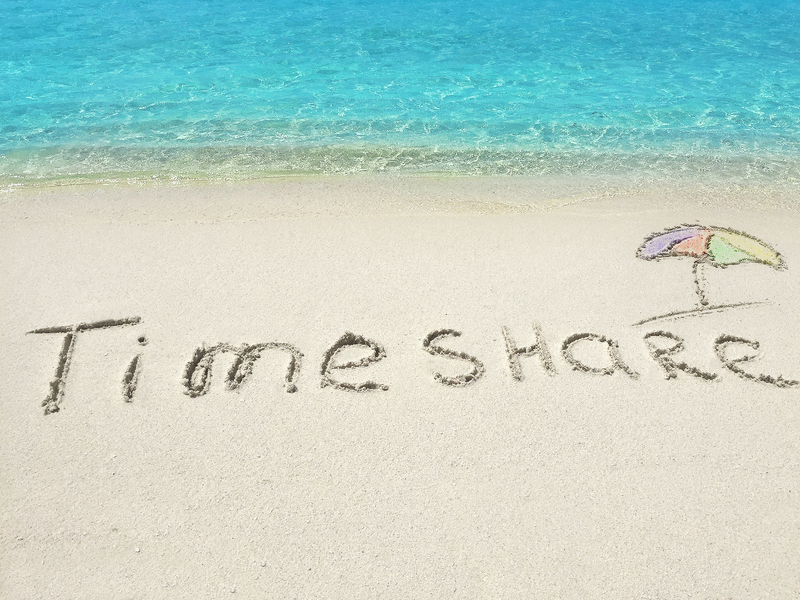
Selling a timeshare isn’t always easy. But once you find willing buyers, it’s similar to selling a house.
As it stands, only 9 million households in the U.S. own at least one timeshare. That leaves plenty of potential prospects.
But if you’ve been unsuccessful in selling your timeshare, you might want to consider redesigning your logo.
This article will take a look at how you can sell timeshares faster with a good logo redesign. Keep reading to find out what steps you can take to garner more attention with your logo!
Simplify Your Current Logo
It may be tempting to completely overhaul your current logo and add many elements and colors. In reality, this is the wrong approach. Often times, complexity works against you.
When redesigning your logo, you want to aim for something simple yet different. Why? Well, there are several benefits to simplifying your timeshare logo.
For starters, a simple logo is direct and easy to remember. It allows your audience to grasp your brand’s message right away since there’s no room for confusion.
Also, simpler logos are easier to scale. Plus, you can use them in any type of media. On the other hand, complex logos are harder to copy and resize properly.
Reassess Your Color Scheme
After your logo is nice and simple, you want to look at your color scheme.
Colors can have a significant impact on what moods your brand evokes. If you choose the right color in your logo, you can strengthen your message even more.
For example, black is an excellent color choice for timeshare resale companies. It signals a powerful, formal message. Blue is also ideal because it gives off a professional and trustworthy vibe.
You can also use red if you want your brand to appear warmer, and green if you want to seem more ethical.
When going through the process of logo redesign, you can try using multiple colors as well. That said, limit your logo to two colors. Otherwise, you’ll water down your message too much and confuse your audience.
Optimize Your Font
Much like colors, fonts can either add to your brand message or subtract from it.
Therefore, make sure your font is consistent with your overall theme. You don’t want to pair a formal symbol with a silly font. Instead, you want your font to compliment the symbol in your logo.
Keep in mind that the most important aspect of any font is legibility. You won’t unload any timeshares if nobody can tell what you’re selling in the first place.
Lastly, if you choose to use multiple fonts in your logo, make sure they compliment each other. This will allow you to highlight certain words. But simplicity comes into play here too, so don’t use more than two fonts.
Start Your Timeshare Logo Redesign
At this point, you probably have a few ideas for your logo redesign project.
Keep in mind that you don’t always need a drastic overhaul to your logo. Simplifying your current logo can help you deliver a stronger message.
Also, don’t forget to consider revamping your color scheme. The right colors can go a long way in setting the mood for your brand.
Start trying out new designs with our free online logo maker tool. Also, feel free to leave a comment below if you have any other redesign ideas!
The Science Behind Fashion Logo Design Colors
Posted on July 05, 2017 by Logo Design Tips and Tricks

Logos are an important component of any company’s marketing strategy.
A clear, recognizable logo helps to establish a company’s brand. Customers will begin to associate your company with that logo, which will help encourage repeat business. This builds your company’s visual identity.
That said, not all logos are created equal.
You want your fashion logo design to resonate with customers. To do this, it must incorporate certain design principles that will make it visually appealing and compelling.
Studies show that using the right color combinations in a logo can increase brand recognition by up to 80%.
While color choices might seem like a matter of preference, there is actually a science behind it. Paying attention to color theory will help you create a more effective fashion logo design.
Let’s take a look at how to science of colors can impact a logo.
Color Influences Emotion
Have you ever seen a particular color, and it raises a variety of emotions?
It’s not just your mind playing tricks on you. There is ample evidence that colors actually have the ability to influence emotion.
Colors are generally divided into warm and cool colors. Warm colors are your reds, yellows, and oranges, while cool colors are your blues, greens, and purples.
Warm colors tend to arouse active emotions. This can include emotions like anger or anxiety, as well as excitement and creativity.
By contrast, cool colors lead to passive emotions. Cool colors can make people feel calm, or comfort, but can also lead to melancholy.
When choosing the colors for your logo, think about what kinds of emotions you want customers to experience.
For instance, if you want your brand to be associated with fun and high energy, then you might want a fashion logo design that includes red or yellow. If you would rather communicate consistency or dependability, colors like blue and brown might work better.
Memory Affects How We Perceive Color
Another way colors affect people is by bringing up associations with that color. Memory can certainly have an impact on the way we perceive colors.
Sometimes this can be deeply personal.
Perhaps it’s the color of your favorite crayon from kindergarten. Or, maybe it was the color of your prom dress.
In other cases, a universal memory and or association is brought up. For instance, most people associate the color green with nature or the color blue with water.
If you want your customers to associate certain environmental or cultural features with your company, color choice can influence that.
Shades and Hues
When it comes to fashion logo design, the color itself is not the only factor to consider.
Colors come in different shades and levels of brightness. Whether a particular color is dark, dull, light, or bright can impact how customers perceive it.
For instance, dark colors tend to indicate a more serious, or somber tone. Bright colors are more lighthearted and playful.
The shades of colors you use can influence what customers believe your business is about.
Take pastel colors, for instance. These colors are typically associated with babies. Using them in your logo could lead customers to assume that your brand is for children.
Dark colors, on the other hand, may lead customers to believe that your brand is geared towards professionals.
Whatever shades of colors you choose to use, keep these associations in mind. You always want your color choices to complement your brand identity, rather than confuse it.
Making Colors Work Together
While many logos are monochromatic, other logos use two or more colors.
Using multiple colors in your logo can help your company draw on different aspects of different colors.
For example, you can use colors that are similar to each other, like blue and purple, to emphasize the use of a cool color palette. This will reinforce the associations with cool colors.
Or, you might choose to use contrasting colors. Using blue and yellow in the same logo can tell a more complex story about what your brand is.
How Color Affects Fashion Logo Design
While there are many scientific facts about the impact of color in general, there is also specific research on how color is perceived in fashion.
Obviously, color is extremely relevant in the fashion industry. The color of a certain piece of clothing has a great impact on how a customer will react to it.
Additionally, the color of your fashion logo design will influence how customers perceive your brand overall.
For instance, blue in the fashion industry is associated with competence and confidence. Think of the blue shirts and navy blazers that businessmen often wear. Blue is considered a classic and reliable color.
Meanwhile, colors like green are considered more rugged or outdoorsy. Purple brings with it an air of sophistication or even royalty.
You should choose the colors for your fashion logo design based on what you want customers to think of your company.
If you are marketing mostly to customers who need professional clothing, blue should appear in your logo. Or, if you want to show that your clothing is high-end, purple might be a better choice.
Building Your Brand
At the end of the day, there are no right and wrong answers when it comes to choosing the colors for your logo. Rather, the colors you use should be based on the preferences of your customers, and the goals of your brand.
Remember, the purpose of your logo is to create a brand identity. You want customers to look at your logo, and immediately make associations that help them understand what your business is about.
You also want something that will stick in your customer’s mind. This way, when they see your logo in an advertisement, or on a product label, they will immediately call your business to mind.
If you’re ready to start working on a fashion logo design, then check out our free logo creating tool. You can incorporate the principles you’ve learned in this post into making an awesome logo for your business.
The Role of Color Psychology in Jewelry Logo Design
Posted on July 05, 2017 by Logo Design Tips and Tricks
You know all about the latest color trends when it comes to jewellery design. You have pieces in rose gold and have adorned your necklaces with show-stopping pendants in every shade of the rainbow.
But what role does the psychology of color play in your jewellery logo design or re-design?
Read on to find out.
The Fire Shades: Red, Orange, And Yellow
When you’re picking shades for the pieces you display in your online jewellery company, you likely think about what would look good on a variety of skin tones, is representative of your brand, and is up-to-date with current trends.
The same should be said of your logo colors.
First, we’ll examine the psychological impact of fire shades.
Yellow
Yellow is associated with optimism.
If you design pieces primarily sold for special occasions — graduations, engagements, or birthdays — be sure to include lots of yellow in your logo. It will make shoppers excited about the road ahead, while instilling a sense of joy in them.
Red
Red is a color you need to be careful with.
While it’s great for making customers stop and pay attention, it’s also been proven to cause stress and raise blood pressure levels. People also associate it with sales — meaning that if your products are higher-end and expensive, you’re setting shoppers up for disappointment.
To temper the psychological side effects, use red in your logo design when associated with a natural image, like a rose.
Orange
Orange reminds customers to think outside of the box.
Psychologically, we associate the color orange with excitement, risk-taking, and confidence. If your line is more avant-garde, play into it by using orange in your design.
The Soothing, Regal Shades: Blue, Green, and Purple
Now, let’s take a look at shades that carry more symbolism psychologically than the fire shades. Blues, greens, and purples make us think of certain experiences and can alter our perceptions of ourselves and others.
Blue
Blue calms down and relaxes anyone who sees it — after all, why do you think so many of us feel calm by the seashore?
If your brand wants to convey a sense of dependability and stability, be sure to include this hue in your logo.
Green
Psychologically, we associate green with nature. Are you a natural, hand-made artisan jeweler? Do you take inspiration from images of the woods or other natural elements?
If so, be sure to include this shade in your logo.
Purple
Purple has long been associated with royalty and expense, meaning it’s a perfect color choice for the logo of a high-end brand.
It also has psychological associations with fantasy, making it a great choice for jewelers selling costume jewellery or with designs rooted in the inspiration of a by-gone era.
Create Your Jewellery Logo Design Today
Birthstones aren’t the only way to get symbolic when it comes to the colors you use in your jewellery line.
As you’ve learned from this quick post, the colors you choose to include in your jewellery logo design can evoke certain feelings in your target market. But just like when you’re stringing beads, sometimes it can take a few tries to get the perfect combination.
Use our free online logo maker tool to test out a variety of jewellery logo design options. Make sure your logo looks as lovely as your pieces themselves!


