The Best Ceiling Fan Logos Are Cool. Is Yours?
Posted on July 28, 2017 by Logo Design Tips and Tricks
A ceiling fan may not be the first element you think of in home design.
But the truth is that the ceiling fan is the focal centerpiece of any room. And the design of the fan can make – or break – that room’s appearance.
Whether your company sells traditional or modern ceiling fans, you need a logo that will attract homeowners to your business.
How can you create a solid home decor logo that will enable you to stand out from the competition? Read on for five ways to create the best ceiling fan logo.
Choose the Right Color
The human brain is hard-wired to respond certain ways to certain colors. Color offers a powerful, nonverbal method of communicating meaning and mood in logo design.
- Warm colors such a red, orange, and yellow are usually used to convey energy, warmth, and playfulness.
- Cool colors like green, blue, and purple are often associated with serenity, calmness, and harmony.
- Neutral tones like gray, brown, and black are typically viewed as earthy, classic, and practical.
Which color is right for your company logo?
Avoid Cliches
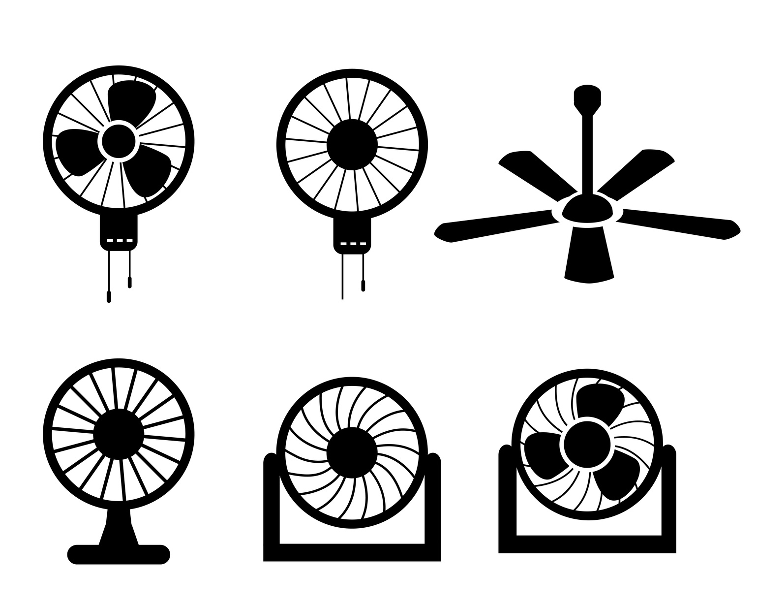
Sure, you could incorporate a fan into your logo, like hundreds of other companies. But that’s hardly going to make you stand out from the crowd.
The best logos – for ceiling fans or any other product – are unique. You have to think outside of the box. Delta Airlines doesn’t use an airplane for its logo, just like Apple doesn’t use a computer.
Think long and hard about your brand until you come up with something other than the standard cliche.
Use a Custom Font
Speaking of cliches, nothing could be more cliche than being the millionth company to use Papyrus font.
A great way to break the mold is to use your own custom font. If you want to make a standout logo, team up with a designer and create a font that suits your brand’s personality.
Are your ceiling fans classic? Colorful? Minimalist? Ornate? Your font should be a reflection of your products.
Keep It Simple
It’s tempting to cram as much information into a logo design as possible. In reality, though, the most successful logos are the simplest.
What does Nike use? A swoop. What does McDonald’s use? Golden arches. These designs are incredibly simple, yet they’re recognizable in an instant.
That’s the kind of logo design you want for your ceiling fans.
Incorporate Motion
A recent trend in logo design is to incorporate movement or a sense of action.
The logo for Twitter originally began as a perched bird to a bird taking flight. Recently, they updated their logo again so the bird is flying in an upward direction instead of straight ahead.
What are some ways you could incorporate movement into your logo design?
Final Thoughts
A logo is your customers’ first impression of your company.
Don’t simply slap your company name into a box and call it a day. To get the best ceiling fan company logo, give it some serious time and thought and define what makes your business different than the rest.
Are you ready to design your logo, but you’re not sure where to start? Please contact us with any questions or concerns you may have.
Stay Secure With These 5 Tips On Designing A Driveway Alert System Logo
Posted on July 27, 2017 by Logo Design Tips and Tricks

Many people make the false assumption that it’s easy to design a logo. However, logos are much more complicated than people realize. A logo is the visual representation of your brand.
If you’re looking to design a logo for your driveway alert system business, then here are the top 5 tips for designing a logo that makes people feel safe and secure!
1. Consider the Purpose of Your Logo
Before designing a logo, you need to establish what the purpose of your company is and what you’re trying to achieve.
Doing some research on your competitors could help to work out what makes your brand and product unique. You need to reflect your unique selling point in your logo.
You can ask existing customers for feedback on your ideas about logos.
2. Keep It Simple
It’s important to avoid going over the top and too flashy when designing a logo for a driveway alert systems company.
If there is too much going on in your logo, then it won’t be recognizable to potential and existing customers.
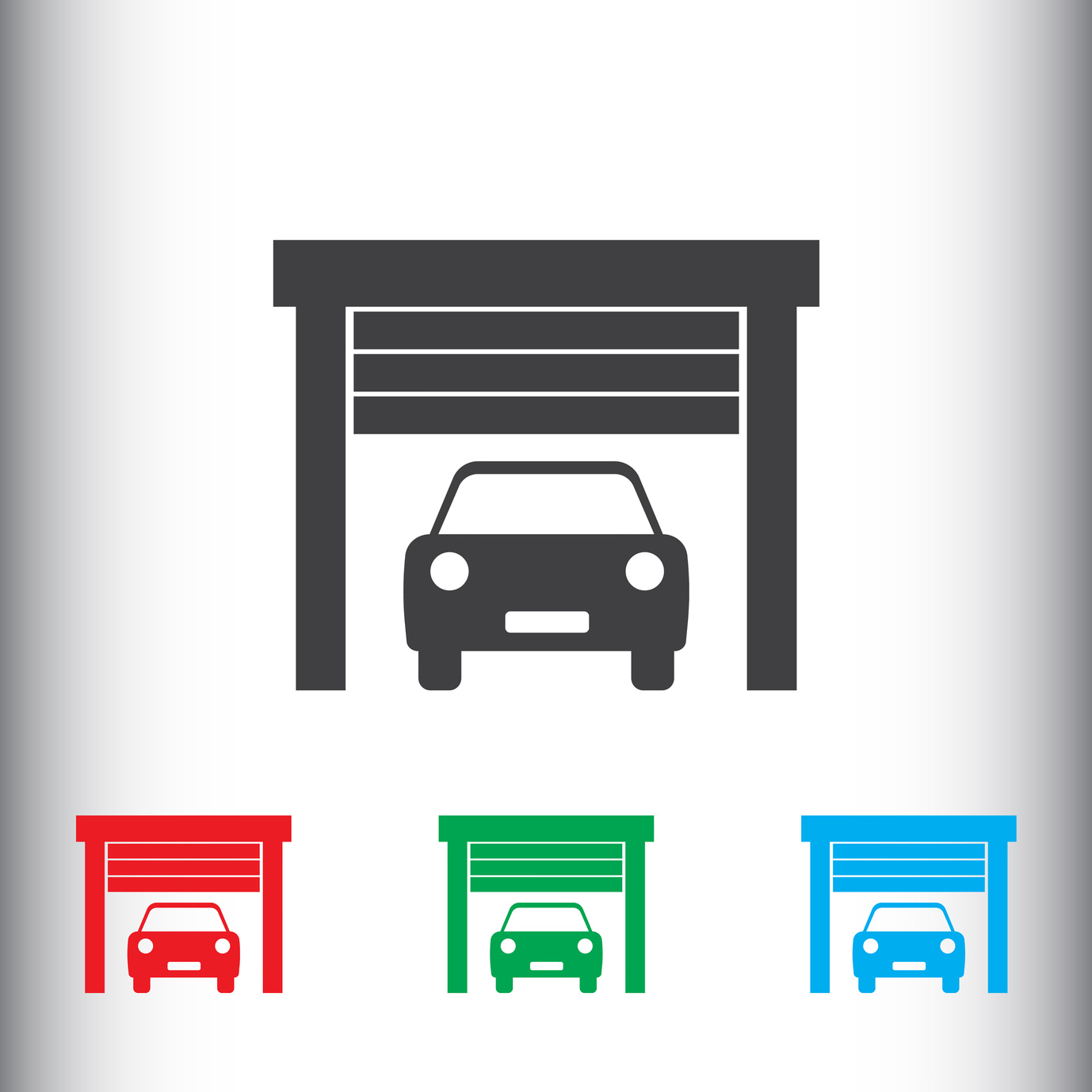
Logos represent your brand – driveway alert systems need to evoke security, safety, and trust. Maybe include a symbol representing an alarm, a camera or even a padlock to represent security and safety.
3. Where and How Will it Appear
Before designing a logo it’s important to consider where it’s going to be used and how it will appear to customers. There is a wide variety of places you can display your logo; business cards, posters and billboards, social media and websites.
This is important to consider in advance because if you design your logo with lots of details, then it may not be visible in a smaller format on social media.
4. Color and Fonts Matter
Many people associate colors with different feelings or ideas.
For example, perhaps you could use blue for your logo because research shows that many people associate blue with security, trust, and order. Once you have decided which color to use, then be consistent throughout your marketing.
You may also want to choose a font for your driveway alert systems business. But remember that many of the most recognizable logos, such as Nike or Apple, don’t have any text. When considering fonts select something that is clear and reflects your brand.
5. Be Creative and Original
Being creative with the design of your logo doesn’t mean being complicated. It’s about creating something new and original that stands out against your competitors. This sometimes requires thinking outside of the box.
Coming up with an original logo is not easy. But it’s useful to think beyond the simple image and text. Instead consider the possibilities of using negative space, shadow, and double meanings to create a great logo.
Final Thoughts
Now that you have all the 5 top tips for designing a great logo for your driveway alert systems company, you’re ready to start our online logo making program. On these programs, you have the ability to create, edit, and complete your company logo. Follow these 5 tips to ensure you have a great logo for your driveway alert systems business.
5 Must-Have Design Trends For Your Garage Logo
Posted on July 26, 2017 by Logo Design Tips and Tricks
Designing a logo is no walk in the park.
From colors to text and graphics, there’s a lot to the process. A good logo should convey the organization’s message in simple, easy to understand terms.
According to legendary designer Dieter Rams, good design needs to be both aesthetically appealing and be easily understood.
Any designer will tell you that walking the fine line between creating a simple, timeless design and one that is easily understood by the customer can be a tough task.
If you’re working on coming up with a new garage logo for your company, keep reading for a closer look at 5 design trends design trends that will help keep your new logo modern and fresh.
Keep It Minimal
In case you haven’t noticed, minimalism is all the rage. From design to lifestyle–simple is in.
It might sound counterintuitive, but simple logos often catch the eye of the viewer much more quickly than a more busy, complicated one.
If you want to give your garage logo a refined modern look, keep it simple and minimal. This business–providing garage door repair Austin–is a great example of minimal design.
Give Your Logo A Handmade Touch
For a unique, intimate look, try giving your logo a hand drawn or handmade look.
A hand drawn look can convey a sense of warmth and sincerity that is often not possible with other logo styles. So if you’re a small shop or feel like an intimate look fits your business, this may be a great choice for you.
Negative Space Is Your Friend
Another great design trend that may be a great fit for your garage logo is the use of negative space.
With this technique, a designer essentially cuts an image out of negative space. A classic example of this is the hidden arrow in the FedEx logo.
With the use of negative space, you can create a very simple logo that quickly draws the viewers eye.
Line Art
A line art style logo makes use of simple lines to draw an image or text. The logos also typically only employ a single color, often just sticking to black and white.
Line art logos create well-balanced images while adhering to a minimal aesthetic.
Flat Design Is Here To Stay
While flat design had already been around for a few years beforehand, Apple really put it on the map with iOS 8. The trend towards realistic, 3d-like designs has been replaced in favor of simple more timeless designs.
Forget the drop shadow and excessive color gradients and keep your designs strictly 2d for a flat, refined look.
Final thoughts on your next garage logo
Creating the perfect logo is tough. Afterall, your brand is important and choosing its most important symbol can be an emotional experience.
Starting with one of the trends above will get your design started off on the right foot. Just remember to keep your brand in mind when planning your logo. Your business’s message is central to your logo design.
If you stick to one of the trends above and some solid design principles, you should be all set to take a stab at designing your own logo.
5 Logo Design Trends to Distinguish a Virtual Voicemail Company
Posted on July 26, 2017 by Logo Design Tips and Tricks
Logos can be the very first introduction to a company. They immediately set the tone and vibe of the business they’re selling or representing. That can be a lot of pressure for a virtual voicemail company!
Companies looking to succeed should consider trendy logo design when developing their brand. (Don’t know if your current logo checks out? Try this resource.)
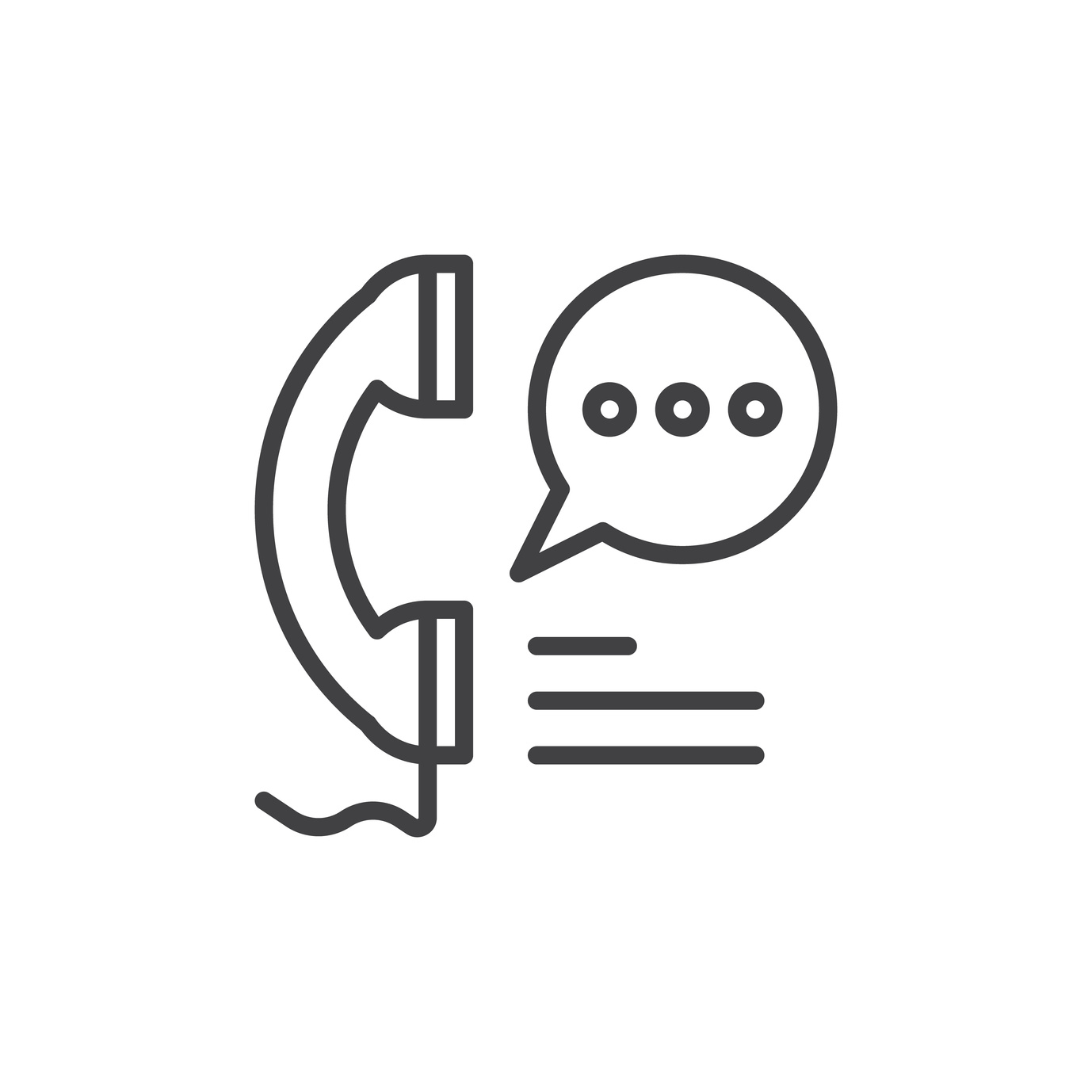
But how do you accomplish that and set yourself apart from the competition? For starters, voicemail companies might want to avoid sticking to a simple telephone symbol (unless you’ve got an unexpectedly creative design).
Let’s look into some current and forecasted logo design trends that are sure to draw the eye and please consumers.
Winning Logo Design Trends
1. Simple/Minimal Design
Simple and minimal is just the way things have been going for a while now. Thanks to everything since the year 2000, we see ourselves as futuristic, and products and design should be sleek and clean (just look at the iPhone).
Simple, clean, bold–that’s what consumers have come to expect. Your logo shouldn’t be any different. Companies should consider app buttons and how a logo will look inside them. (People spent 900 billion hours using apps last year).
Virtual voicemail companies should consider actionable app buttons with simple design that are easy to find.
2. Bolder, Brighter Colors
Dim blues and dark grays might look sleek and sophisticated, but it’s the brightly colored logos that are more likely to draw attention. If voicemail clients need to find an app button quickly, bright yellows and oranges will definitely help out.
According to a recent poll, around 85% of people named color the main reason why they bought a particular product.
3. Negative Space
Negative space is a creative way to blend objects or characters in a logo. This logo design trend certainly draws the eye by overlapping and using empty space in fun ways.
Look at the A&E channel logo to get an idea of what is meant by “negative space.” The USA channel logo also. Try playing around with designs like telephones, sound waves, and checkmarks using negative space.
4. Hand-Drawn
Hand-drawn logos are quirky and personal. They indicate that a company is geared more towards a light-hearted audience, which can be comforting.
Businesses that deal in more obscure products (such as voicemail companies) can benefit from a personal touch. Giving a personality or human touch to the company makes it less intimidating and more approachable.
5. Geometric Shapes
This one goes hand-in-hand with the simple/minimal design we talked about earlier. Geometric shapes prove to be eye-catching and easy on the eye at the same time.
Virtual voicemail companies may not need any relevant icons if the geometric shapes are attractive enough. Don’t restrict yourself to typical design expectations.
Crafting a Perfect Logo
Okay, there’s no “perfect logo” per se. The best ones just do their job really well: they attract, they’re familiar to returning users, and they can be recognized in a crowd of logos.
And where can virtual voicemail companies start with a great design? With an exceptional logo from Online Logo Maker!
Our services are complete and take into account current logo design trends. You can design a logo in ten minutes, download it in various formats, and save it for future downloads or edits.
Online Logo Maker makes it extremely simple to design winning, eye-catching professional logos.


