Elegant Inspiration for Your Jewelry Logo
Posted on August 03, 2017 by Logo Design Tips and Tricks
How do you create the perfect logo for something that speaks for itself?
The perfect piece of jewelry needs no explanation when you present it as a gift to someone. So how do you create a logo that will make just as much of a statement?
Online Logo Maker has been able to show you how to create some pretty riveting logos for your businesses. But what kind of logo will work the best for your jewelry business?
It is definitely a tall order, so make sure that your jewelry logo is perfect before you send it out to represent your company.
Come along as we help you to find some elegant inspiration for your jewelry logo.
Use A Simple Color Scheme
Just because you are designing a logo for a luxury brand, doesn’t mean you should go overboard with colors.
Don’t be afraid of minimalism. Make sure you go as simple as possible with your color scheme.
The best option would be to use one or two simple colors to play off of each other like black and white. You can also incorporate gold to mirror your own jewelry.
You should be looking not to confuse your audience with an over-the-top logo. Plus, you don’t want it to take away from the beauty of your pieces.
There are reasons why some of the biggest brands have such simple designs.
Use a Sleek Font
As with your color scheme, use a simple font for your jewelry logo. Leave the intricate designs for your necklaces and wedding bands.
The right kind of font gives shoppers a sleek and memorable way to recognize your brand.
If you couple the right colors with the right font, you can add your jewelry logo onto almost anything. You can even imprint it onto your own jewelry, to get anyone who sees it curious about what else you make have to offer.
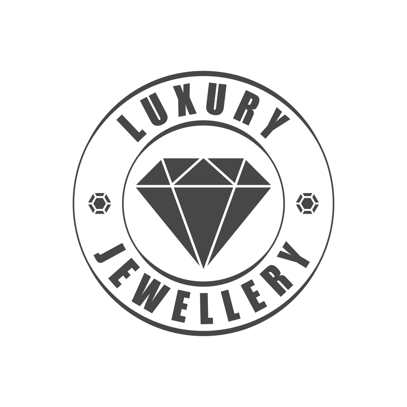
Incorporate Jewelry Into Your Logo
But how will people know that your logo is representing a jewelry company? Well, this is where you can add your own personal touch.
We would suggest that you add some sort of graphic of a piece of jewelry into your logo in a creative way. By adding font and color to a tasteful graphic to tie it all together, you will have a dazzling logo.
Take Glamira’s logo for their brand of platinum engagement rings. They take a simple font and color scheme and add the silhouette of a diamond to represent their brand.
Elegant Inspiration for Your Jewelry Logo
With these helpful tips, you will be able to create the best logo for your jewelry company.
It’s time to create a logo that’s just as unique and eye-catching as the pieces that keep your clients coming back for more. Of course, you might not get it right the first time! Use our free logo maker tool to help you test out different options!
If you have any more questions on how to spice up your logo, feel free to send us a message through our contact page.
How to Incorporate Shapes Into Your Baby Products Logo
Posted on August 01, 2017 by Logo Design Tips and Tricks
Every parent has a “hack” that has made living with the children easier. Some parents see the potential to turn this hack into a business.
It might be some attachment to a baby crib or a handle extension/back scratcher for a stroller. Whatever it is, you think it will make parenting easier and put some money in your wallet.
While there are a number of things that have to be done before you can take a product to market, we’re going to just focus on one of those. The logo.
Creating a logo for baby products entails not just an understanding of the appeal of your product but also the story that a logo can and should, tell.
Look at the Familiar
The best logos stand on their own, without a company name or other descriptor. There’s a good chance that you can draw a logo and someone would name who it represents right away.
Think the golden arches, an apple, the swoosh. Pretty easy right?
While those are all very distinctive logos from three separate business types, they do have one thing in common. Shapes.
Using Shapes in Your Baby Products Logo
A shape can tell a story.
It can evoke a feeling.
Understanding these can help you to utilize them in your logo design. Now think about your product.
Is it’s primary use for babies or for parents? While you of course always need to keep your purchasing audience in mind, your usage audience is important in this case as well.
You’ll want to evoke definite feelings in a parent that your product is useful, safe, and needed. Shapes can help you do this.
Indicating the Product
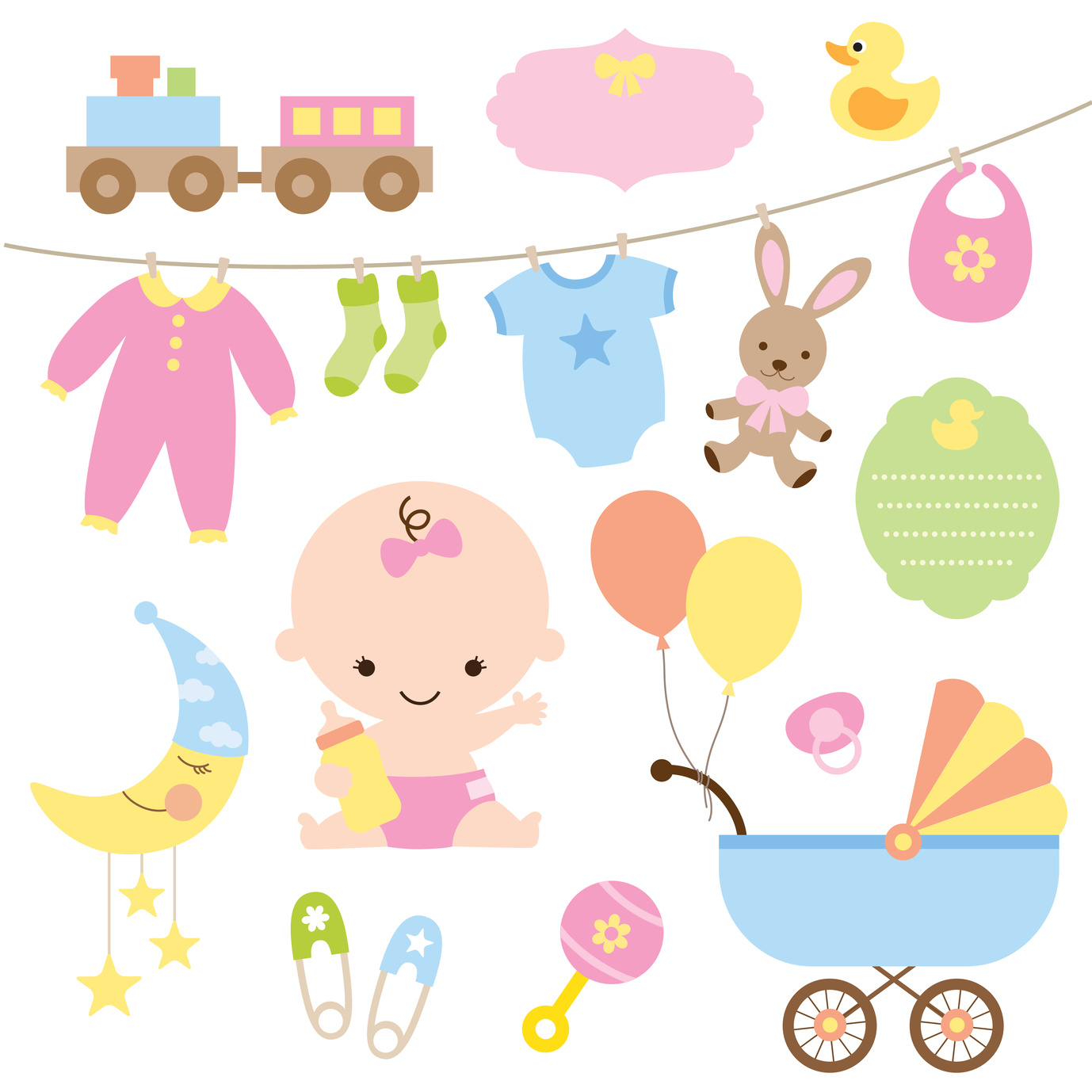
A popular trend is to use the logo to give a sense of the product it represents. Take for example the logo for the stroller company Baby Bug.
It uses soft, round shapes to indicate the shape of a stroller AND a ladybug. It’s a good example because it uses shapes in both a practical and fanciful way.
Another example is the company Tiny Love. They have a somewhat simple logo, it’s their name encased in a shape, one that represents a heart yet it isn’t a literal heart.
In these two examples, we see the two sides of the spectrum for using shapes in a logo for a baby product. Either in a literal “this is a picture of what we sell” style or in something more abstract.
Is there a better way to go? There is no universal yes or no to this answer because it depends on the product and the way that your particular company wants to represent itself.
Consider that earlier idea – is this for the baby or the parent? The answer to that may guide your decisions on the best way to use shapes.
The Total Package
We have to mention the importance of typography in your logo. Using the right font is just as important as the way you incorporate the shapes into the logo for your baby products.
Since this is about a baby product, it makes sense to use a phrase that parents have said since time began to illustrate this point. “It’s not always what you say but how you say it.”
The best logos use type, color, and shapes to tell a story. When considering incorporating shapes into your logo think about what story it should tell and how that story should make someone feel.
What Are The Different Types Of Logos?
Posted on July 31, 2017 by Logo Design Tips and Tricks

You know that an eye-catching logo is a key component of a successful business, but did you also know that there are different types of logos to choose from?
Read on to learn more about the different types of logos out there. We’ll also share some tips to help you decide which logo type will work best for your business!
Types Of Logos
Lettermarks
Lettermarks — also known as monogram logos — create a logo centered around a company’s initials. The logos for General Electric, CNN, and Hewlett-Packard are good examples of this.
Lettermarks are great for companies that have longer names and need a simple, streamlined logo.
One of the most important things to keep in mind when designing a lettermark is the type of font you will use.
When you use a lettermark for your company’s logo, it’s important that you choose or create from scratch a font that fits your company’s personality. A geometric font works well for companies with a more elegant style, while serif fonts are best for businesses with a more traditional message.
You’ll also want to make sure that whatever font you choose is legible so that people know which letters are being used. Your brand will definitely suffer if people can’t read your logo!
If you have a new business that you’re designing a logo for, it’s also helpful to print the company’s full name below the lettermark. This helps with brand recognition and lets people know immediately what the initials in the logo stand for.
Wordmarks
Wordmarks — also known as logotypes — are very similar to lettermarks. Instead of using letters, though, a wordmark is a font-based logo that uses the business’s full name. Major businesses that use wordmarks for their logos include Google, Facebook, and Visa.
Typography is important for wordmark logos, just like it is for lettermarks. Pick a font that reflects your business’s products or services and make sure that it is legible.
Other things you’ll have to keep in mind for both lettermark and wordmark logos are color, use of capital and lowercase letters, and kerning (the amount of space between letters).
A wordmark is one of the best types of logos for new businesses that need to get their name out there. However, they work best for companies that have a fairly short name. If your business’s name is too long, a wordmark might not be ideal since a long name will often make the logo design look cluttered.
Wordmarks also work well for businesses with distinct names that are easy to remember. Again, Google is a great example of this.
Pictorial Marks
Unlike the types of logos discussed above, which focus on words, pictorial marks — also known as logo symbols or brand marks — are icon-based. Some common pictorial marks include the Twitter bird and the Target bullseye.
This type of logo can be tricky for new companies since they don’t initially have strong brand recognition — there’s a solution for this problem further down, though!
When you use a pictorial mark for your business’s logo, the most important decision you have to make is, of course, which image you’re going to use. There are a few questions you need to ask when making your choice.
Do you want the image to relate to your company’s name? Do you want it to say something about your product? Should it evoke a specific emotion?
A pictorial logo doesn’t have to be a specific image image, either. Lots of company utilize abstract marks in their logos — for example, Nike uses the swoosh image and the Pepsi has its split circle logo.
Abstract marks are great because they give you freedom to design a logo that represents your business without any cultural implications attached to a specific image.
Whether you choose a specific image or an abstract one for your pictorial mark, you’ll want to make sure that it’s simple enough for people to remember and recreate. A complicated image won’t stick in people’s minds easily, and it will also be difficult to print on your merchandise and business cards.
Pictorial marks are great for companies that want to take their brand worldwide. This is especially true if your business’s name is difficult to translate. However, they’re not ideal if you think your business model might change later on.
Mascots
A mascot is a character that represents your company, like the Kool-Aid Man or Tony the Tiger. When properly utilized, the character will become synonymous with your brand.
Mascots are an especially useful logo type for brands that want to appeal to families and children with their product or service. This is why so many brands that sell food or toys incorporate mascots into their logo design. Mascots increase familiarity, encourage customer interaction, and are overall excellent marketing tools.
If you’re thinking about the type of mascot you want to use for your business, remember that they can be difficult to transfer across platforms. This is especially true if you’re planning on using a highly detailed illustration of your mascot.
As with other logo types, it’s best to keep your mascot illustration as simple as possible. If it’s too complex, it will be hard to transfer to small things like business cards.
Combination Marks
As the name suggests, combination marks combine elements of multiple types of logos. They usually combine a pictorial mark or mascot with either a wordmark or lettermark to create a unique logo.
Adidas, for example, uses both a pictorial mark (the flower) and a wordmark (the company name) in its logo.
Combination marks are great for new businesses that don’t yet have a lot of brand recognition.
When you put an image and your name together you can set yourself apart from your competition, establish your brand, and make sure people know your business’s name right away.
This type of logo is also nice because it gives you some flexibility with your branding. Once you gain more recognition, you can drop your business’s name from the logo and rely solely on the image, if you want. You can also use the image by itself in certain cases and the full combination mark in others.
Combination marks are also one of the most popular types of logos because they’re easier to trademark than logos that are just based around an image.
Emblems
Emblem logos consist of a font inside of a symbol like a badge or a crest.
Starbucks and Harley-Davidson are two major brands that utilize emblem logos. Many schools and government agencies also rely on them because they have a classic style and are usually easy to recognize.
When designing an emblem, make sure that it is fairly simple so that it can be recreated across different platforms. An overly complicated logo will be difficult to embroider on clothing or print on a small business card.
Emblems are hard to get right because it’s difficult to split them up or downsize them so they can be used on a variety of products. Because of this, they are used less frequently than other types of logos.
However, just because they’re rare, that doesn’t mean you shouldn’t use them. When done well, emblem logos can really make a statement and set your company apart from your competition.
Other Things To Consider
You now know what the different types of logos are, but how do you decide which type is best for your business? Remember, the logo is one of the most important aspects of your business — especially if you’re a new company that doesn’t have a lot of money to spend on advertising.
Personal preference should be considered before pulling the trigger on a type of logo, but you should also think beyond just what you like. When you’re choosing between the most popular types of logos, there are a few things you should keep in mind.
Be strategic. Ask yourself the following questions when deciding on the type of logo you want to use to represent your business:
- Is it different from my competitors?
- Is it simple and easy to replicate and recognize?
- How will it look on my company’s products?
- Can I easily implement it across different surfaces (T-shirts, brochures, business cards, mugs, etc.)
- Does it match my company’s core values and message?
- How will it tie my brand together?
- Is this the image I want my company to have for a long time?
- What emotional response will people have to it?
Start Designing Your Logo Today
Now that you know a bit more about the different types of logos out there, it’s time to make a decision and create your own!
If you’re feeling lost or unsure of your design skills, don’t worry. There are tons of tools out there that can help you create the best logo for your company.
Did you know that we have a free online logo maker tool? Give it a try today!
If you’re still having trouble coming up with a good logo, check out our blog for some great design tips. We can’t wait to see what you come up with!
A Guide to Creating Crystal Clear Window and Door Company Logos
Posted on July 28, 2017 by Logo Design Tips and Tricks
Clear window and door company logos is a boost to any business. It covers products and company material in a way that solidifies the best brands and keeps customers coming back for more.
And nothing is more important than clarity when it comes to the visual properties of your logo. Not only will it be easily recognizable, a clear logo will work wonders on your windows and doors to announce your quality and unique capabilities.
When we think of the most iconic logos they all have clarity in common. They use pictures, colors, and contrast to be clear and bold from any distance.
Make sure your logo is clear and bold too. Here’s how:
Typography for Door Company Logos
The best logos announce quality from a single glance. But they continue to hold value over time and gain recognition and strength.
You may get to a point where your logo design is so recognizable, like Rolex or Target, that you might not need words.
But many logos, from Coca-Cola to Google, embed typography and words into the logos themselves. Most small businesses will need a similar approach at first.
When using words remember you need to make a clear impression right away. A fancy font may look cool but does it have the clarity to carry your company name from a distance?
Don’t let the words get lost. Especially on doors and windows, you need a clear statement that is easy to see.
Color Theory
High contrast colors will make it easier for people to see your logo. And the right colors will also let potential clients start to associate emotions with your brand.
There is a difference between warm and cool colors and the feelings they project. Cooler tones like blues and greens might be more associated with stability and comfort.
Warm tones are exciting and fun.
Whatever emotion you convey, using contrasting colors can make a logo pop and be more clear for any viewer.
Make Sure You Have A Clear Canvas
When we think of McDonald’s we think of the golden arches. When we think of Apple there is a glowing shape beckoning from the back of an iPhone or computer screen.
In logo design, a logo is only as good as its placement. For ultimate clarity in window and door company logos, you need to make sure your logo is on the best quality surface.
Whether your logo is on replacement windows in Ventura County or announcing your company brand anywhere in the world, make sure you match the finest logo with the finest glass.
Make It Yours
Clarity isn’t just a quality of eyesight and vision. Clarity is a quality of singleness of purpose and great branding.
A clear logo doesn’t just look great it announces the unique properties of your brand. Make sure you design a logo that is clear about your brand.
The good news is you can use the latest trends and still come up with a clear logo for your business.
More than 3 million brands have used Online Logo Maker to build their brand. We can help you too.
Check out our tutorial today and see how easy it can be to design a logo for your brand.


