5 Tips for Making a Logo for a Student Loan Debt Relief Agency
Posted on August 14, 2017 by Logo Design Tips and Tricks
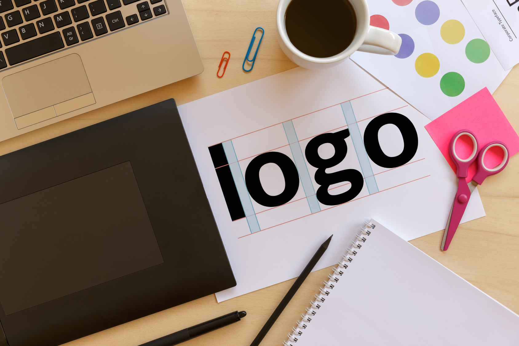
Are you working on designing a logo for a student loan debt relief agency?
As with all industries, a logo often serves as the face of a brand.
A great logo will provide potential customers with a memorable image of the brand that they will return to time and time again.
Here are five tips to springboard your creativity for your student loan debt agency logo!
1. Research Your Audience
Get inside the minds of the target audience for a student loan debt agency.
Most likely the target audience for these types of agencies will be college graduates or parents.
Research what types of colors speak to these demographics of people so that you can create an appealing design.
For example, light blue colors may appeal to people in their twenties, while older adults might resonate with reds and orange hues.
2. Know What Messaging to Use
As you consider your audience’s color preferences, also consider the verbiage in your logo, if it includes text.
Pull familiar buzzwords from popular student loan debt websites such as the Department of Education’s Student Loans page.
Don’t be afraid to include a description of services or even the agency name in the logo.
For example, you could include something like student loan counseling or Navient Student Loan Forgiveness, if the agency is offering consultations to students or debt forgiveness services.
Simply put, make sure any text in the logo speaks to the end user and is in a readable, clean font.
3. Consider the Digital Impact
After making initial decisions regarding color and verbiage, make a note of where the logo will be used.
Will it be displayed primarily online on the agency’s website and social media?
Will it be used in print advertising or even video commercials?
The final media that will include the logo will dictate the resolution and size, so be sure to take this into account before you start laying the groundwork for your design.
4. Make It Your Own
Like many art forms such as music, video, and architecture, graphic design is present almost everywhere we go.
While it’s important to gain inspiration from other brands, be careful not to follow trends too closely or blatantly plagiarize the image of another company.
Create a logo that is unique to the agency brand.
The company will certainly reap the benefits that come with brand imagery that is fresh and engaging to its audience.
5. When In Doubt, Keep Your Student Loan Debt Agency Logo Simple
If you’re feeling overwhelmed and not sure where to start on the logo, take a step back to basic elements of design.
Some of the world’s most popular logos have flair and longevity because of their simplicity.
Consider Apple’s logo, the signature Coca Cola font, and the Nike Swoosh logo.
So here’s a final tip as you build a logo for a student debt relief agency: pick one simple design element and color as your base and expand from there as necessary.
Off To The Drawing Board!
With these five tips under your belt, you’re all set to open up Photoshop and start designing the perfect logo for your student loan debt agency client.
Have you seen any logos lately that really stood out to you? Let us know in the comments!
Be sure to contact us if you have any questions along the way. We would be happy to help you craft a logo that really stands out for your company!
How to Make a Logo for a Psychology Practice
Posted on August 14, 2017 by Logo Design Tips and Tricks

Are you looking to brand yourself and your psychology practice? Making a beautiful logo is an important part of setting yourself apart from the competition.
Seem too complicated? Too expensive? We promise, it’s neither.
Let’s get into the handy guide to help walk you through designing your company logo.
Your Psychology Practice Logo
Focus on Shapes
We associate shapes with certain feelings and expectations. They even have a significant impact on how we internalize the world.
For example, circles create a sense of connectedness, unity, and harmony. This is a goal most clients are actively trying to achieve, right?
Squares emphasize a sense of order and discipline. They can convey the notion of stability and routine.
Horizontal lines show a sense of equality and connection. They encourage a feeling of open-mindedness.
You may want to check out some sample designs to get an understanding of how different shapes make you feel. These designs may also help you better pinpoint the kind of image you want to convey to your future clients.
Nail Down Your Color
If you run a psychology practice, you probably know that color has an impact on behavioral functioning.
This is also true for marketing and branding. A majority of consumers point to color as the main motivator for purchasing an item or service.
Consumers gauge product and service effectiveness by the visual appearance of your logo. So, it’s worth taking seriously.
Start with identifying the emotions of each color.
According to color psychology, green demonstrates a sense of growth, peace, and health. This is commonly seen in organic brands and environmentally-friendly companies.
Purple demonstrates creativity and free thinking. It’s commonly seen in children’s toys, specialty restaurants, and TV channels.
Red demonstrates sharpness, boldness, and dominance. It’s seen in department stores, leading beverage brands, and children’s games. Use this color for ascertaining authority and power.
Yellow demonstrates warmth, optimism, and joy. It’s used in television shows and phone companies.
Blue demonstrates dependability, consistency, and safety. This makes it a popular choice for hardware stores, department stores, hygienic products). Blue is a safe color for showing a sense of practicality and stability.
Depending on the type of psychology practice you specialize in (i.e: focusing on play therapy with children versus working towards your hypnosis license), your color needs will vary.
Keep it Simple
Think about the work you engage in with your average client.
Strong psychological work focuses on maximizing pleasure and minimizing pain. It is about simplifying life and eliminating unnecessary people, places, or things.
With that said, your logo should match the message you want to convey. Remember, a cluttered logo makes for a cluttered mindset, and this is often opposite of what you’re aiming to achieve.
Final Thoughts
Making a logo for your psychology practice doesn’t need to be complicated.
In fact, it can be quite fun. Following a tutorial is a great way to understand the steps for making your perfect image.
Remember, edits and needs will change over time, and that’s okay. Just like your practice will likely evolve, your branding and marketing will as well.
Copier Rentals and Creating a Logo to Market Them
Posted on August 14, 2017 by Logo Design Tips and Tricks

A good logo is a brilliant calling card for your products and services.
It represents who you are and what you do at a glance – even if you’re in copier rentals. Logos also contribute towards your overall brand recognition.
It’s not surprising when you consider that 92.6% of consumers say visual factors influence their choice to purchase a product.
Getting your logo right is key to building a brand you can be proud of. Read on to learn tips to designing a strong logo for your copier rentals service.
1. Keep Things Simple
Having too much text, or using too many colors, dilutes your message. Your logo needs to be easily understood at first glance.
It also means you can reproduce it easily if you stick to minimal shades and simple shapes. Think about the evolution of the Starbucks logo.
Can you simplify your logo in a similar way?
That also means you need to think about where your logo will be. Will you have it on stationery, vans, your website, promotional materials, or your shop window?
Your logo needs to work at a range of sizes. Try it out in black-and-white to make sure it still makes sense without color.
2. Go for Something Timeless, Not Trendy
Following design trends can be a good way to get a logo that works for now. But will it be the right logo in a year?
If you chase a trend, you’ll need to update your logo every time that trend changes. The more timeless your design, the less often you’ll need to change it.
Coca-Cola or Nike are good examples. Their logo says so much about them that they don’t need to follow fashions. Plus, because these logos have been around for so long, they’re instantly recognizable.
After all, if you provide copy machines leasing services, that’s not a flash-in-the-pan service. Your logo should reflect the solid, stable nature of your offer.
That means choosing colors that suit your business, not the trends. For more information, read this guide to choosing fonts for your logo.
3. Your Copier Rentals Logo Must Be Memorable
Just because you’re keeping a design simple, doesn’t mean it has to be dull. Choosing a good font and a strong color palette will help to make it memorable.
You don’t need to use obvious imagery like paper or copiers in your logo. Think about what it is that your copier rentals service does.
Can you play with repeating elements to play on the idea of copiers?
Try starting a word cloud and coming up with words and ideas that strike you. Even try using a thesaurus to find alternative words. Synonyms can give great ideas for strong logos.
Don’t just stop at the first design you like. Generate as many as you can. Then, whittle them down until you create the perfect logo.
Ready to Put This into Practice?
Now you know that you need simple shapes, strong colors, and a timeless design.
Your logo will be memorable and will work anywhere you put it — both now and down the line.
Keep these principles in mind and try our online logo maker. See what you come up with!
You Won’t Object to These 5 Debt Attorney Logos
Posted on August 14, 2017 by Logo Design Tips and Tricks

Want to design a debt attorney logo that makes your firm stand out from the others?
Whether you’re helping clients to pay off a mountain of credit card debt, deal with multiple debts, or file for bankruptcy, you need to put forward an image they can trust.
And that image starts with your logo.
That’s why we’re sharing five impressive law firm logos to help you get inspired.
1. Simple Text Logo
Not sure which elements to include in an attorney logo?
The Lebedin Kofman LLP logo looks pretty simple at first glance. It shows the initials of the two main partners, with their full names on the right-hand side.
It’s simple but effective, and the white text stands out clearly on the blue background.
The bottom of the logo is where things get interesting. Text reads, ‘New York Debt Relief Attorney’. This makes the location and purpose of the company crystal clear, which is what clients need.
There’s no point in specializing in debt law if your logo doesn’t reflect your expertise. Extra text is the easiest way to include this essential info.
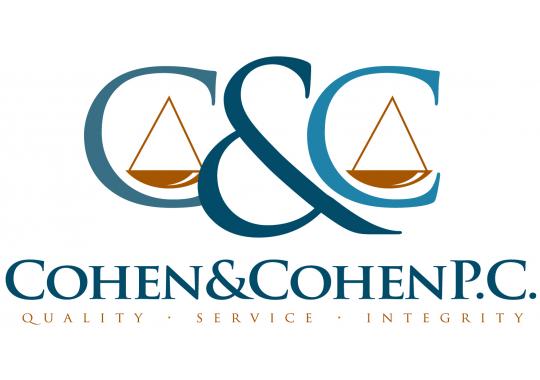
2. Logo Based on Values
The Cohen and Cohen P.C. logo doesn’t scream ‘debt attorney’ as clearly as the one above, but still uses a relevant design.
The letter ‘C’ is repeated twice in a traditional font, giving a sense of professionalism.
The scales pictured within each ‘C’ are a nice visual representation of the kind of help they offer – literally helping clients to ‘balance’ their debt.
At the bottom of the logo are three words: ‘Quality. Service. Integrity.’ They’re subtle enough not to look overbearing, yet still convey the values of the firm clearly.
Consider integrating your key values into your logo design.
3. Image Logo Based on Firm Name
The logo for Trident Debt Solutions is bold, modern, and clear.
The words ‘Trident Debt Solutions’ make up the bulk of the logo, using a simple font and capital letters for increased clarity.
To the left of the text is a stylized image of a trident, made of three squares arranged into a triangle. The combination of multiple shapes could represent teamwork and cooperation, while the complete image brings to mind resolution.
If your firm’s name translates well into an image, try a few different designs and see what kind of values they communicate.
Avoid anything that’s too busy. Clarity and simplicity are key.
4. Logo Based on Geographic Location
The Ariano & Associates logo combines a modern image with a traditional font to get the best of both worlds.
A large letter ‘A’ is created using a single stroke, creating an impression of flow and connectedness.
The ‘A’ also resembles a mountain, reflecting the geographical location of the practice. This is a really smart move that will appeal to local clients.
5. Iconic Symbol Logo
The Lincoln Law logo makes clever use of an iconic image to create a sense of trust and integrity.
Sticking to a silhouette of Lincoln means that their logo doesn’t look too busy, but the message is still clear.
Using a traditional font for the company name enhances the overall appearance. It also speaks to the trustworthiness and integrity of the firm.
How to Design the Perfect Debt Attorney Logo
The best debt attorney logo will include some or all of the following:
- Clear communication of you values.
- An indication that you specialize in debt law, or a specific area, like non tax federal debt.
- Traditional elements to convey integrity.
- Modern elements to appear up-to-date.
- Memorable imagery.
Once you have a firm idea of what it is you’re trying to create, don’t be afraid to experiment!
Be sure to create a few different logos before you settle on your final design.


