5 Expert Logo Tips for Your Video Editing Service
Posted on August 16, 2017 by Logo Design Tips and Tricks

Whether you’re aware of it or not, your logo says a lot about your video editing service.
The colors, typography, and layout you choose can, for better or worse, influence your potential customers. In fact, in a 2015 study, researchers found that even the shape of your logo can affect how consumers view your brand identity.
That’s why, when it comes to expert logo design, the devil is in the details. Keep reading for our top 5 tips on creating the best logo for your video editing company.
5 Tips for Creating an Expert Logo for Your Video Editing Service
1. Choose the Right Shape
So what did those researchers find when it comes to logo shape? It turns out that logos with rounded, circular shapes seem “softer.” As you may expect, logos with a more angular design come off looking “hard” to consumers.
These associations go deeper. Companies with rounded logos actually seem more caring and sensitive to consumers. Harder shapes conjure up ideas of durability and strength.
Keep these associations in mind as you design your logo. When it comes to video editing services, a rounded logo can create a feeling of movement. That may be an association you want to encourage for your customers.
2. Pick Purposeful Colors
Color psychology is a trending topic in the logo design world. That’s because every hue you choose evokes quick, subconscious responses in your customers.
Blue, for example, tends to evoke feelings of trust and confidence in the minds of consumers. Red is highly stimulating, orange is attention-grabbing, and yellow seems energizing and warm.
Keep these ideas in mind while designing. The colors in your logo should match your brand’s overall image.
3. Typography Matters
Your font choice says a lot about your company’s products, message, and core values, depending on what you choose.
In general, serif fonts—those with small lines at the end of each stroke—come across as traditional and professional. Sans serifs—those font families without lines—seem more modern and innovative. Specialty fonts can seem creative, playful, or too busy.
Above all else, make sure the font you choose is readable, even at a small size. Your logo will show up on banners, business cards, and smart phones. Make sure you can read your company name across any iteration.
4. Look at the Whole Picture
While it can be easy to get caught up in the details of the design process, your customers will view your logo as one whole picture. That’s why you need to periodically take a step back and consider how well each element works with your overall design.
Get your logo down to just the essentials. Get rid of any element you don’t really need and make sure everything to include plenty of white space.
5. Don’t Be Afraid to Innovate
While it’s essential you keep these tips in mind as you design your logo, don’t let yourself feel bogged down by them. Sometimes an unexpected element in a logo can spark extra interest in a brand.
Start Designing Your Logo Today
If you’re ready to refurbish your logo—or create a new design from scratch—visit Online Logo Maker. We make it easy to design a beautiful, professional expert logo to advertise your video editing services.
Electric Logo Designs for Electromagnetic Therapy Sites
Posted on August 16, 2017 by Logo Design Tips and Tricks

Many people struggle with sleep problems, chronic pain, and their general health. Electromagnetic therapy is a new and rising field that has been shown to have amazing healing effects in these areas.
For your electromagnetic therapy business to succeed, you’ll need an interesting and relevant logo. In fact, it takes only 10 seconds for consumers to have a first impression of a company based on its logo.
Keep reading for our tips on how to create a great logo design that will leave a lasting, positive impression on consumers.
Use Recognizable Electromagnetic Therapy Symbols
Because electromagnetic therapy is a somewhat new form of healthcare, potential customers might not be familiar with certain terminology or symbols yet.
By using symbols people recognize, it will make your logo much more accessible to a more general audience.
You could incorporate a lightning bolt or sparks to represent the “electro” part of “electromagnetic.” Similar to this, you could use a classic horseshoe magnet. The benefit of using these types of symbols is that it will link items and symbols that people are already familiar with to your business.
Be Smart With Colors
Colors aren’t just for aesthetics: it’s been shown that certain colors can create particular feelings and emotions to consumers.
As an electromagnetic therapy business, you want to express that you are trustworthy as a medical company. Many medical logos use blue, as it’s associated with comfort, trustworthiness, and calm.
You may also want to include some brighter colors in order to catch the eye of potential clients. Bright colors like yellow and orange might match well with the conception of electricity that would go along with your brand.
Notice the Trends
Keeping up with the current styles and trends is important for an innovative and new company. Having an outdated or vintage looking logo could make you look out of touch.
You could go for a minimalist look to keep it simple and trendy. Another current design trend involves something we mentioned earlier: color. Going for brighter, bolder colors is something that has recently become huge in logo design.
There are so many different types of logos, so follow the trends and pick something that works for your brand.
Don’t Be Afraid to Be Unique!
It might seem counterintuitive to put a tip to be unique right after the tip to follow the trends. Just hear us out: noticing and incorporating trends does not mean copying other logos and having no creativity.
For example, you can follow the minimalist trend while coming up with an interesting design for your company. You could use a recognizable symbol along with a symbol specific to your business as part of your logo, like a PEMF machine or a MAS therapy mat.
Here are some logo ideas that could set you apart from other companies:
- Use illustrations or a hand-drawn logo
- Try various color combinations that aren’t as popular
- Depict symbols other companies aren’t using
These are just a couple of ideas to get you going on a creative design that will make your company logo stand out. Don’t be afraid to take a risk or try something completely new!
Bottom Line
Hopefully these tips will help you create a great logo for your electromagnetic therapy company.
If you’re still feeling stuck or need some more help creating a logo, we are here to help! Try out our logo tutorial, or contact us to get started!
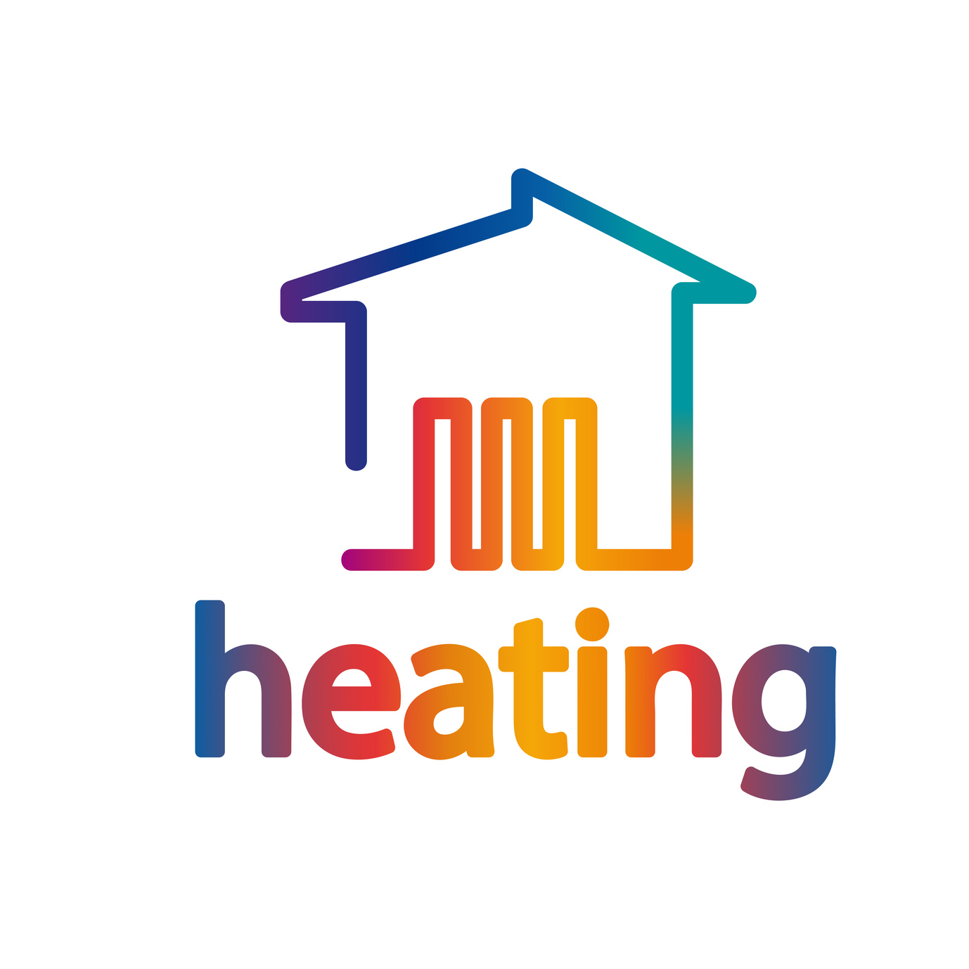
Spice Up Your Company’s Heating Logo With These 3 Ideas
Posted on August 16, 2017 by Logo Design Tips and Tricks
Heating, ventilation, and air conditioning (HVAC) is a booming industry. According to the Bureau of Labor Statistics (BLS), jobs in this field are expected to grow by 14% in the next decade, which is much faster than most other industries.
For HVAC companies, however, that additional growth means additional competition. To set yourself apart from other companies on the market, it’s essential to create a brand that customers will recognize and be loyal to. Creating an engaging heating logo is one great way to do just that.
Here are three ideas to help you learn how to make a logo for your heating company that will be bold and memorable.
Legibility is Key
The purpose of your logo is to make your company’s name and brand memorable. When customers see your logo, they should be able to immediately recognize it and associate it with your company. For this reason, it’s important that your logo is clear and easy to read.
One way to do this is to keep your logo simple. A logo that is cluttered with too many colors, words, and images is distracting and difficult to understand. When it comes to logo design, remember that, in general, less is more.
Of course, you don’t want to be too minimalist with your logo. A well-established brand like Nike may be able to get away without putting their brand name in the logo, but the same is not usually true for small businesses. Instead, Make sure your logo displays your companies name in a way that is clear and easy to read.
Remember the Importance of Color
The color is one of the first things a customer notices when they look at a logo. Think of Coca-Cola for instance. The iconic red-and-white coloring is immediately recognizable, even from a distance.
When choosing colors, try to choose something memorable, and that gives the right connotation. For instance, the color green is typically associated with nature, so probably is not a good choice for a heating company. Instead, consider choosing blues, which are associated with authority, or reds, which are associated with warmth.
Think of Where You’ll Print Your Logo
When you’re making a logo, it’s important to consider what it will look like in context. Since your logo is part of your brand, it will appear on all printed materials. A logo that looks great on your website might not look as good on a pen or a coffee mug.
For an oil or gas heating company, you’ll probably want your logo on hats, t-shirts, and trucks. Think about whether the colors and design you choose for your logo will translate well to these mediums.
Making the Perfect Heating Logo
By following these tips, you’ll be able to create an awesome-looking logo that draws people to your HVAC company.
If you’re ready to get started on your company’s heating logo, check out our free online logo maker. This tool will help you to make a logo that looks great and represents your business well.
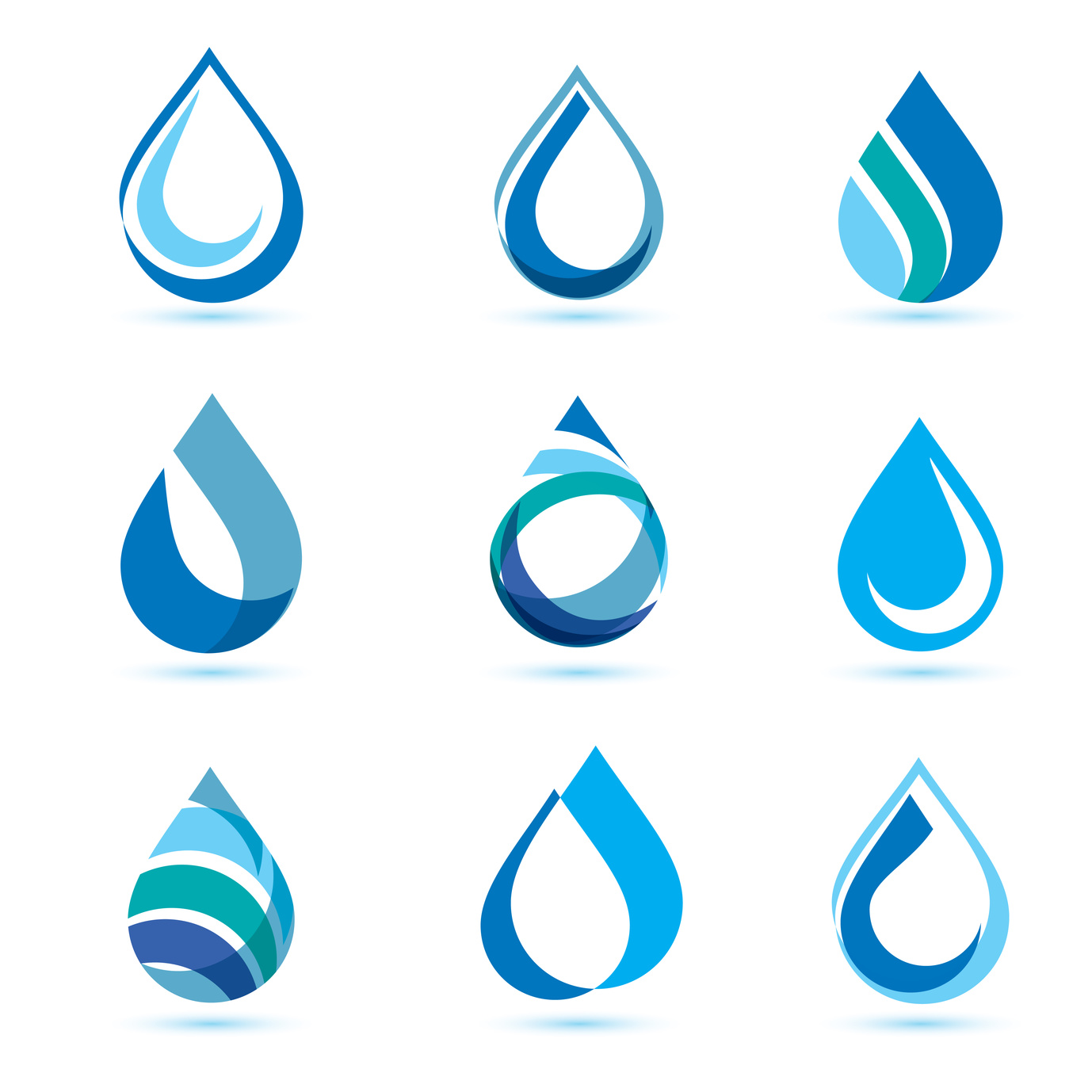
5 Ideas to Create a Fluid Water Company Logo
Posted on August 14, 2017 by Logo Design Tips and Tricks
A company’s success can hinge upon the design of their logo.
A large amount of information can be given in the smallest shapes and lines. Logos should help the clients get a sense of your brand. Navigating the vast waters of logo design can be challenging. However, we’re here to help.
Check out these 5 ideas that make designing an effective water company logo a breeze.
1. Water Effects That Work
Ripple effects are a very subtle but striking way to portray the aspect of water in a design. Text or shapes can appear to reflect off of the service of water.
A 3D geometric shape, like a cube, submerged halfway underwater can turn its harsh points into rounded edges.
The drop of water is seen in many water company logo designs. We love the idea of turning various items and shapes into water droplets. Add a new twist on this instantly-recognizable interpretation of water.
2. Design With Simplicity in Mind
When using text, the best designs use a simple and clean font with straight lines. This can make it easier to add contrast with ripple and wave effects.
Script fonts can often get lost amongst the waves.
A line of text like “Filter Pure Pentek” can be elevated by using initialism or a single letter. This keeps logos from appearing clustered with multiple words.
Color is quite simple. Blue and white are incorporated in essentially every water logo design on the market. You can add variety with two or three variations of hues.
3. Dive Deeper
Tired of only using water images in your design? Why not use nautically-themed objects to stand out a bit?
Neptune’s trident is a bold choice that can appear both elegant and strong. The captain’s wheel adds a bit more complex visual symmetry to designs.
Water is formless and fits the shape of the vessel it is placed in.
Realistically, a water logo can use any vessel and appear to fill it with water. A soggy shoe with a puddle inside. A hat turned on its head may reveal an ocean of fish inside.
4. Bring the Water Company Logo to Life
Another option may be to use animals, but don’t just go for fish.
Octopus were the world’s first highly intelligent animals. They’re a perfect fit for your logo design. If lakes and rivers are in the picture, try the platypus.
5. Go Do Some Surfing
Surfing the web is a great tool to generate loads of new ideas. Pinterest Boards are a great resource for amazing ideas that will inspire new designs.
Search for some high-quality images on Unsplash that are free to use as backgrounds for your logo. Plus, those real world images can spark new creativity when feeling stuck.
It’s Smooth Sailing from Here
With these new ideas to create cool water company logo designs, it seems success is just around the river bend.
Get started now and test out your design ideas with our free logo maker tool. Create unique designs that align with your company’s vision and let your clients know you mean business.
If there is anything more we can do to assist you in your design process, don’t hesitate to reach out to us through our contact page.


