Qualities Your Practice’s Health Logo Needs to Have
Posted on August 23, 2017 by Logo Design Tips and Tricks

The perfect logo takes time to create. It must be drafted, reworked, simplified, and studied by focus groups. Often a logo takes several attempts.
One must be aware of the redrafting process and weigh that with the deadline that has been set.
When it comes to health logos specifically, there are certain factors that must be kept in mind. Like any creative business endeavor, it is important to balance uniqueness with brand recognition.
The Red Cross logo is instantly recognizable for this reason: it is unique, simple, elegant, and creates an immediate sense of what its company is.
The following are some additional qualities that are necessary to create a successful health logo:
Be Unique and New
In the medical field, it is very easy to create a logo that shares overlapping characteristics with other companies.
This is because there is a pile of “go-to” symbols and features one would consider when creating a health logo.
Items in this list include pills, crosses, stethoscopes, smiles, a heart, and the caduceus (the staff with two snakes and wings).
Perhaps try to incorporate specific components of your focus.
For example, let’s say you’re creating a logo for a dental office. Instead of using teeth or a smile, choose to either dial in or zoom out.
In dialing in, you can focus on the shimmer of one immaculately clean tooth. In zooming out, perhaps create a more abstract logo that evokes the feeling of a pristine mouth.
Be Uncomplicated
When it comes to being memorable, less is more. Always. Just like “economy of word” in a slogan makes a slogan more memorable and easy to repeat, a simple logo design will stay in the minds of consumers much longer than a complicated one.
Minimalism is often hard to accomplish. It is natural to want to load as much information as possible into a health logo. But a unique, stylish, contemporary logo goes a long way.
Take a look at PHMP for an example of this. It is technically the first letter of the brand name. Yet its sleek minimalist style puts the focus on a circle, conveying a full comprehensive practice.
The circle is a classic and timeless symbol of progress and renewal.
Be Timeless
This leads us to the next tip. A perfect health logo must stand the test of time.
Even as your practice grows and changes, your medical equipment evolves and gets more advanced, your logo should be able to grow with the times without growing pains.
The use of symbols that are important to your practice, or the notion of creating an abstract representation that evokes a feeling is timeless.
As your company changes, your logo should be able to remain mostly constant, while being strong enough to only require minor tweaks to adapt to changing trends as time goes by.
Guarantee Success with the Perfect Logo
It is essential that your health logo be unique and memorable, even if it doesn’t feature anything that has to do with your specific medical field (like the abstract representative logos mentioned earlier).
After all, the Apple logo and Nike swish have absolutely nothing to do with computers or shoes respectively, but they are among the most recognizable logos in the world.
In conclusion, test your logos with everyday people. Share them with your patients and clients.
You may not be aware of the feelings that your logo evokes until you receive feedback from someone who hasn’t spent the past month staring at it. Often you will be surprised by their reactions.
Logo design is highly psychological in ways most people would never think about. Use the above methods to achieve an eye-catching instantly memorable health logo today.
5 Consumer Stats to Inform Your Shipping Logo Design
Posted on August 23, 2017 by Logo Design Tips and Tricks
Your brand logo is a symbol of your company’s standards, products, and performance.
However, many retailers do not realize a shipping logo is just as important. Sometimes, it’s the deciding factor in product comparisons.
To stand out throughout the purchase cycle, retailers need to understand consumer opinions. Market perception is just as strong as market demand, especially in communication strategies like logo design.
Translation? If you want to increase your conversions and make more sales, your logo design needs to grab the attention of everyone who sees it — and has to be powerful enough to stick in their minds.
Here Are 5 Consumer Stats to Inform Your Shipping Logo Design
1. 90% Of Consumers Say Free Shipping Is the #1 Incentive
The only thing better than fast shipping is free shipping, according to a recent survey of over 1,400 people.
Some consumers will even wait an extra day or two if it comes at no extra cost to the item purchased.
Electronics and clothing items are usually wanted right away, in which case consumers will pay for shipping. Other things like household items may not be needed as rapidly. Consumers will gladly wait to receive such items for free.
When designing your shipping logo, keep in mind the products you offer.
How much are they worth to your consumer? Enough to pay for shipping?
2. Two of the Top 5 Countries Shopping Online Prefer Digital Currency
Having an online market often means having a global audience.
China is number one in the world for the most frequent online shoppers. Of which, more than half of these consumers prefer digital currency.
India is not far behind. The country places fourth for having the most frequent shoppers per month, yet comes in first place with over 70% of consumers using digital currency.
Customers in Germany, the UK, and the United States are all regularly clicking “go to cart” and “checkout,” too.
This makes digital currency an easy way for everyone to get the latest trends, no matter the shipping address.
3. 50% of Consumers Opt For One-Day Shipping
This statistic highlights the old truth: the faster, the better. It really is that simple.
Many consumers want an estimated time slot of when to expect their package. However, updates are more than welcome. Email or text updates when the package is ready, shipped, and delivered can help.
This has an added benefit of more exposure for your shipping logo. To best tie-in fast shipping to your logo design, think of what reminds you of speed and efficiency.
4. Home Furnishings For Home Delivery Orders Are Increasing
About 30% of consumers are planning to make big, bulky purchases in the coming year.
Retailers need to consider things like special load boards for freight, depending on the total weight and distance traveled.
Retailers have to get the delivery right the first time always, but there literally is more riding on a big order. A trustworthy logo can help establish customer rapport from the start.
5. 82% of Consumers Expect Proactive Communication Throughout the Shipping Process
This is an age-old truth of establishing good relationships – communication.
Using SMS or email strategies are such simple tactics retailers can implement for high customer satisfaction ratings. In fact, of the consumers looking for consistent communication, 45% are tracking by SMS and 85% are checking their emails for updates.
Additionally, the more you send something out to your consumer, the more opportunities you have to expose your logo.
Demand and Design
Designing your shipping logo means taking many things in to consideration.
Your established brand logo and products are the foundation. However, consumer shipping opinions and statistics are important, too. Use the data here to your advantage, especially when it comes time to design your logo.
Have your delivery logos made a difference in customer satisfaction and relations? Let us know in the comments below.
How to Design Casino Logos that Radiate Good Luck
Posted on August 18, 2017 by Logo Design Tips and Tricks
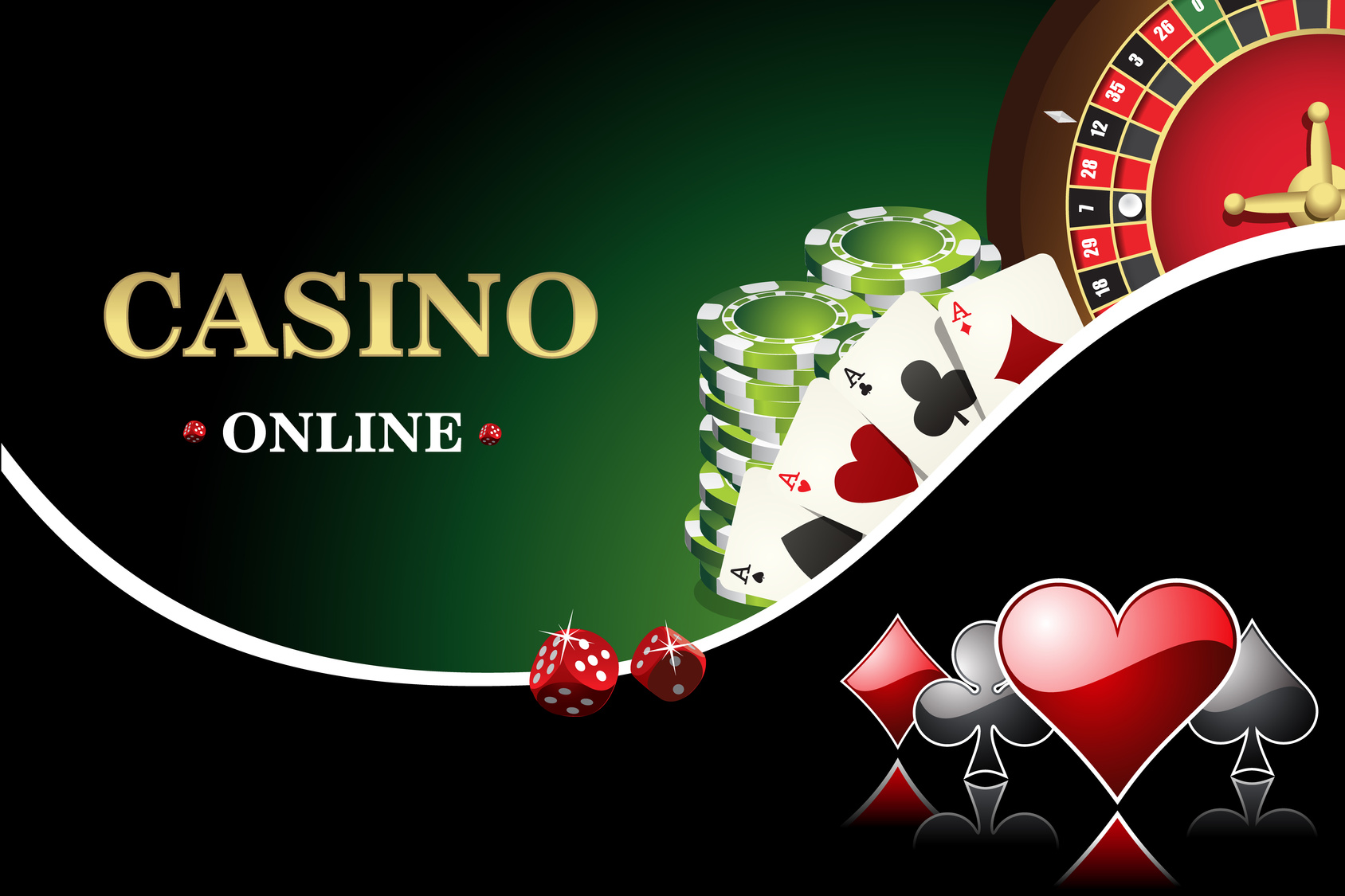
Crafting a great casino logo is like hitting the jackpot — when you do it right you know you’ve struck gold.
Casino logos are crucial to making your brand memorable to customers. With the number of new online casinos cropping up, a good logo will make your business stand out.
So, here is the ‘how to’ guide on creating a winning logo for your online casino.
What Do Casino Logos Say About You?
Here are a few things to consider when brainstorming your casino logos:
- Is there a kind of game or theme you’re using in your logo?
- Is there an audience or customer type you want to appeal to?
- Do you have a specific message you’re trying to send out?
By 2020, online gambling is set to become a $60 billion dollar a year industry.
Making your brand stand out is more important now than ever. While creating your iconic logo, the first step should be deciding what your brand says.
Remember that people are looking for an online gaming site they consider fun and gives them hope in a payout.
Once you have an idea of your brand you can actually start brainstorming a design.
Drafting an Idea
Some questions to ask yourself during the design process are:
- Do you want to be sleek and stylish?
- Do you want to use an old-school call to the casinos of Vegas?
- Do you want a fun and easy-going look?
Now that you have a message for your brand, how can you convey that?
You could use a character with your brand — a cartoon that looks fun and inviting, or you could use the name of your online casino in a memorable way.
Text styles are a common form of logos. There’s a good reason for that since a name will be the most searchable tool to find your specific website.
Consider using an old school pen and paper to draft out your casino name. Then move to an online creator to bring your ideas to the web.
Compare the Competition
Creating a simple draft will give you some form of originality but knowing how other successful businesses in the industry have used their casino logos, can help you improve yours.
There are a number of successful online casinos like Guts, Rizk and Sloty. These websites utilize a variety of different designs that have found them success.
A quick check may give you ideas on how to improve your casino logos design and make it stand out next to other big names in the business.
You could also check other general guides on a good logo design for a different perspective.
Know What Not to Do
Don’t date yourself. Aspects of design can get old and there are a ton of cliches that will make your customer’s eyes roll out of their heads.
When designing, strive for simplicity. Overly complex and gaudy are easy to recognize and will make customers think your site is cheap.
Remember that customers need something they can focus in on and recognize quickly. If your design has too many elements it will push people away.
Simple, memorable and unique are key ideas for designing casino logos.
Strive to Hit the Jackpot
You now have the tools to make a great logo that will draw people into your site. From here you should try to create a few designs to test with online customers.
Getting feedback from a group of people will broaden your ideas and give you valuable perspective.
When you’re ready to learn about the next steps in logo design try out this tutorial to craft a free logo.
A good logo will stick in your customer’s head and have them returning for more chances to win.
5 Killer Logo Redesign Ideas for Accommodation Websites
Posted on August 17, 2017 by Logo Design Tips and Tricks
The logo of a business can make or break the customer’s connection with the brand. The thumbnail logo sized image seems small, but it has a huge impact on brand recognition and relations. A logo can even express the difference between one company and its competition.
In the accommodation world, staying ahead of the competition is key. For companies who haven’t been having success with their logo, there’s no reason to start over. It may just need a modern logo redesign to regain its power. We’re teaching how to do that below.
Logo Redesign
Simplify Design
Logo design trends in 2017 have companies simplifying their logos. When it comes to logos, minimalism is in. Are there complementary colors that could get deleted without losing the image’s integrity? Then they should go.
A simplified logo is more visually appealing, modern and will make customers take a second look.
Delete Logo Words
Another trend in logo design is editing the logo to lose the words altogether. Companies should only do this if they have a high recognition level with their logo’s image already. Starbucks employed this strategy in 2011. They removed the wording from outside their central mermaid image, leaving her alone.
The result was a fresher and easier to print logo, with the same amount of recognition. Not ready to make that jump? Some companies are trying out both worded and non-worded logo versions. Non-word logos look great as small profile pictures and the worded logo can appear on the site itself.
Change the Lettering
Hand-lettered or text changes in a logo are another noticeable logo redesign technique. The image of the logo stays the same, while the company’s name is presented in a fresh new way. The changes don’t need to be extreme.
Companies have succeeded by something as simple as changing capitalization around. Other companies, like https://www.whistlerpremier.com/accommodations, deleted letters and replaced them with a readable image. As long as the consumer can read it, the possibilities are endless.
Stay Original
It’s easy to look at competitors logos and get ideas for a logo redesign, but using the same format is tacky in the end. A logo should be used to differentiate one business from another, not make them all blend in together.
One marketing professor from UEA suggests this can be achieved by changing logo colors. What differentiates one company from its competition? Are they greener? More trustworthy? He suggests companies use color psychology to assert that.
Get a Fresh Pair of Eyes
Breaking a cycle is hard and can hinder the logo redesign process. The easiest way to break the cycle is to get a new pair of eyes on the redesign team. Someone who isn’t familiar with the original logo will be able to point out subtle aspects the team has long forgotten.
Teams can use this new insight along with knowledge of the company’s brand and values. The combination of old and new will create the perfect logo. The resulting image will be the best of both worlds.
Wrapping Up
Redesigning a logo is a long and labor intensive process. It’s hard to leave the familiarity of an old image, but consumers will appreciate a new one. Using these tips along the way will make the process a little easier. Start redesigning a logo today.


